
Introduction
The following is a design brief consisting details of the design process of developing a logo for a previous client. One of the members of the family had asked me to make a logo design for them and I agreed to take on the design challenge. They were building on their brand R & D Automotive and needed a fresh logo to work with.
Process
The first step was analysis. Robinson and Dodge Automotive, R&D, has been a business that focuses on auto repair for over twenty years. Recently the business has rebooted its towing services. Thus the operations manager and the owner wanted a logo to use for new marketing methods and to improve their visual brand. The business is located in Fort Mill, South Carolina and serves the Charlotte community.
The next step, Ideation, I began researching images, such as icons, symbols, and signs other automotive businesses used to gain an understanding of conventional imagery clients will recognize. I wanted to use something simple that clients can catch and recognize easily.
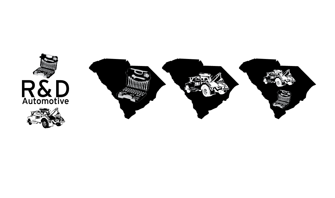
Below are logo designs based off the images found during ideation. The goal is to design a simple logo that potential clients, can recognize easily and gives core information about the business. The image on the far left informs the viewers of the two major services R&D offers. The second logo from the left informs the viewer of the location of the business, and the main service they offer. The second logo from the right informs the location and the rebooted service to the viewer, which may also "lead on" the potential client to inquire about other services. The logo on the far right informs the viewer of the location, and the two major services R&D offers.
The Typeface was already predetermined by another designer that would later implement my logo design to the rest of R&D's marketing materials. For presentation purposes, I chose interstate as the typeface for the text. If the first logo from the previous set was chosen, then the typeface would have been replaced with the typeface from the other designer.

The title of the company has the Interstate, typeface for its clarity and more balanced composition.
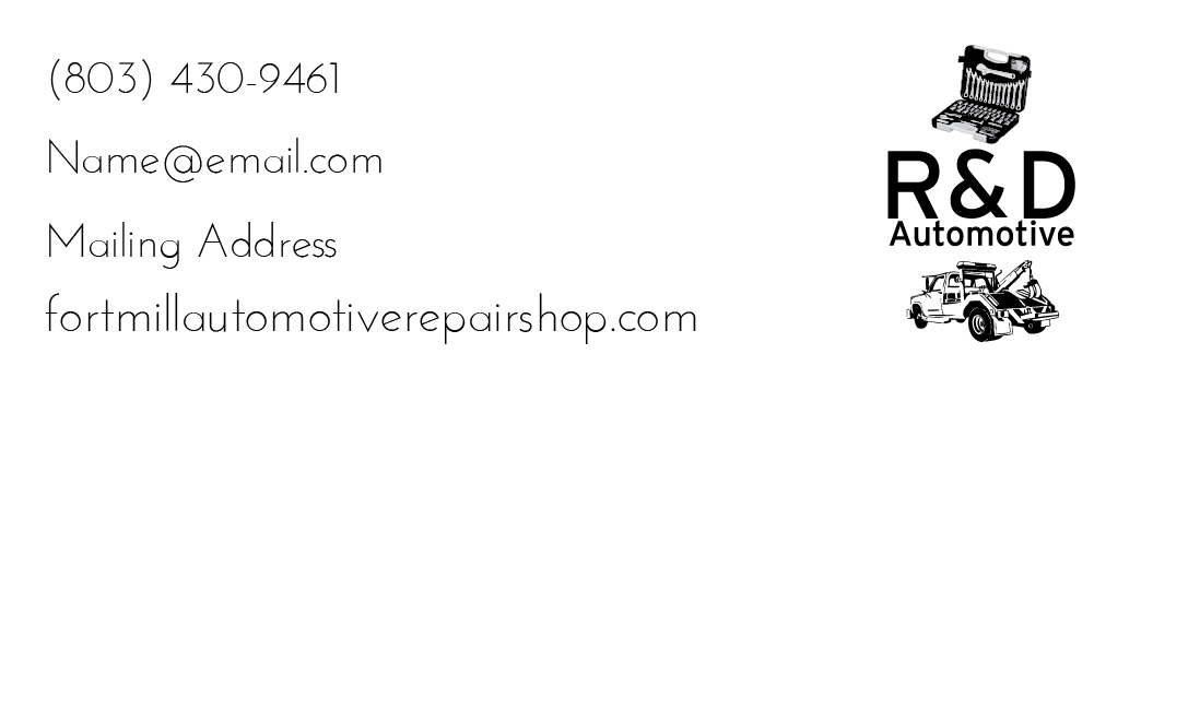
This is an example of how the logo will appear on some of the company's brand materials. This was produced to help illustrate to the client, how the logo may look. The Interstate Typeface is part of the logo, but the Eurofluence typeface serves to offset the text. This composition provides clarity and clenliness, which contributes to its legibility.
The following are colour selections found in Color Lovers. After I found the colour pallette, I began implementing colour combinations with the logo design the client had previously asked for. Both sets have the same colour, but have coding for both RGB for digital design purposes, and CMYK for printed design purposes.


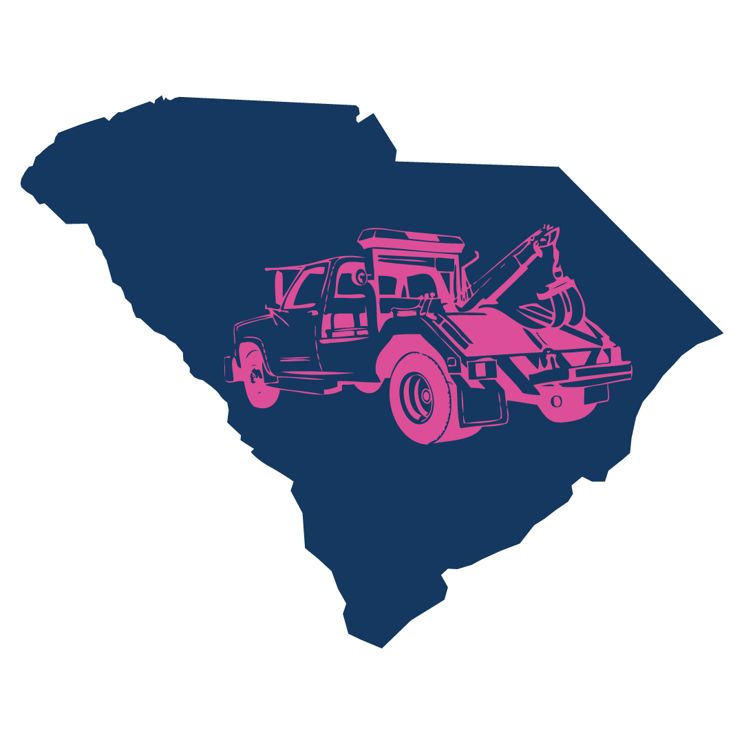
Below are combination sets o the chosen logo and the colour choices. After presenting this to the client, she chose the ninth design colour choice but to change the orange into the magenta. The magenta was not initially included in the colour choices but was added upon the client's request.


After choosing the logo, I made a draft business card to give an idea of that the logo would look like. This is an example of how the logo will appear on some of the company's brand materials. This was produced to help illustrate to the client, how the logo may look. This particular example displays the logo the client had chosen, with the combination of Fuchsia and South Carolina Blue, as well as Interstate and Eurofluence Typeface.

Credits
More work can be shown on jordantrobinson.com. All images, with the exception of the image research, is under sole authorship of the designer and the client. Therefore, all copyrights are owned by the designer, Jordan Thomas Robinson, and the Client, Robinson & Dodge Automotive.


