Vitality Magazine
Magazine redesign
This is a redesign of Vitality, a magazine delivered 3 times each year to over 1.1 million CareFirst BlueCross BlueShield member households. I was responsible for the concept and execution of the redesign, including the logo. The magazine is produced by a third party under my art direction with the exception of the cover, which is produced in-house. The examples shown below are from our first issue featuring the redesign, so the layouts were done by our third party under my direction, using the style guide I provided.
The old Vitality, while printed in magazine format, was less a magazine and more a newsletter lacking organization. The old design was dated and lacked hierarchy and visual interest.
The new layout was designed to be more contemporary and user-friendly. The magazine is divided into 3 main sections – a Member Update,a feature article relating to the cover, and a series of departments featuringmini articles. All the sections and departments are color-coded for easy navigation. Color choices and typography all comply with health literacy standards.

First issue our third party vendor created from the final template (above), detailed instructions and design board I provided.

Color-coded sections and departments make navigation easy.
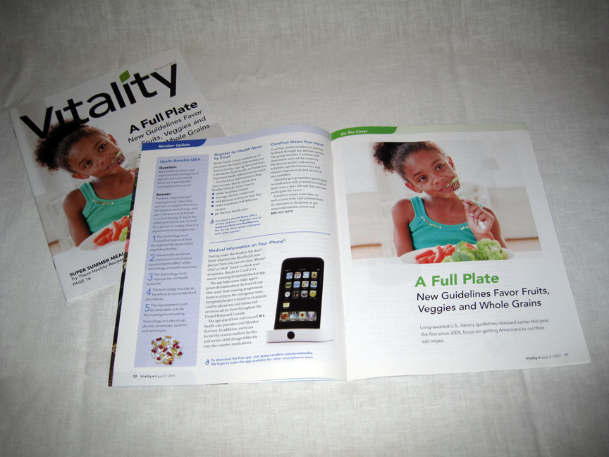
Feature article relating to cover. The feature article looks inviting and very different from the Member Update to signal a transition to another section of the magazine. The relation to the cover also gives more meat to the magazine.
Detail of feature article call-out.

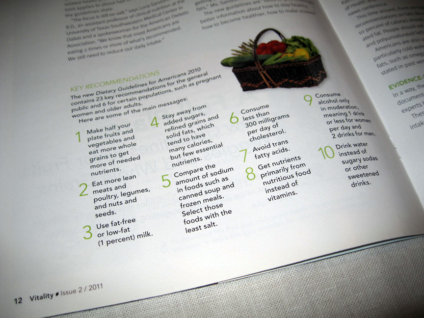
Example of a department spread.


