
About the Project
This project is a vast departure from anything else I have ever done before and by far shows the most growth in my academic career. In fact, I think this a great comparison piece to what I designed for the Human Rights magazine spread that shows growth beyond measure.
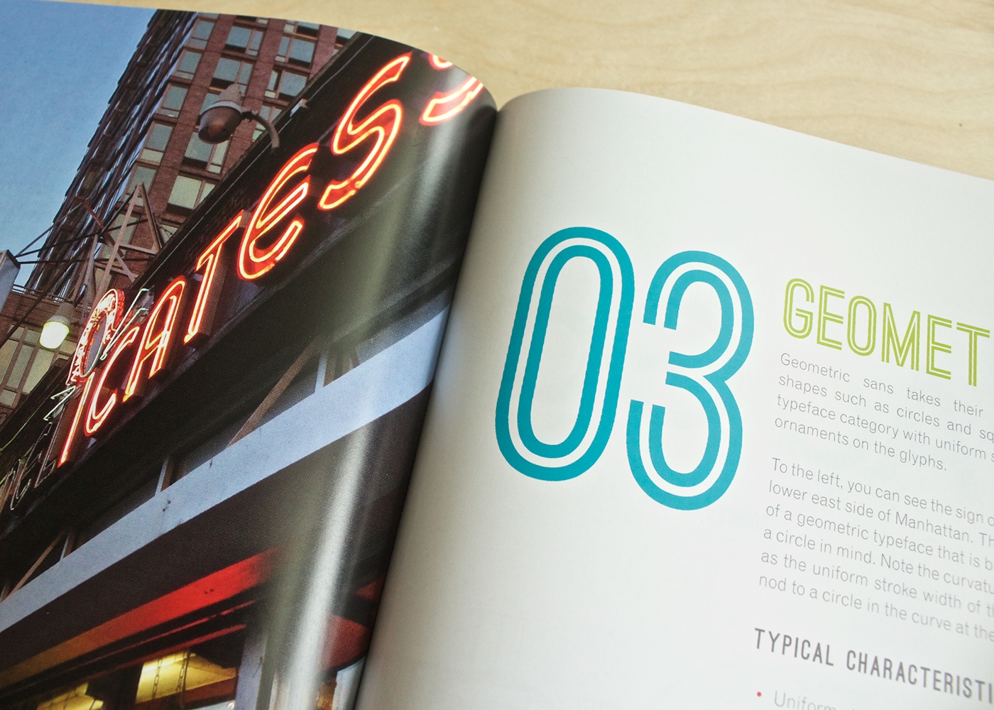
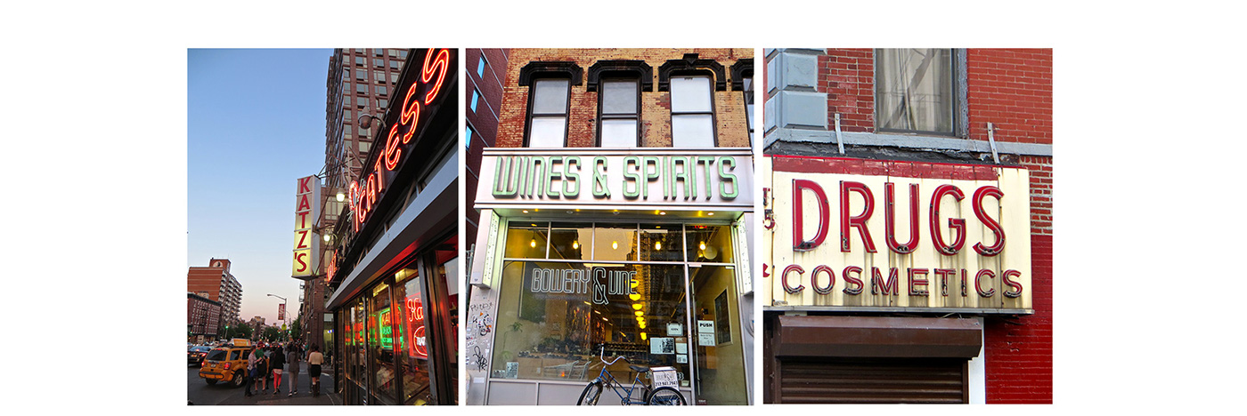
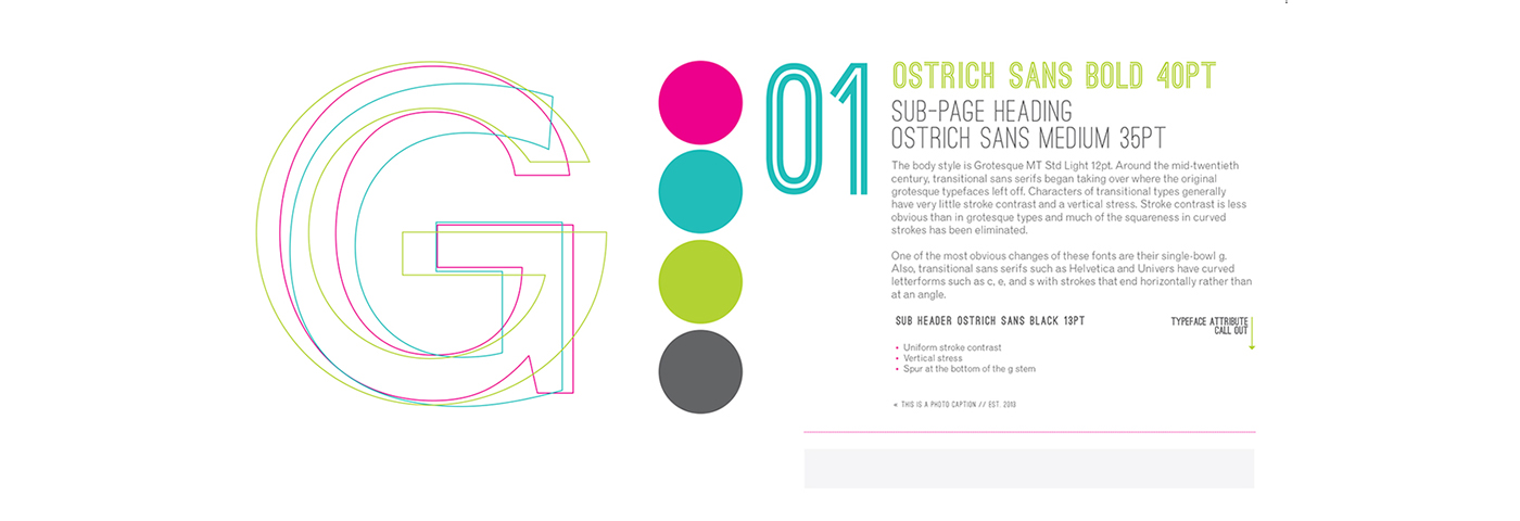
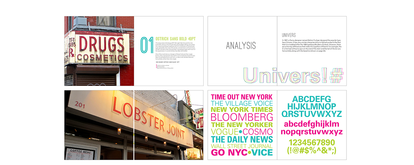
This project was a labor of love. We were tasked with creating a book that analyzed certain typefaces during a period of time. Living in New York City at the time, I decided to venture into the world of vintage signs. This proved to be a fascinating project that challenged me in multiple ways. I had never curated a project in such depth before. I analyzed signs, discovered their typefaces and created typeface specs for each type of font. What I discovered along the way was the rich history of NYC stores and restaurants as well as a large amount of signs that had been around for 50+ years. I also discovered that a majority of these signs were neon and sans serif.
Through careful research of historical typefaces and signs, I was able to narrow down the project to three categories of sans serif typefaces and signs. I then went out into the great concrete jungle of Manhattan and photographed as many signs as I could. Once I came home, I catalogue each sign and tried to discover the age of the sign in the process.
This project showed me the importance of in depth research and what can happen to a design project when the history of the subject is researched thoroughly. I am most proud of this book because of the time and effort I spent to create every aspect of the book from the front cover to the back. After all, there was no way I could not include this in my candidacy review.

