BURTON: CHILL FOUNDATION
Packaging, Social & Environmental Design
The Chill Foundation is a youth development program that lasts for six-weeks. The non-profit foundation uses snowboarding to teach life skills and increase self-esteem in underserved youth between the ages of 10-18. The six week programs themes are patience, persistence, responsibility, courage, respect, and pride. Chill created this to provide a framework for learning and personal growth. They ride up to the mountain to introduce the weekly theme through an activity, and reinforce the concept during their time on the mountain. This structure allows the youth to make meaningful connections while experiencing the joy of snowboarding. I wanted to bring more awareness to the program and create a product for the youth that would be given as a gift to them while the profit would go to the foundation.
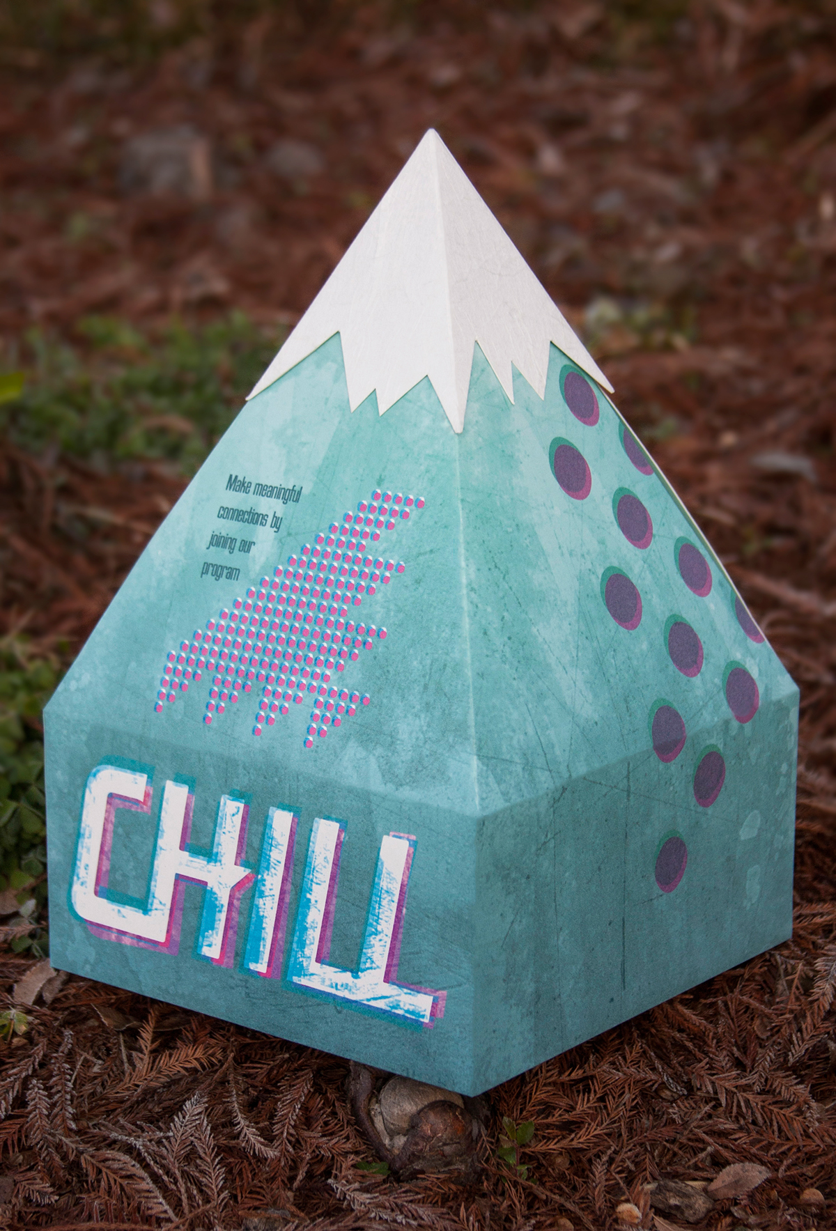
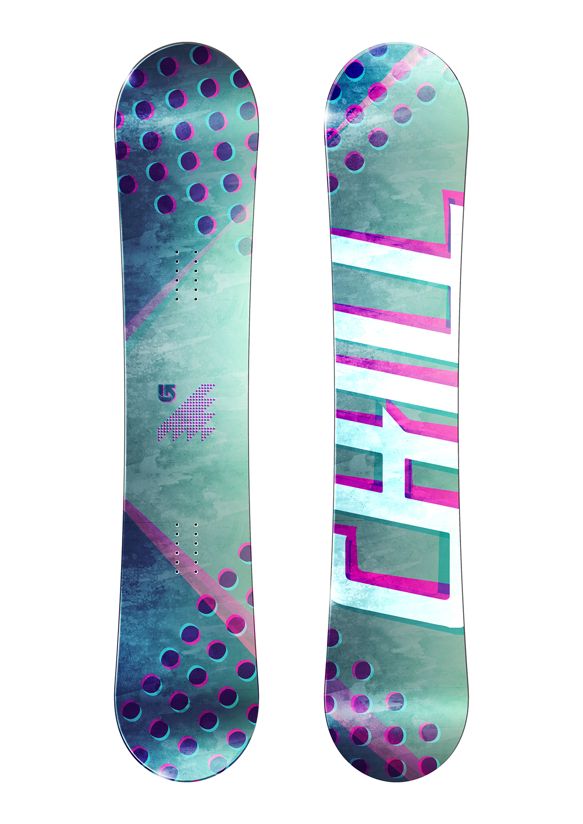
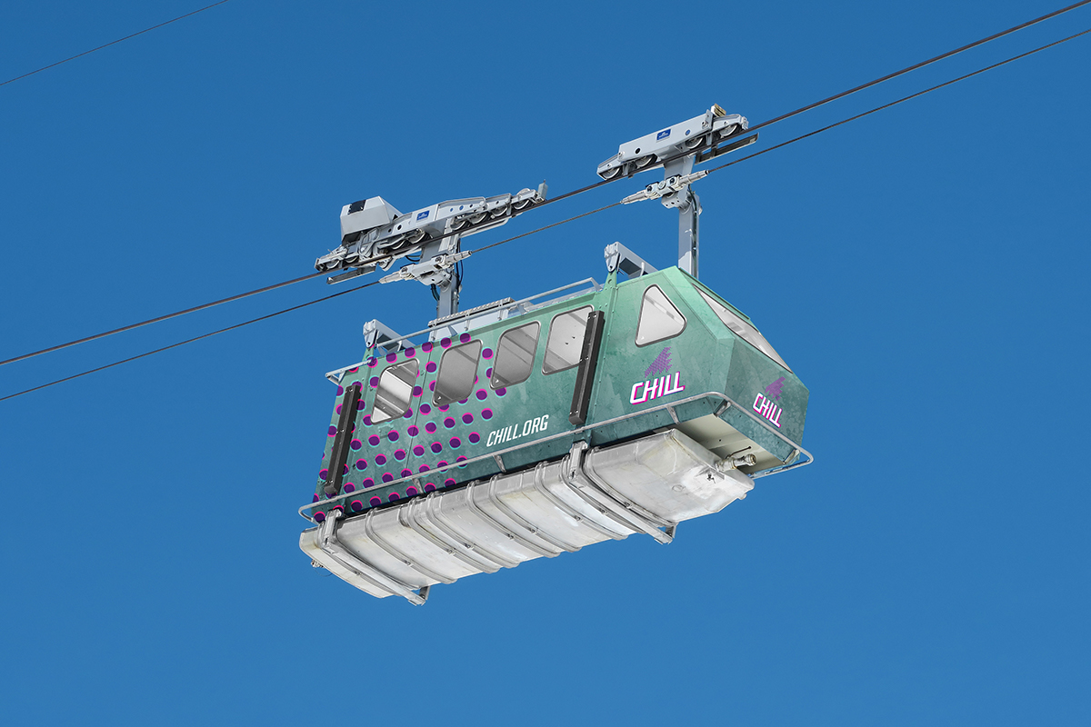
I wanted to bring awareness to the Chill Foundation in another way for them to gain more donations. By doing so, I designed a package that is interactive as it is both physically and visually appealing. The package intentionally looks like a mountain peak which is held together by an ice-cap. The environmental graphics are meant to invite and inform the people of the cause to gain awareness and donations. The snowboard design which would be made by Burton would be sold in stores and the profit would go to the program. The watercolor design is a texturized gradient blue. The blue represents a cool, icy aesthetic that works well with the snow sport. The pops of bright pink come from the Chill logo, but was changed slightly with a color overlapping technique to create a grunge look that appeals to the youth. The font I used for the header was BigNoodleTitling because of its tall yet bold look which represents a snowboard very well. As for the body copy, I used Gill Sans for its tall ascenders that work well with the bold header typeface.