
This is a packaging design for a box of dried cherries- the brand and logo are something I created as well.
I love both hydrated and dehydrated fruits, so I was pretty excited about this one.

Below is some of my process work- after thumbnailing the general design of the box, I did a
rough sketch and compiled all of the sticker and label elements onto one file to see how it would look.
Then, I could get a stronger grasp of how the box would be laid out and could tweak the layout.
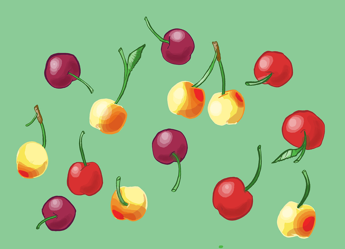
I also needed to see for myself how the cherries would look on the box in
relationship to the other elements before progressing any farther.

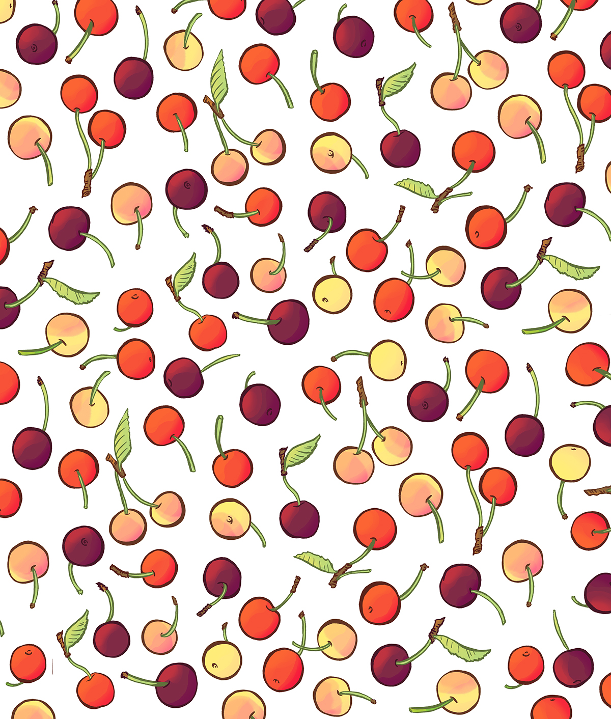
For the sake of time and speed, I used my rough cherry sketch to create a few quick color studies
rather than recreating them again. I did, however, feel I needed to make the cherries smaller and
greater in number for the final.


The more I tweaked the colors, the more I realized that white was a much cleaner and
nicer background color. After creating the final, I dropped it into my template and started on the text next.
Below are three different type options for the words on the box.


(The logo I had made in Adobe indesign- I scanned in a few pencil sketches and vectorized them.)
Then I made a few minor changes to create the final version seen at the top of the page.


