As a non-experienced photographer, this project proved to be one of the toughest of my design career. There were many uncontrollable variables that made the execution of the final imagery quite a challenge. Lighting was most difficult as the room/environment itself needed to be dark and appear “creepy”, but at the same time, lighting was necessary to make the text show up on camera. Using a flash made the images too hazy, and without a flash, the images were often barely recognizable. Taking hundreds of photographs, at various times of the day, in various positions, with various light sources was necessary to get a handful of readable frames.
I was satisfied with the serious and matter-of-fact look of “Tymes Little Caps”, so I chose to typeset the text in that particular typeface. I made the quote into a rectangular shape in order to make the text appear more purposeful and planned. I enlarged the words “you fear” to not only emphasize the meaning of those words, but the quotation as a whole. I set “is certain” to the right, also for emphasis, and to force a slight pause in the reading of the text.
After tracing the printed text onto poster board, I hand cut each letter with an X-acto knife. I cut the text out three different times at three different sizes for experimentation purposes. My family’s abandoned farm house, in the middle of rural South Carolina, served as the “environment” for this project. With it’s dark interior, creaky wooden floors, cracked walls + ceilings, and centuries worth of historical memories, this location was ideal for representing a spooky, haunted-like atmosphere.
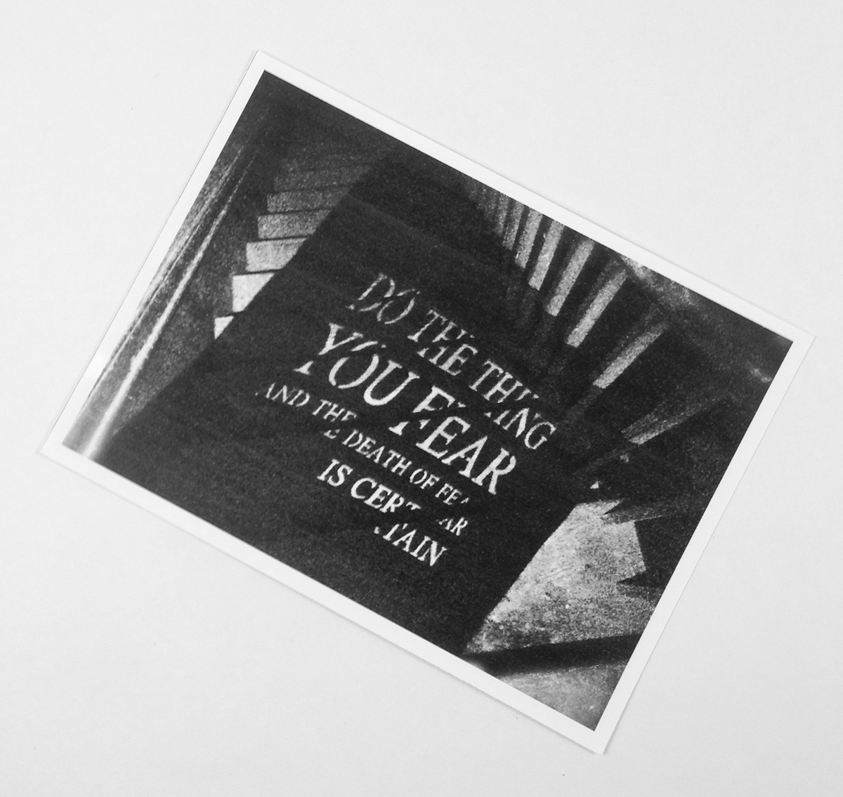
Since this location is privately owned, the message represented in this project will only be available to most viewers through photographs. In my second attempt at this project, my goal was to create a mysterious image reminiscent of stills found in film noir. My goal was to allow the environment to shape my text, rather than having the text bring meaning to the environment. With the use of flashlights, I was able to project the text from the poster board onto the walls and floors of the home. Ambient lighting was adjusted by opening doors and/or covering windows as necessary. Late afternoon, around sunset, proved ideal for lighting purposes.
I wanted the darkness and sense of uncertainty seen in my final image to represent the “fear” people have, whether it be something physical or emotional. I chose to focus on the stairway of the home for a couple of reasons. For one, stairs are often a crucial aspect of horror movies - with the victim running up them when they need to be running out the front door. Second, the stairs represent a sense of confusion - should you go up or down? They represent a symbolic path in life. Taking the wrong path always seems to be a relatively common fear for most individuals. The darkness of the image also allows the viewer to decide for him/herself what may be lurking at the bottom or the top of the stairs. I also used the stairs to break up the text, in an attempt to represent shakiness, hesitation, and anxiety. Generally, when we fear something, it’s not an easy thing to overcome.
I relied on shadow and light to make up the text, or the subject of these images. Although the shadows in this project are man made, they are natural occurrences in every day life. I thought that fact would help the text “fit” into the image and allow it to become invisible, rather than looking out of place or forced. The idea behind the images is to not only elicit a physical reaction in the viewer, but also an emotional one. It is telling them to not be afraid, face your fears, because it could lead you to new possibilities, adventures, and a stronger you.