I believe the creation of this cruise ship infographic was a success because the topic is a personal issue I have dealt with as a resident of Charleston, South Carolina. It was eye opening to learn of the issues associated with the effects of cruise ships on port cities, many of which create a domino affect, rarely discussed with the public.
The goal of my infographic is to provide information on the topic of cruise ships to my fellow Charlestonians, as well as the tourists who arrive in Charleston, not understanding how their travel plans affect others. While I was able to find both positive and negative facts about cruise ships, the main goal of my poster is to educate, provoke, and elicit change, ultimately calling for the end of Charleston as a major port city. In order to make this goal a reality, I wanted to show the imbalance in positive versus negative effects of cruise ships on port cities.
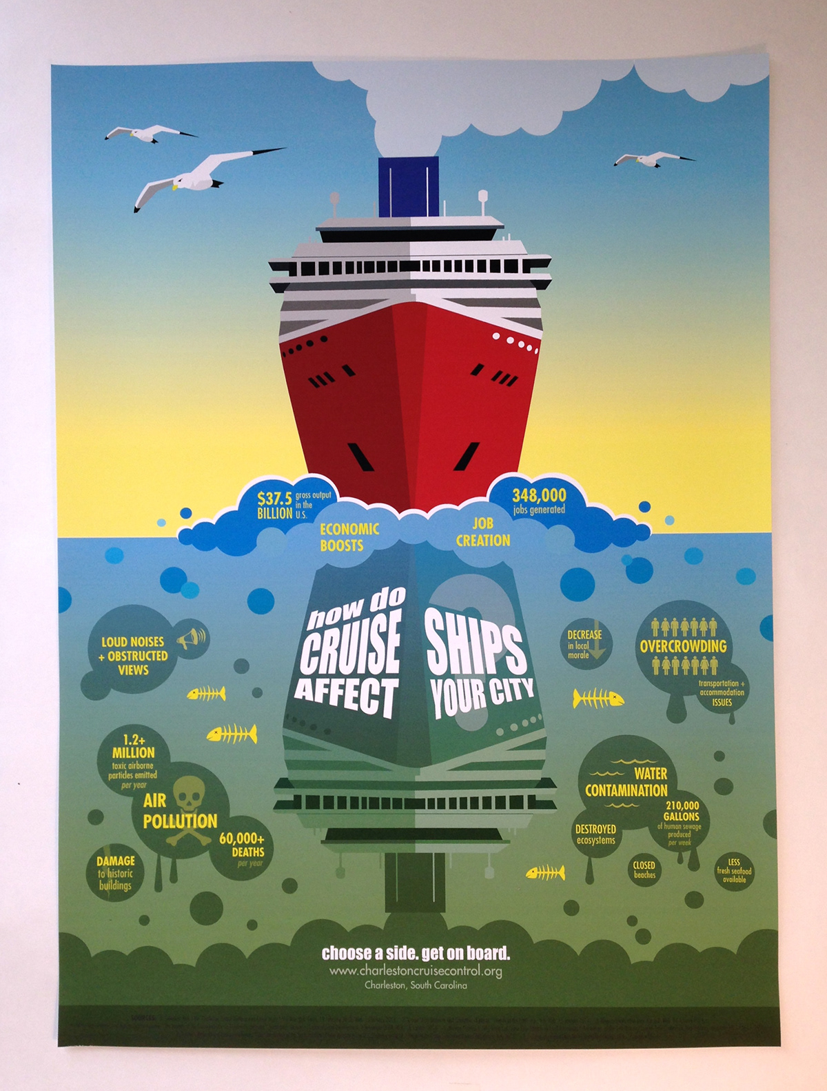
The top of the poster is meant to be viewed first. It is supposed to generate a calm, happy, and peaceful feeling. A bright and shiny cruise ship floats on top of the blue water, the sun is shining and birds are flying above. This is meant to represent what the public sees and are most often told about cruise ships. When you, as a viewer, think about cruises, the negative effects don’t generally cross your mind. You think about the vacation you are going to take and how much fun you are going to have. Responsibilities fly out the window. For this reason, I wanted this infographic to be about discovery. I used the concept of reflection (literally and figuratively) to uncover the realities of the cruise industry. I wanted the change from positive to negative to be somewhat subtle. To allow viewers to form their own opinions, I used gradients to switch from calm, serene, blue ocean water, to darker, murky, green ocean water.
As birds are flying above, dead fish can be seen floating in the water below. I tried to use similar shapes throughout the image to keep everything cohesive. Round bubbles, in different shades of blue and green are used for both positive and negative effects. Throughout the poster, I used the typeface “Futura” for its sans serif and condensed characteristics in each of the fact bubbles. I kept the text yellow so as to not make any one fact, good or bad, stand out. The circular placement of the bubbles around the cruise ship reflection help lead the eye in a circle. I chose a slightly bolder sans serif typeface (“Impact”), in white, for the headline and subheadline. My goal was to connect the two in a vertical line by having the subheadline appear to be coming out of the ship’s smoke stack. Once the viewer discovers what the infographic is about, he/she will then be directed to act on the issue.