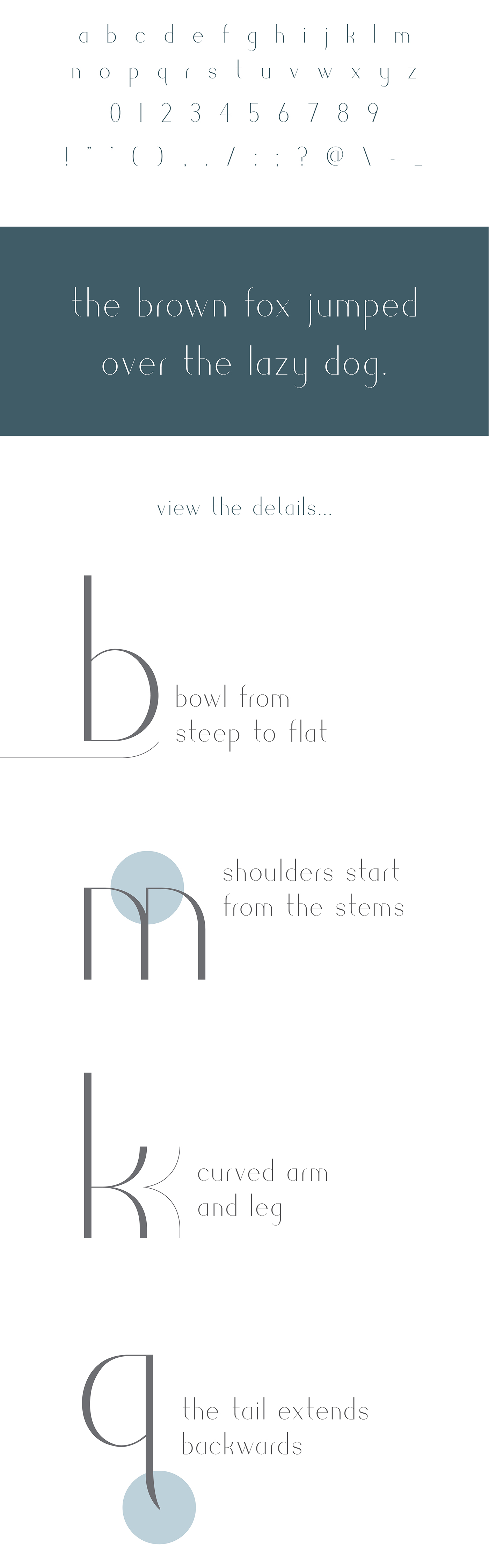
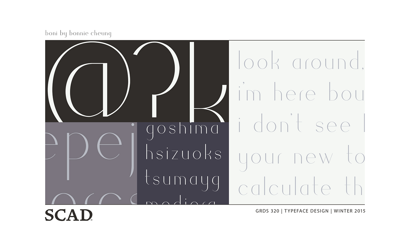
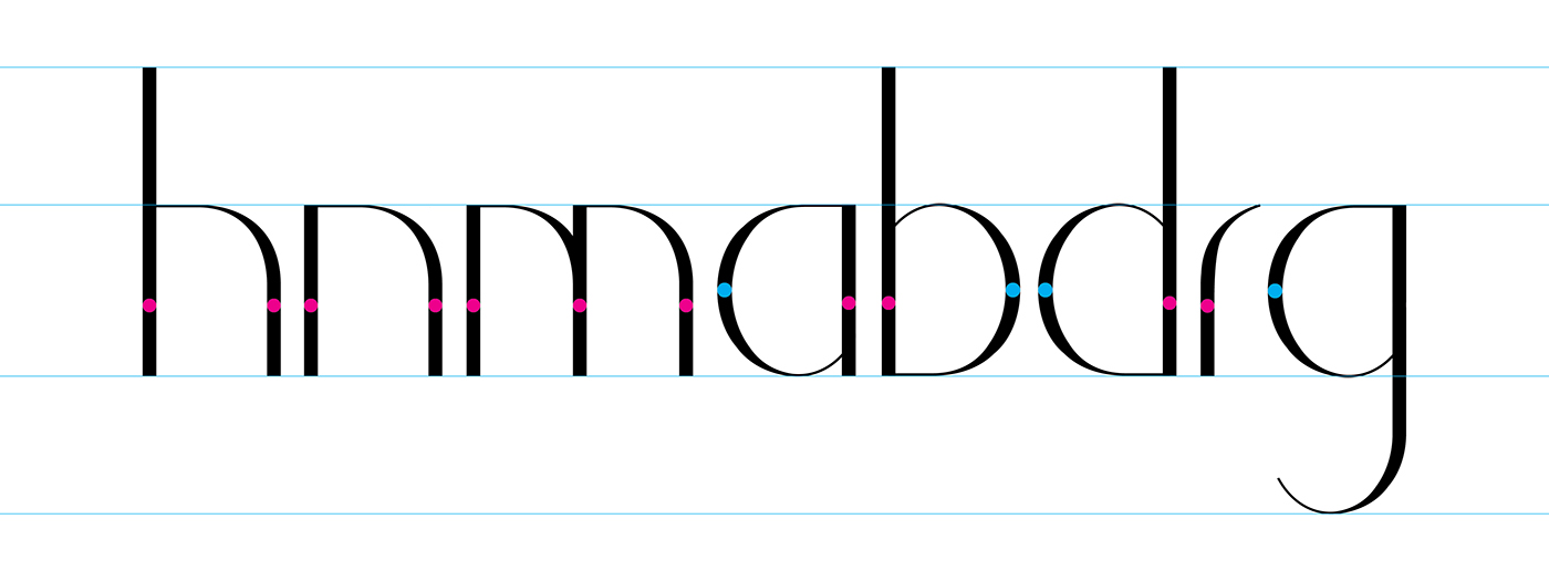
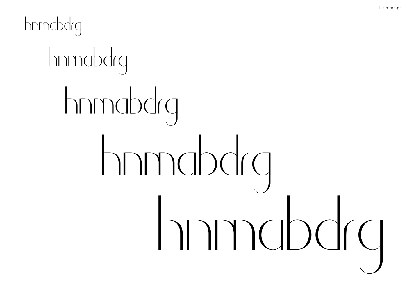
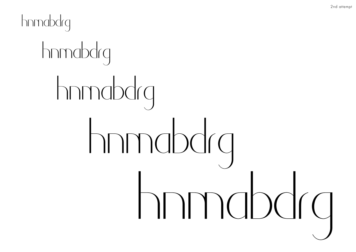
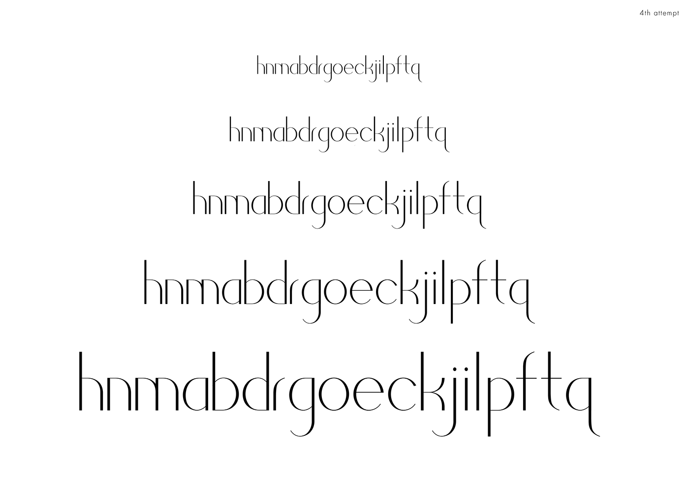
Concept
To create a geometric san serif with slender form and stroke contrast.
Outcome
Boni includes the word "bon"(meaning good in French), and has the same pronunciation as my name Bonnie. Due to its stroke contrast, the use of Boni are recommended to be not less than 24 points.