Overview
This was a project to renew an identity and create an application for a smaller business; I chose Li's Asian Cuisine, a personal favorite restaurant of mine that I've been going to for years. There was practically no identity to speak of, so I started from scratch about what I personally know about the restaurant, what the food is like and what the owners are like (very friendly and down to earth!).
Design Decisions
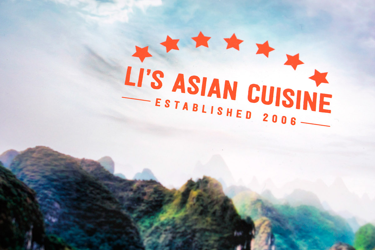
A chinese restaurant is difficult to design for because there are so many cliches, but I avoided many cliche/ubiquitous chinese images in favor of something a little different. The food is fresh, light, authentic and simple; these would be the qualities for my logo, and I've embodied them appropriately. I chose Festivo for the logo and display type, Franklin ITC for subheadings and Chronicle Text G1 for small copy.
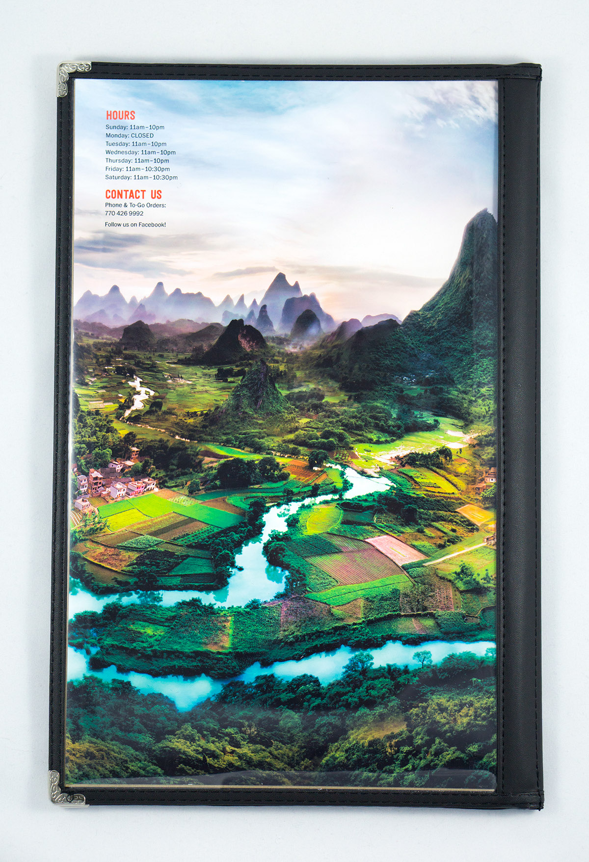
The whole point of the menu was to emphasize that the food is so authentic, it feels like you're there. A powerful photo of Asian countryside was the best solution to convey this without resorting to cultural gimmicks.
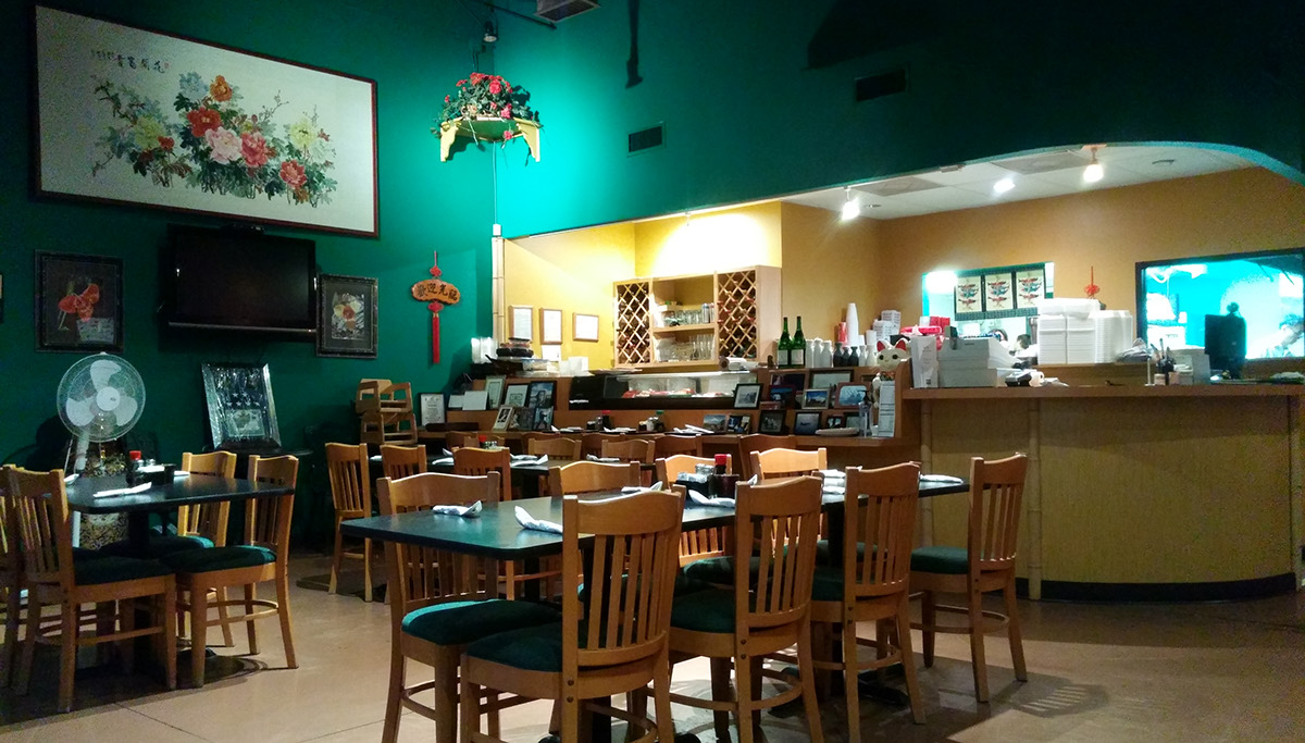
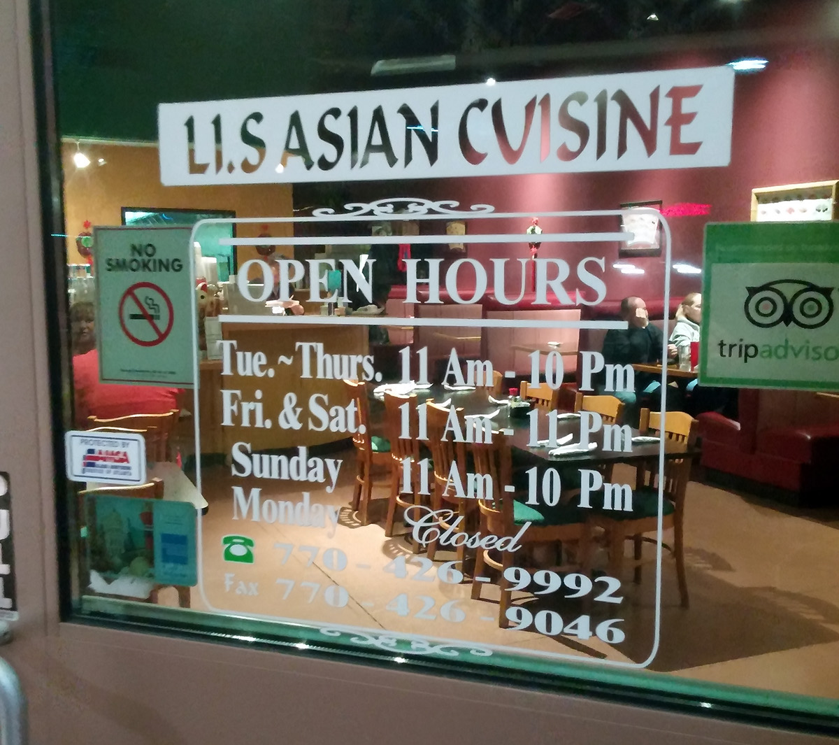
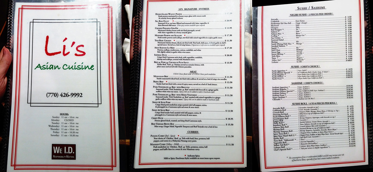
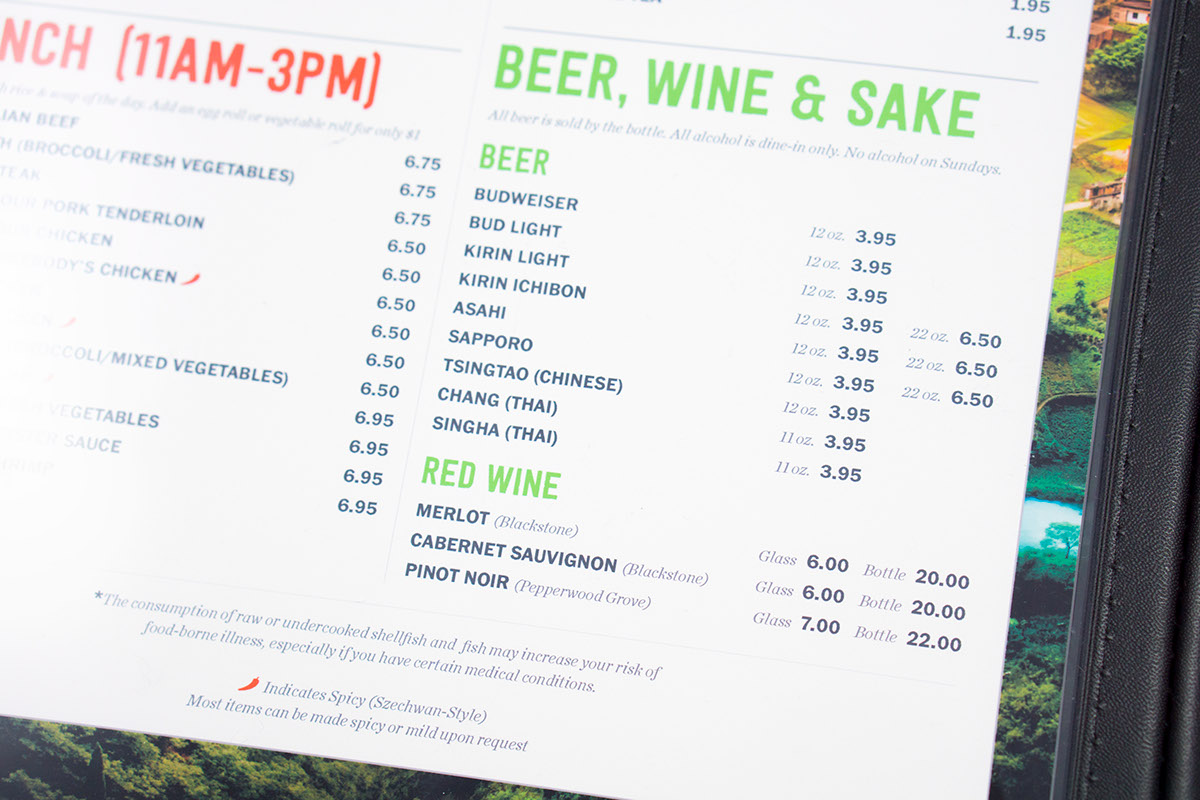
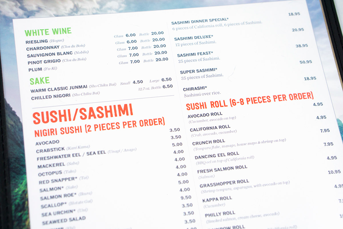
Restaurant, Existing Identity & Menu Design
New Identity/Menu Design
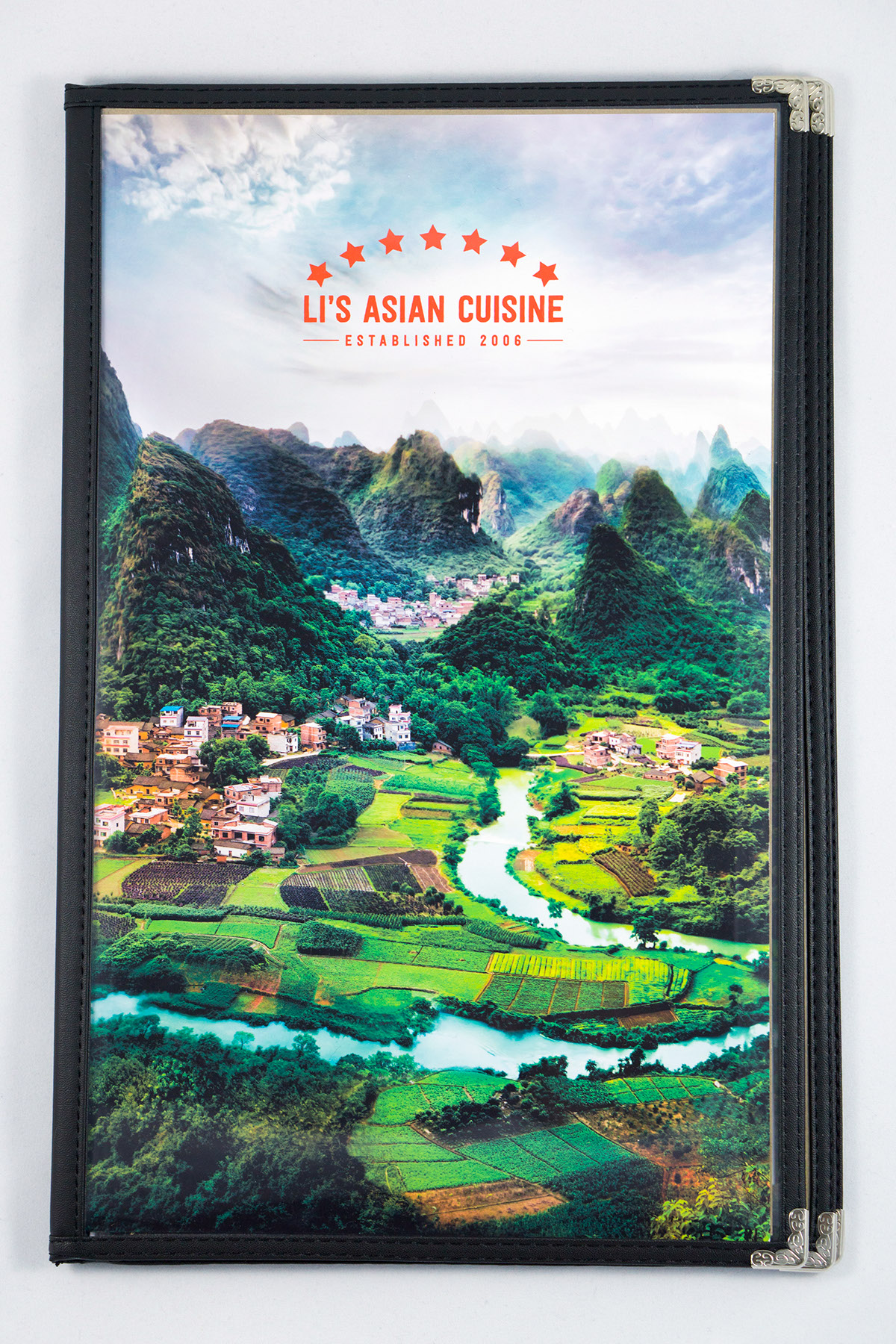
Photo credit: "Deep in the Guangxi Province of China" by Trey Ratcliff (http://www.stuckincustoms.com/)
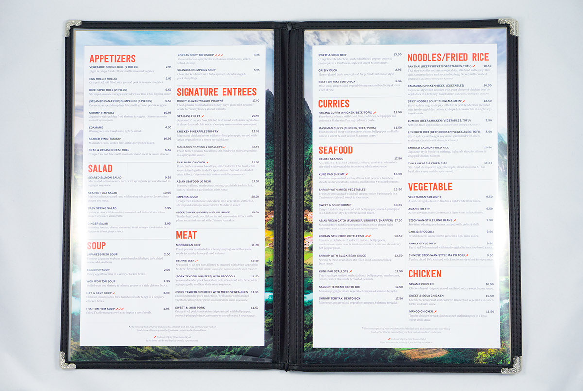
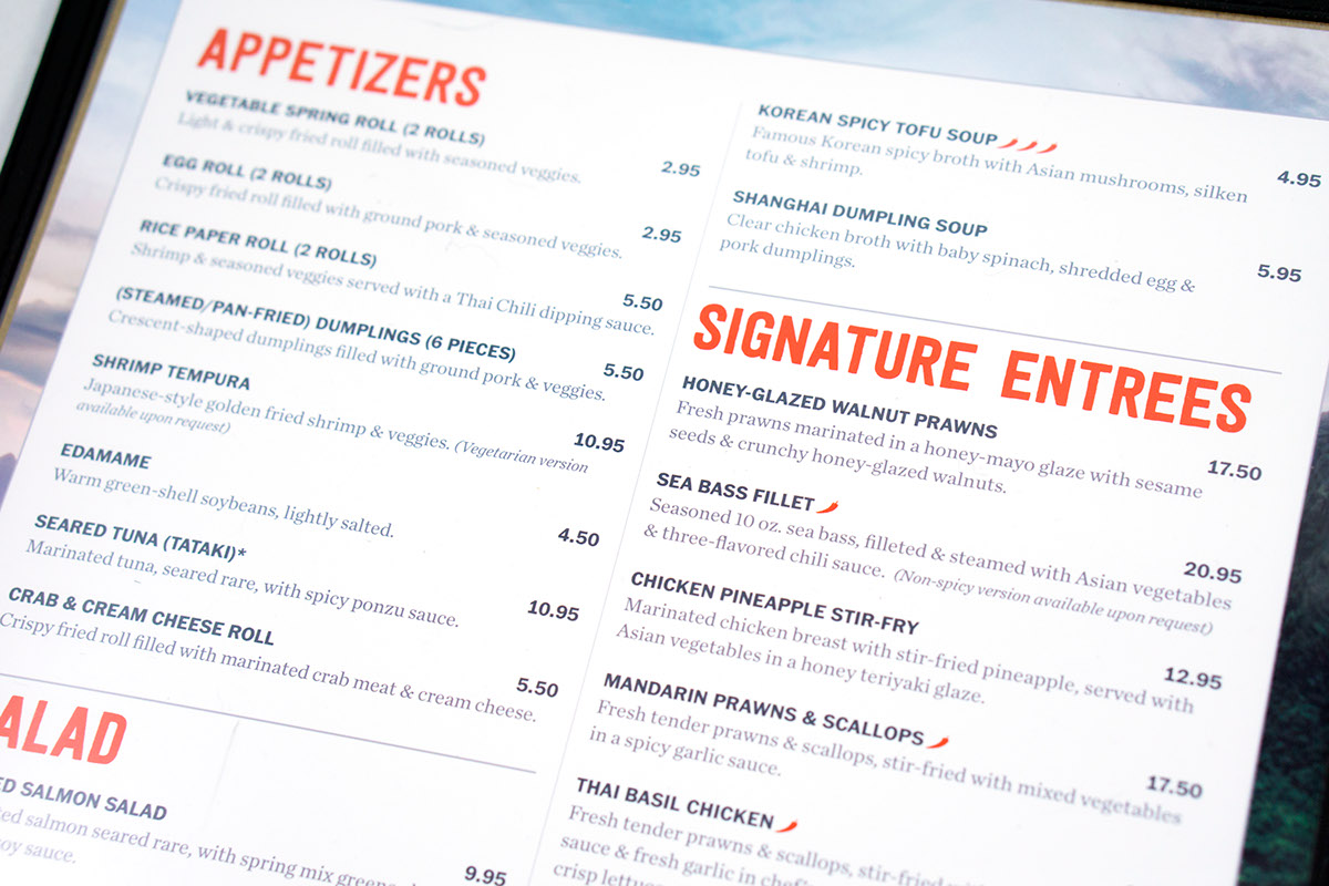
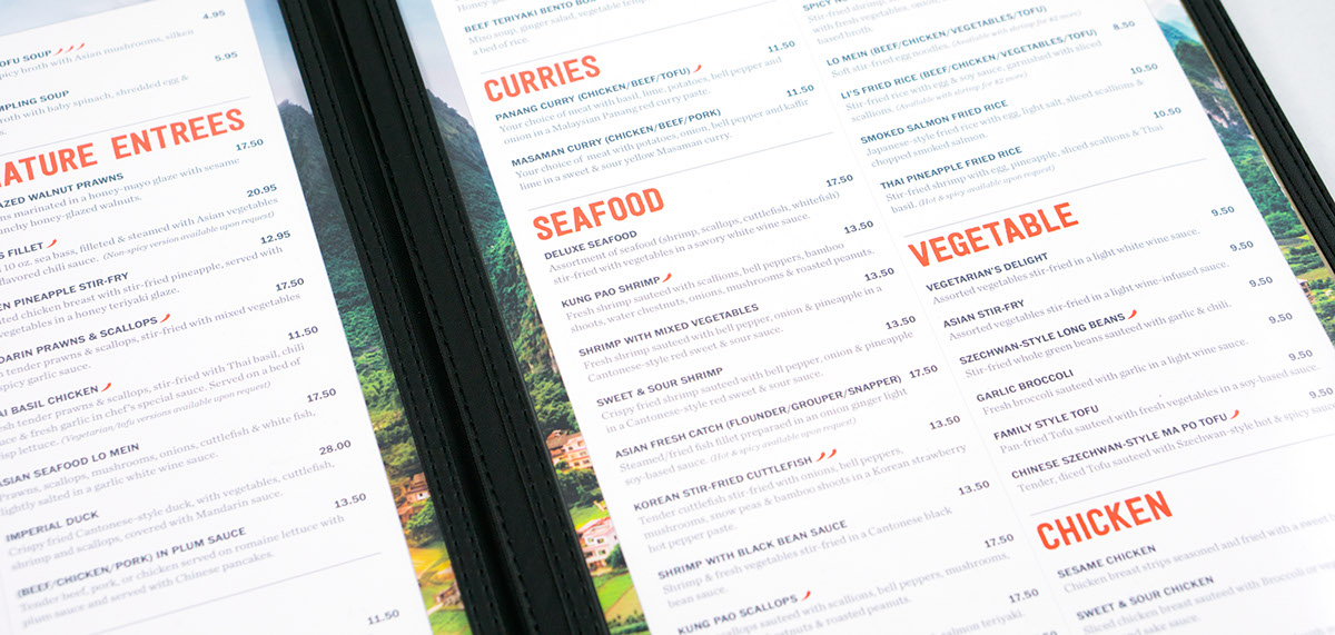
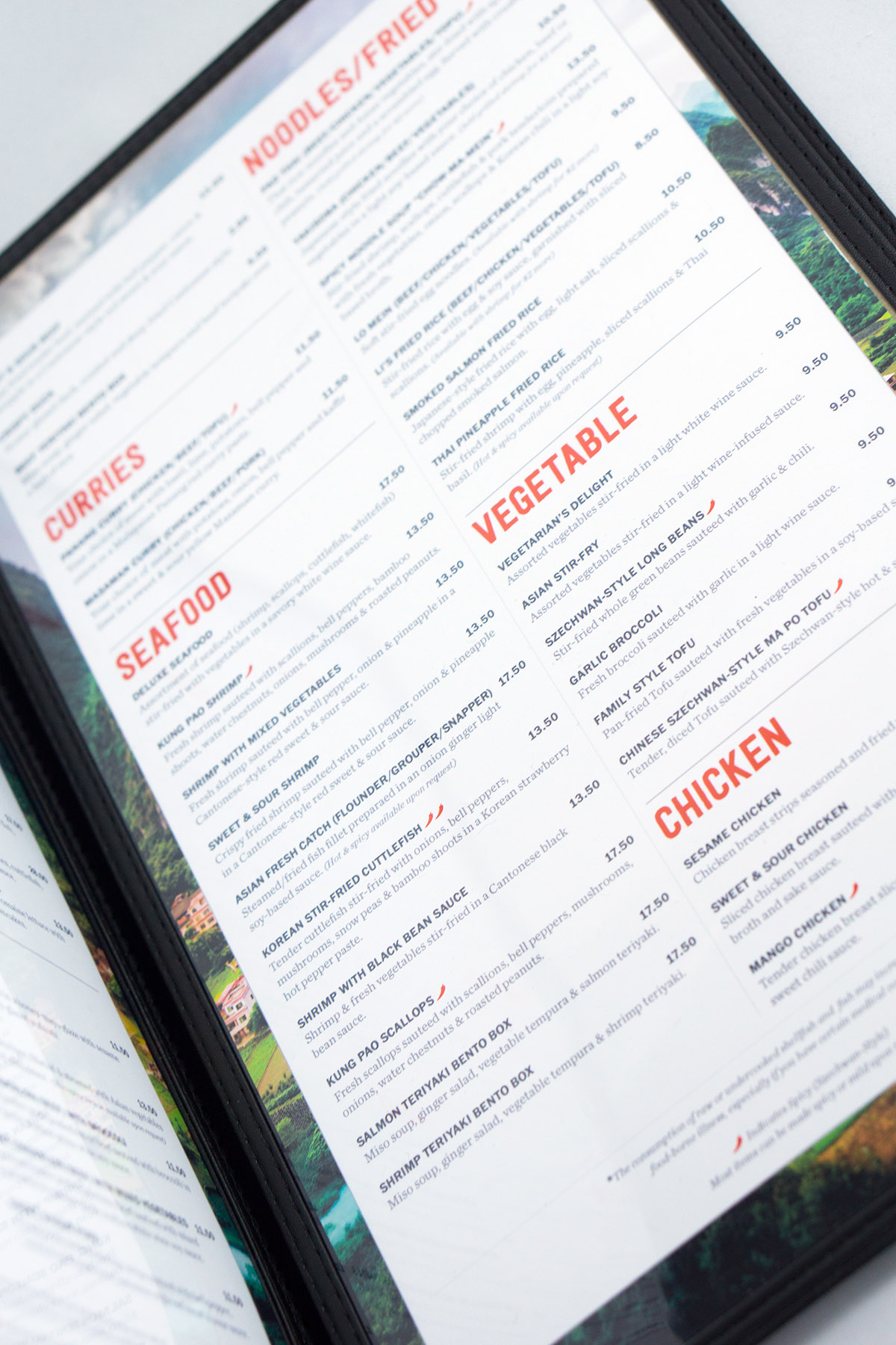
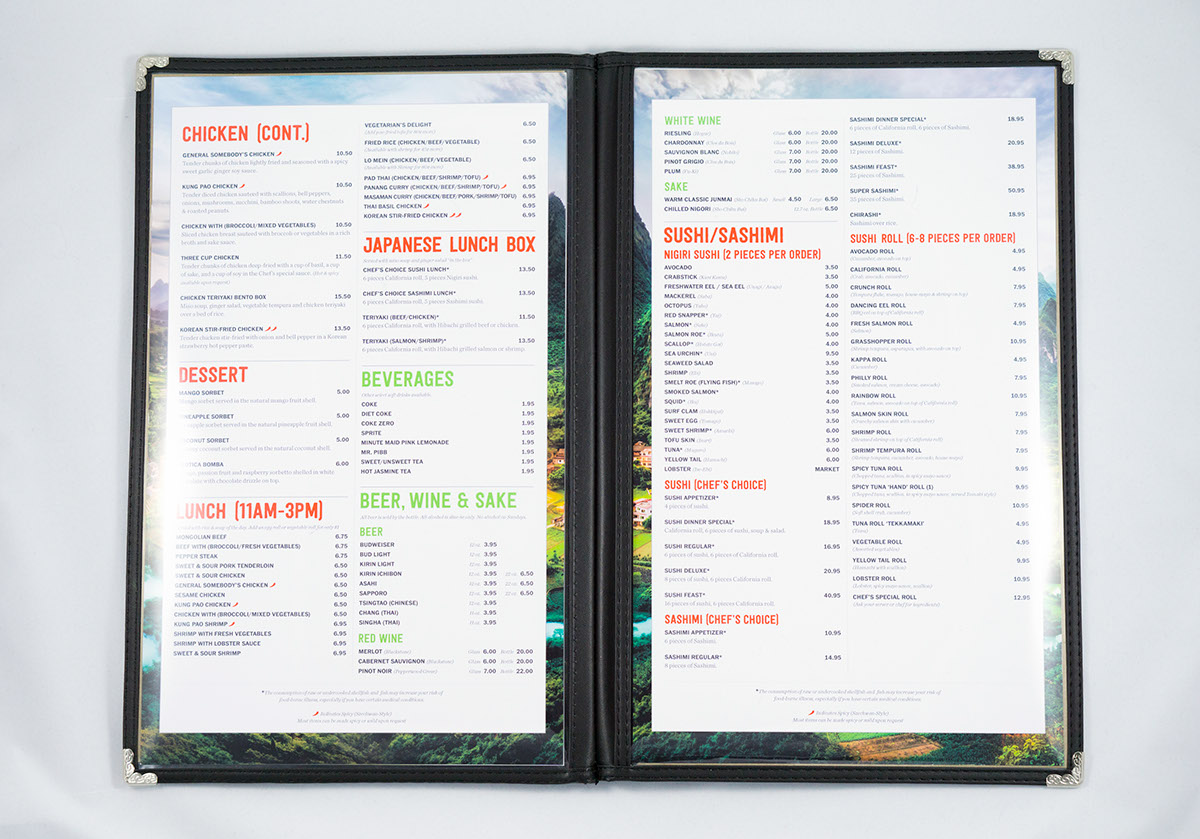
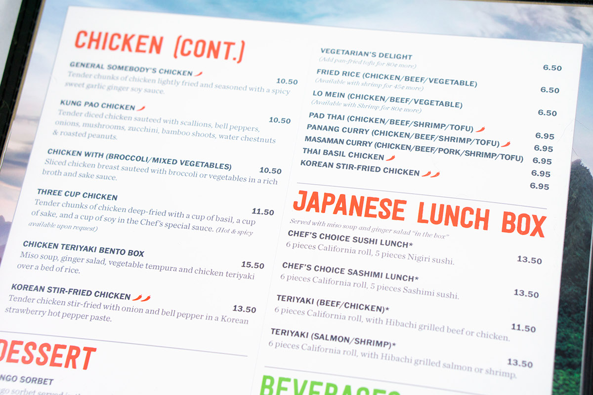
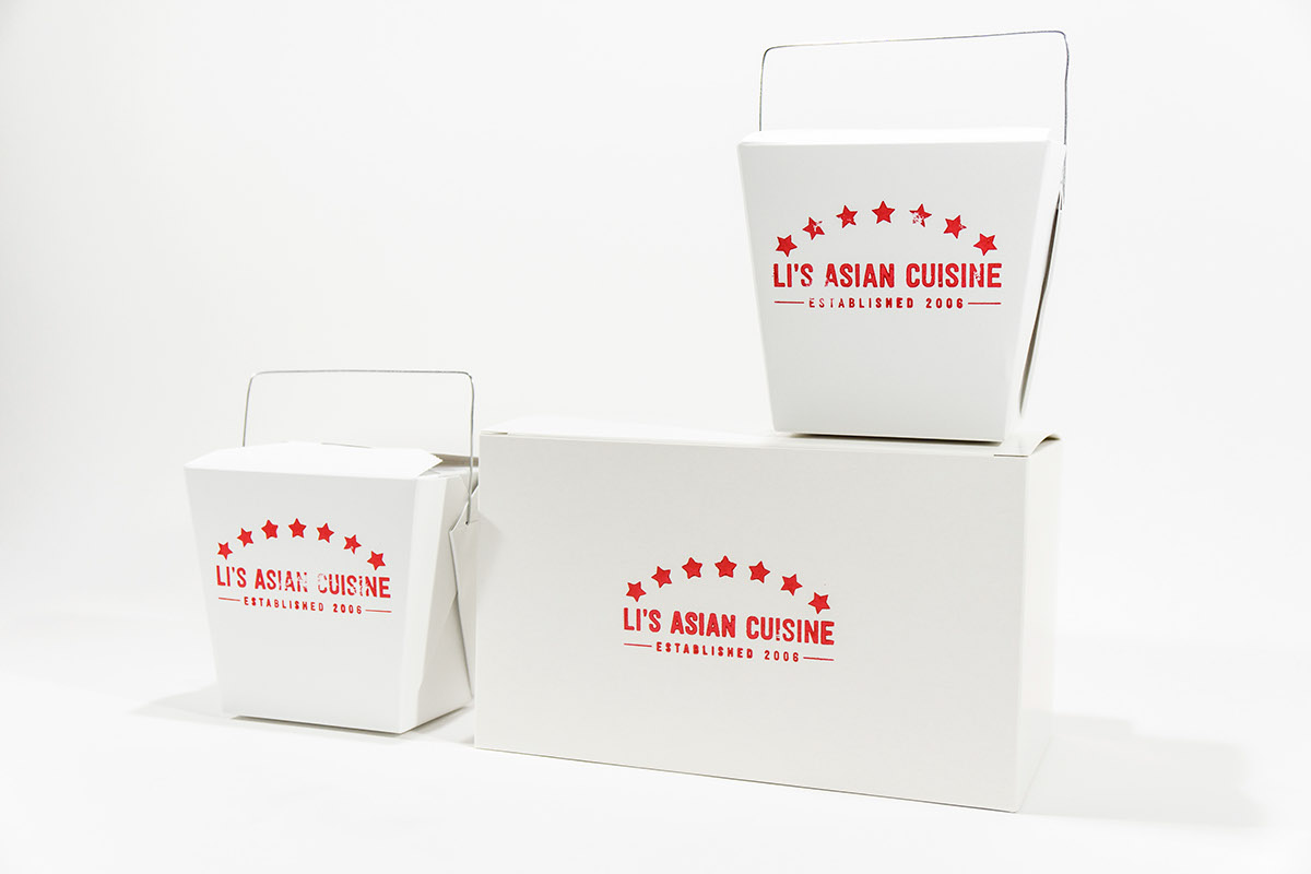
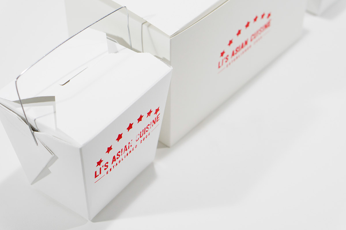
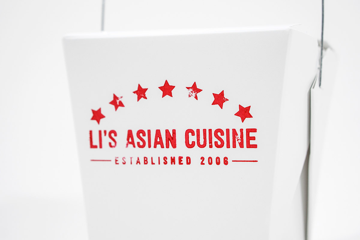
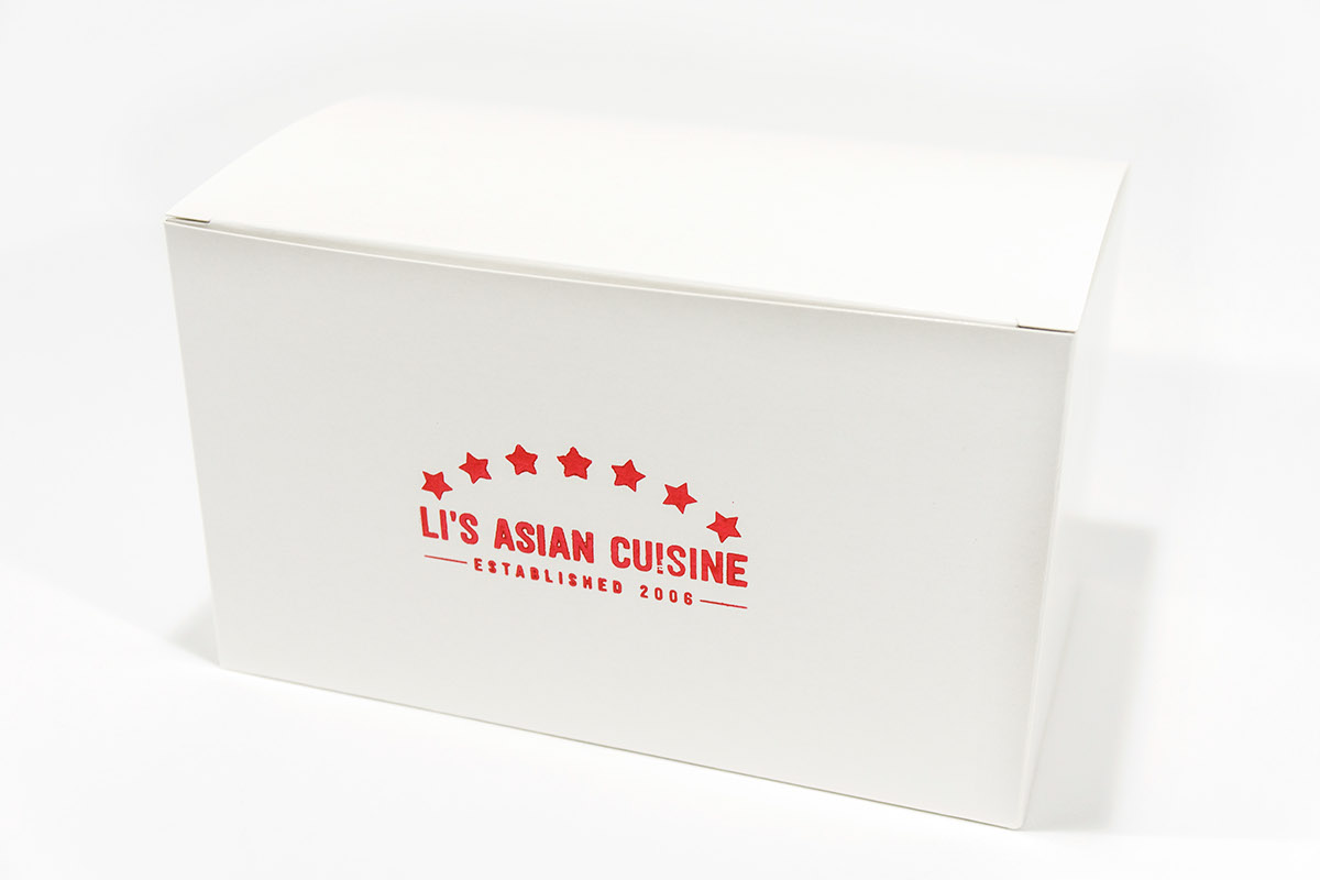
The stamped boxes maintain the emphasis on local cuisine and authenticity

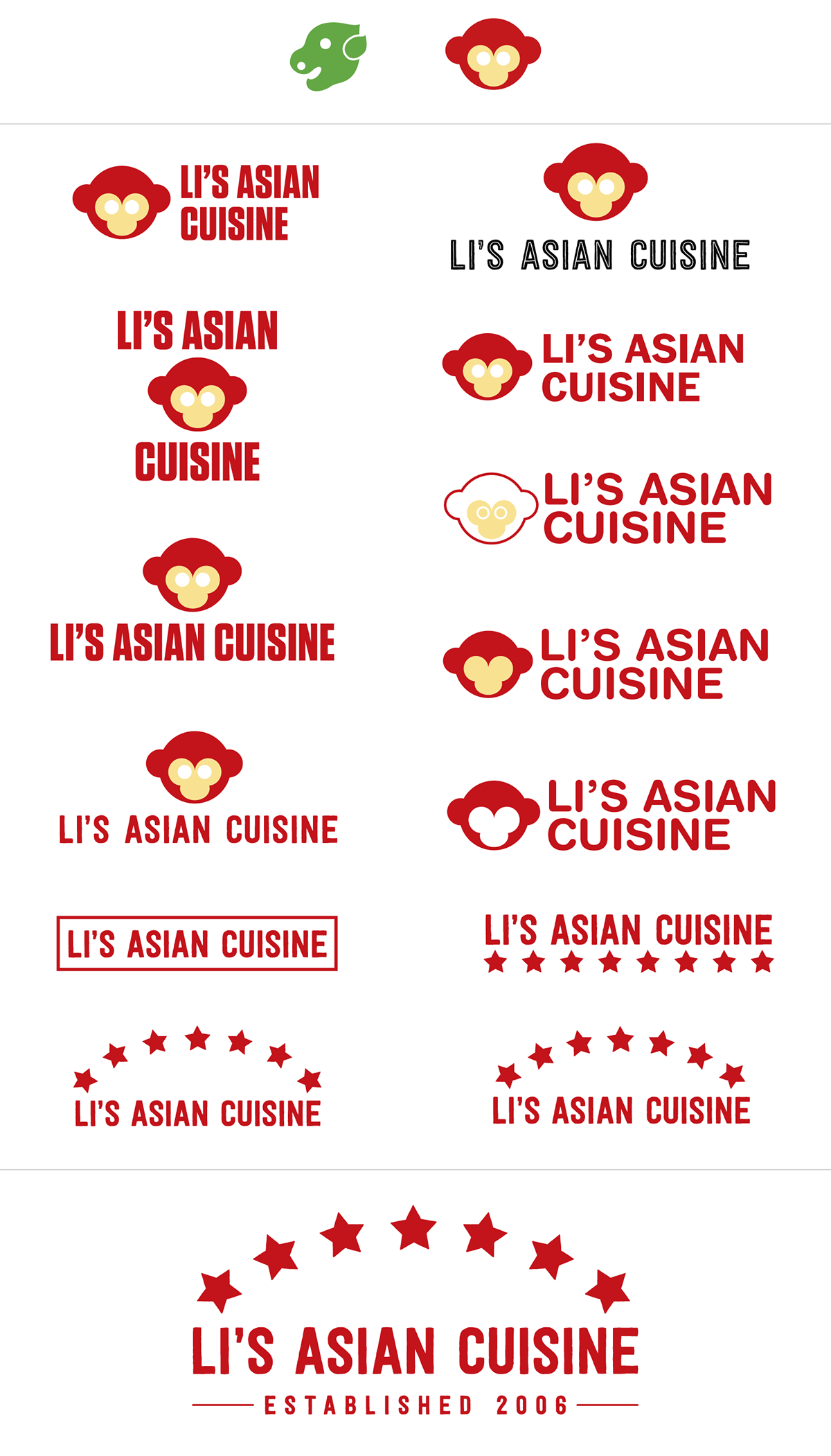
Logo Progress Work
In the beginning I had the idea of a mascot/Chinese zodiac (I decided on monkey), but realized that all
of the chinese zodiac illustrations come with a certain aesthetic that simply wasn't what I was looking for.
Without a proper depiction, I abandoned the idea.
of the chinese zodiac illustrations come with a certain aesthetic that simply wasn't what I was looking for.
Without a proper depiction, I abandoned the idea.