Hopefully my images will win the contest, we will see around March 15th. Until then, wish me luck and thanks for looking!

I thumbnailed A LOT for this project. After several iterations of thumbnails and a false start or two, I arrived at these ideas.
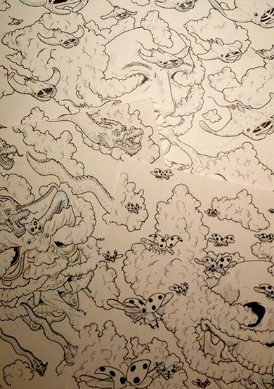
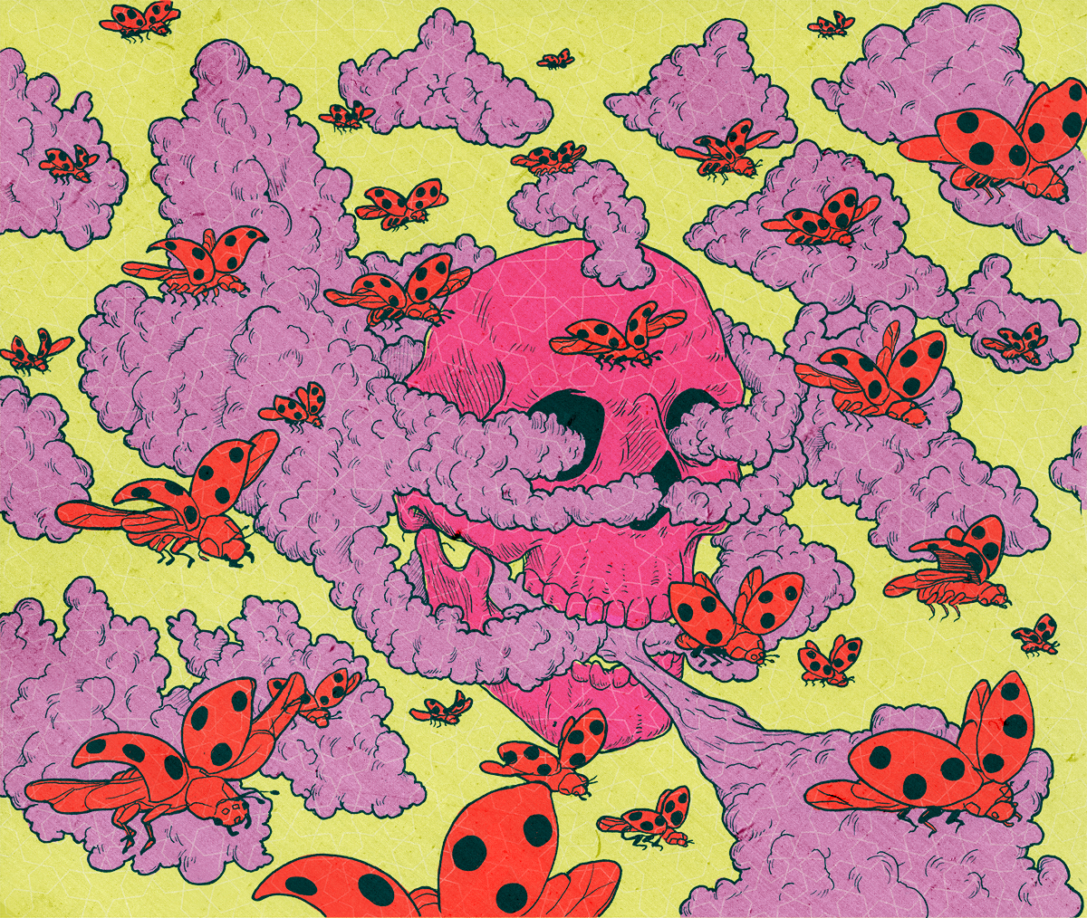
I didn't take too many process shots, but as is typical with my current process, I sketch in non-photo blue and used fineliners to define the lines. .02 for details .05 for thicker outlines.
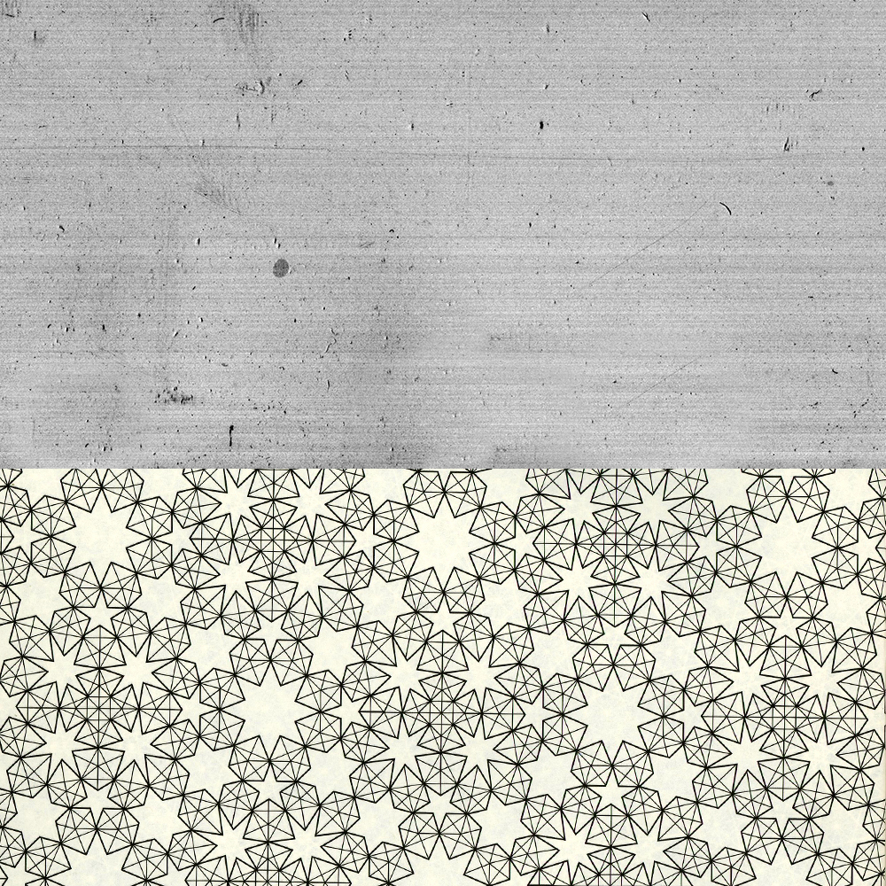
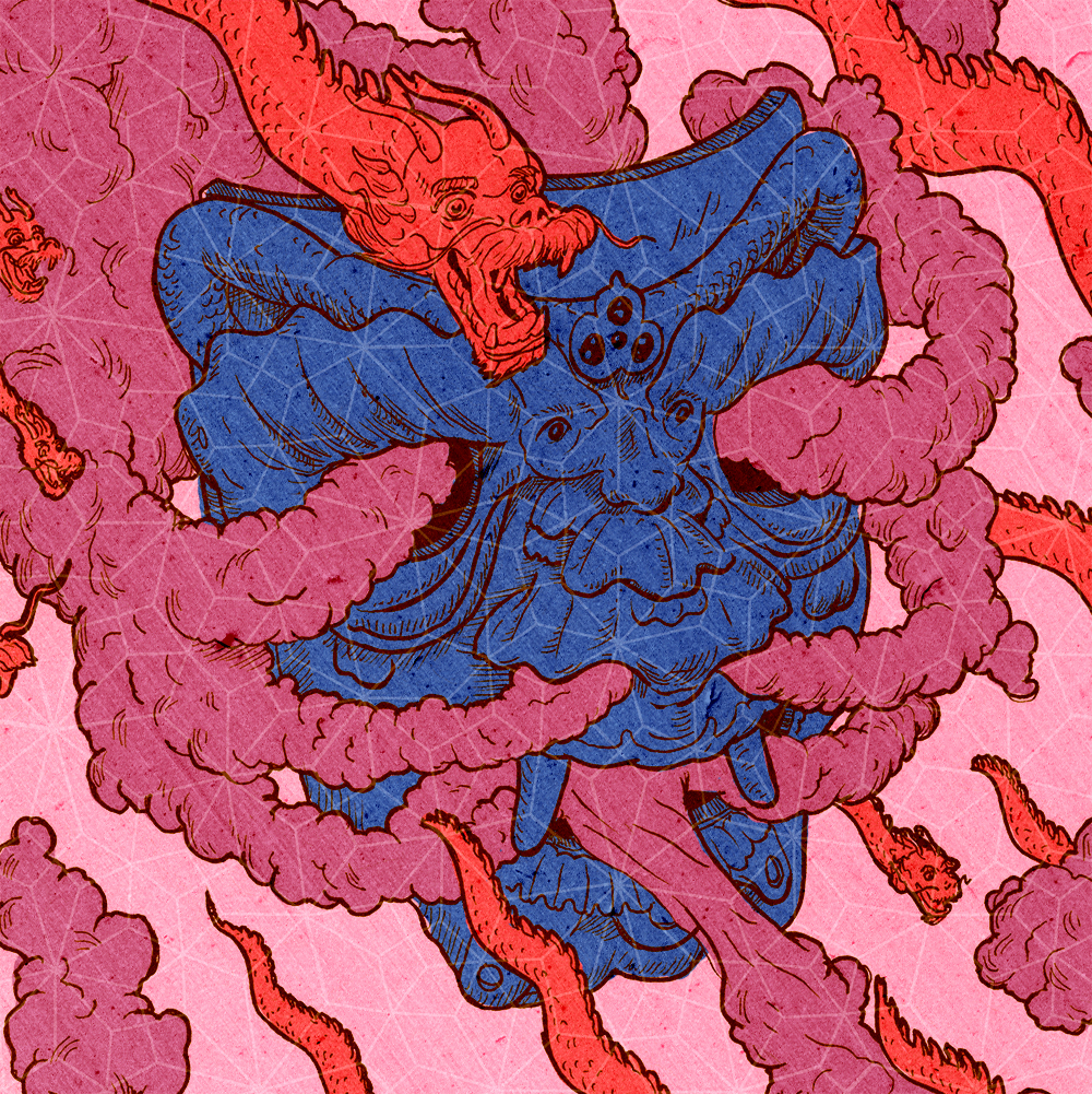
The patterns I used are from a book I have, in line with the sacred geometry from the project prompt. I used a grainy film for texture.
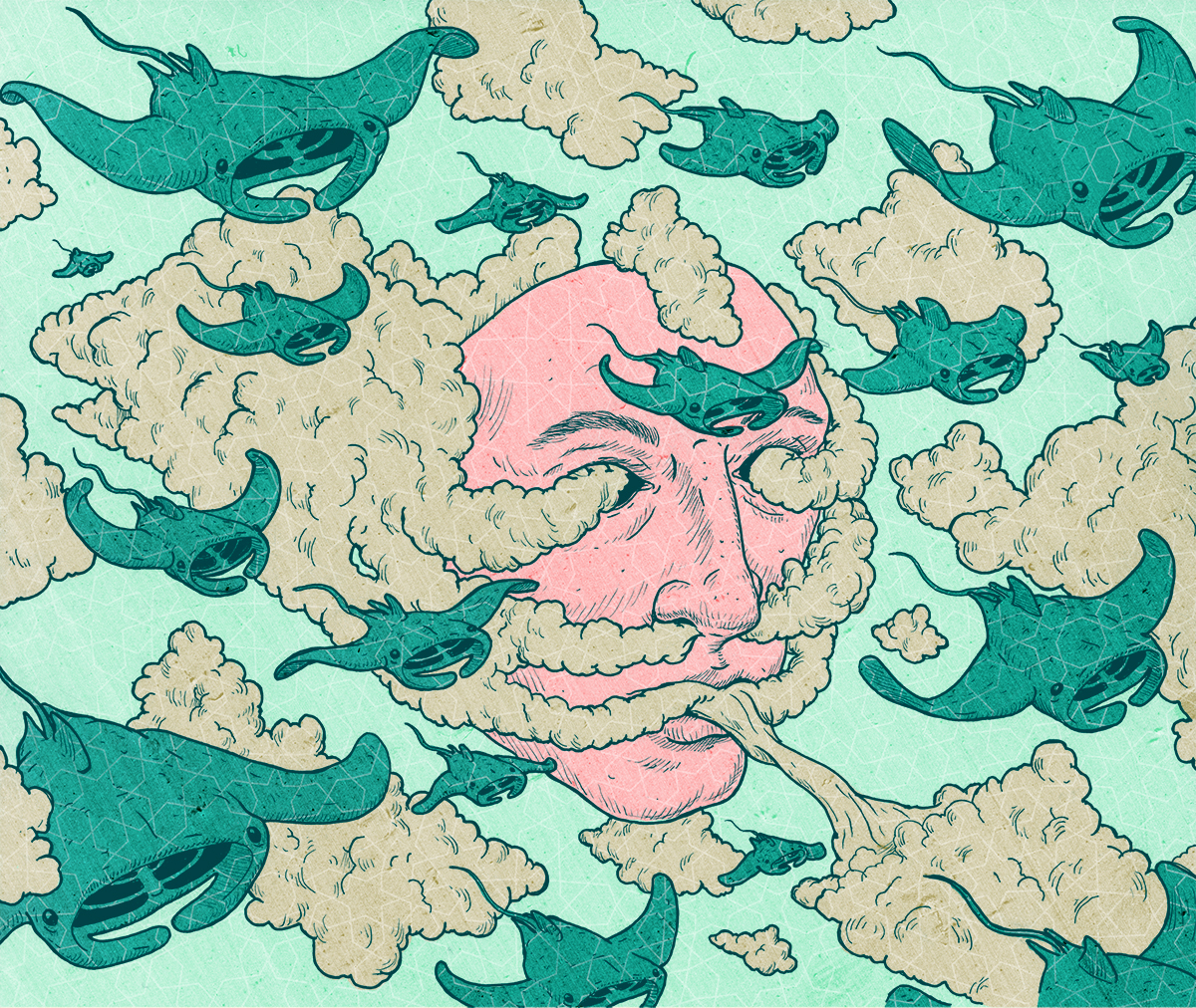
For some of the finals colors came easily, in others they didn't. In every one I altered the color of the line which drastically changes the effect the image gives.


Finals with Logo Placement