

Breeze Magazine is a fictional outdoor adventure type magazine that I created these spread designs for in my graphic design introduction class. The large titles are hand-traced typographic compositions, the photographs are all my own, and the articles are just random articles to fill the pages. The point of this project is to understand the dance that takes place between typography and imagery to create powerful magazine compositions. I was only allowed to use Helvetica, Times New Roman, and variations of those fonts for the typography.
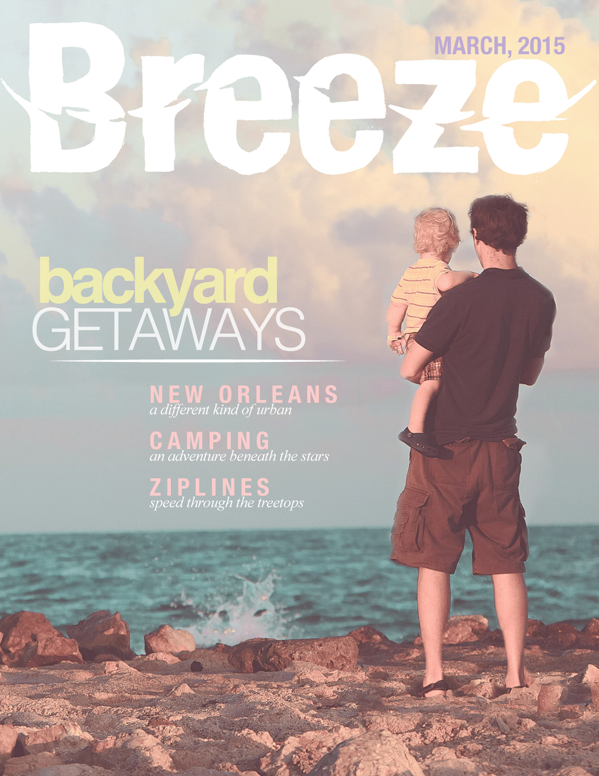
The cover design featuring an image that I took in Tulum, Mexico. It has the hand traced logo, and other typography to get across what is inside the magazine.
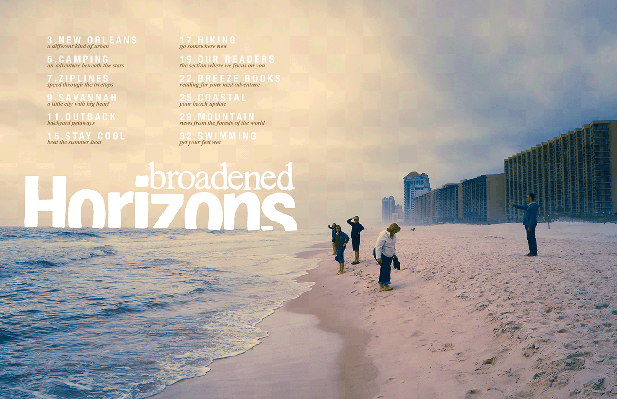
The table of contents featuring a picture of my family on the beach in Virginia.
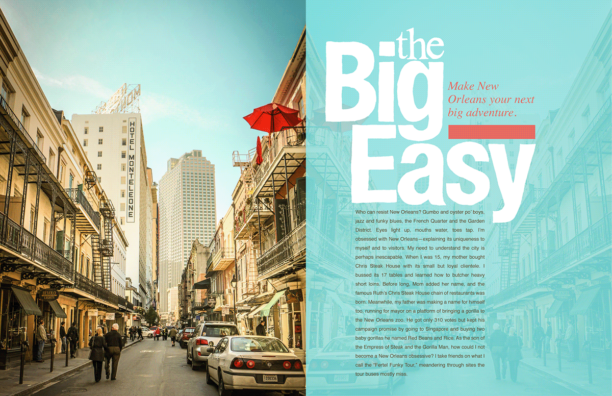
The first article spread. This is the first spread for an article about New Orleans. The picture is a favorite of my urban photography. The typography I kept big, bold, and vertical, just like a cityscape.
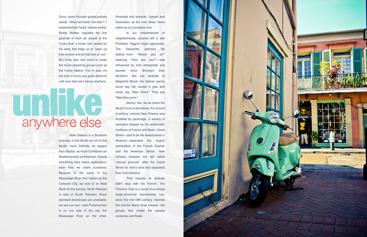
This is the second spread for the New Orleans article. I brought over the redish color from the last spread, a found a teal color that was similar to both the last spread's sky and this spread's moped to keep things cohesive.
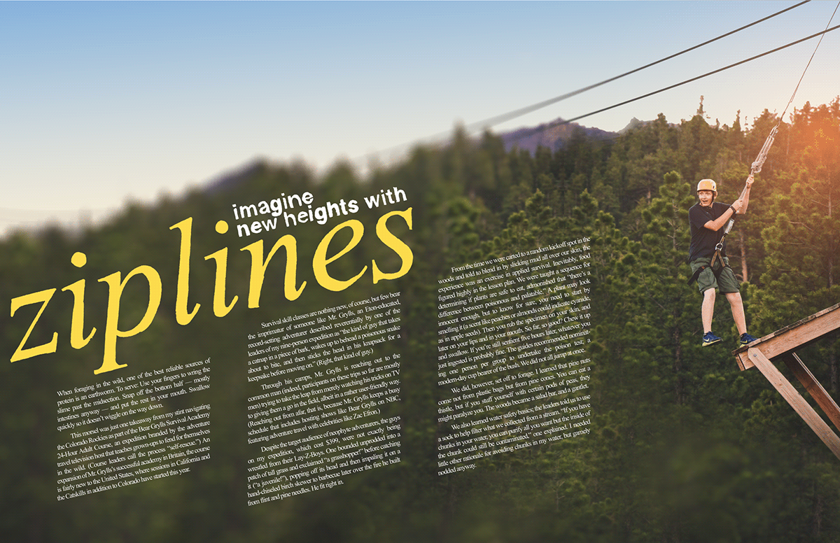
This spread is for an article about ziplining an features a picture of my good friend Quinn working the platform. Normally I would find such an angled composition to be perhaps cheap or gimicky, but there is something very diagonal about ziplining that really warranted this composition.
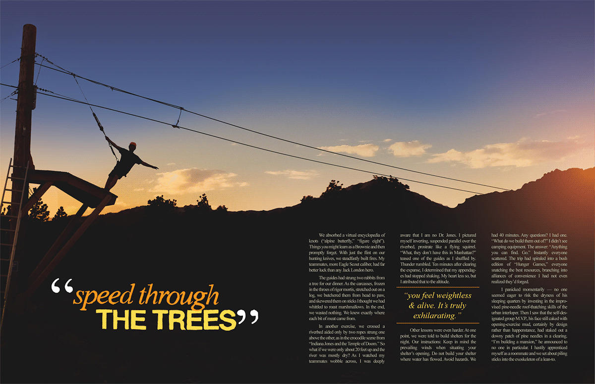
This is the final spread for the ziplining article. It features yet another picture of Quinn, but a more peaceful composition to reflect the mood of the lighting in the image.
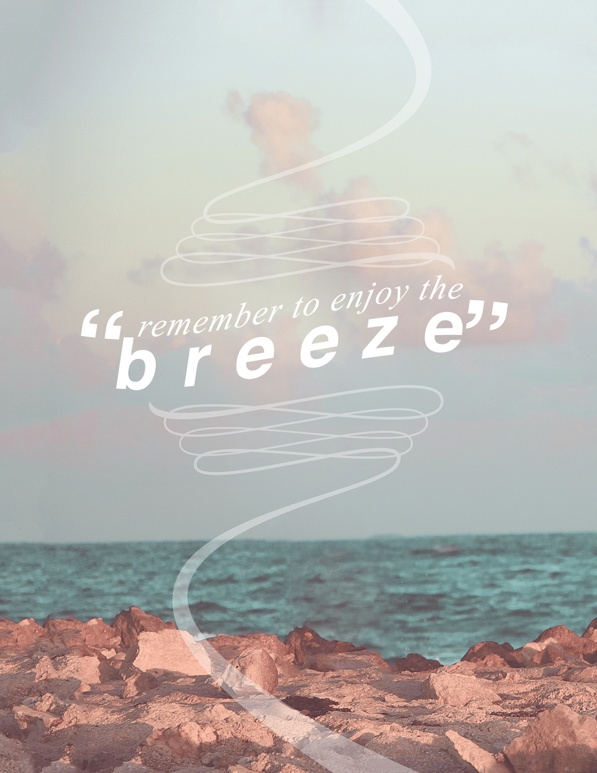
The back cover was sort of a breath of fresh air for the magazine. I wanted to keep it simple and airy, and I accomplished this with an elegant flowing line, simple typography, and—of course—the continuation of the image from the cover.
Thanks for showing interest in my work!


