Overview
This project was a class project to rebrand a smaller company through a new logo, stationery and physical applications.
Logo Design
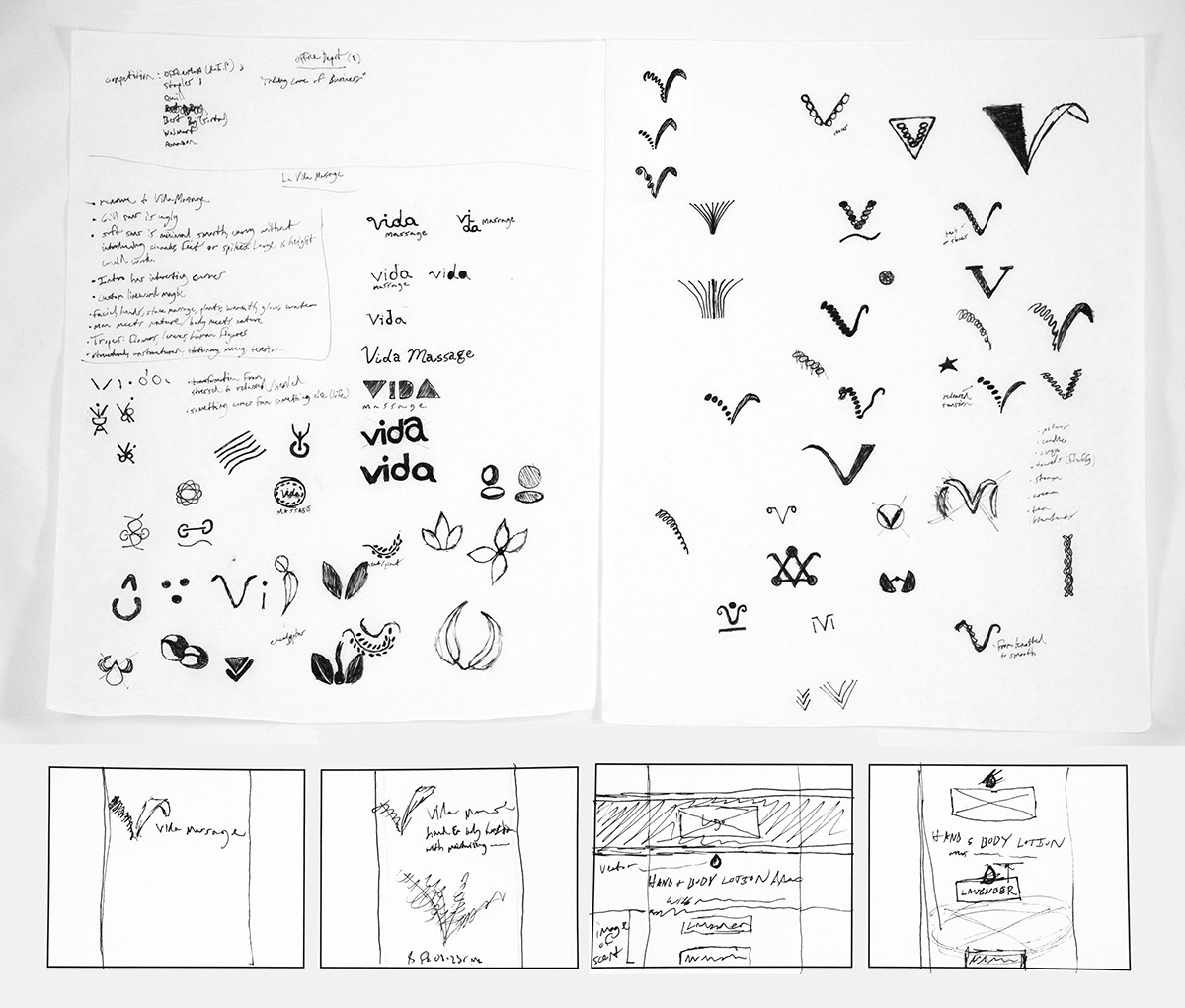
I chose to shorten La Vida Massage to Vida Massage because "La Vida Massage" is a kind of spanglish company name that translates to "the life massage" (which assumes you're offering one single massage), whereas vida massage is both shorter and makes more sense as "life massage".
I changed the typeface to Intro instead of the clunkier Gill Sans that is used in the old logo. The mark is created from hot stones and a blade of grass. The symbolism represents the tension of life transitioning into feeling normal and natural (a la massage/spa treatments). Also, I simplified the color scheme to three colors: a lighter green, darker green and pure black.
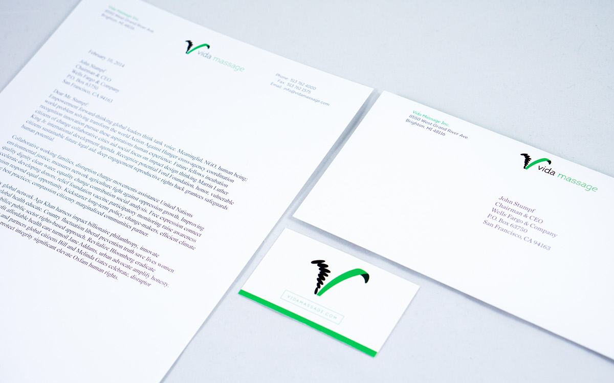
Physical Applications
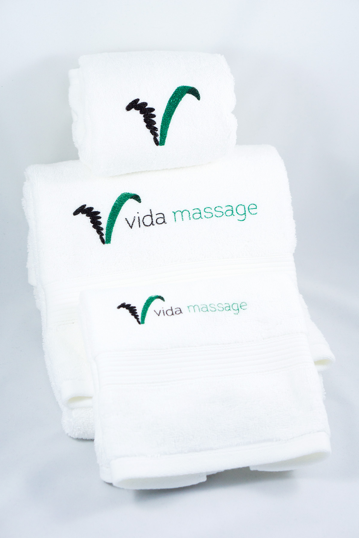
Aside from letterheads, envelopes and business cards, I chose to create two different sized hand towels and a bath towel. Lastly, I developed lotion and oil packaging with a flexible design system that makes new product designs beautiful and effortless.

Old logo

New logo

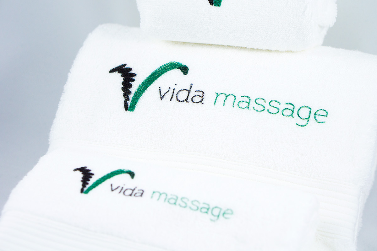
Towels
I chose three towels of varying sizes and printed on them using a direct-to-garment printer. Direct-to-garment is advantageous because it's not scratchy or stiff; the print feels the same as the fabric on the rest of the towel.
Bottles
The bottle designs for all spa products would be flexible and cohesive using the standards I implemented here.


Progress Work