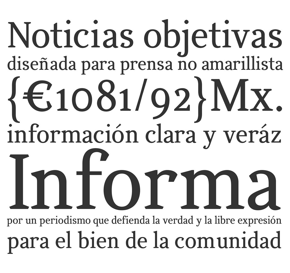
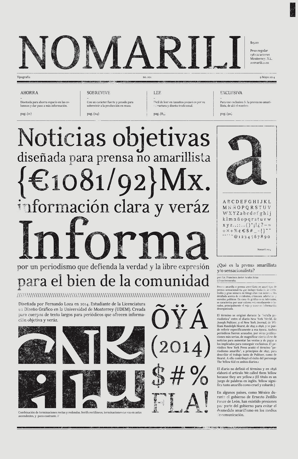
Typography designed for newspapers who believe in objective information and do not practice yellow journalism.
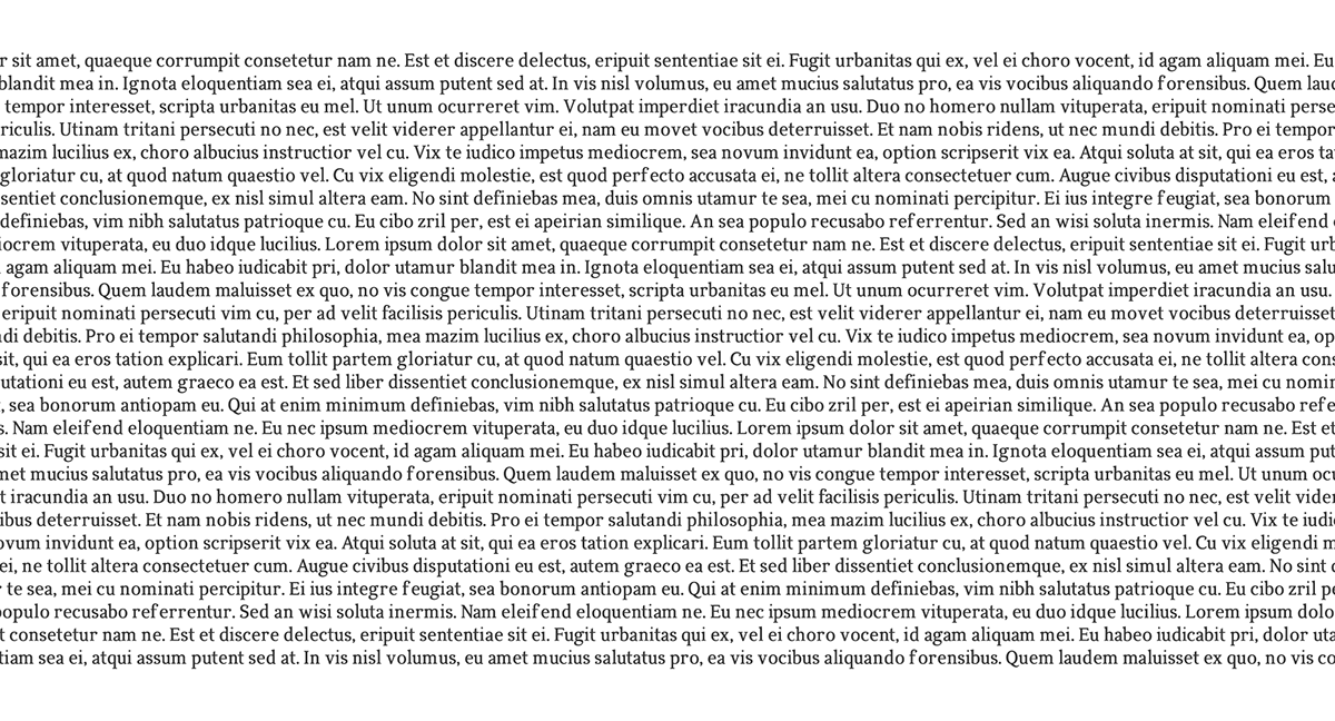
Typography designed for long text bodies in newspapers and crafted to save space and remain readable despite the printing techniques of the newspaper industry. “Nomarili” comes from the abbreviation of “no-amarillo” (non-yellow), referring to the main objective of the typography.


Final design