
Redefine the visuals of Seoul Metro
From concept development to visualization
From concept development to visualization
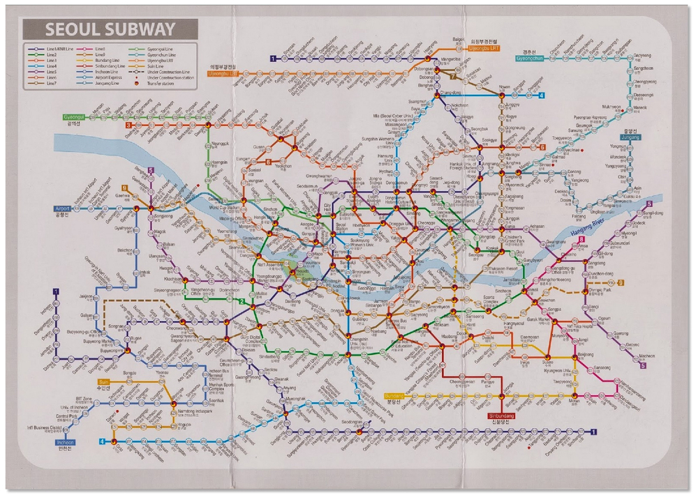
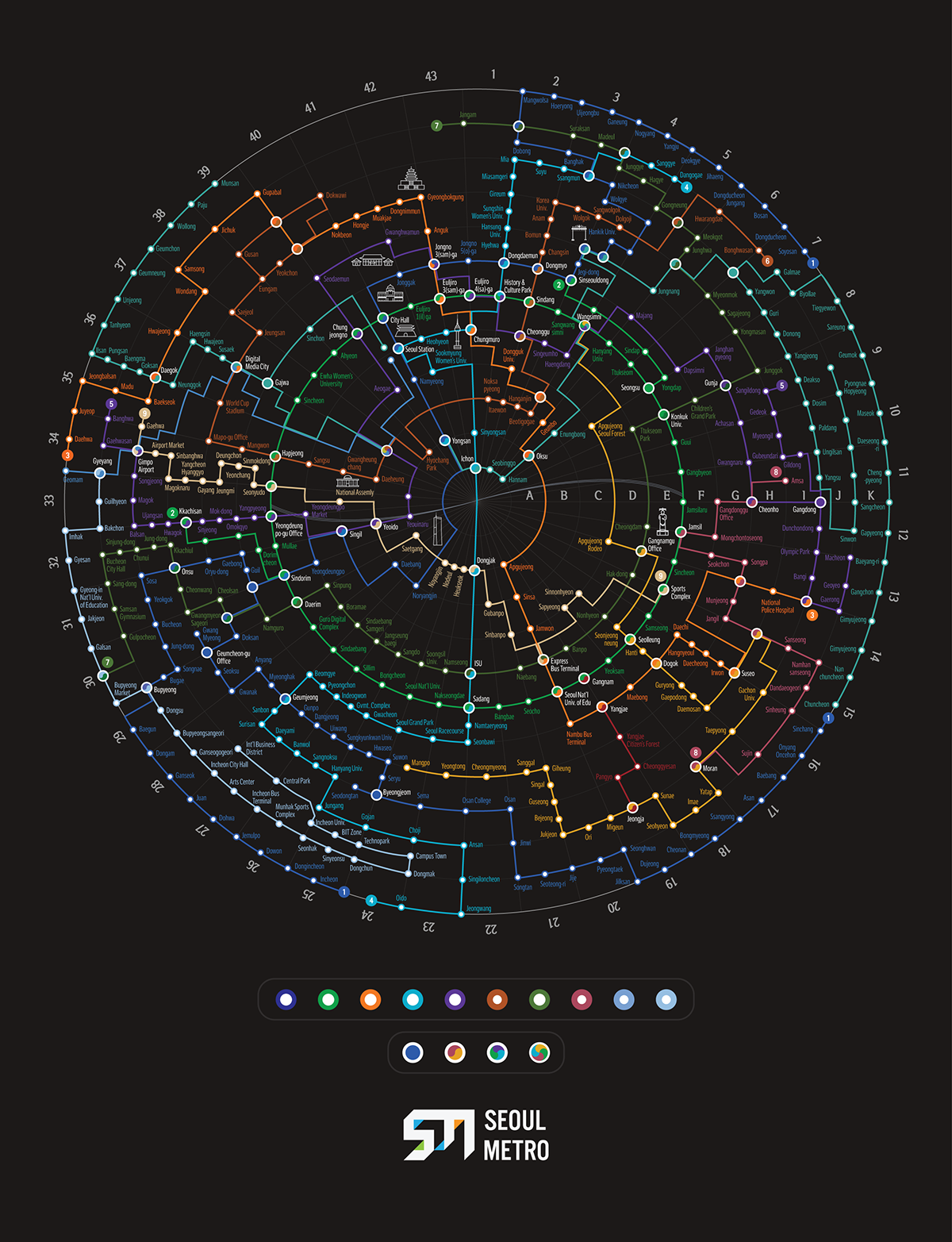
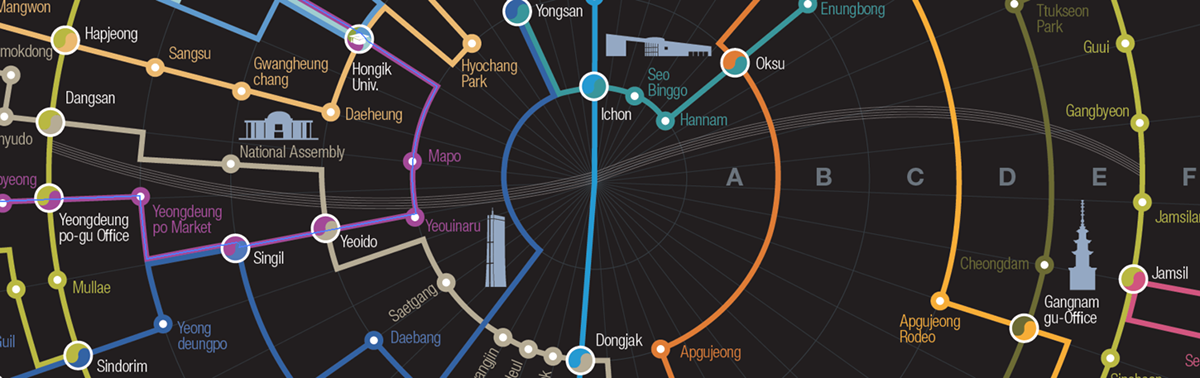
Original Seoul Metro Map
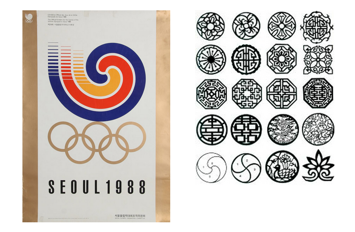
Visual Inspiration
Tried to get some hints from the traditional korean design patterns to define what makes a "seoul look".
Tried to get some hints from the traditional korean design patterns to define what makes a "seoul look".
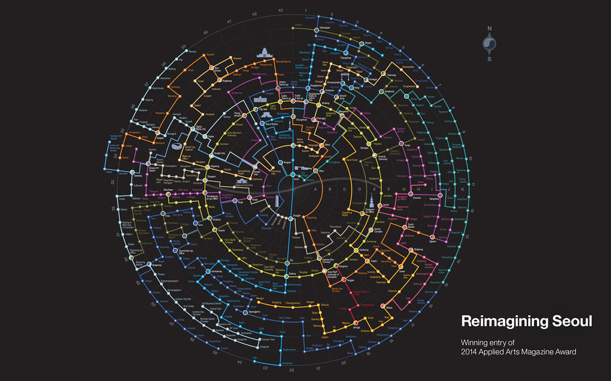
Design Process
Draw out the circular plane, place the stations on top of it, and connect. Voila!
Draw out the circular plane, place the stations on top of it, and connect. Voila!
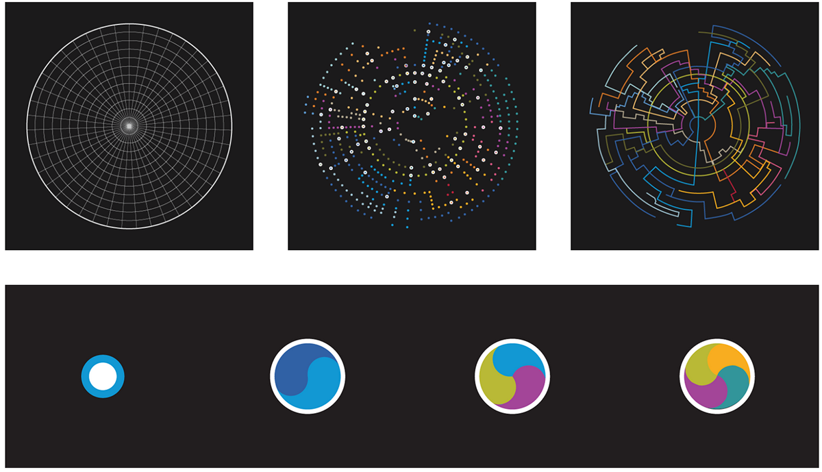
Yin-Yang station is scalable
Logo
Initials SM for seoul metro, using negative space to create an arrow to show progression.
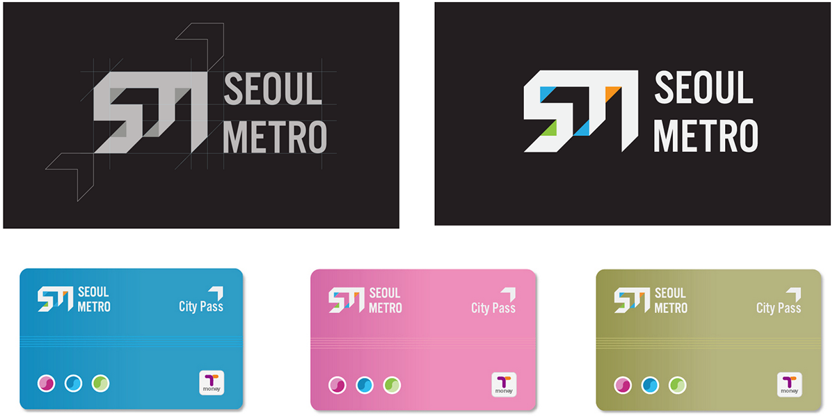
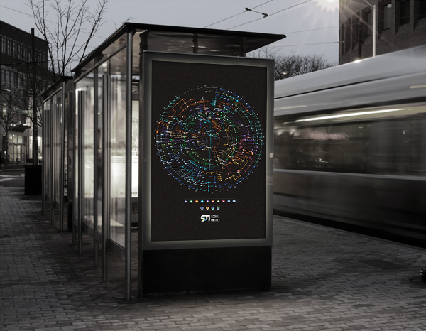
Logo Application (T-Money Metro Card)
Iconography
Finding ways to use the least to express the most.
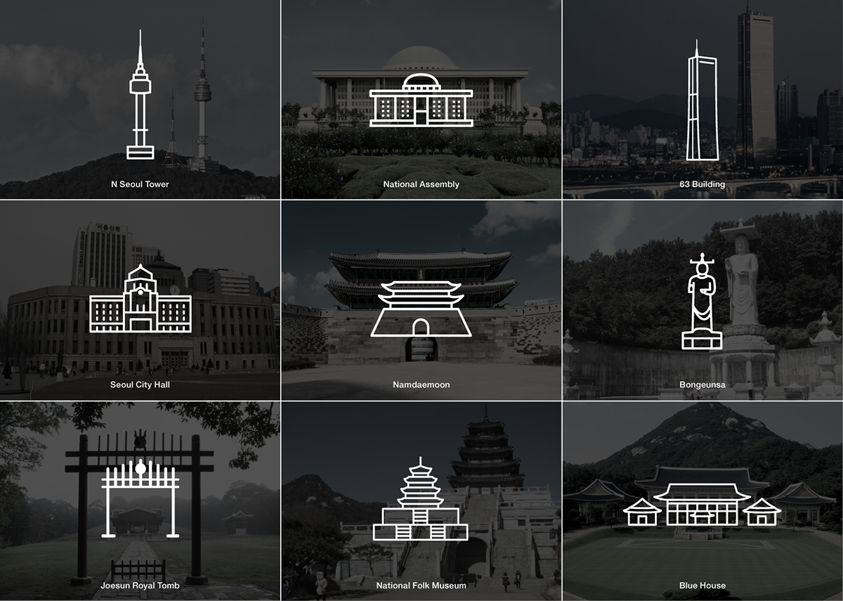
Minimalistic icons for Seoul landmarks
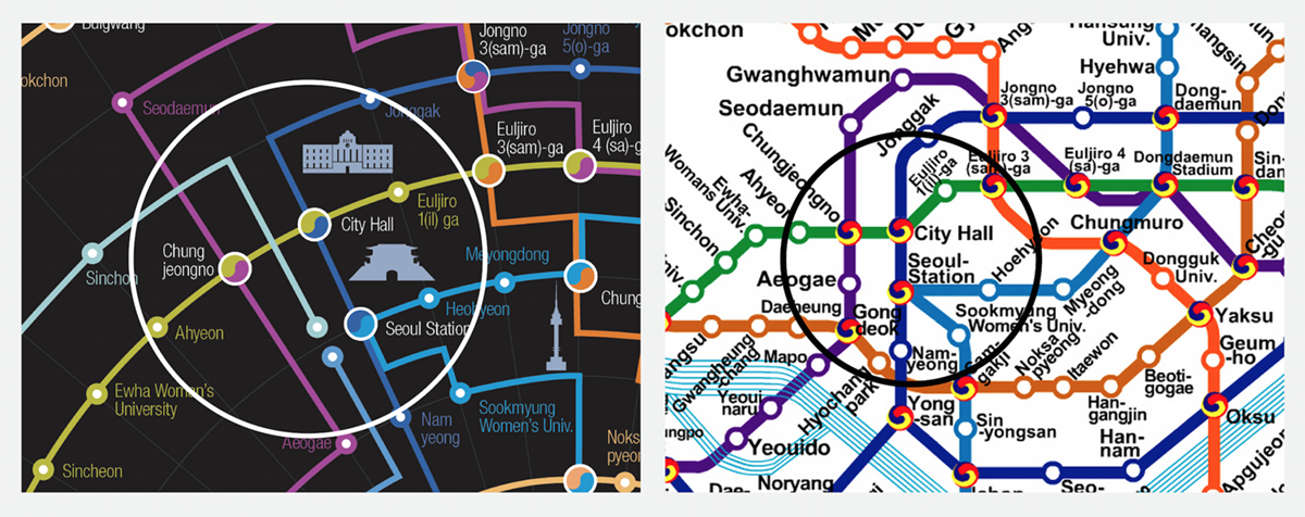
Seoul Metro Map Design
2015 Revisited for Publication
Areas of attention: Typograpy, colors, craftsmanship


Old Version


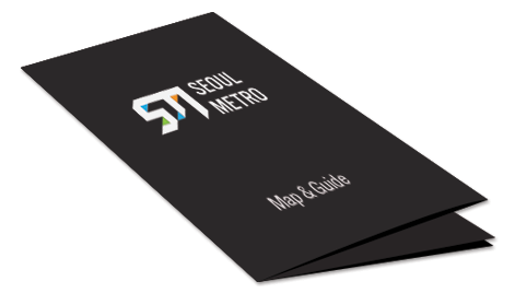
Pocket-Sized Brochure
The design is created to be print-friendly. Enjoy all of Seoul in your pocket.
Front of the "Map & Guide Handbook" (Unfolded)
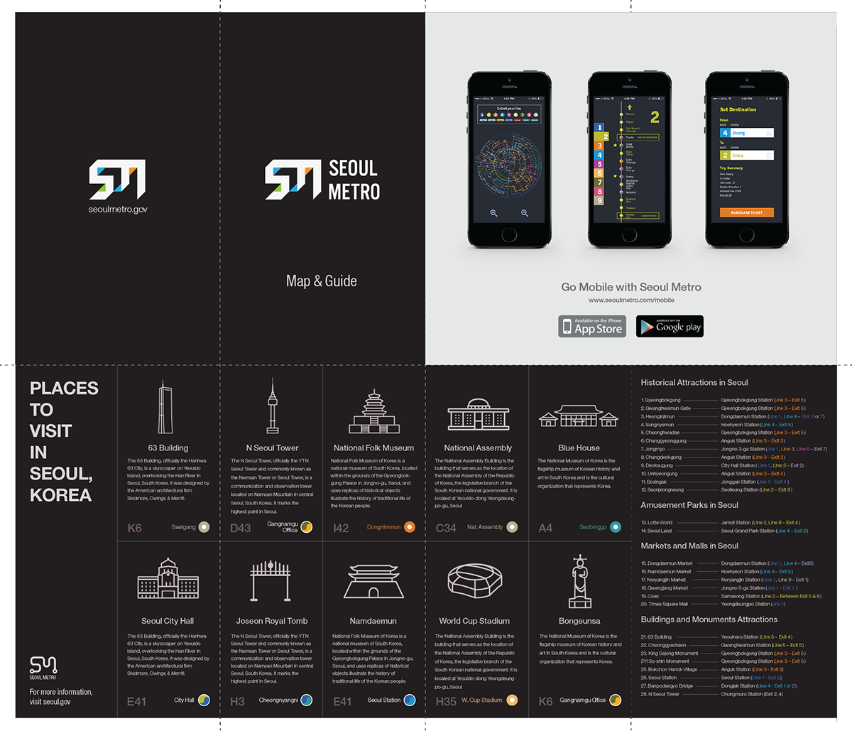
Back of the "Map & Guide Handbook" (Unfolded)
All of Seoul, in one hand.
For more information, please visit sunghcho.com


