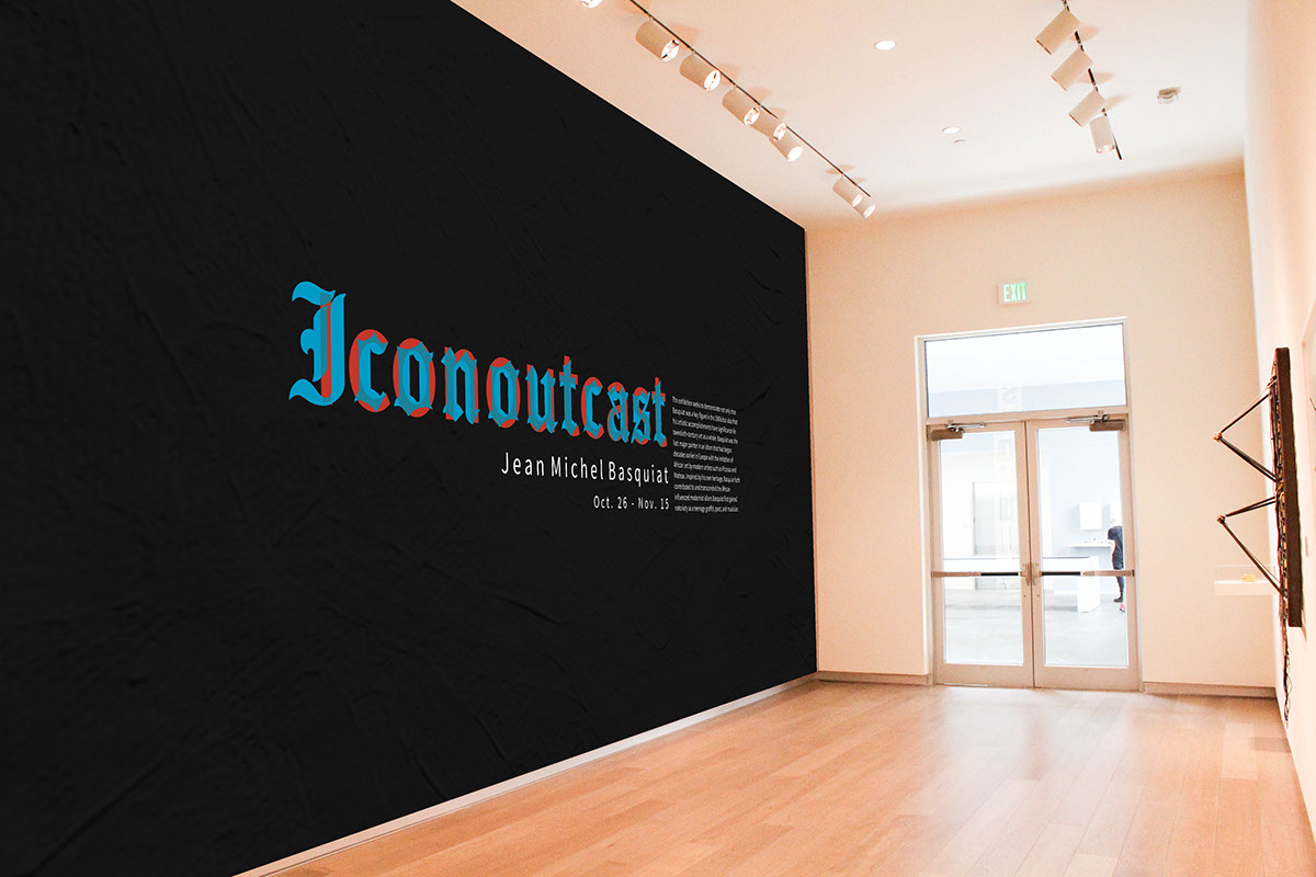
Iconoutcast
Jean Michel Basquiat
Brief: Practice skills to develop design solutions through research, conceptual ideation, design exploration, and development using the formal elements and basic principles of design, to create innovative and well executed final solutions. The following elements will be studied and developed by the creation of a program for a museum exhibition. Including: Identity / Graphic Standards, Exhibition / Environmental Graphics, Narrative Literature, Packaging.
Identity
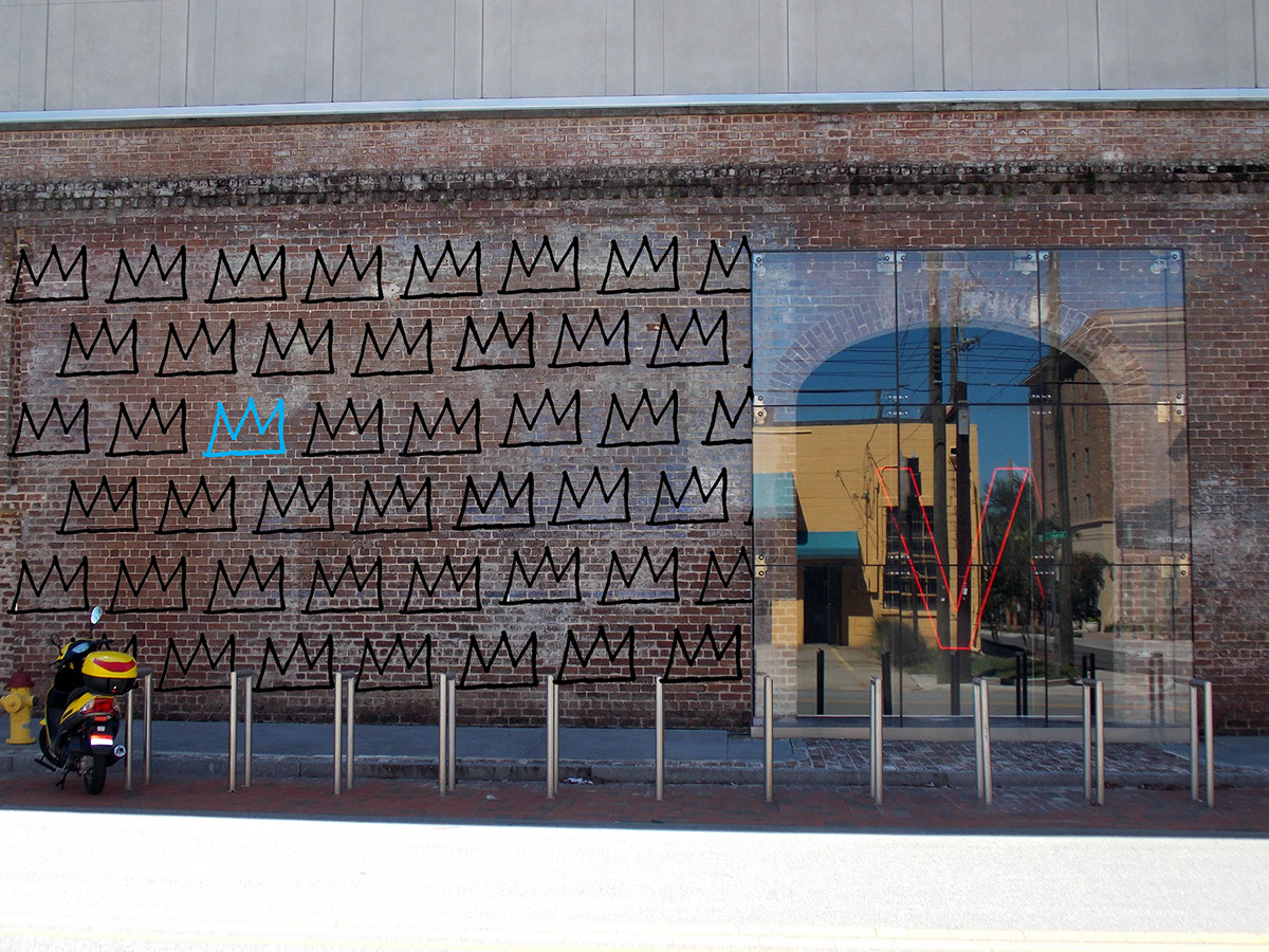
The word Iconoutcast derives from ‘iconoclast’ and ‘outcast’, melding the two opposite sides of a person. Jean Michel Basquiat is a complex person, being perceived by the public as an icon, but internally feeling an outcast within the art world. I used an Old English typeface to represent the way that people describe Basquiat as royalty, and a San Serif to contrast, depicting the more lonely side of Basquiat. The red and blue also allow you to see one side, see the other, and then the two overlap together, but don’t completely mesh. For graphic elements I chose an inkblot test to illustrate two sides becoming one unity, as well as the effect of seeing various images within one, a Basquiat crown that is used in various paintings, and a polaroid taken by
Andy Warhol.