OBJECTIVE Design a map for the city of Moscow’s metro system as well as a visual identity and app.
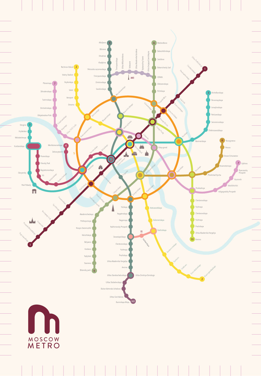
GOALS Create a new information system that is simple and straight forward as well as having a color system that gives a positive feel of the city.
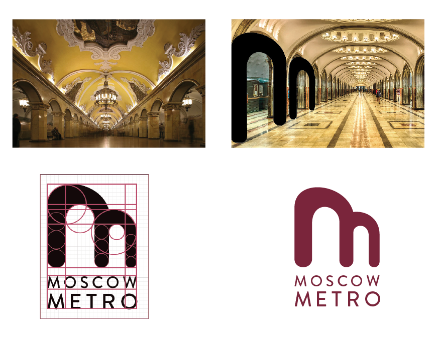
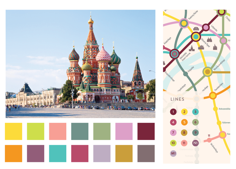
SOLUTION I decided to use the city for my inspiration, so for the logo I looked into the metro itself. I used the streamlined and curved arches that Moscow Metro has for the logo mark. The color palette was taken from different parts of the city, such as the colorful and elegant St. Basil’s Cathedral and the interior of the metro. The map itself has a very flowing and rounded design to promote the positive feel of the city.