
A tale of two cities
The diagram compares data of the daily temperature and precipitation between two Bay Area cities, San Francisco and San José.

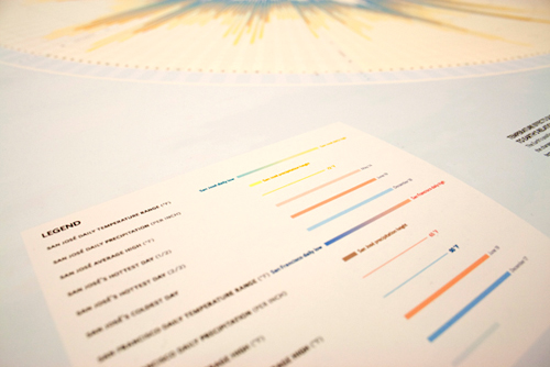
Diagram comparing temperature in the main layer, rainfall in the outermost area and center indicating the seasons.
Macro and micro view of data
Bigger picture
Taking two data sets as comparison, the diagram provides a quick impression of the overall flux in the data in the macro level. In reading the details in the 2008 calendar year, users are able to see the cycle of the temperature, rainfall and its relation to the hottest day and to the seasons. While the general pattern of these two cites did not seem too different, closer comparison showed a 10 Fahrenheit degree difference.

Representing the data as a range with competing gradients in representing the two cities.
Design detailing
On the micro level, users could pick a specific date to see the difference in data between the cities. Circular presentation was used as an approach to relate to the spherical shape of our planet and the cyclic repetition of the seasons. Use of color gradation show the day to day temperature range and were carefully selected to prevent muddied view of the data. Solution also placed focus on typographic details for information flow and legibility at a small scale.
Typography is a crucial piece in detailing the data.

Special indication of the unique coldest day and warmest day in both cities.


