
The Concept
A friend and I decided we wanted to start a business together. He is a tattooist and I am a Graphic Designer so it seemed like it was the perfect match.
The initial idea was to start a Tattoo Parlour which was friendly and inviting, as well as starting an art gallery and design studio.
The first step was to design a brand and "theme" for our studio.
I decided that I didnt want it to be like the rest of the studios around my town, I wanted it to feel clean, contemporary and friendly. I decided to base the branding upon his personality and beliefs. My friend is a strong believer in buddhism and everything that comes along with that. Because of this interesting outlook on life, I knew I wanted to spiritually connect the studio to that.
Sacred Geometry
These 4 shapes are know as sacred shapes. They are believed to be connected to the "flower of life".

The Flower Of Life

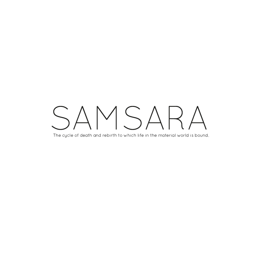
The Perfect Name
The Design
After a few hours of drawing, I came upon this simple design. It uses the Flower of life as a background, I also tried to include the sacred shapes within the design. I felt that these sticking out the side of the circle made it feel a bit clunky and un-even so I went with a circle logo with the flower of life behind the name, and two triangles overlapping to include the sacred shapes as best I could with out over whelming the design.

Refining the Design

The Chosen Design


Website Design
I decided to design a single page for what the Samsara website could look like.
I felt the best page to design for example purposes would be the gallery page, this would most likely be the reason people come to the website. Either to check out the studio, look at thequality of previous work and possibly even come here for inspiration.
Much like the logo, I want to keep the black and white colours. I also wanted to keep it extremely simple and un-complicated. From personal experience, a lot of the people who came to the studio would be interested in a "flashy", slightly complicated website. They would just want what they want, displayed to them as simply as possible.
Keeping this in mind, I used a grid layout to keep it simplistic, but gave it slight details to add a bit of interesting movement. Accelerated images when they load onto the page, fade in and out buttons. as well as other variations for selection and information.


A Few Pictures Of The Studio
Here are a few images of the studio the week we opened. It was an incredibly long process, finding the perfect place, re-decorating and applying our own touch. But it is the most fun I have had and enjoyed my time there.
I have since moved on to progress in my design career but they are still working at samsara and it is so popular due to its clean, friendly atmosphere.


