
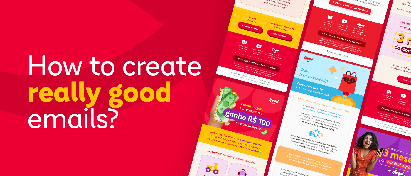
When I was part of a dedicated team working for iFood Restaurantes (iFood's sector dedicated to the restaurants registered on the platform), designing emails was almost a daily activity. Sometimes for promotions, others for the user's account maintaince, newsletters, everything you can imagine could become an email. The challenge here was to make them interesting and functional independently of its content.
To stay consistent at the visual quality but also keep a fast pace of work I naturally started to follow some steps whenever I received a request of an email creation. Steps those which I'm gonna describe down bellow.
[PT-BR] Quando eu era parte de uma equipe dedicada ao iFood Restaurantes (departamento dedicado aos restaurantes registrados na plataforma), criar emails era uma tarefa praticamente diaria. As vezes para promoção, outras para manutenção da conta do usuário, newsletter, tudo o que se pode imaginar pode virar um e-mail. O desafio aqui era fazê-los interessante e funcionais independentemente do seu conteúdo.
Para manter uma qualidade visual consistente, mas também a agilidade, eu naturalmente comecei a seguir alguns passos sempre que recebia uma demanda de criação de e-mail. Passos esses que vou descrever abaixo.

The first step is to identify the type/category of the email. Is it an offer? An announcement? What is it goal? These answers guide my layout and the references i'd look for.
[PT-BR] O primeiro passo é identificar o tipo/categoria do e-mail. É uma oferta? Qual seu objetivo? Essas respostas guiam meu layout e as referências que eu possa vir a buscar.
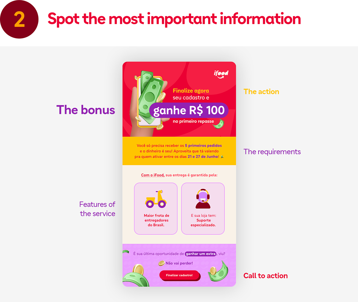
Knowing the objective, I mark words or phrases on the text that are important to the user and then select which ones I will highlight. In the example above I decided that the bonus was the most important information, but there were more that should be highlighted, these in a minor hierarchy.
[PT-BR] Sabendo o objetivo, eu marco palavras ou frases no texto que são importantes para o usuario e escolho quais eu vou destacar. No exemplo acima eu decidi que o bonus era a informação mais importante, mas haviam outras que também deveriam ser destacadas, essas em menor hierarquia.

People always say that a picture is worth a thousand words, so why not use both? Images help us comprehend the contexts easier by guiding our interpretation towards the message we want to pass (when well done). Use them to simplify your message too.
It doesn't need to be litteraly an image, use icons and emojis 😉. You can also arrange text in compositions that acts like images, even being made by written information, and that help to build a more fluid reading pace.
[PT-BR] As pessoas sempre dizem que uma imagem vale mais do que mil palavras, então por que não usar ambos? Imagens nos ajudam a compreender contextos com mais facilidade ao guiar nossa interpretação em direção a mensagem que queremos passar (quando bem feita). Use elas para simplificar sua mensagem também.
Não precisa ser literalmente uma imagem, use ícones e emojis 😉. Você também pode criar composições de texto que funcionam como imagens, mesmo sendo compostas por informação escrita, e isso ajuda a construir uma leitura mais flúida.


One thing I consider crucial is to pay attention on the flow of reading in your email. I always try to make it more "friendly" by breaking big text blocks into smaller chunks, creating boxes for some information or playing with the size and weight of some other.
The previous steps usually make this one easier, because at this point I already know what I'll do to each section.
[PT-BR] Uma coisa que considero crucial é prestar atenção no ritmo de leitura do seu e-mail. Eu sempre tento fazê-lo mais "amigavel" quebrando grandes blocos de texto em pedaços menores, criando caixas para algumas informações, bricando com o tamanho e peso de outras.
Os passos anteriores geralmente fazem esse ser mais fácil, porque nesse ponto geralmente já sei o que vou fazer com cada sessão.

After those steps I do some tweaks here and there, and then it's done.
Well, actually there is another step, which is probably the most important one. But it may come prior to all of the others and sometimes even before the request.
[PT-BR] Depois desses passos, faço uns ajustes aqui e ali, e pronto.
Bem, na verdade tem outro passo, que é provavelmente o mais importante. Mas ele pode vir antes de todos os outros e as vezes antes mesmo da solicitação do job.
Bem, na verdade tem outro passo, que é provavelmente o mais importante. Mas ele pode vir antes de todos os outros e as vezes antes mesmo da solicitação do job.

Here is where you'll get your references from. Market's standards, trends, new ideas, things to do and do not. Maybe thats how you ended up here, looking for inspiration, and that's the point of it.
I didn't put this step before because I try to make it a routine outside of the creation process. Surrounding me with references in my social medias and my own mail box in this case. This way I can be prepared to project requests in antecipation.
Back to the subject, when it comes to emails, I usually search for inspiration at Really Good Emails (that's also where the idea for this project's name came from). Other places like Behance, Dribbble, Pinterest and even your own email box are good places to look for too. And to contribute for that, here are some of my favorite emails I did for iFood. 😁
Back to the subject, when it comes to emails, I usually search for inspiration at Really Good Emails (that's also where the idea for this project's name came from). Other places like Behance, Dribbble, Pinterest and even your own email box are good places to look for too. And to contribute for that, here are some of my favorite emails I did for iFood. 😁
[PT-BR] Aqui é de onde você vai tirar suas referências. Padrões de mercado, tendências, novas ideias, boas e más práticas. Talvez seja por isso que você está aqui, buscando inspiração, e esse é o objetivo.
Eu não botei essa etapa antes porque eu tento fazer dele uma rotino fora do processo de criação. Me rodeando de referencias nas minhas mídias sociais e na minha própria caixa de e-mail nesse caso. Dessa forma eu posso me praparar de antemão para os trabalhos que virão.
Voltando ao assunto, quando se trata de e-mails eu geralmente busco por inspiração no Really Good Emails (inclusive foi dai que tirei a ideia para o nome desse projeto). Outros lugares como Behance, Dribbble, Pinterest e até mesmo sua própria caixa de e-mail são bons lugares para procurar também. E para contribuir com isso, aqui estão alguns dos meus e-mails favoritos feitos para o iFood. 😁


This project came as an idea on "how do I showcase different emails that I did and liked in a way that makes sense and shows my proficience on designing them". Hope you've liked it. If you did and read it all the way here, please comment: "Really good" (or don't, the choice is yours 😅)
[PT-BR] Esse projeto surgiu de uma ideia sobre "como eu mostro vários e-mails que eu fiz e gostei de uma forma que faça sentido e demonstre minha proficiência em criá-los". Espero que você tenha gostado. Se gostou e leu do começo até aqui, por favor comente: "Really good" (ou não, a escolha é sua 😅)


