


After bankruptcy, dwindling memberships, and increased customer dissatisfaction, and later gaining a new CEO and marketing team with a plan for redemption, New York Sports Club urgently needed a shift of its brand perception.
-
CONCEPT
The new visual branding focuses on a clean, empowering approach to the NEW New York Sports Club, and is inspired by Swiss-style design. Below are some design references.
-
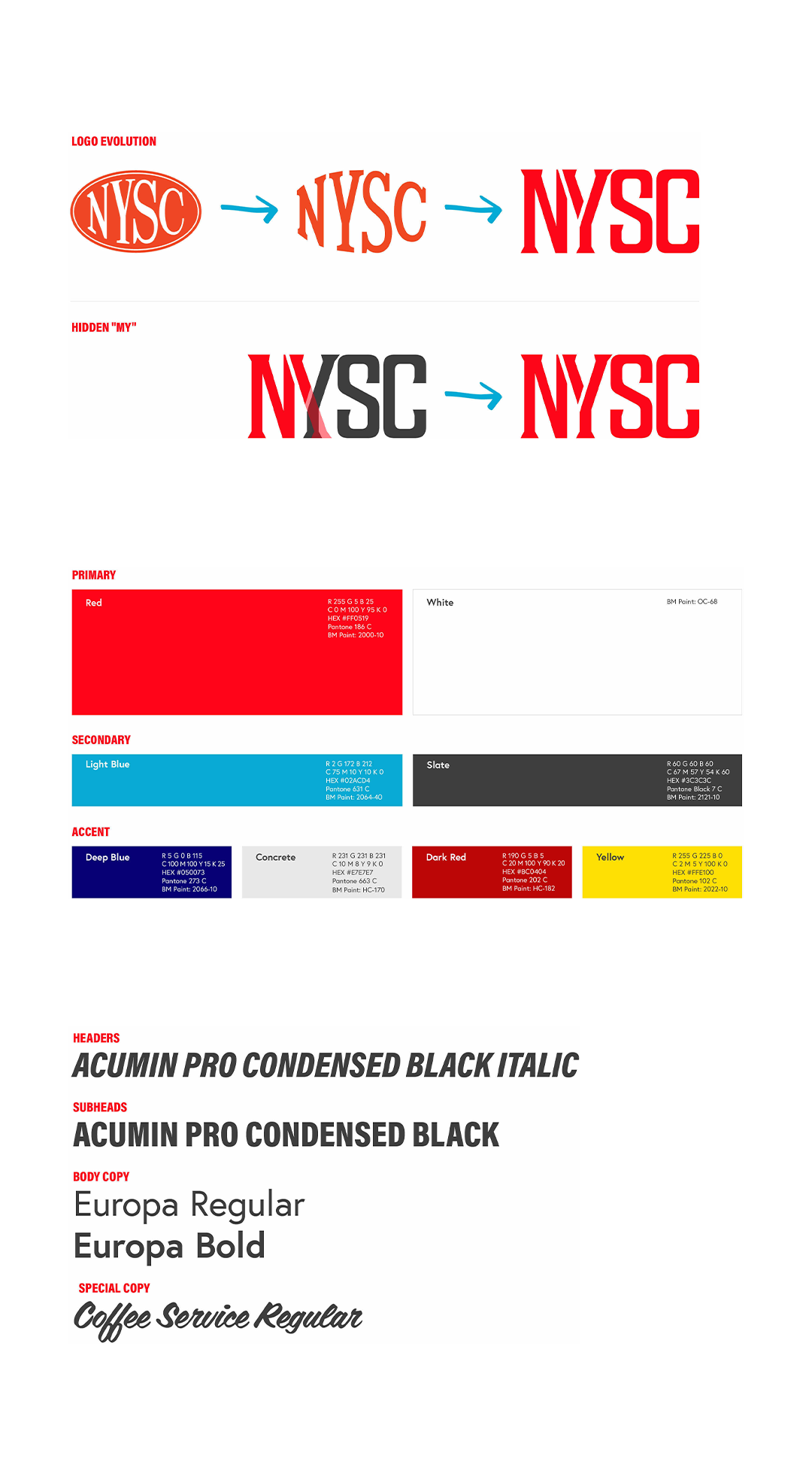
LOGO REDESIGN
The typographic logo nods to NYSC’s past by blending strength and retro-sporty with the concept of MY Sports Club, whose dynamic design also reads "MYSC”.
-
TYPOGRAPHY
Acumin Pro Condensed and Europa provide a 20th-century-inspired geometric sturdiness, whose power is complemented by the flowy script Coffee Service.
-
COLOR
Vibrant primary colors inspire positivity and movement, with a dominant Red that’s reflective of the brand’s energy, excitement, and dedication to its members.
-
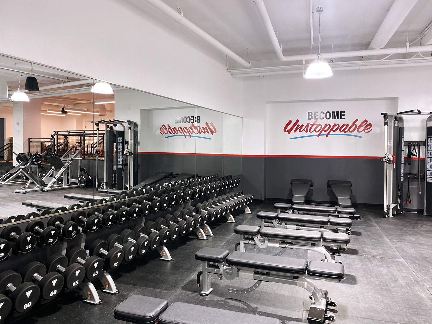
GRAPHIC ELEMENTS
NYSC’s signature angle (a bit of new) is extracted from the negative space within the brand logo. The oval pattern (a bit of old) preserves part of NYSC’s oval-logo history.
-
CONCEPT
The new visual branding focuses on a clean, empowering approach to the NEW New York Sports Club, and is inspired by Swiss-style design. Below are some design references.
-
LOGO REDESIGN
The typographic logo nods to NYSC’s past by blending strength and retro-sporty with the concept of MY Sports Club, whose dynamic design also reads "MYSC”.
-
TYPOGRAPHY
Acumin Pro Condensed and Europa provide a 20th-century-inspired geometric sturdiness, whose power is complemented by the flowy script Coffee Service.
-
COLOR
Vibrant primary colors inspire positivity and movement, with a dominant Red that’s reflective of the brand’s energy, excitement, and dedication to its members.
-
GRAPHIC ELEMENTS
NYSC’s signature angle (a bit of new) is extracted from the negative space within the brand logo. The oval pattern (a bit of old) preserves part of NYSC’s oval-logo history.
-
MY ROLES: Art Direction, Animation Direction, Graphic Design
TEAM: In-house
YEAR: 2023
TEAM: In-house
YEAR: 2023


