

The Whiskey Reserve
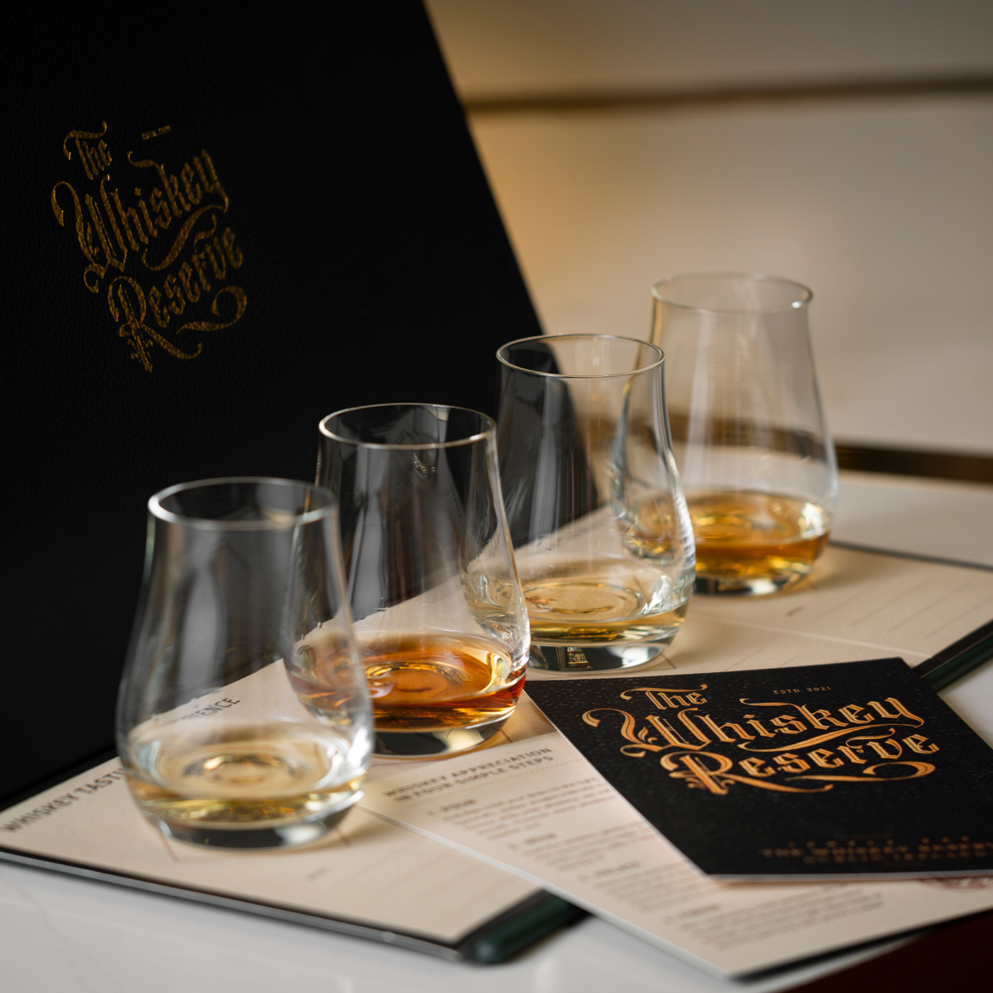
The Whiskey Reserve is a special destination in the heart of Dublin where whiskey lovers can discover, taste and purchase rare, premium whiskeys from across Ireland and around the world. It offers a Michelin star-quality experience, celebrating the history and craft that goes into each whiskey.
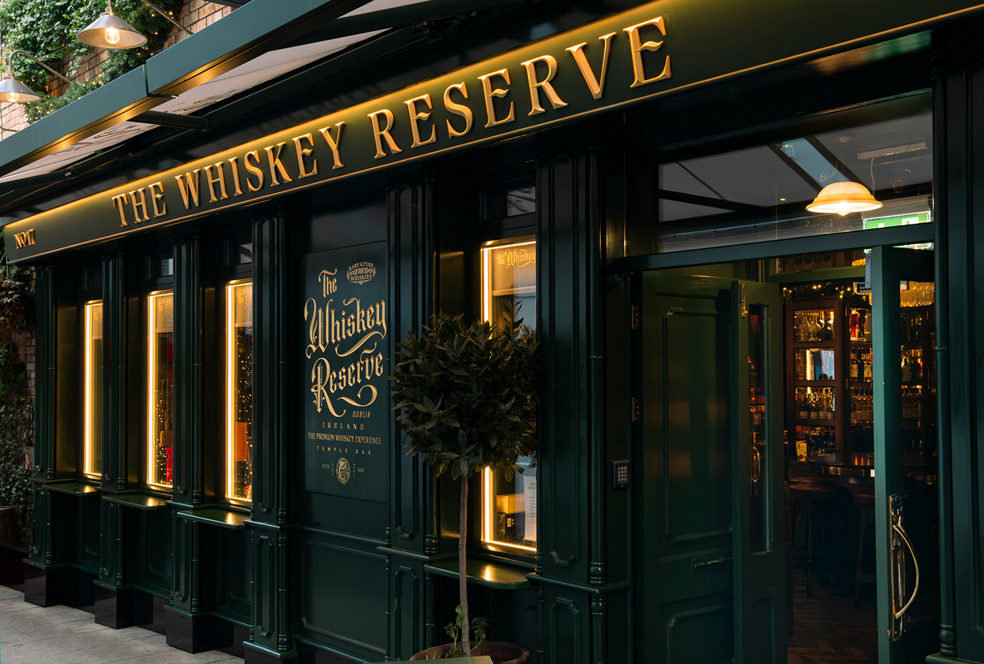
In 2021, The Whiskey Reserve was developing the interior design of its location in the Temple Bar district of Dublin, and contacted Ginger Monkey Design because of our track record creating premium yet accessible spirits packaging and branding. Our challenge was to design a brand system to instantly communicate the quality of the experience on offer and firmly position it in the world of whiskey.
Research & development
Our process always delves deep into who our client is, their story, qualities and objectives. The Cleary family represents three generations in whiskey bonding, and own and run the world-famous Temple Bar pub along with the Temple Bar Whiskey company. Their experience in the field is second to none, and the idea that they are creating an experience for customers led us to double down on the notion of ‘experience’ as being core to the brand. We then focused on how we wanted consumers to feel when encountering the brand and how to differentiate The Whiskey Reserve – not just from existing Irish whiskey brands but from typical representations of Irish culture in Dublin’s tourist quarter.

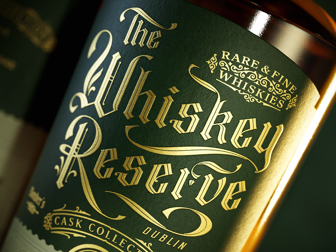
Ornate, impactful logotype
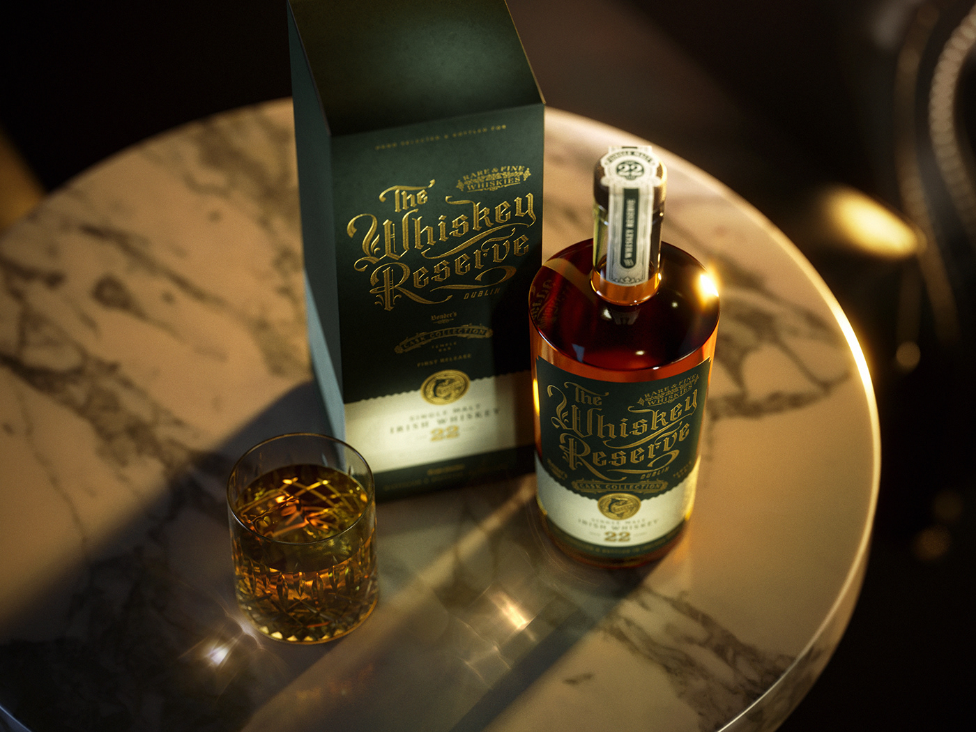
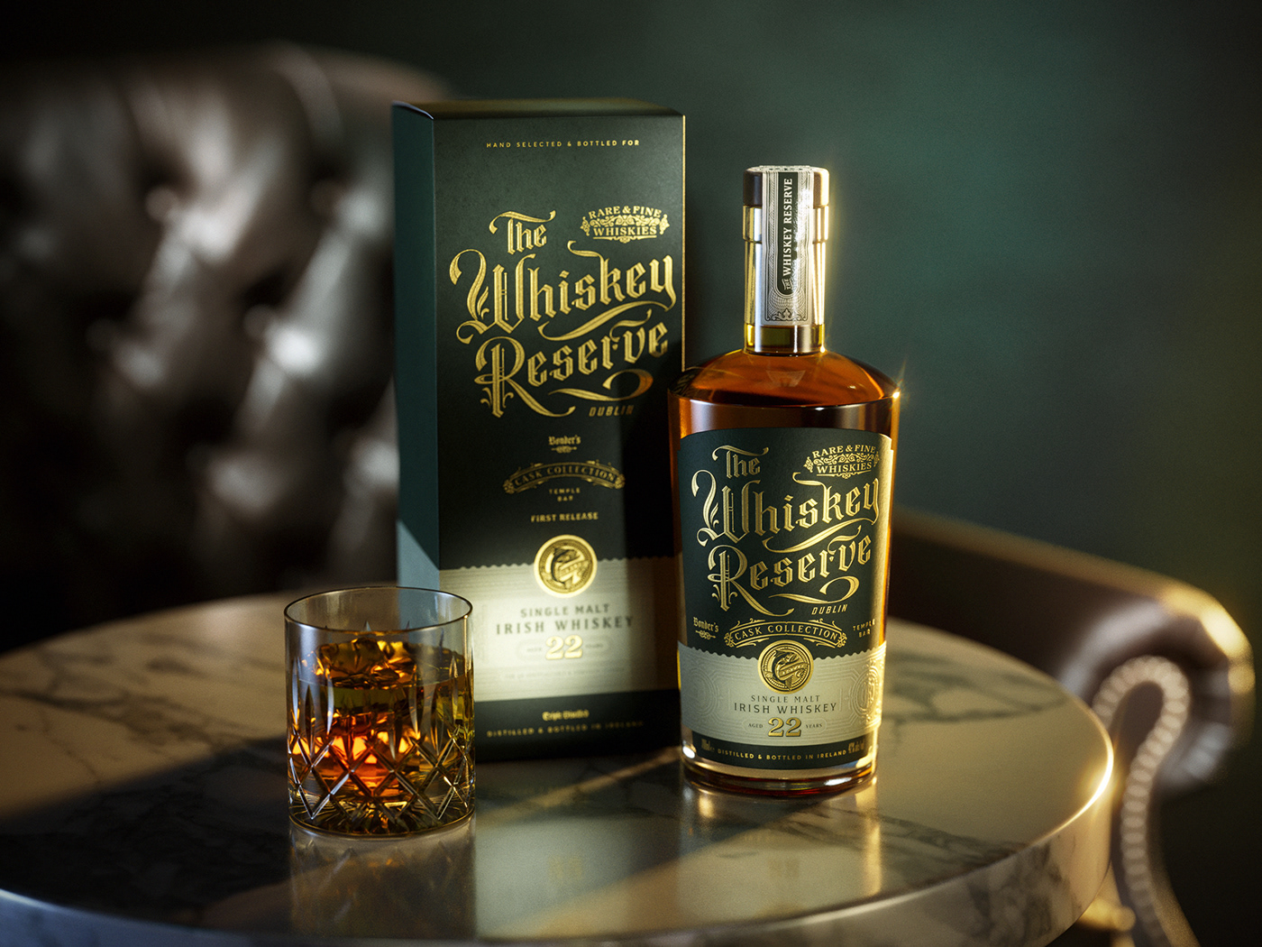
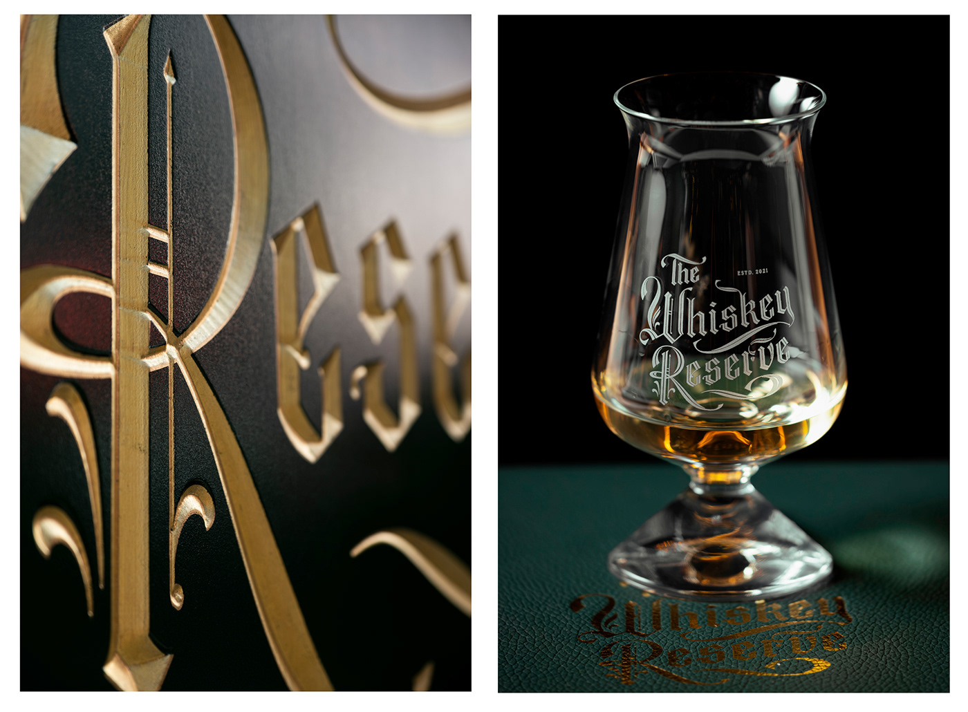
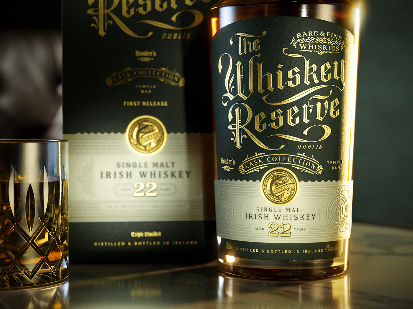
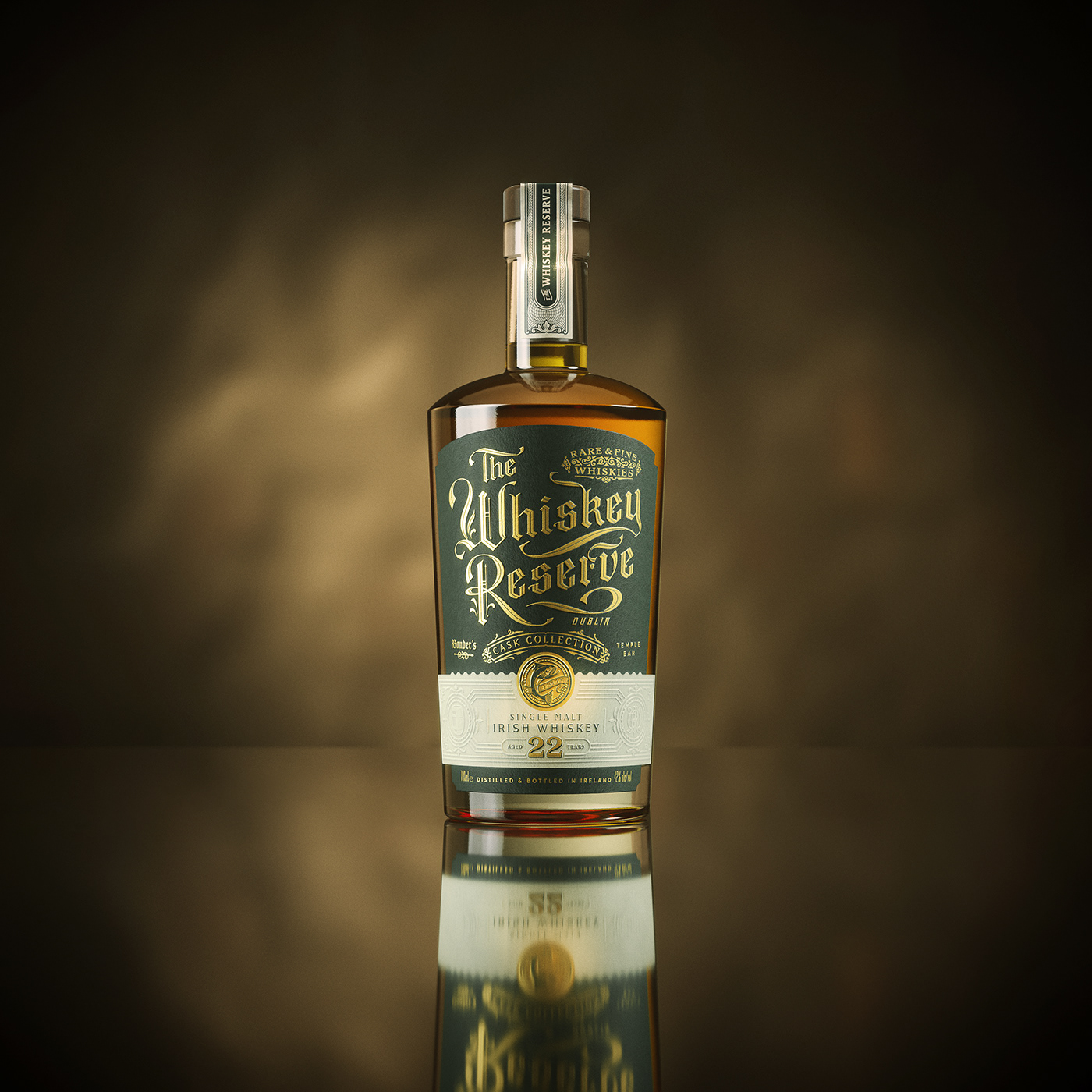
Based on our research, we developed and rationalised multiple visual approaches utilising differing letter forms, unique takes on whiskey iconography and layered storytelling inspired by Irish history and folklore. Our clients chose a visual expression structured around an ornate, impactful logotype that begins in black letter calligraphy, hand crafted with an inline and free-spirited flourishes to create a mark that looks traditional but also feels contemporary and approachable.
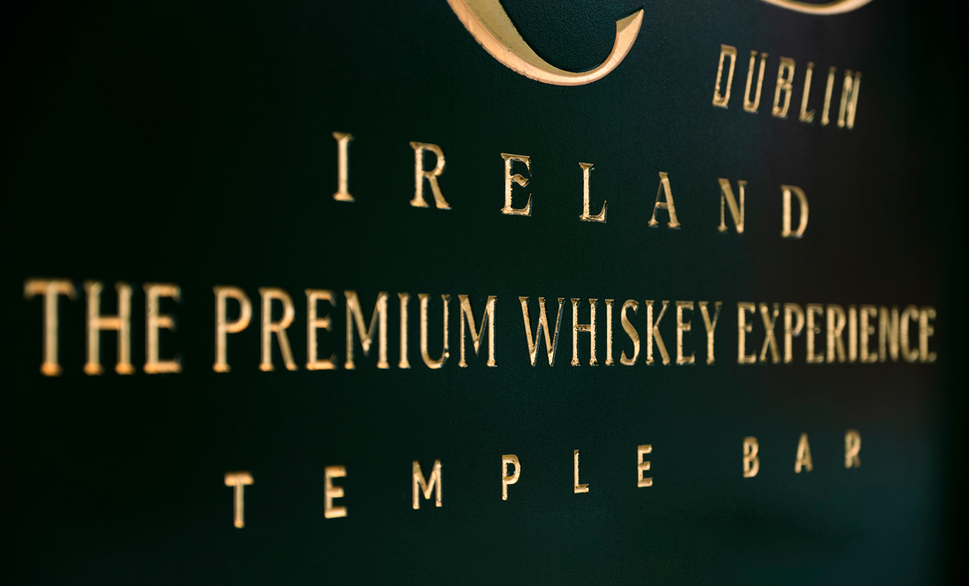
Presented in gold foil on the venue’s front window, or printed on a rich, deep green background colour, the logotype feels just like a whiskey label might – premium execution, with a level of craft speaking of The Whiskey Reserve’s deep expertise in its field.
The Salmon of Knowledge
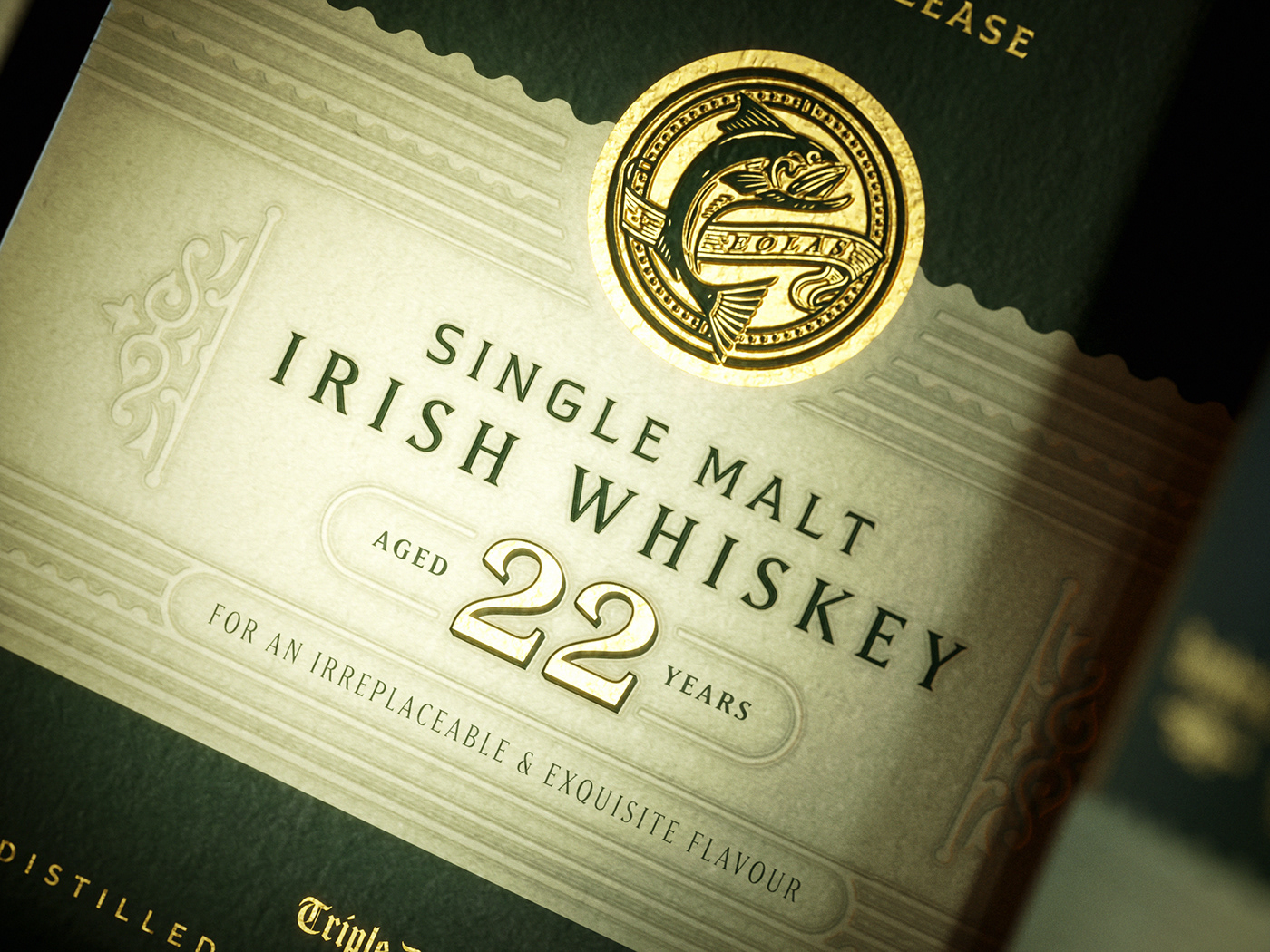
Secondary graphics in The Whiskey Reserve brand toolkit include a traditional monogram that feels like it was wrought by an 18th century blacksmith, and an icon depicting the Salmon of Knowledge. The salmon comes from Irish legends about the hero Fionn mac Cumhaill, and is shown in gold with the Irish Gaelic word eolas, meaning knowledge gained through learning, experience and practice. It reflects the knowledge and experience The Whiskey Reserve and the Clearly family have to offer – valuable qualities at the heart of the brand. Touches like this give the brand substance and a strong foundation in storytelling, because whiskey tasting is a personal experience.
Now try the whiskey...
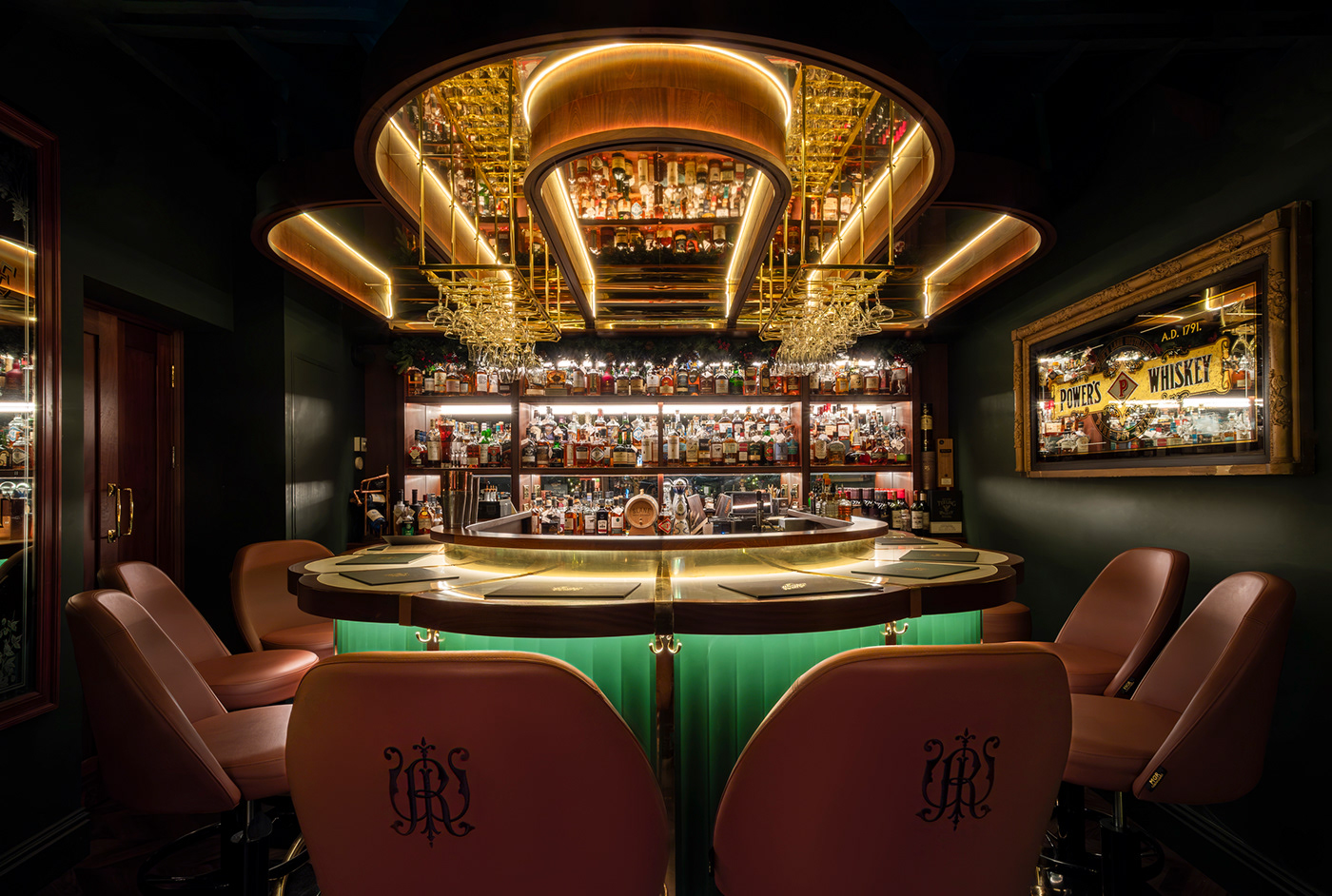
The Whiskey Reserve has opened to become a priority destination for whiskey lovers visiting Dublin, frequented by celebrities, with tastings, live music, and a bar boasting over 2000 whiskeys from Ireland, Scotland, Japan, the United States and more.
The brand has also launched its own select line – The Whiskey Reserve Cask Collection, which began in 2023 with a 22-year-old, triple distilled Irish single malt. To create the bottle and gift box design for the Cask Collection range, we adapted and refined the brand assets to create spirits packaging using layered design, tactile materials and finishes that result in a satisfying experience for the consumer.
Credits
Creative direction & design by Ginger Monkey, Tom Lane
Creative direction & design by Ginger Monkey, Tom Lane
Client, The Whiskey Reserve / Temple Bar
Copy & research by Garrick Webster
Bottle & box visualistions by Boo BY
Copy & research by Garrick Webster
Bottle & box visualistions by Boo BY


