Our Story
"We all understand that the health of our furry close friend is an important responsibility, not only for them but also for our happiness. Furend was born with the goal of simplifying the healthcare process, bringing delicious flavors, and broadening your understanding of the importance of vitamins in a cat's life."

__
Logo
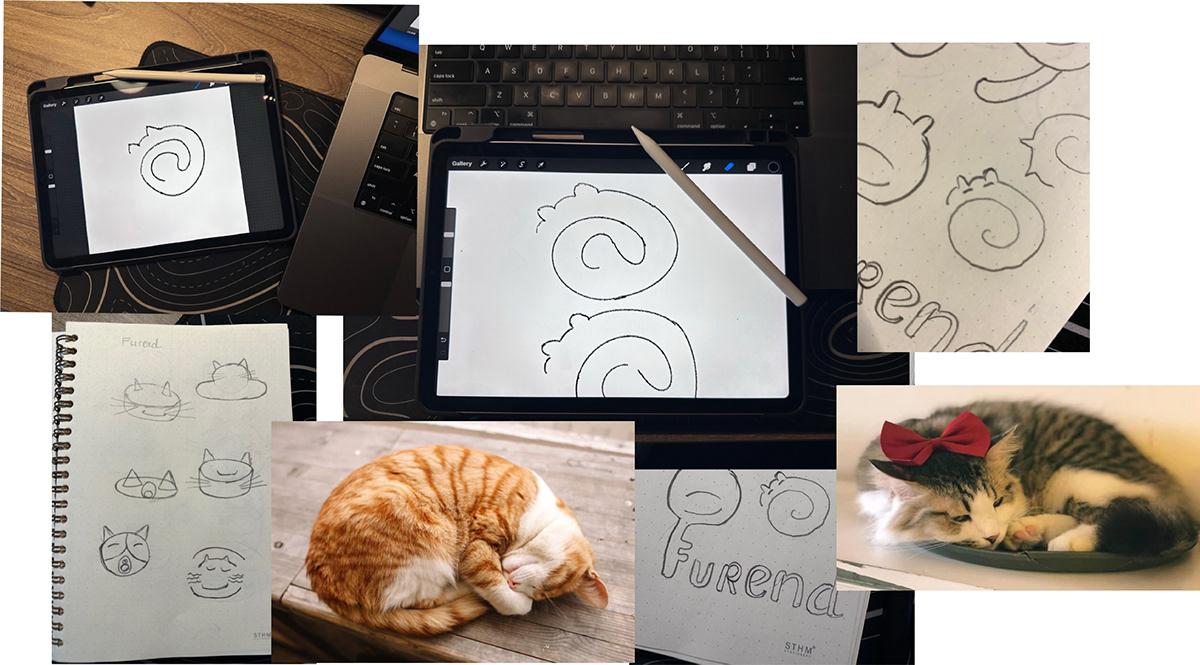
When is the moment your cat is happiest? It's when they're curled up asleep in their happy home, and that is the inspiration for us to create the Furend Logo.
At Furend, each food can is not just a meal but a promise of long-term health and happiness for the cherished members of the family.


__
Color Products
This is the color palette of Furend products, and we've named the colors in a way that resonates with your preferences.


__
Key Visual Identity
The Key Visual Identity Systems are derived from the logo, conveying the message of happy cats after enjoying nutritious and satisfying meals from Furend.


__
Icongraphic
The iconography system will be utilized throughout the brand to showcase Furend's in-depth research and scientific approach in creating their products.


__
Furred Canned Pate
Furend Pate Canned has undergone extensive research investment from us to create a standardized Pate can with a complete, satisfying portion for cats of all ages. With carefully measured quantities, cats receive full nutrition after every meal.


__
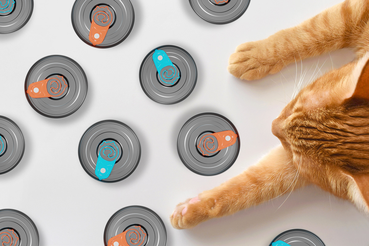
Furend Can Tab
Furend Can Tab is designed with a lid opening featuring the main Furend logo to enhance strong brand recognition, aligning seamlessly with the marketing campaign.


__
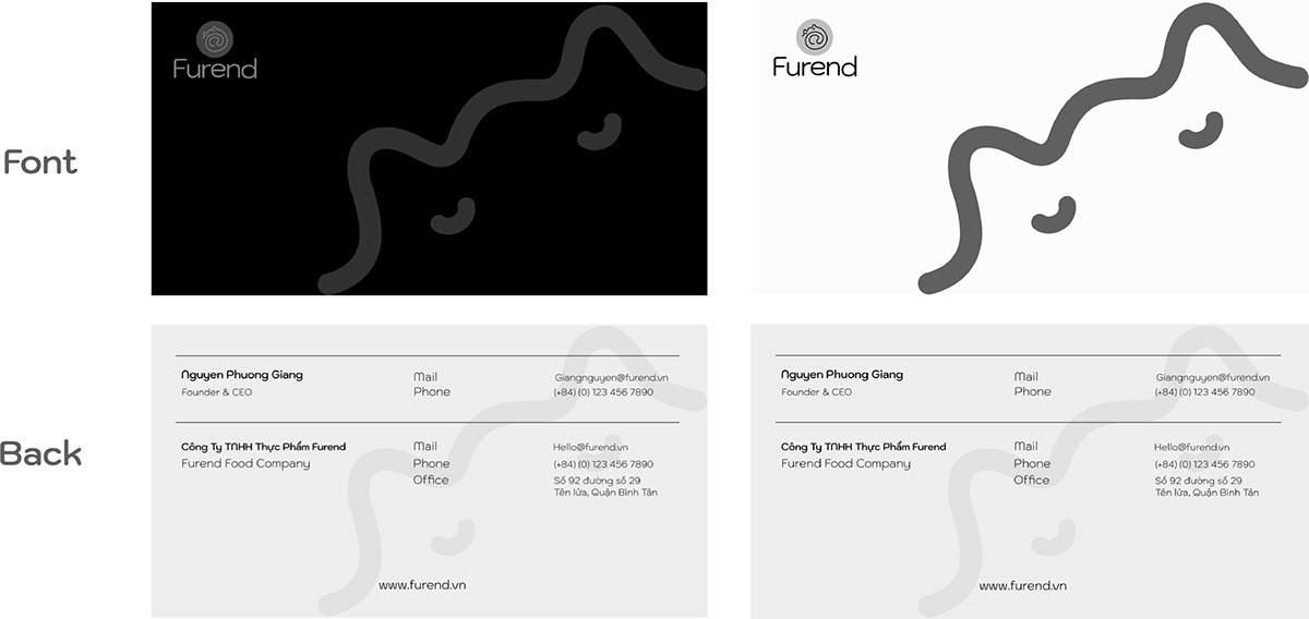
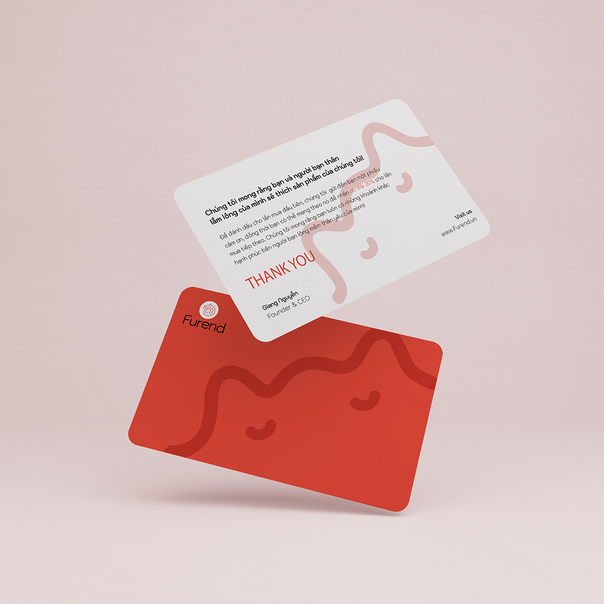
Office Stationery