


Oakwell Beer Spa — Website Creation for a Modern Spa Center
Design Type: Web Design
Specifics and Business Area: Wellness and Relaxation
Client
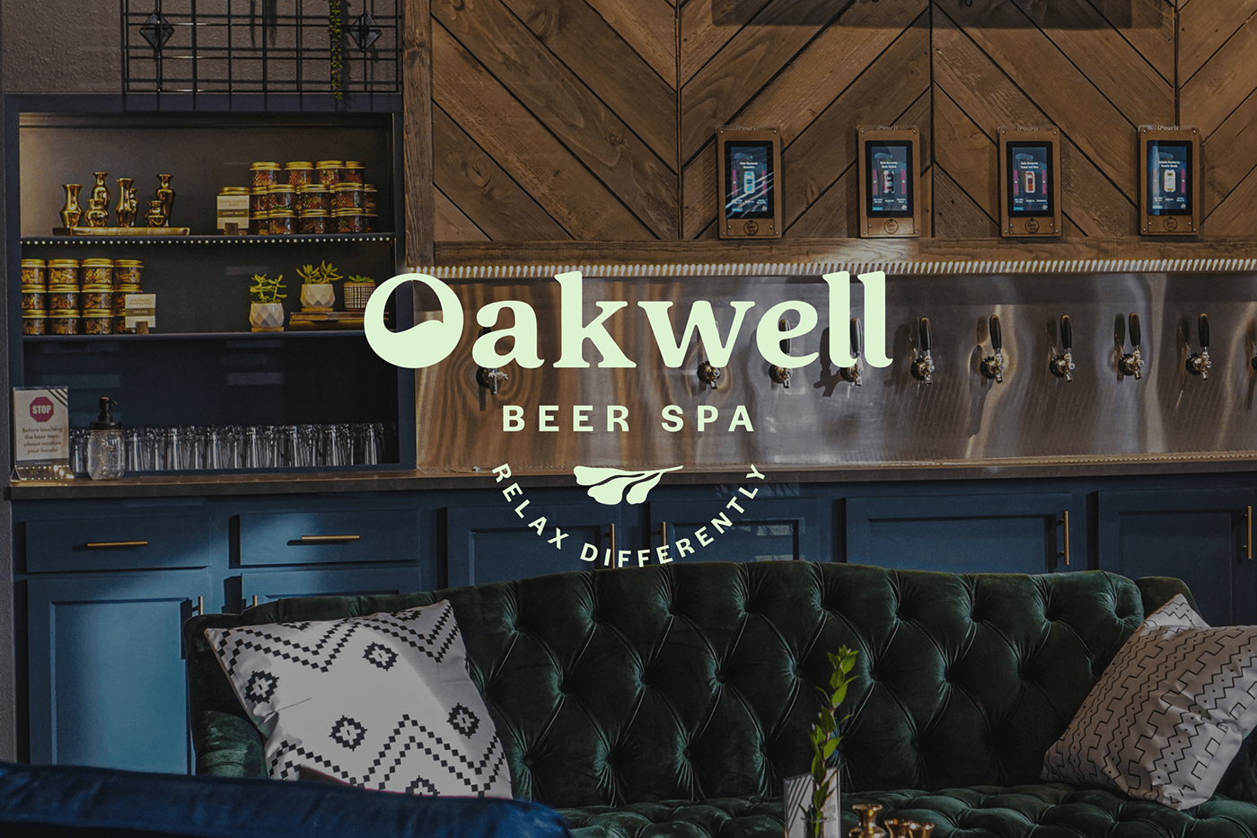
Oakwell Beer Spa is an inclusive spa oasis where nature meets modern technology to create a unique wellness experience. From beer baths to rain showers, Oakwell offers an immersion into the world of nature and water treatments. It's where you can feel nature’s touch and enjoy the harmony of its elements: water and plants.
Design Goals
Our goal was to create a website that reflects the uniqueness of Oakwell Beer Spa as a modern spa center, blending relaxation with nature — a place where people relax and converse. We aimed to highlight the brand's core values of naturalness, tranquility, and inclusiveness.
Concept
The main idea is to visualize the combination of water and plants as harmony and relaxation symbols. Abstract floral illustrations and wavy lines reflect natural beauty and serenity. When water and plants touch, a special pulse and water vibrations occur.
At the spa, guests also feel emotional pulses. Depending on the services, clients may feel more relaxed or dynamic.
Visit our website and look how we make so unique designs!

Main Graphic Techniques
The Oakwell website’s graphics is a key element that reflects the brand’s philosophy and atmosphere. Natural shades,
abstract shapes, smooth lines, and illustrations create a unique visual style. Abstract floral illustrations create a connection
with nature and flora. They are softly integrated into the design, adding organicness and aesthetic appeal. Wavy lines move smoothly across the page, symbolizing water and its calming merits. Photos are also part of the graphics and help maintain
the overall style.
Typography
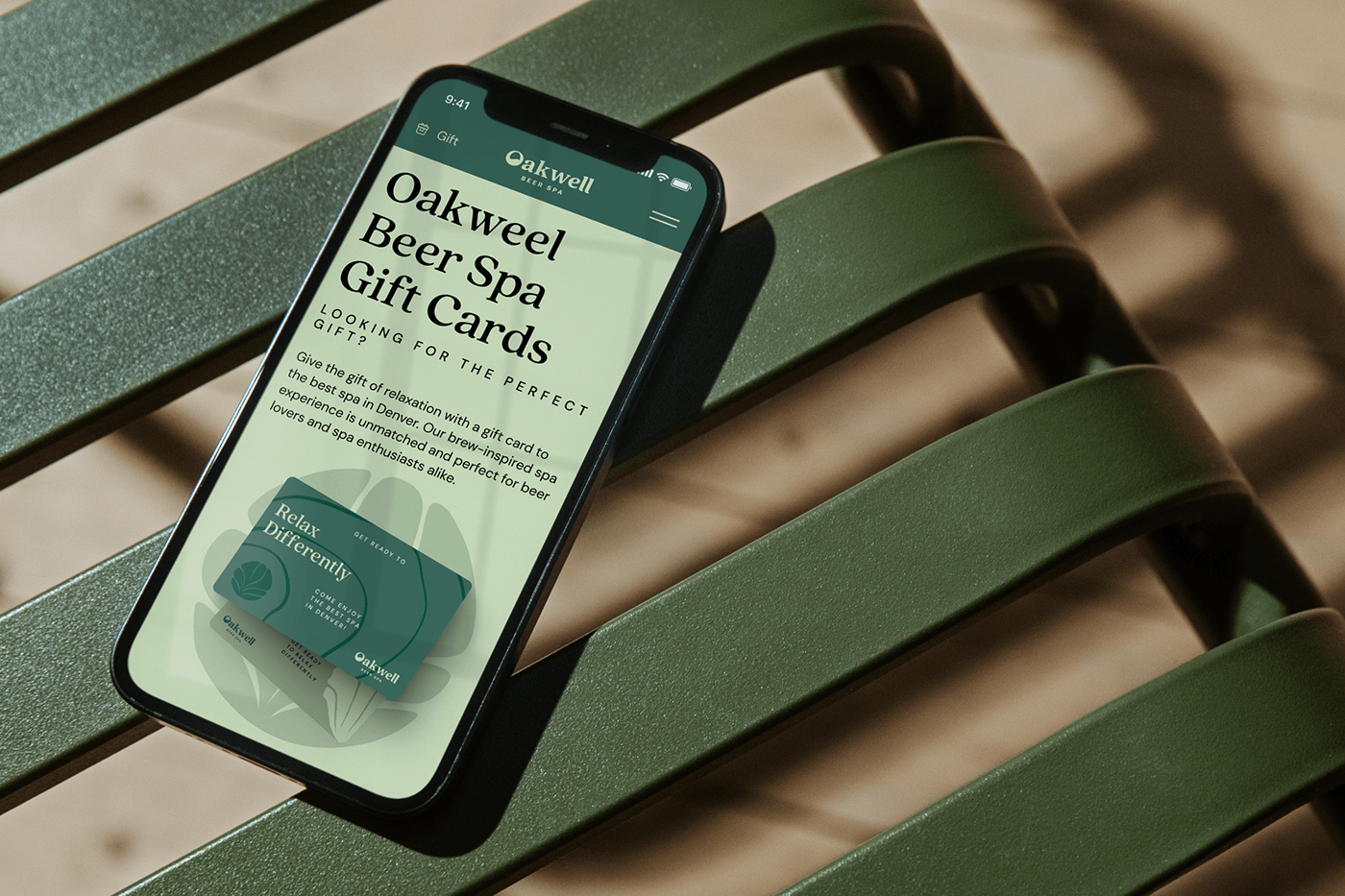
The Quincy CF font emphasizes the natural component and complements the graphics. The low-contrast and geometric
DM Sans font supplements the header font and is easily readable in large text blocks. Combining the serif Quincy CF font for headers and DM Sans for the main text creates a sense of tranquility and naturalness.
Color Palette
We used natural shades of green and blue to reference the plants' and water's colors. The additional calm pastel shades of beige create a relaxing atmosphere.


Composition
The balance between aesthetics and functionality creates a space where each element harmoniously interacts. We designed website pages so that users intuitively understand where to go next. The navigation menu is organized and easily accessible, facilitating smooth transitions between site sections. Graphics and text interact to support each element, adding context and meaning. The composition uses a geometric arrangement of elements, rhythmic placement of graphic objects and text,
and dynamic transitions between sections.
Buttons and Interactive Elements
Rounded buttons and interactive elements complement the graphic design and modernize the site's look.


eCommerce
The project has an additional segment – an online store serving as an eCommerce solution for the American market. We have integrated the store with our design, ensuring thoughtful and convenient navigation.
Each product card has interactive elements: image enlargement, 3D effects, information about key ingredients, product usage tips, and a review & recommendation section.
We used shades of blue for the cosmetic line and contrasting colors for text and logos. The Oakwell Beer Spa website reflects a modern approach to wellness, emphasizing naturalness and relaxation. It highlights the brand style and provides users a comfortable and soothing experience.


League Design Agency Team:
Design Director: Mike Samovarov
Team Leader: Vadym Haidai
Web Designer: Anton Samofalov
Creative Project Manager: Marina Burlaka
Design Director: Mike Samovarov
Team Leader: Vadym Haidai
Web Designer: Anton Samofalov
Creative Project Manager: Marina Burlaka
3d and Motion Designer: Vadim Revin
Case Design: Anton Bukoros, Alina Kovalenko, Dima Kaliberda
Case Design: Anton Bukoros, Alina Kovalenko, Dima Kaliberda
Support Ukraine!


