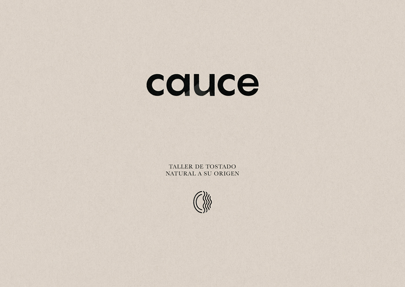
cauce
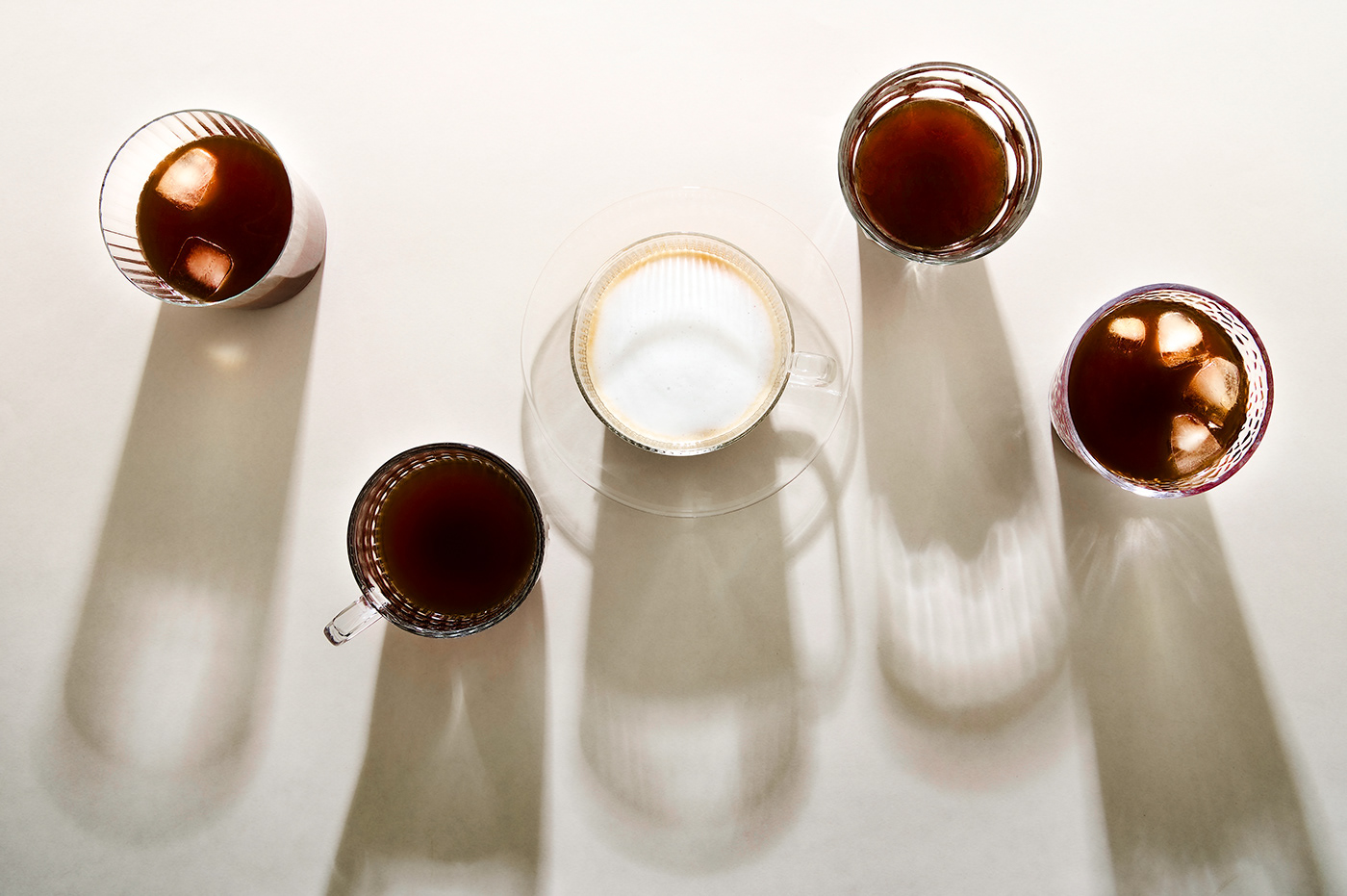
When we set out to create the brand identity for cauce, the most important message to convey was honesty, simplicity and the artistry of small-batch roasted coffee. Drawing inspiration from the Japanese concept of monozukuri, which embodies the ideas of skill, spirit, and craftsmanship in creating superior-quality products, cauce was born. Founded upon the founder's aim of a strong roasting philosophy, to accentuate distinctive flavor profiles to deliver an unparalleled organoleptic experience.
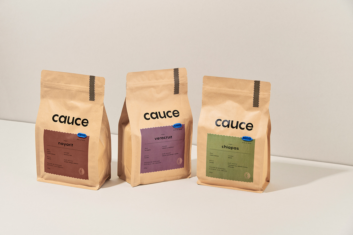
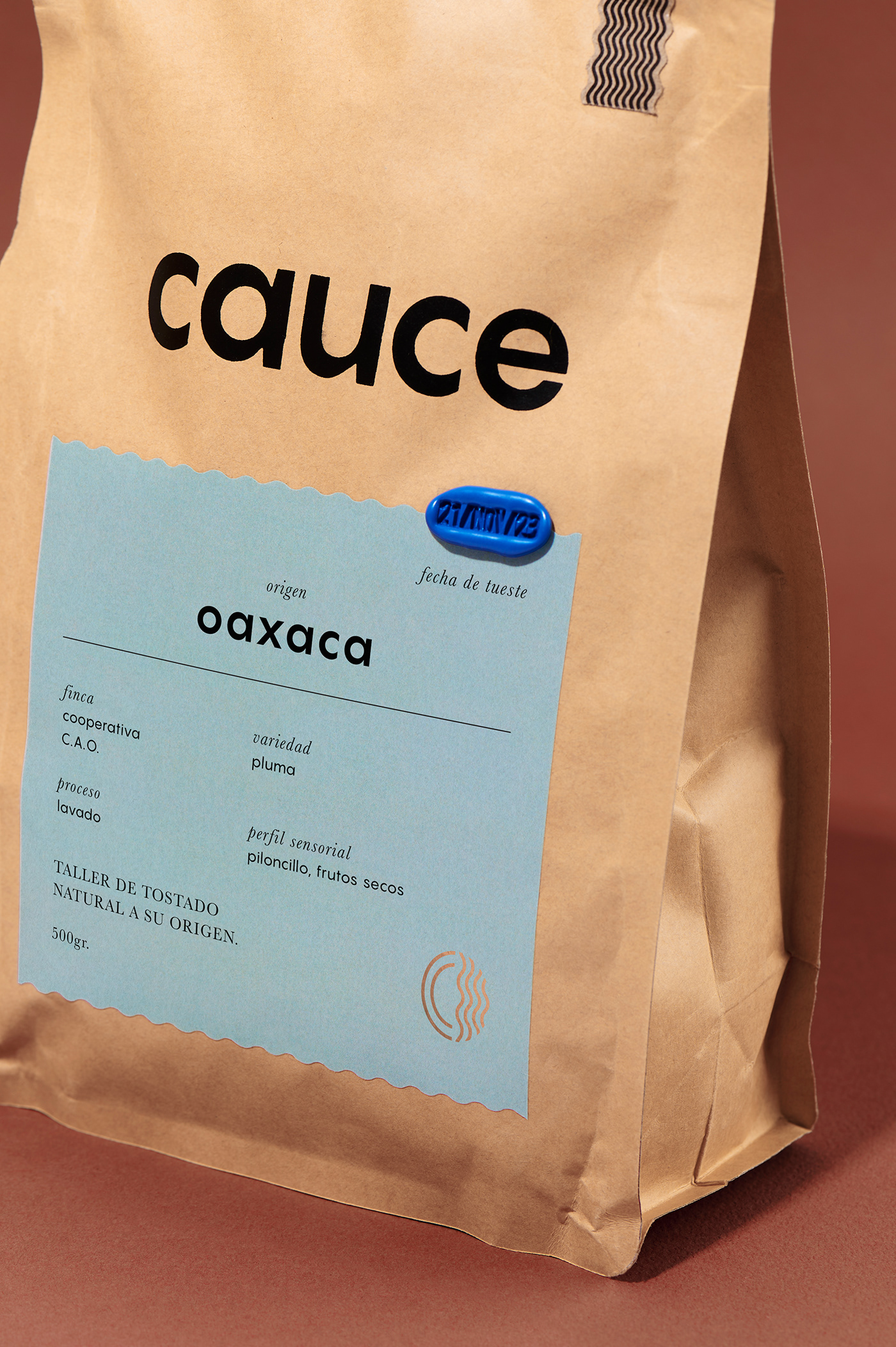
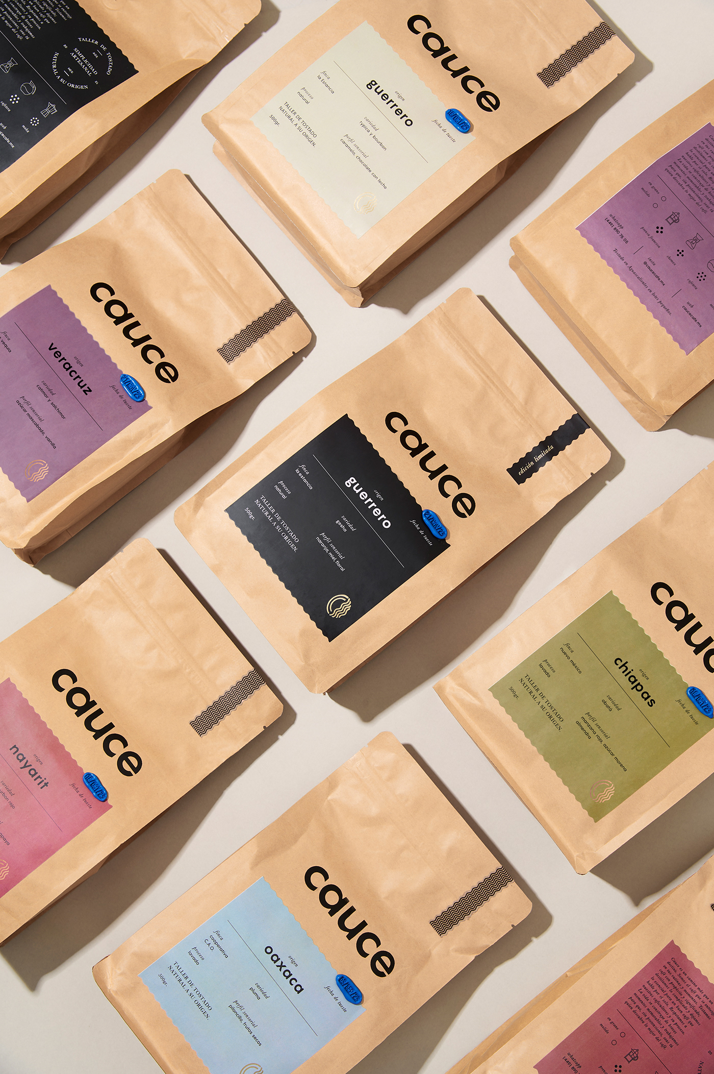
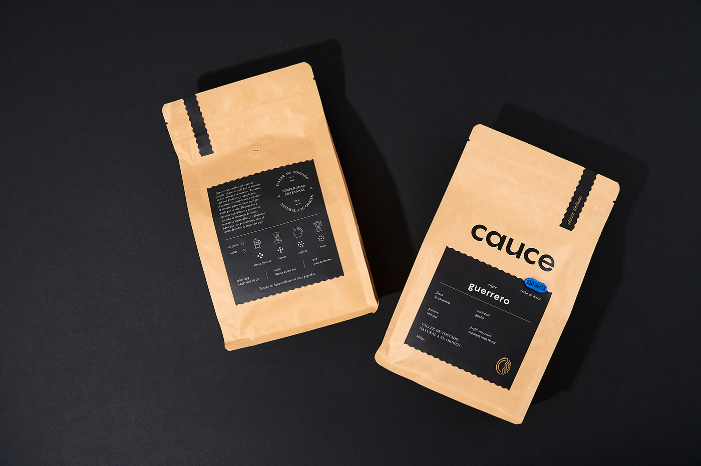
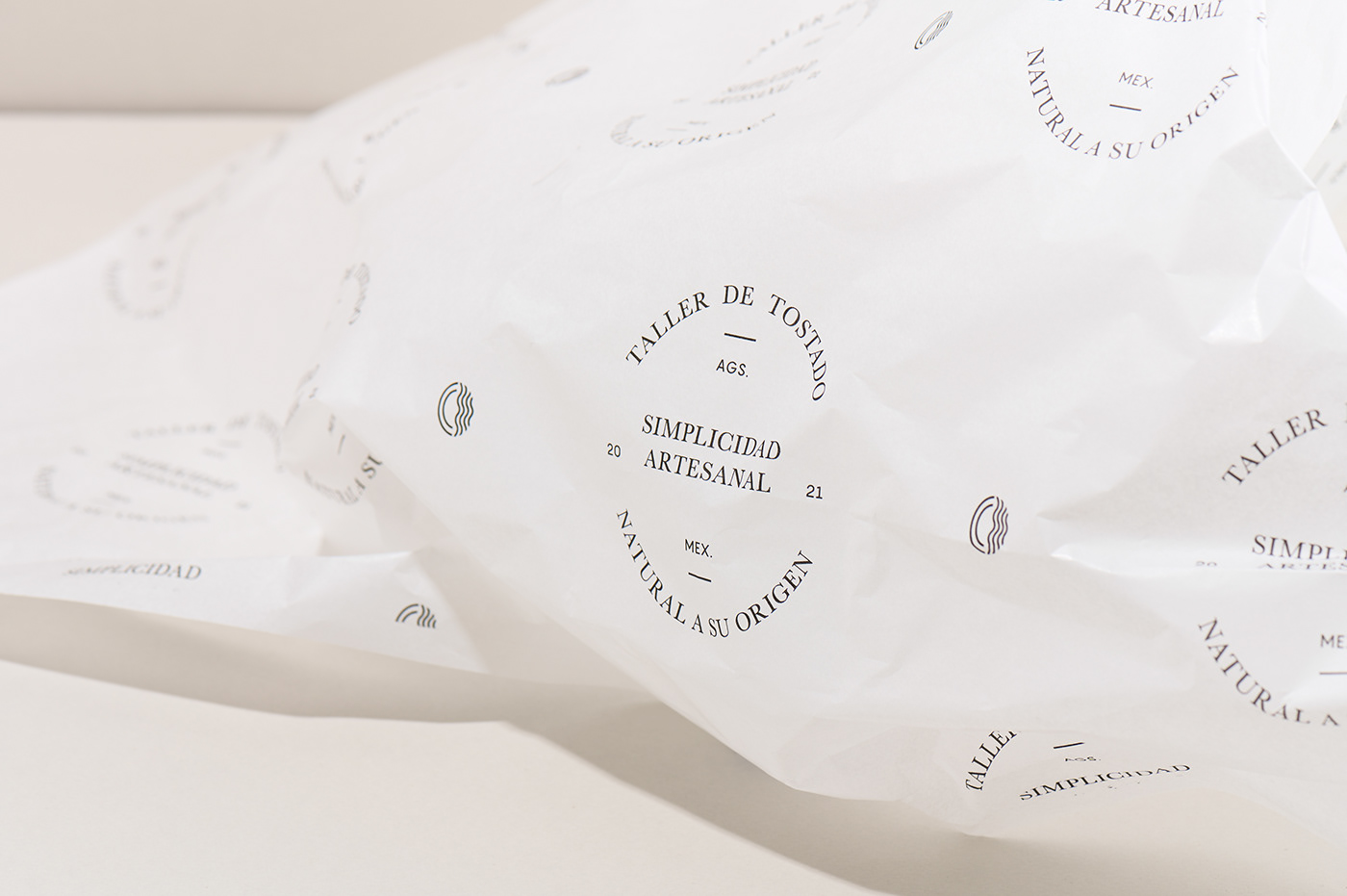
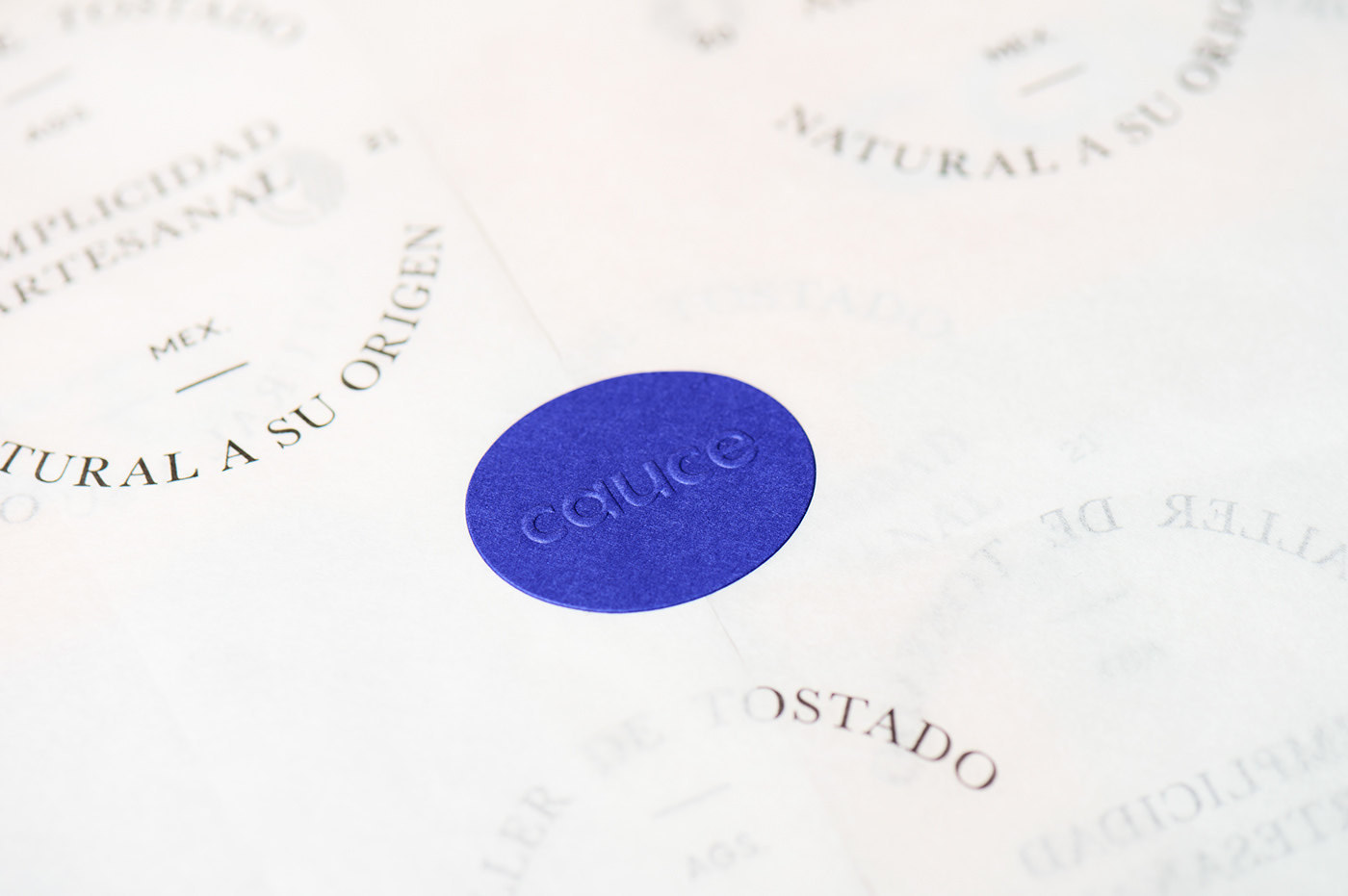
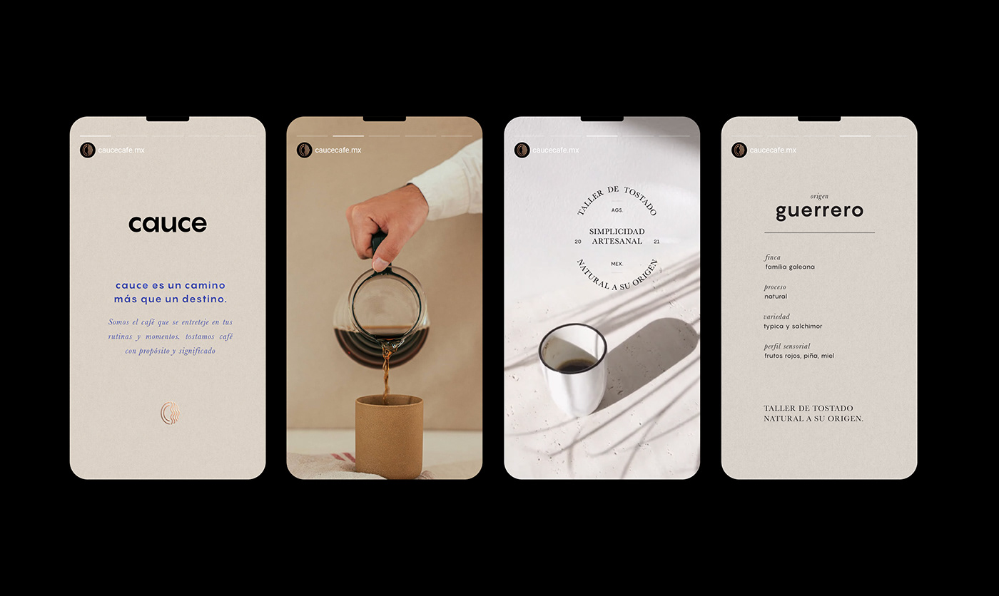
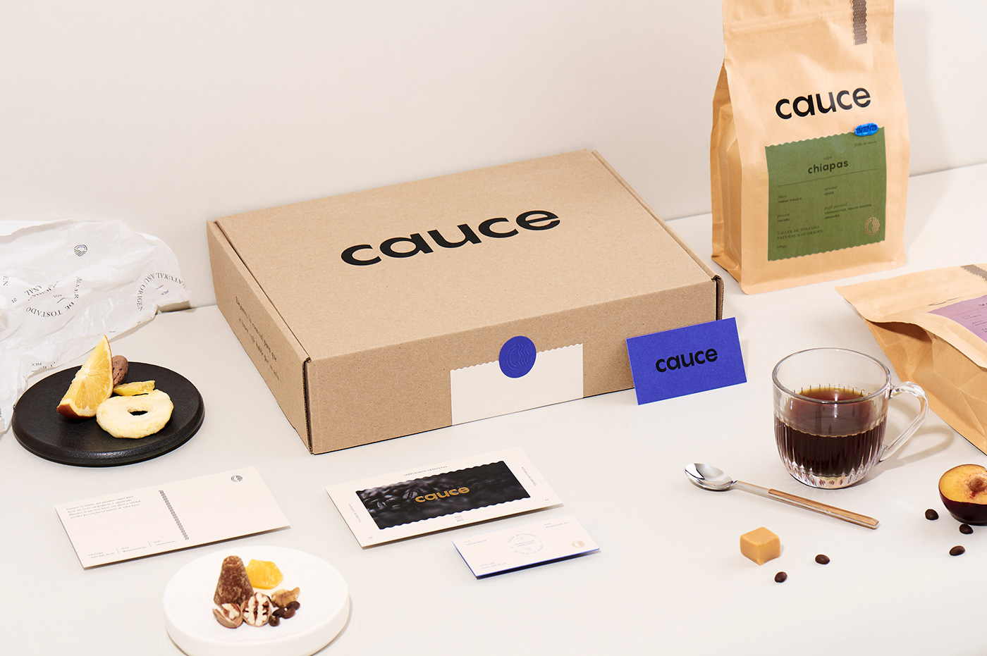
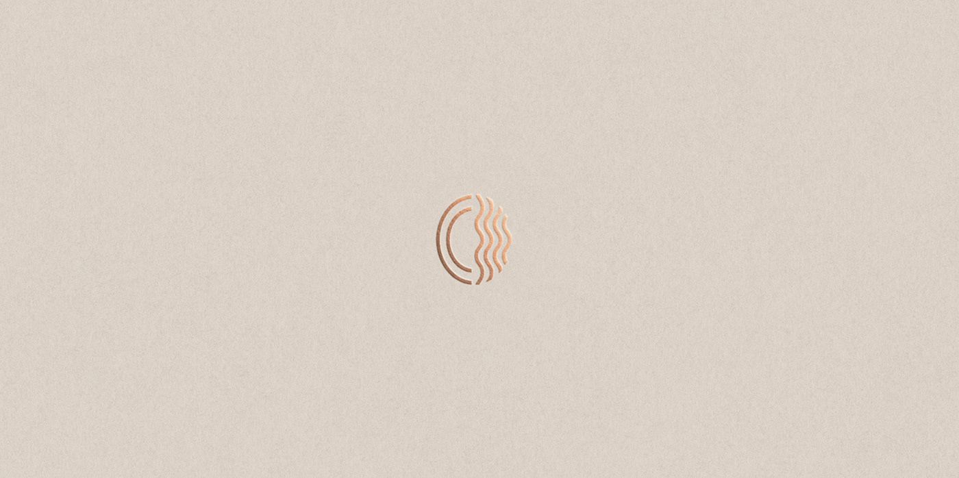
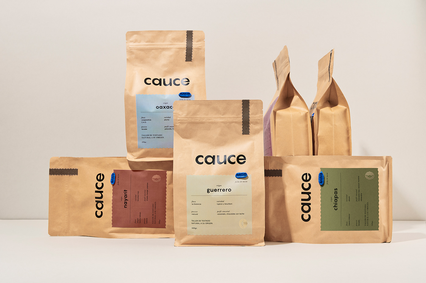
Cauce means 'river bed' in Spanish. The idea behind this brand name is to capture the natural flow of things, creating a purposeful and meaningful path where form follows function, expressing this sentiment through the design details. The packaging prominently features a wax stamp that takes the lead, clearly communicating the roast date. A minimal symbol joins the concept of water, coffee, and a letter C. The earthy color palette authentically reflects the origins of each coffee, while the typographic system embodies minimalism, emphasizing moderation and purity in design. We developed Naming, Brand identity, Packaging.
cauce — taller de tostado natural a su origen.