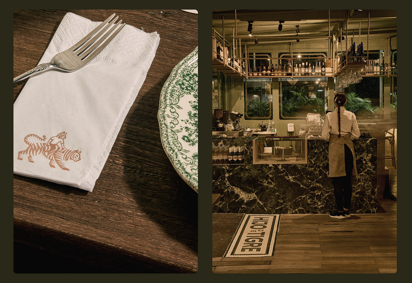
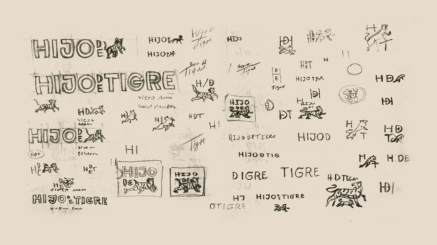
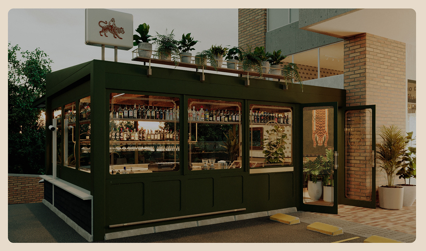
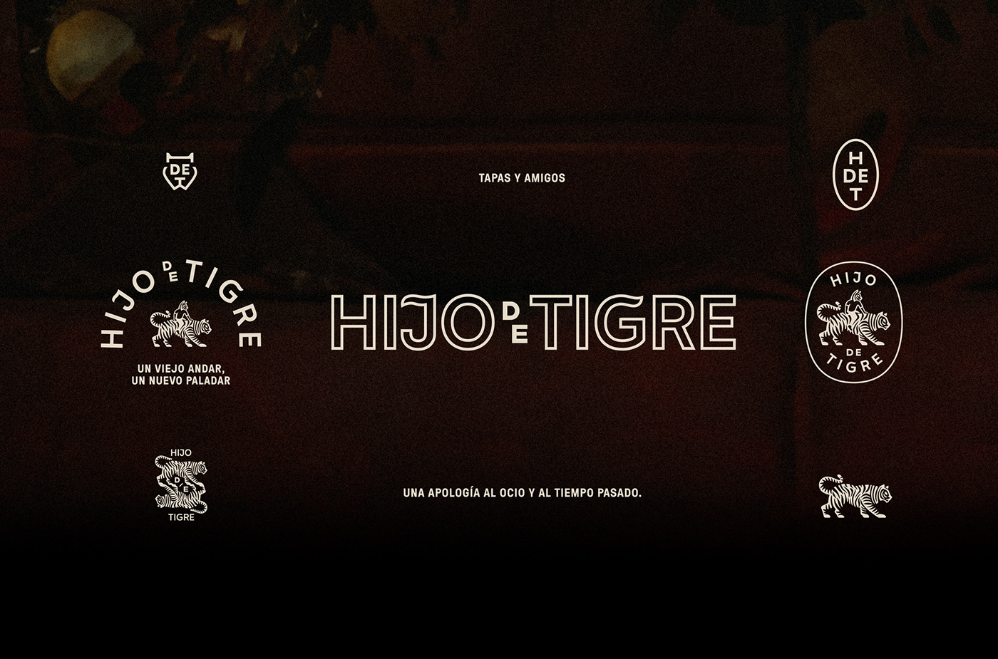
We recently created the brand identity for a restaurant and wine bar in Medellín named Hijo de Tigre. Interestingly, this name ties into a common Colombian saying, "hijo de tigre, sale pintado," which is akin to "like father, like son" or "a zebra can't change its stripes”.
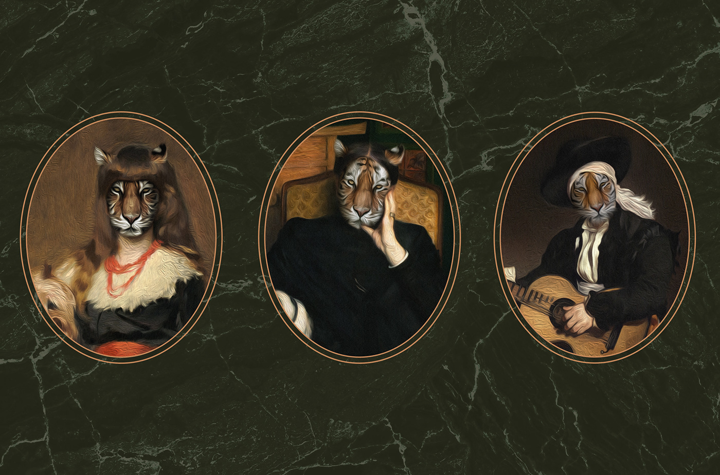
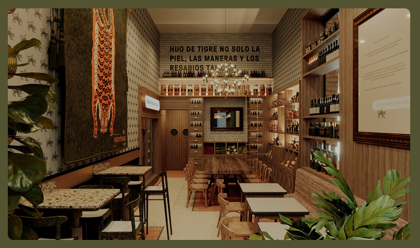
This saying carries a deeper meaning, symbolizing the inheritance of not only physical traits but also the traditions, habits and even the quirks of our predecessors. This concept played a pivotal role in shaping our manifesto and guiding the brand's narrative. As a result, the restaurant invites diners to relish the carefree moments, stories, and music of a bygone era, all while enjoying delicious food and drinks.
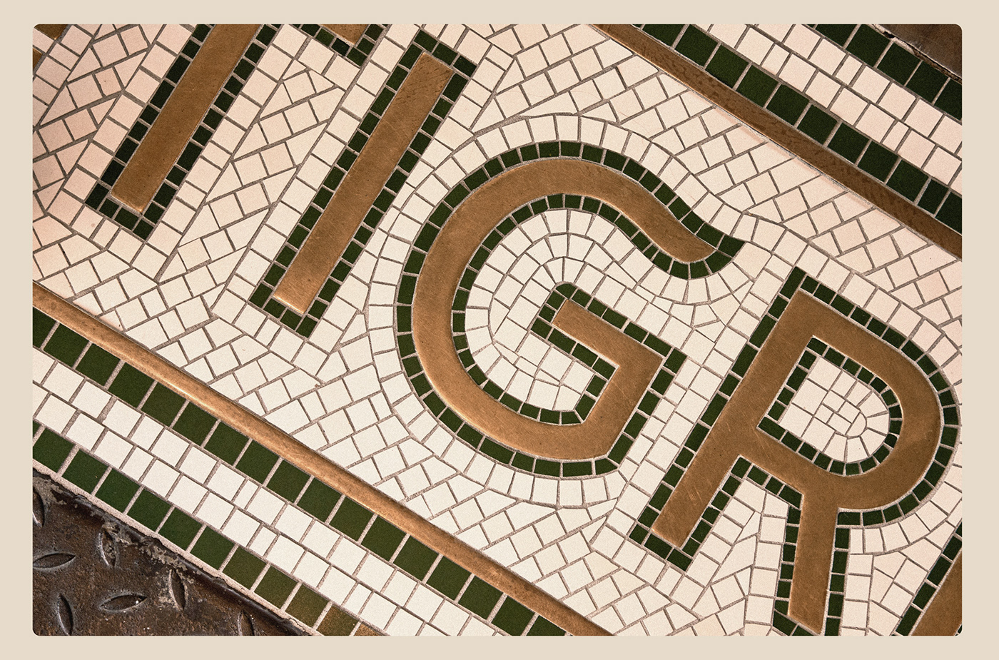
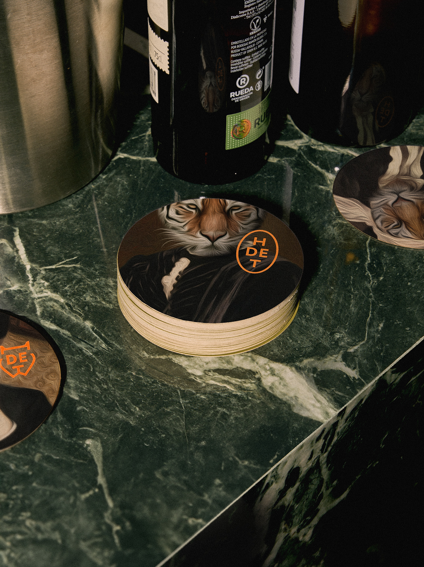
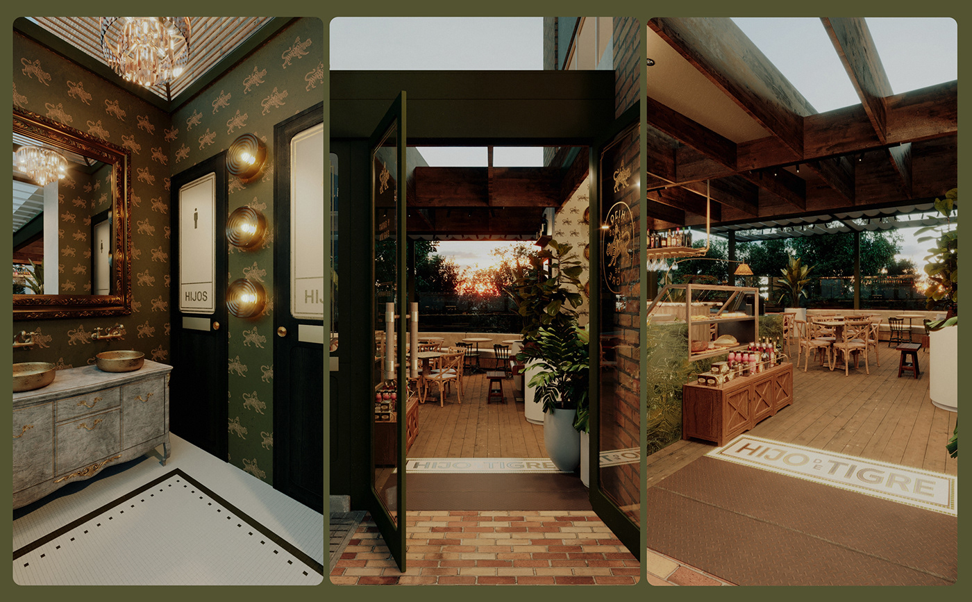
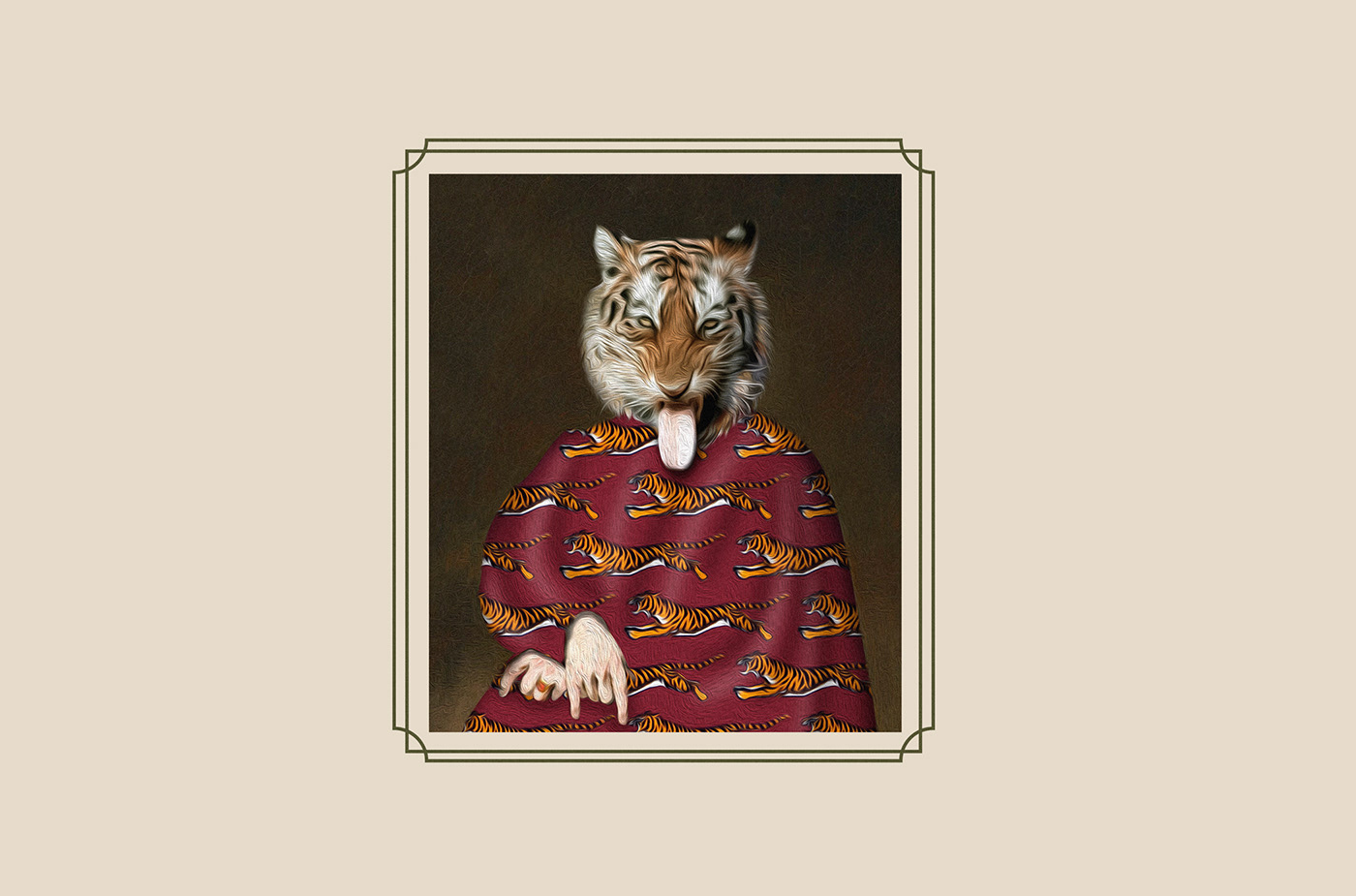
To create the logo, graphic system, and interior design (in collaboration with our partner interno), we drew inspiration from the 1920s, Spanish restaurant aesthetics with ornate decor, and the vibrant designs of vintage cans and preserves. Of course, all of the past brought to the present time.
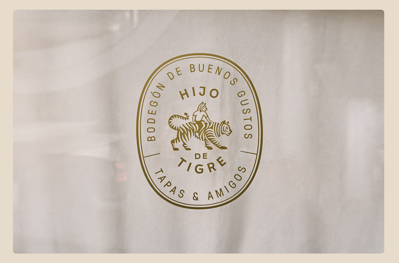
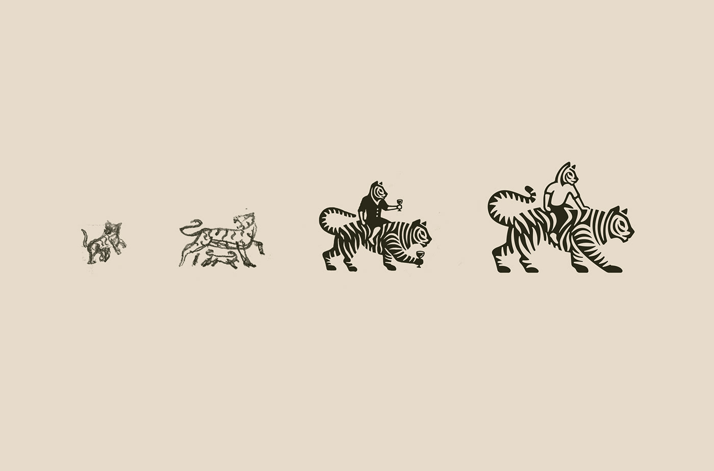
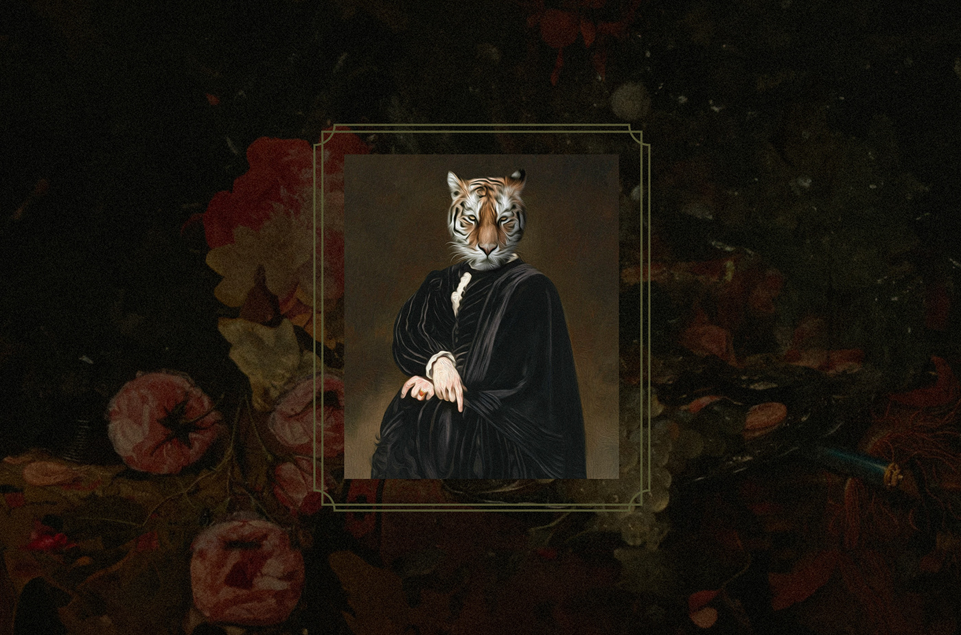
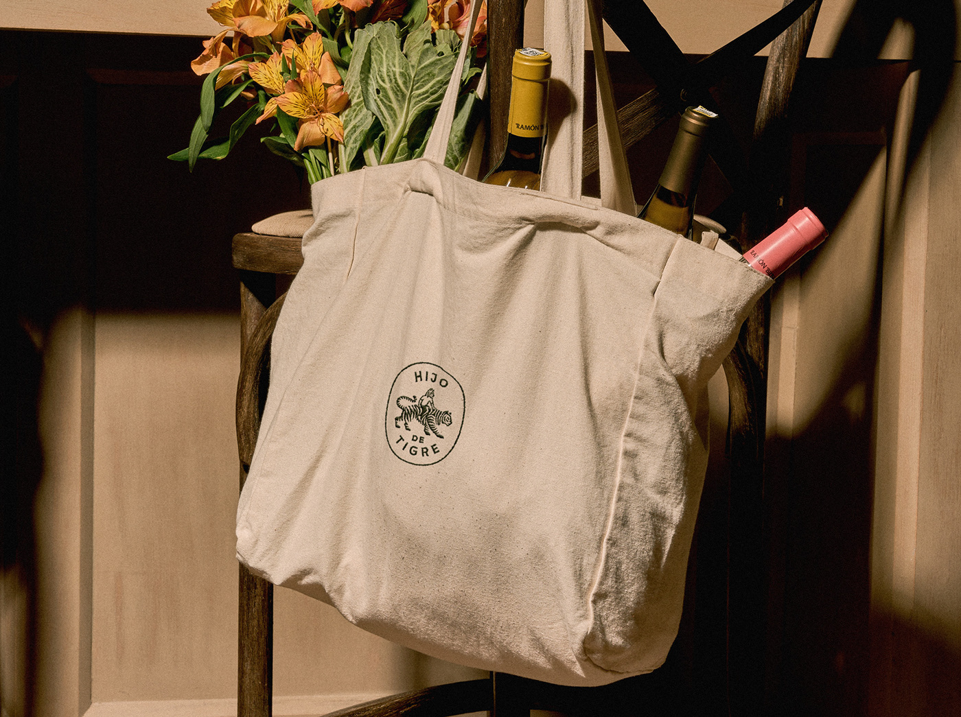
Lastly, the logo symbol itself is a straightforward representation of the son and the tiger, capturing the essence of the brand.
Project:
Brand Identity / invade team
Interior design / interno team
Photography: