We made the debut album cover for The Sweet Release of Death 'Bulb'. For the design we went back to our shared origins with the band. Their (and our) youth was formed by our hometown Spijkenisse, a city near Rotterdam surrounded by chemical factories. Our parents always said the same ominous sentence:
"If 'something' goes wrong, we're doomed"
Spijkenisse, an island surrounded by these factories and water only has two exits to the rest of the country. Two bridges that never have the capacity to bring even a small part of the Spijkenisse population to safety in the feared apocalyptic future where for whatever reason a chemical disaster would take place.
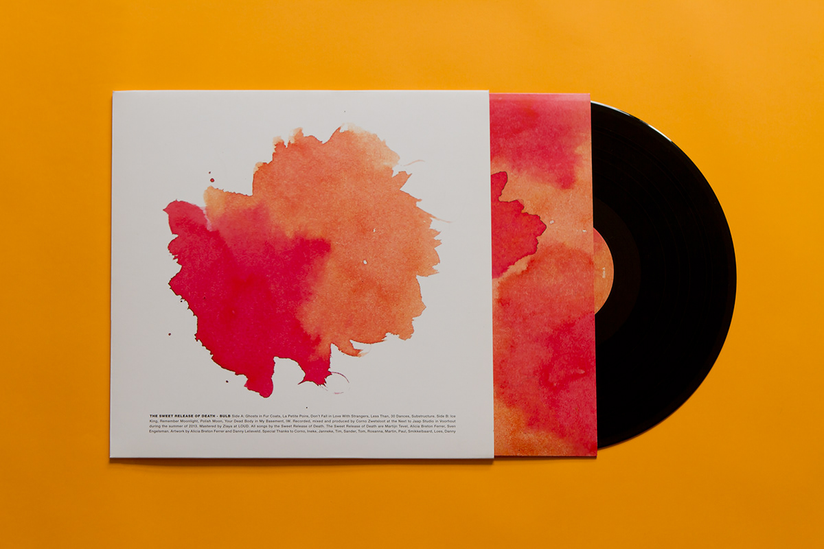
The albumcover is a comment to this fear, with an orange gas cloud as icon on the front (which is a reference to that one wednesday afternoon we all got trapped in school, because a chemical orange cloud hovered above Spijkenisse). An innersleeve where the orange sky is combined with the factory landscape of Spijkenisse. The cover is a nihilistic glorification of the city combined with a minimalistic in-your-face-let's-put-it-all-on-the-front-typography.
"If 'something' goes wrong, we're doomed"
Spijkenisse, an island surrounded by these factories and water only has two exits to the rest of the country. Two bridges that never have the capacity to bring even a small part of the Spijkenisse population to safety in the feared apocalyptic future where for whatever reason a chemical disaster would take place.
The albumcover is a comment to this fear, with an orange gas cloud as icon on the front (which is a reference to that one wednesday afternoon we all got trapped in school, because a chemical orange cloud hovered above Spijkenisse). An innersleeve where the orange sky is combined with the factory landscape of Spijkenisse. The cover is a nihilistic glorification of the city combined with a minimalistic in-your-face-let's-put-it-all-on-the-front-typography.