Brazzalab is an independent music label, born on the outskirts of the countryside of São Paulo, focused on boosting creativity and musical expression. Targeting Brazilian youth, many from underprivileged communities, it aims to be the bridge between expression and materialization, creating a collaborative and inclusive space where the often marginalized voices can reverberate their experiences, struggles and identities.
The brand offers beat creation, music production, and distribution services, seeking innovation and original sound. Its values lie in collaboration, originality, and inclusion.
The label, with its educational and inclusive approach, aspires to fill the blanks between expression and opportunities for new talents, radiating creative energy and providing belonging and identification through music.


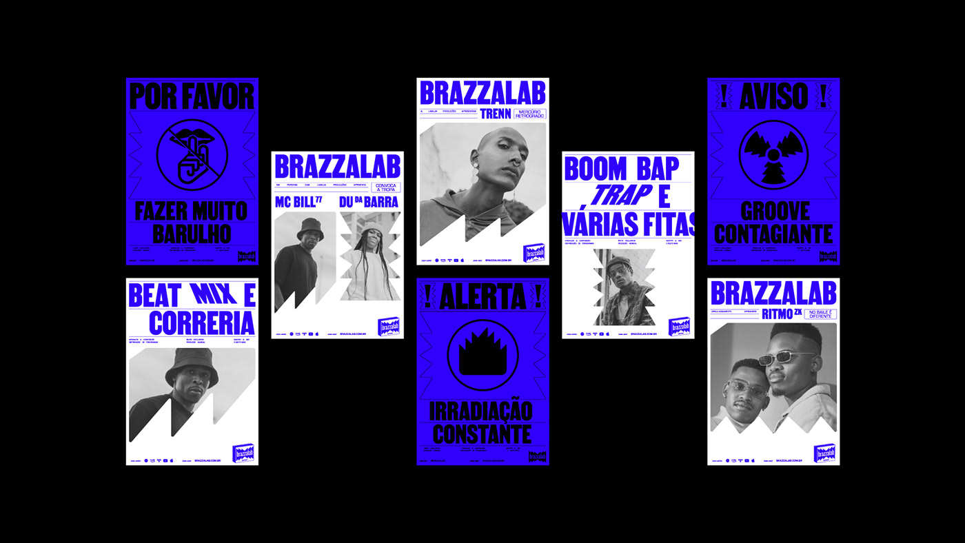
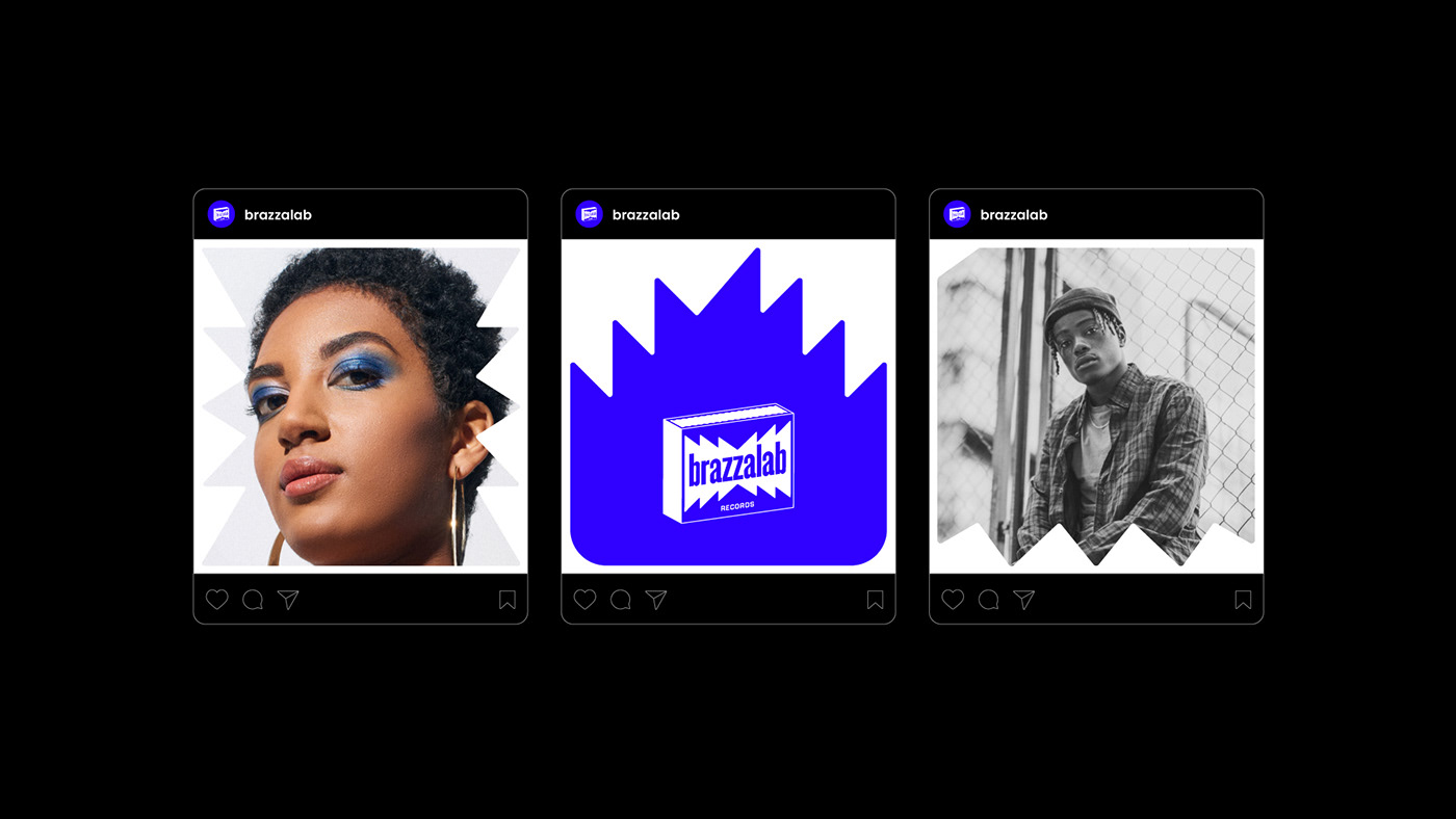
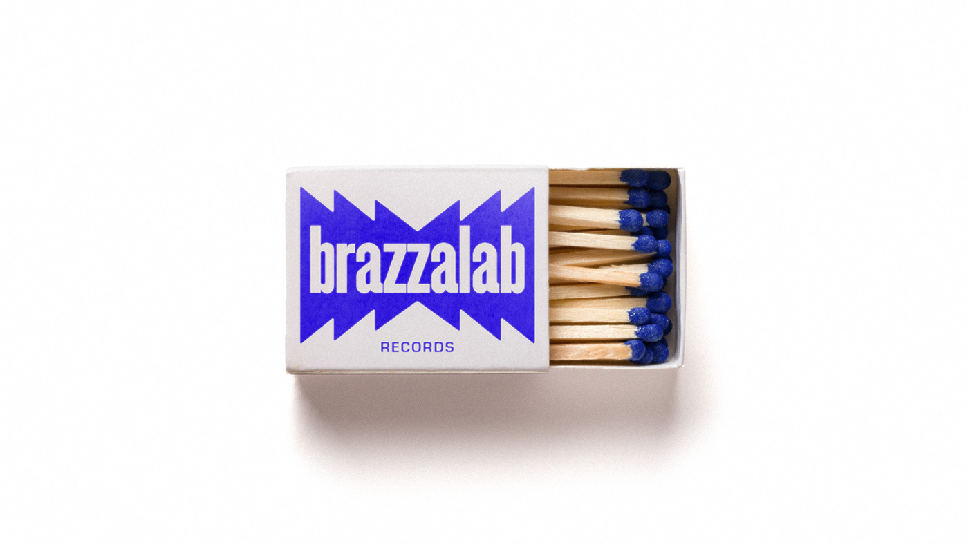
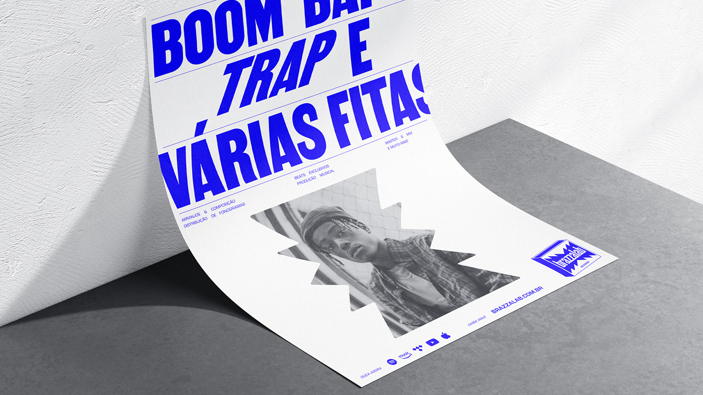
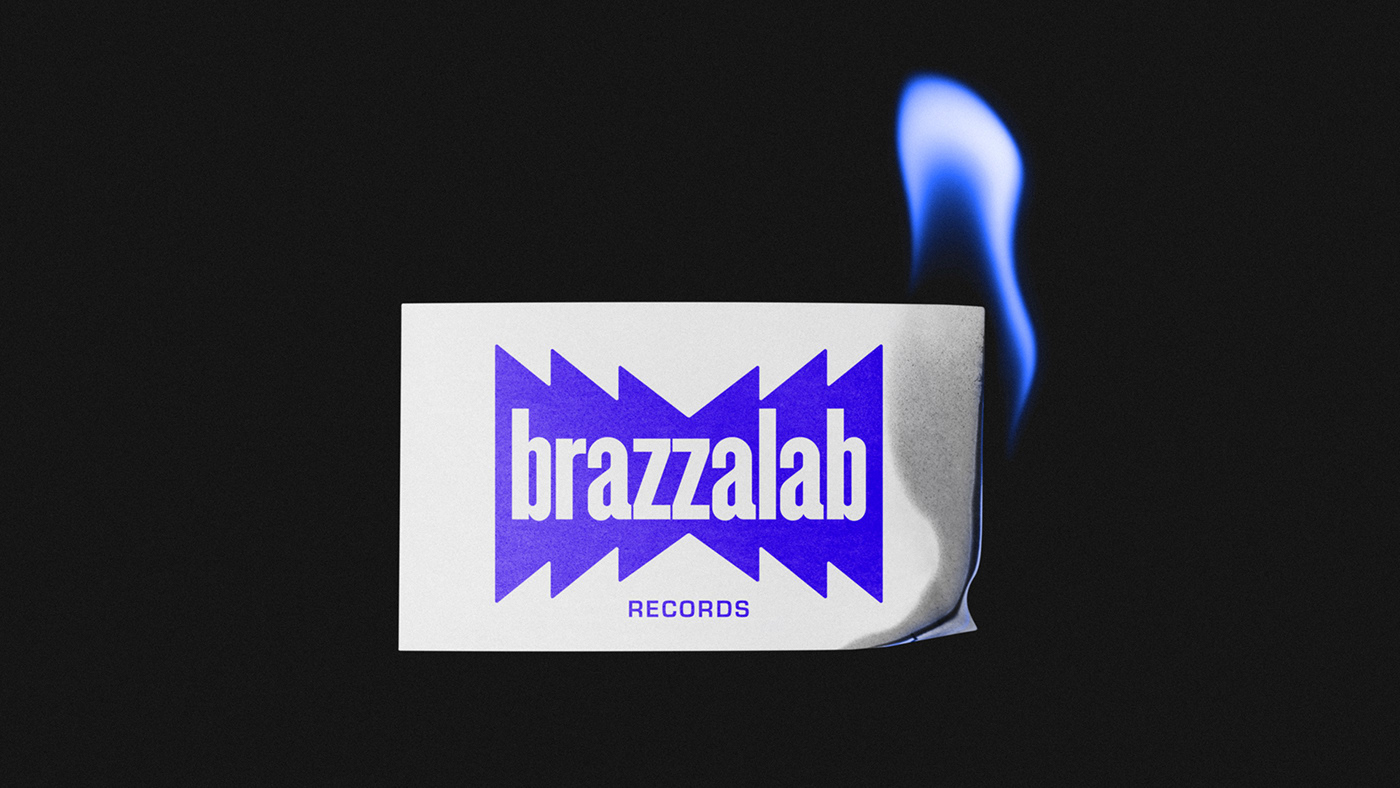
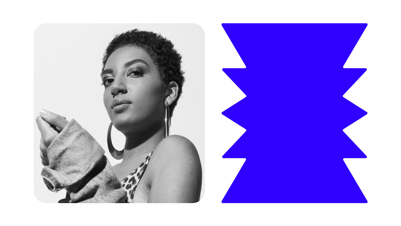
The Brazzalab logo is inspired by the matchbox, a symbol of simplicity and the ability to incite action. The box represents not only functionality but also improvisation and adaptability in music, serving as a substitute for traditional percussion instruments. This adaptability reflects the "do it yourself and do it now" spirit that characterizes the brand.

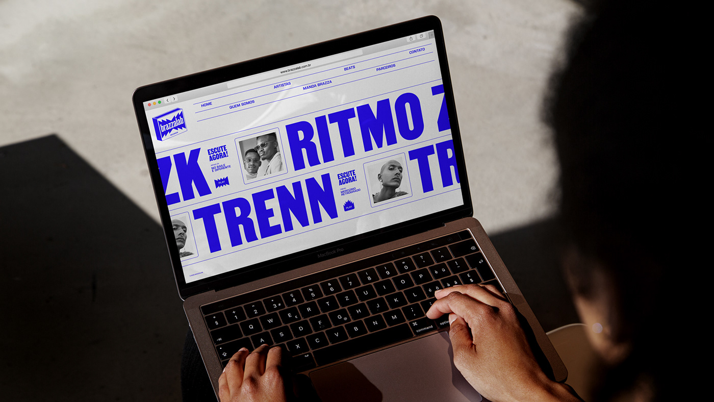
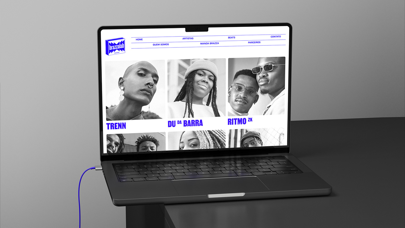
The blue flame is known as the hottest, carrying a substantial amount of concentrated energy and leading to notably efficient and complete combustion. The chosen color needed to offer excellent readability on screens, aligning with Brazzalab's digital emphasis, while reflecting the brand's vibrancy, pioneering spirit, and its metaphorical outreach into spaces formerly reserved for the privileged. The white represents a transformative, creative lab setting, bridging the gap between expression and the unfolding opportunities for emerging talents.
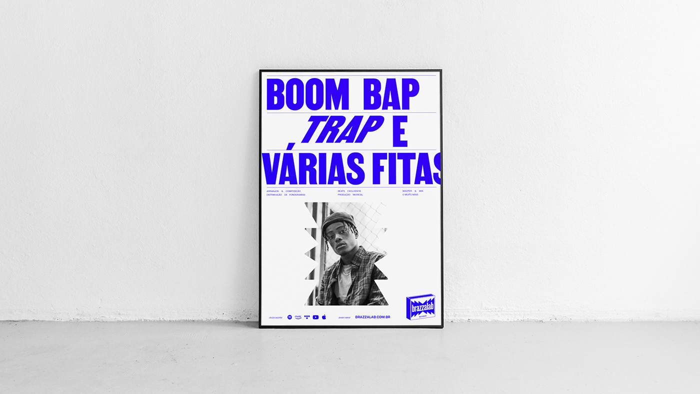
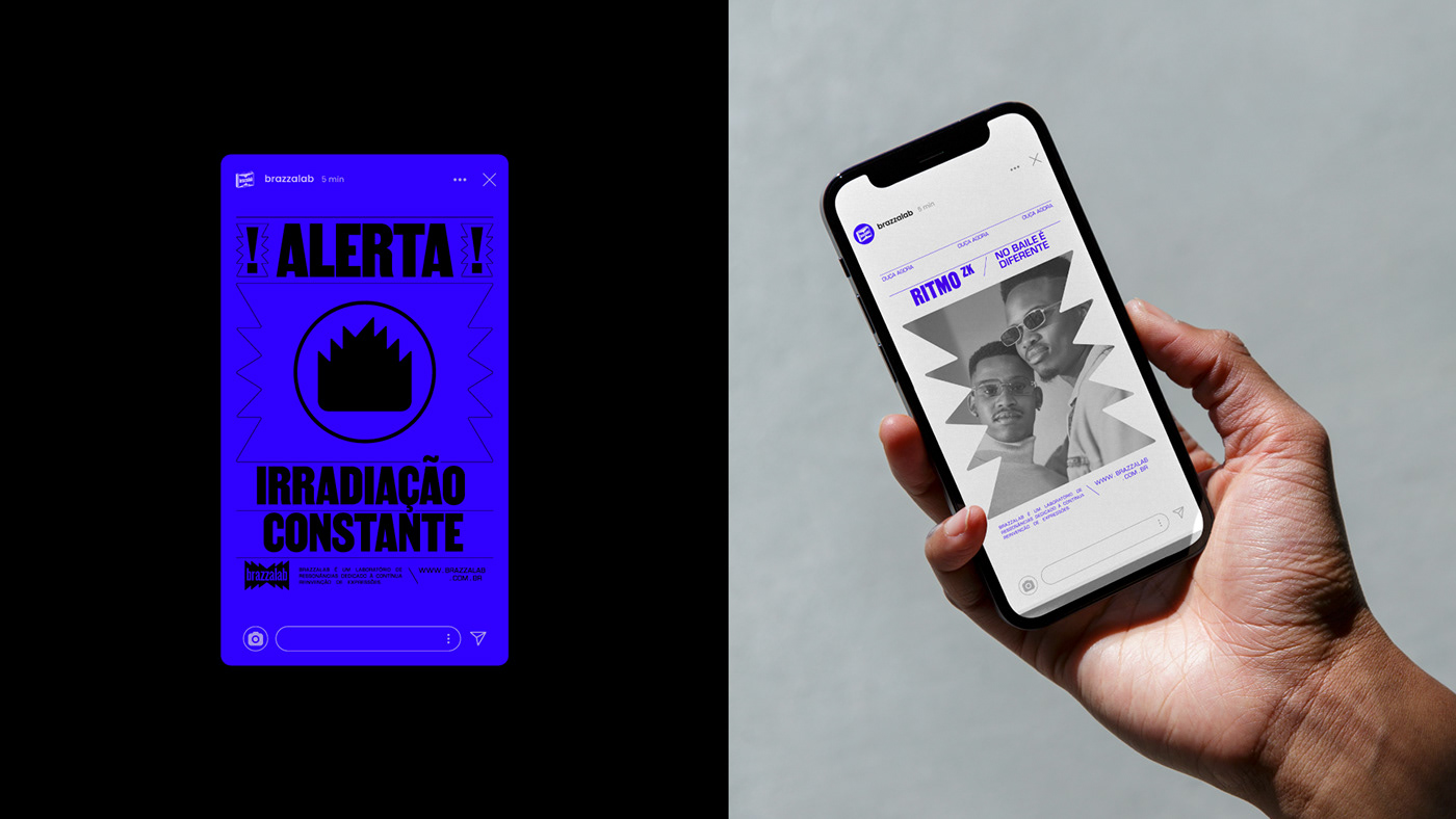
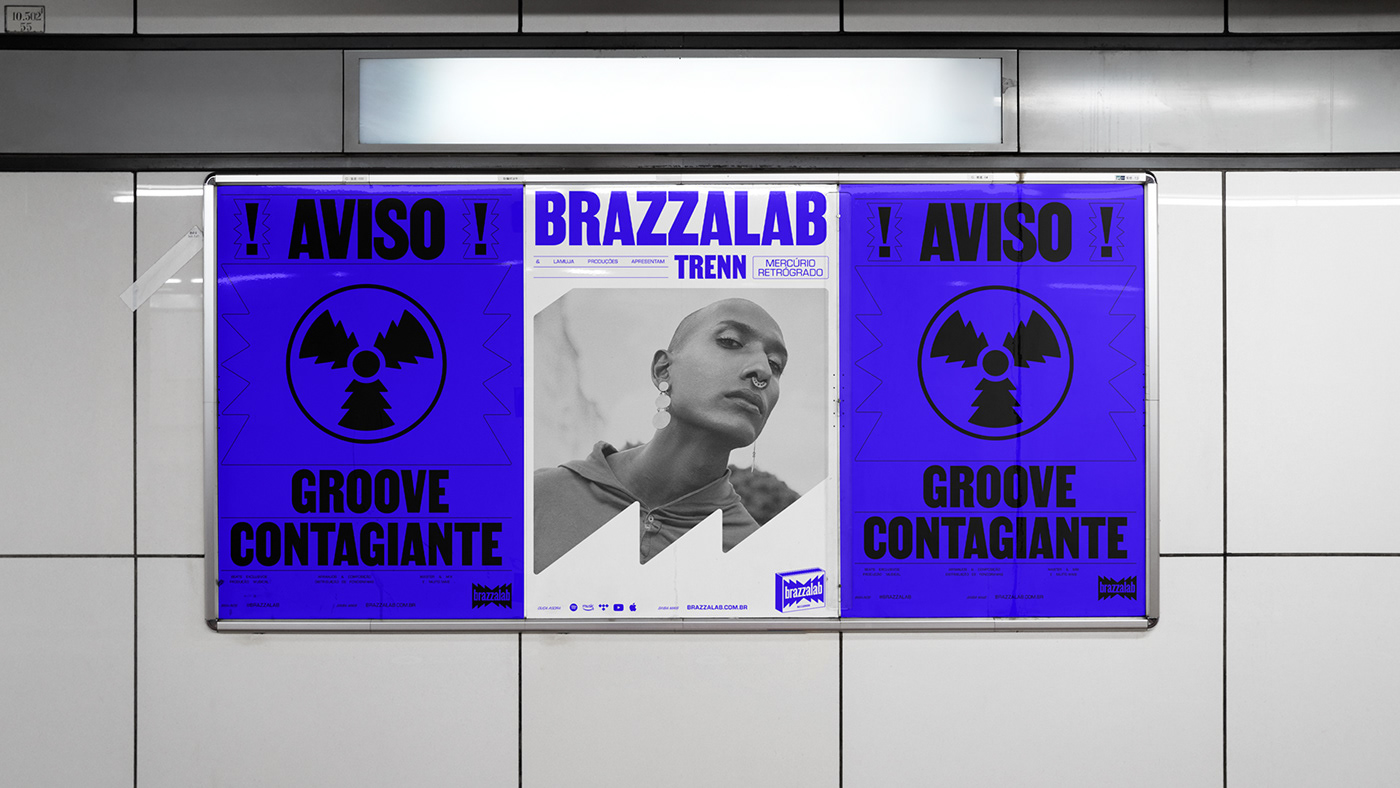
The layout's text formatting was inspired by a scene iconic to peripheral regions: objects hanging from electric wires. These wires symbolize the connection and energy inherent in Brazzalab’s artists. The lines contribute to creating movement, as does the spacing between the letters, rendering the overall design more dynamic and harmonious