


SXSW Film & TV Festival 2023 Opening Titles
Creative studio, Coat of Arms has collaborated with SXSW on opening titles since 2018. It’s a favorite partnership of ours. We’re grateful to the SX team for trusting us creatively and being a dream client.
The 2023 titles pointedly celebrate the SXSW logotype through abstract 3D lettering and multiple easter eggs from recently screened SXSW films, like a plush rainbow, a black snake, googly eyes, an astronaut, and a reference to an Austin, TX landmark. The opening titles played before every screening at the 2023 SXSW Film & TV Festival.

Concept + Script
Having done multiple titles for SXSW, we wanted to do something unique this year. Our first two years we created different titles for each of the main genres at the film festival. Last year we did an exquisite corpse-style sequence with altering styles and environments. So we wanted to simplify the concept slightly by focusing on the Festival’s logo without losing the excitement audiences enjoy from seeing easter eggs throughout.
Here’s a series of some of our work over the years:


With past designs in mind and with an interest in pursuing a fully 3D concept, we presented the concept described here:

SXSW chose this concept from our concept development presentation and asked that we include easter eggs to film's that played at their festival in 2022, just as we had done in prior sequences. We were happy to oblige.
Design
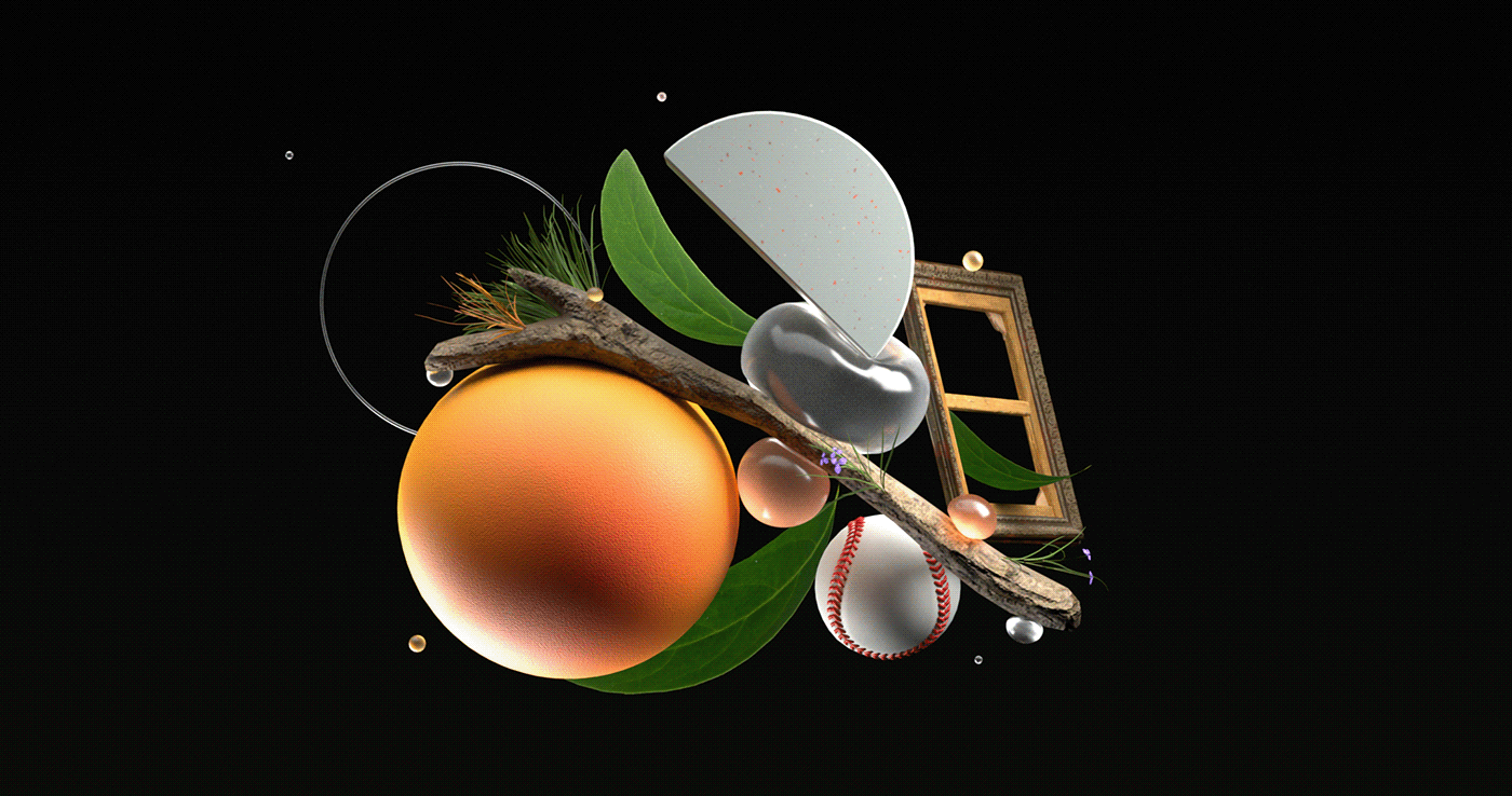
For the first “S” in our titles, we chose to represent documentary films. Some SX documentaries we hid in this lovely S include Mama Bears (rainbow), Facing Nolan (baseball), Tony Hawk: Until the Wheels Fall Off and Skate (skateboard), The Thief Collector (empty canvas), and Master of Light (paint & brush). We also added some nature elements for all the science/nature docs from past festivals like Human Nature and Wild Life.
Here are some of Wendy Eduarte's early explorations (including the image above):


When speaking with designer and animator Wendy Eduarte, she said her section of the titles “were designed around the concept of a deconstructed letter where organic meets everyday objects. I wanted to bring a tactile, magical realism to the design so that elements that would not normally interact with each other felt harmonious."
Final approved frames:


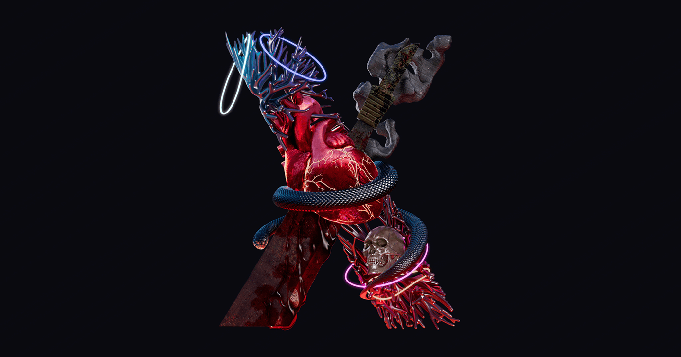
For the "X," we chose to represent some of the great thriller and horror films that played at SXSW recently. The film, "X" from 2023 was included, as were references for No Looking Back (snake), Bodies Bodies Bodies (glow bracelets), Gone in the Night (Blood), and Slash/Back (machete).
Here are some of designer and animator Peiqing Lu's initial sketches:


When speaking with Peiqing about the process she said, "We wanted it to represent the midnighter’s section with a spooky vibe. The center of the X is a metallic heart penetrated by a rusty knife, while a black snake crawls up the branch and wraps around the heart."


She continued, "The motion design reveals elements intertwining and interacting with each other organically so that they ultimately blend into one moving sculpture." Here is an early animation preview of Peiqing's progress:
According to Peiqing, "A major challenge in building this scene was the blood coming down the blade. It turned out that having a real life reference was crucial in figuring out the pattern of the fluid. But please be assured that no real heart was stabbed. A sponge soaked with water made a great substitute!" Check out her final frame:
For the second "S," we wanted to capture some of the comedies that have played recently at the festival. Designer and animator Steve Savalle began working with 3D objects to represent each of the films referenced; Everything Everywhere All At Once (googly eyes and receipts), I Love My Dad (text message), Linoleum (space helmet), Spin Me Round (food ingredients), The Lost City (ruins and sequin dress), and The Unbearable Weight of Massive Talent (hat).
Here is Steve's early clay render and several frames experimenting with color, lighting and placement:


In an early animation Steve developed the best approach for motion while ensuring legibility for the overall composition:
This is a final export from one of his close ups. Here you're able to focus on the fabric simulation and one of the text messages from I Love You Dad. Designer Chris Moberg fine-tuned the fabric animation while Steve finessed all the other fun elements in frame.
For the "W," designer and animator Chris Moberg wanted to use animation and asset movement to fill the space and reveal the letter. He shares this about his process:
"With so many great movies to represent, the first challenge for the W was trying to choose elements that could work together. The result being an astronaut falling from some bricks he may have been holding onto, while getting tangled in duct tape and a microphone cord. The duct tape was actually the element that ended up “tying” it all together. Once the composition was set up, it was time to tackle the animation."
Chris continued, "this was followed quickly by the reminder that just because it works for a still, does not mean it will work in animation. The cloth simulation settings that worked for initial placement of the tape all had to be redone. Even the settings for each piece of tape had to be adjusted as there wasn’t one single setting that would work for all scenarios."
The W embodies narrative films from SXSW and those included are A Lot of Nothing (duct tape and lawn chair), Apollo 10 1/2 (Spacesuit), Atlanta (microphone, record with "A"), Millie Lies Low (brick wall), and Pirates (records).
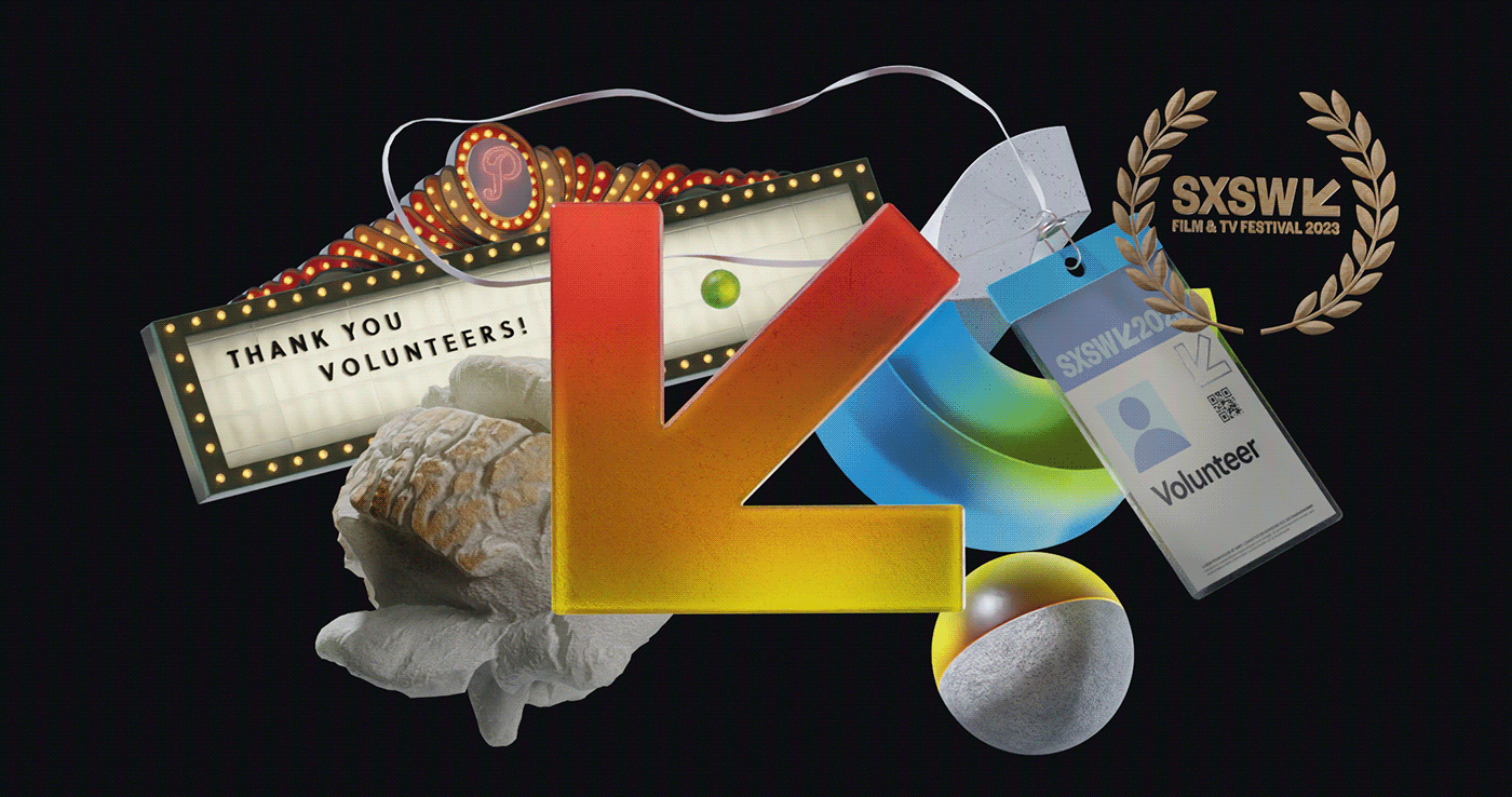
Finally, we needed to represent the trademark arrow that points south west from SXSW's logo. Mohamed Basil dove in with some initial explorations for composition in Blender:


We wanted to tie the arrow to more SXSW specific experiences or landmarks, so we included a volunteer film badge, popcorn, the SXSW laurels, and the Paramount Theater Marquee.


In developing this section, Mohamed said, "My aim was to create a design that captures the vibe of SXSW, especially the cinema part, and give props to the hardworking volunteers who make it all happen. The main design elements are the volunteer card and the classic Paramount theater marquis, with some added pop and color to show off the festival's liveliness and artistic spirit. This frame is a shoutout to all the volunteers who put in the effort to make SXSW totally awesome!"
Keeping with the calm and smooth animation direction of the rest of the piece, Mohamed began developing some motion tests:
He slowed things down a pinch more and began adding light and texture:
Here is the final design for the trademark arrow scene:
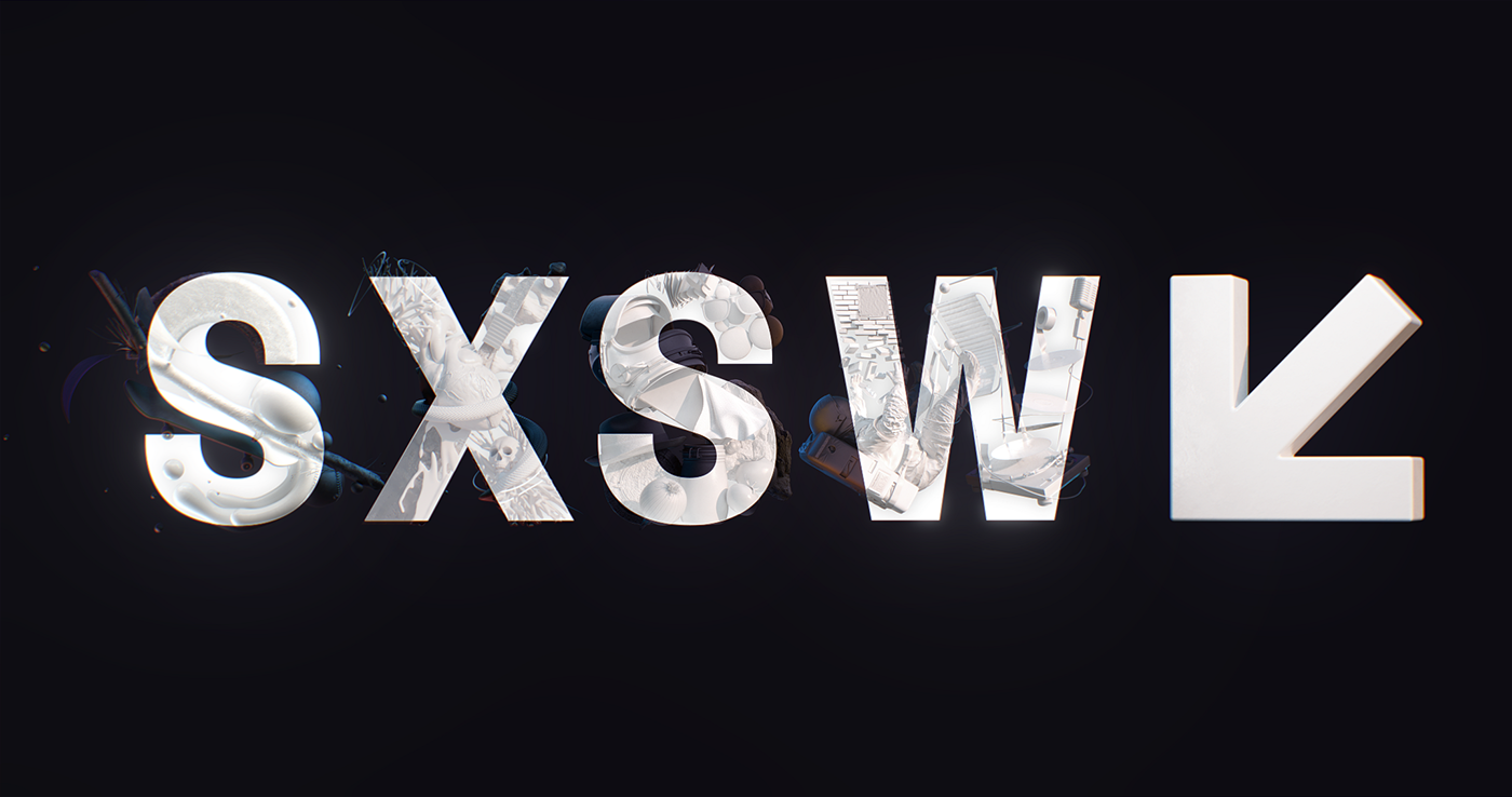
We wanted to rebuild the SXSW logo with our easter egg laden versions and ultimately reveal the true logo at the end. Initially, we struggled to align the letters spatially so that the true logo was easily seen. We had to play with kerning. Ryan had the idea of giving space to each letter and then having them slide together to reveal the logo.


The slide didn't feel like enough after we all saw it. So, Chris suggested re-rendering all letters in greyscale with subtle lighting to show off sculptures from each letter. Then he added a flicker to each letter to lead up to the reveal.
As animation for each letter was refined, Ryan Butterworth worked on title and layout for the copy. He explored several styles of typography, blocking, gradients, and colors.


Ultimately, SXSW selected their favorite style for the copy, and Ryan applied it to all sponsor logos and type throughout the opening titles:


Once our visuals were near completion and locked editorially, we sent the locked animation to Anthony Parsons to begin work on music and sound design. During the process he came up with several interesting options musically, while building out the soundscape with design and effects. One of his early drafts for music was really nice. He adjusted the music to represent each letter's genre:
While we all loved the changing styles and smoothness of each musical transition, we ultimately agreed that we needed a bit more energy for the opening titles. The SXSW team likes the opening titles to build excitement and joy for a grander audience experience. After additional explorations Anthony landed on a style that mixed subtle musical changes with sound design that was able to take a bit of the lead.
We want to thank SXSW and our entire creative team for a seamless and enjoyable creative experience. We hope you enjoy the final titles here!


