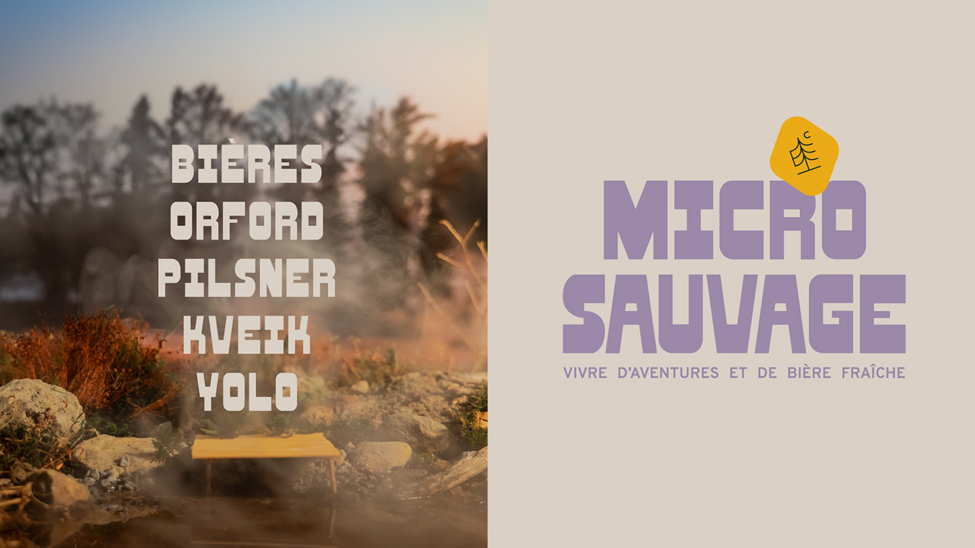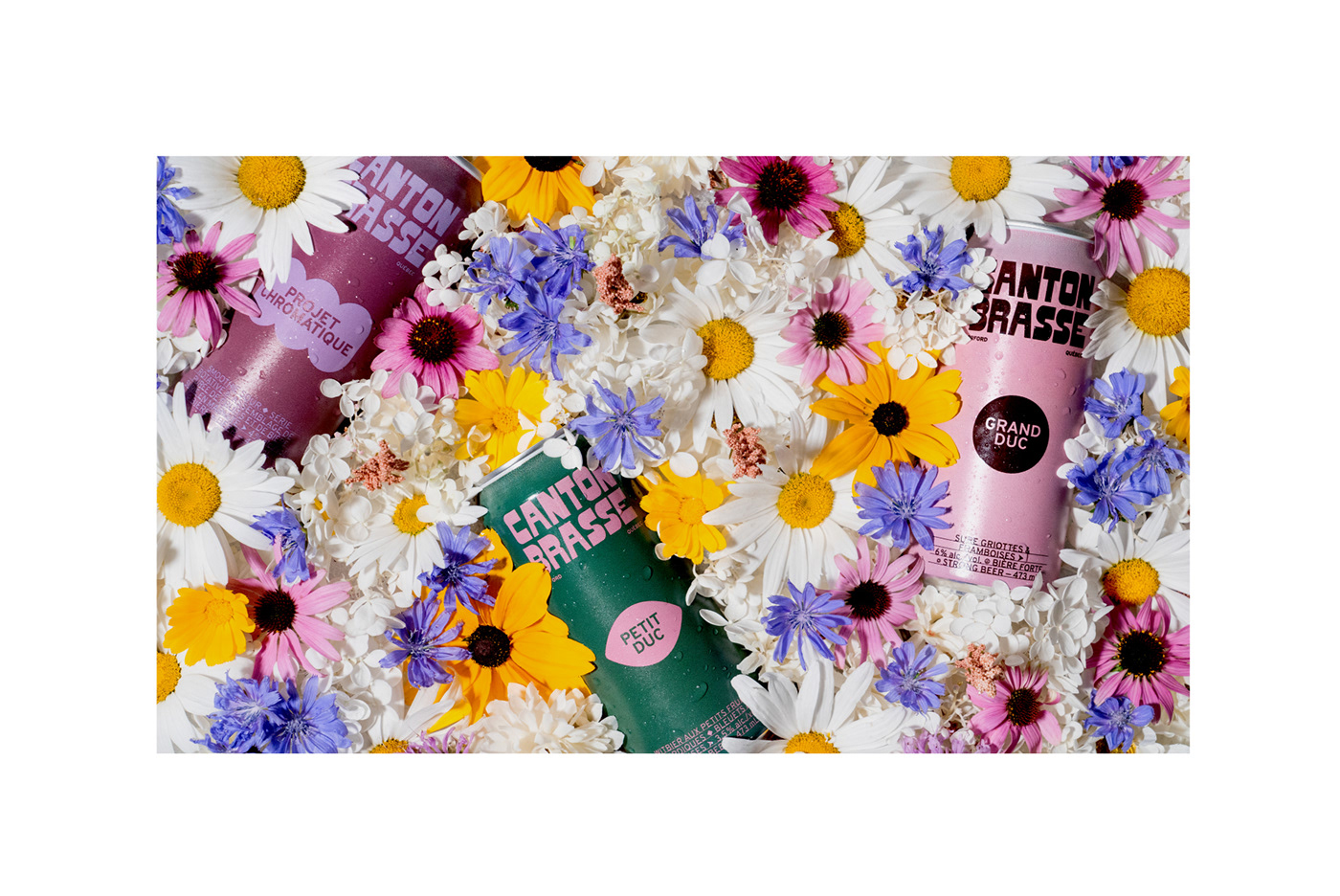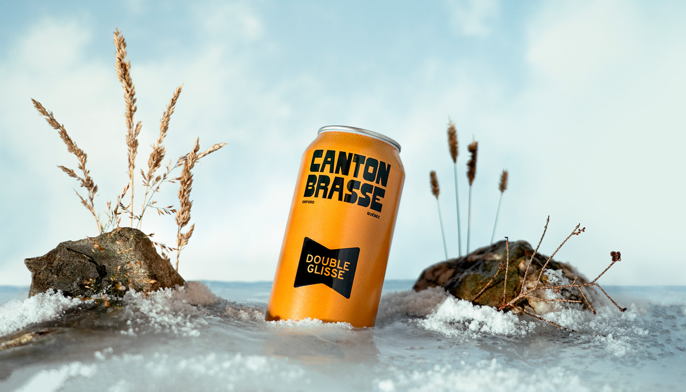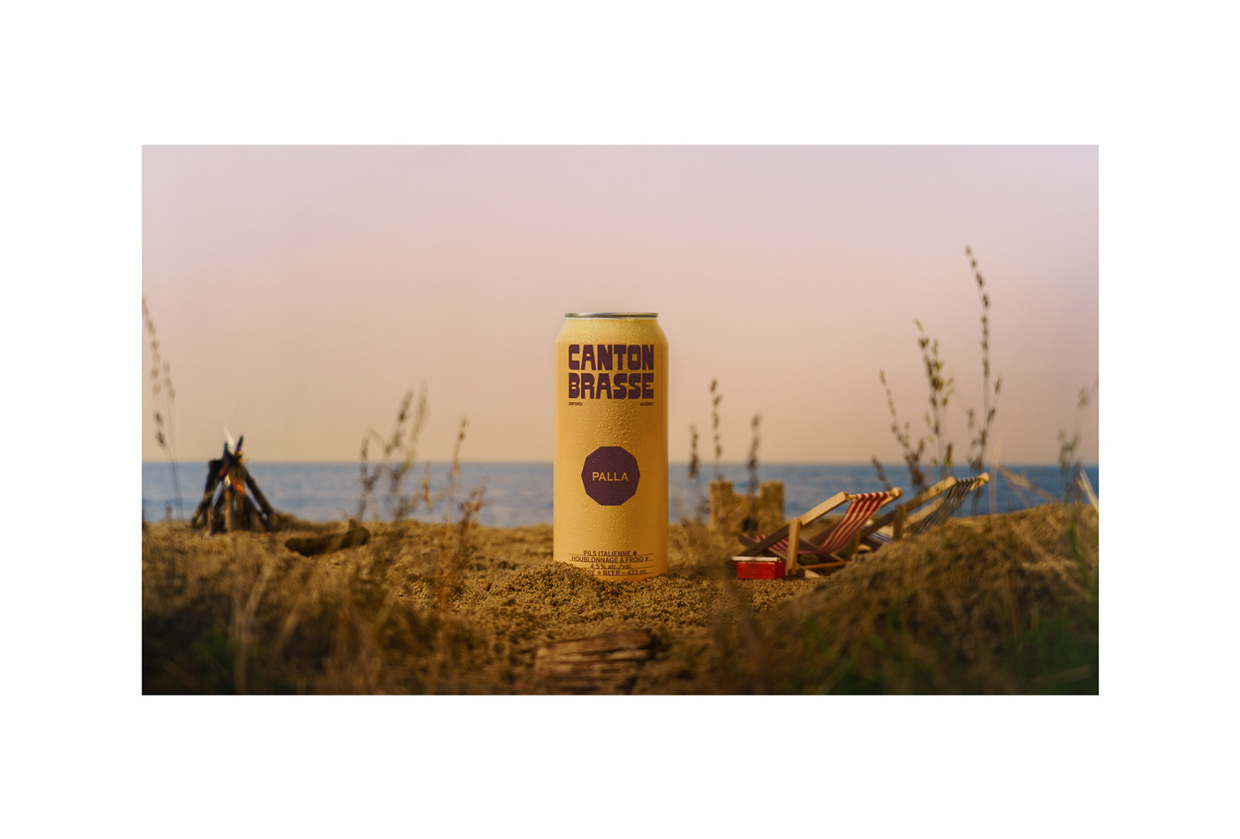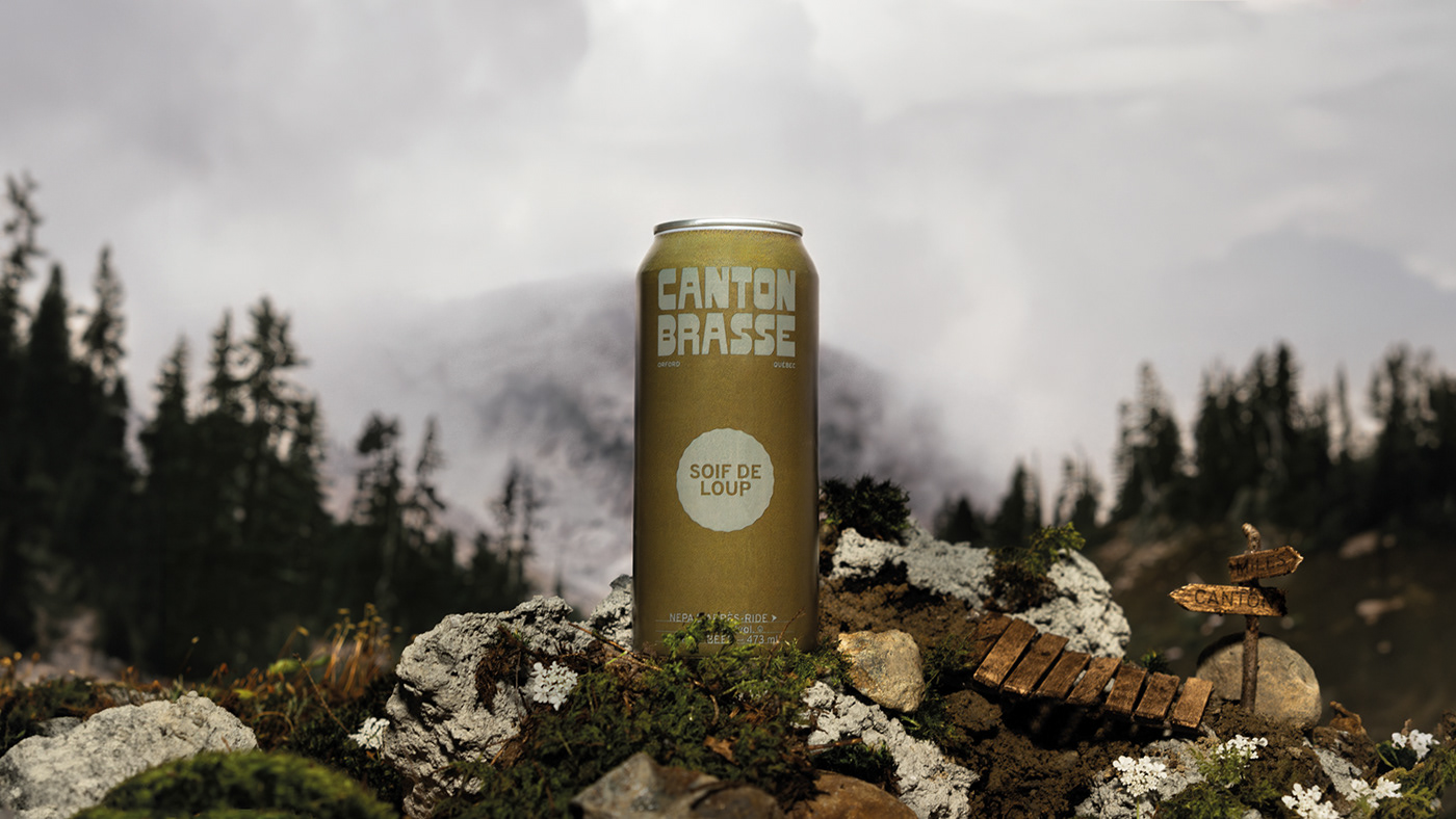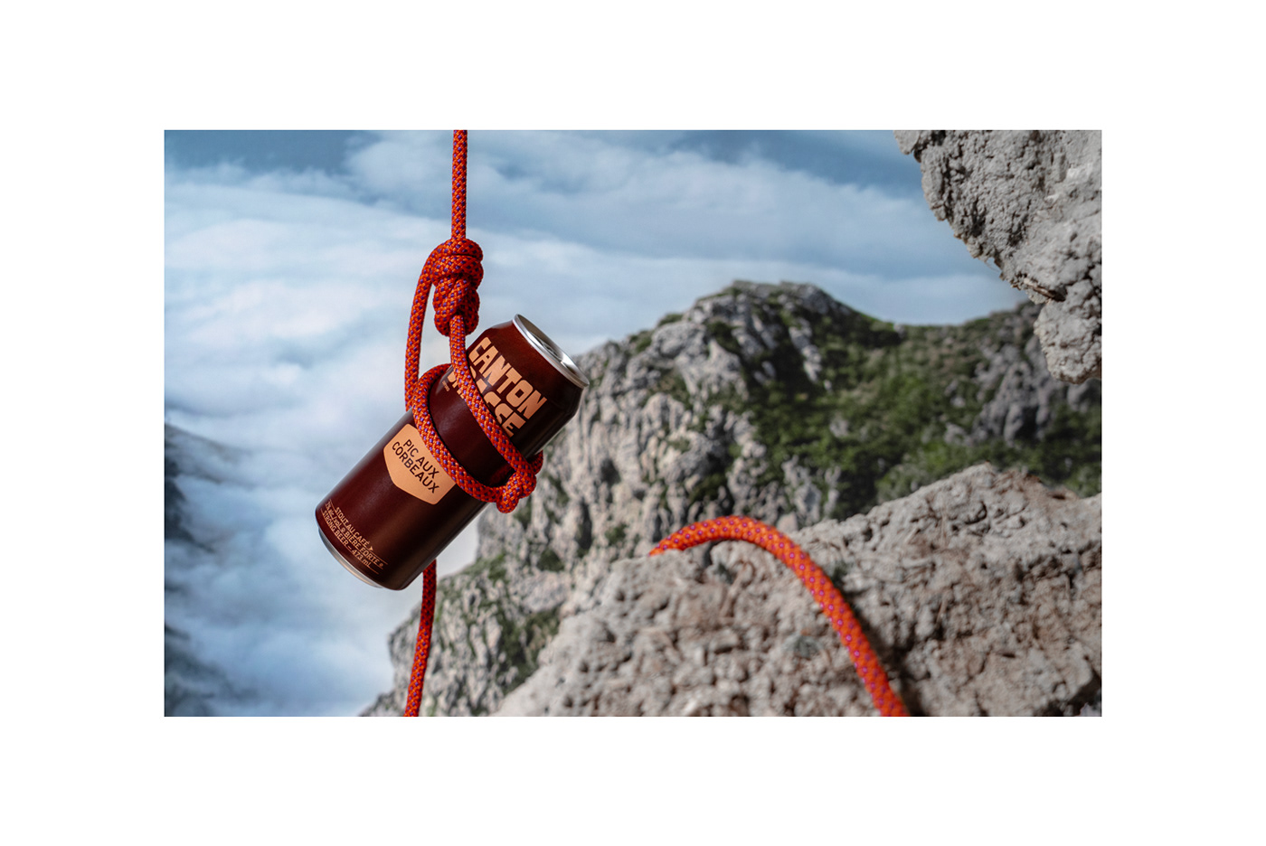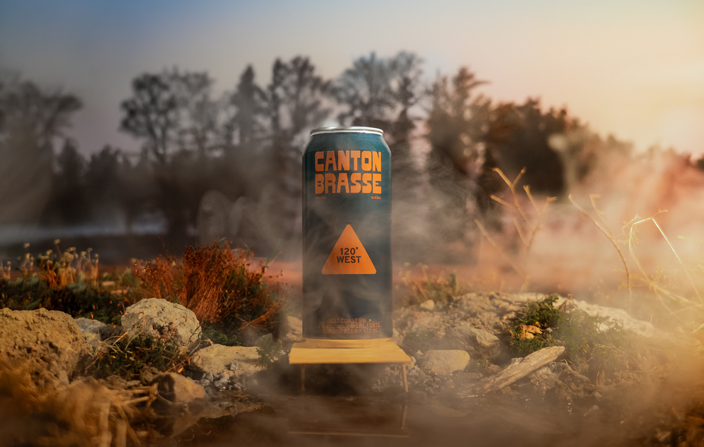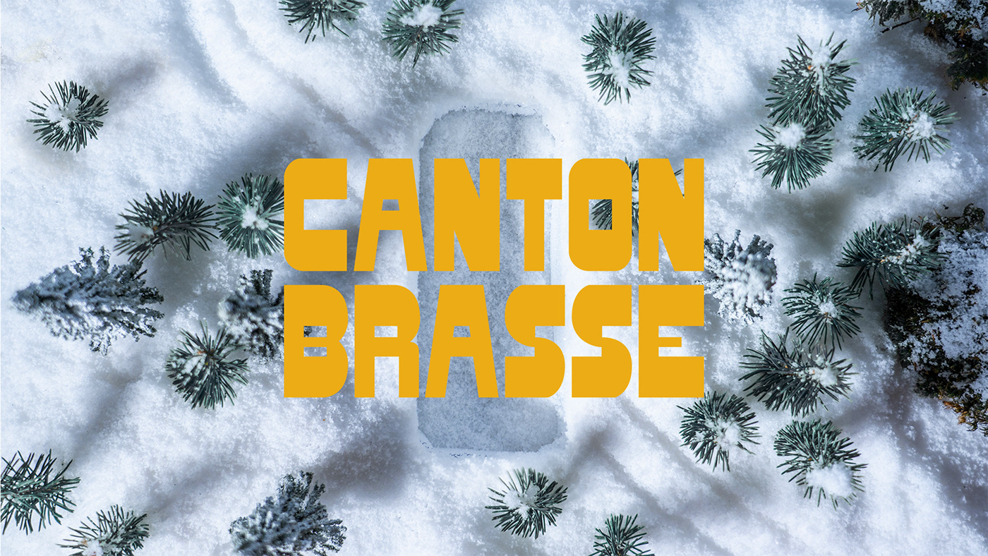

The Canton Brasse microbrewery, located on the edge of Mount Orford National Park, contacted us to redefine their visual identity. After a few years of activity, their intentions have become clearer: to become one of the most visit microbreweries in the Eastern Townships and to create a real feeling of belonging to the brand among locals, tourists and lovers of fresh air.
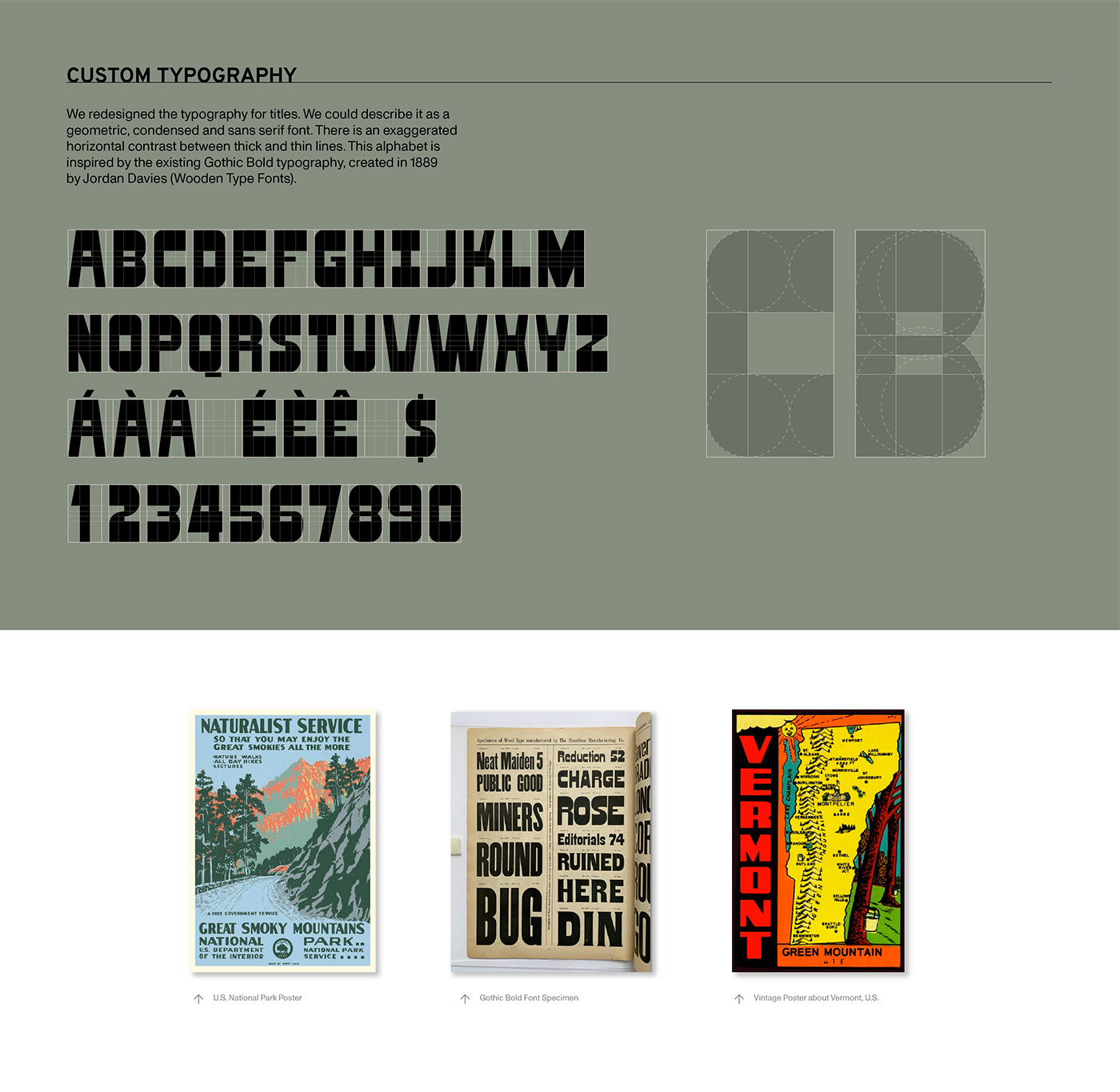
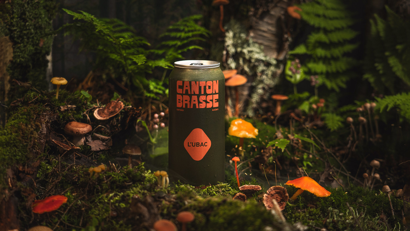
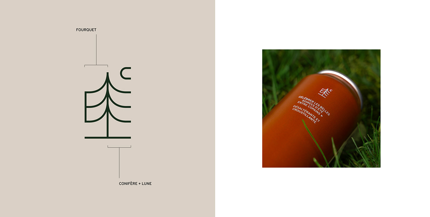
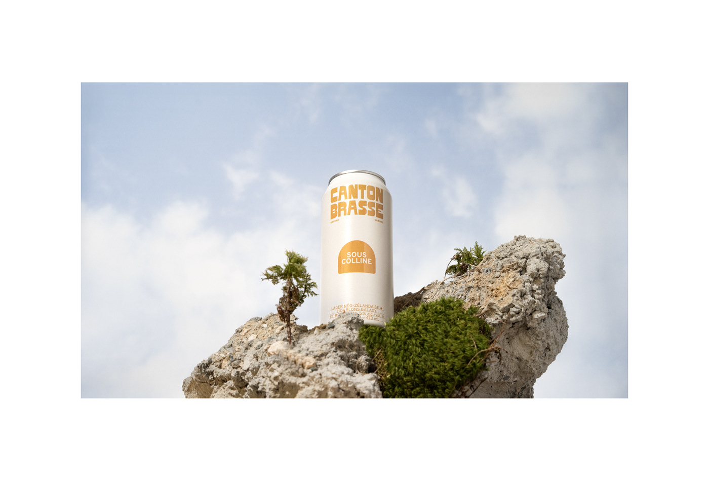
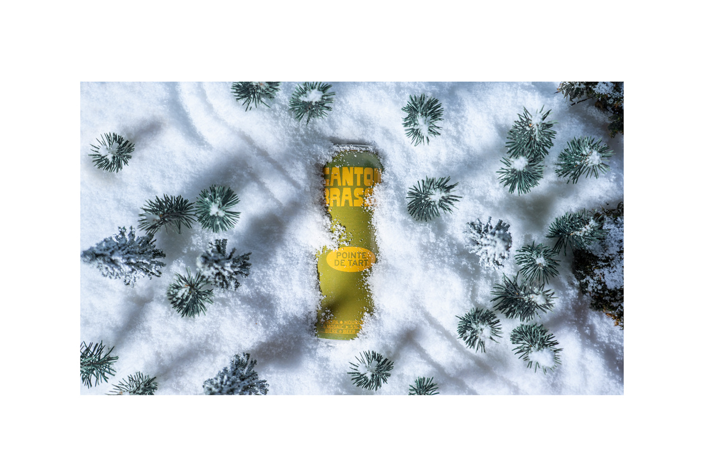
Based on this idea of clean air and wide-open spaces, we thought of a distinctive brand platform that would fit perfectly with the warm atmosphere of the mountain villages so that the company would become an iconic place in the region. Inspired by the nostalgic universe of the West Coast National Parks and the outdoors, the new graphic line is based on a strong and memorable typographic system. The overall project is characterized by a colour palette inspired by nature added to vibrant and authentic colour combinations that remind us of the kitsch side of the 70s.
Nothing better than opening a good and beautiful beer after a long day outside. Cheers!

