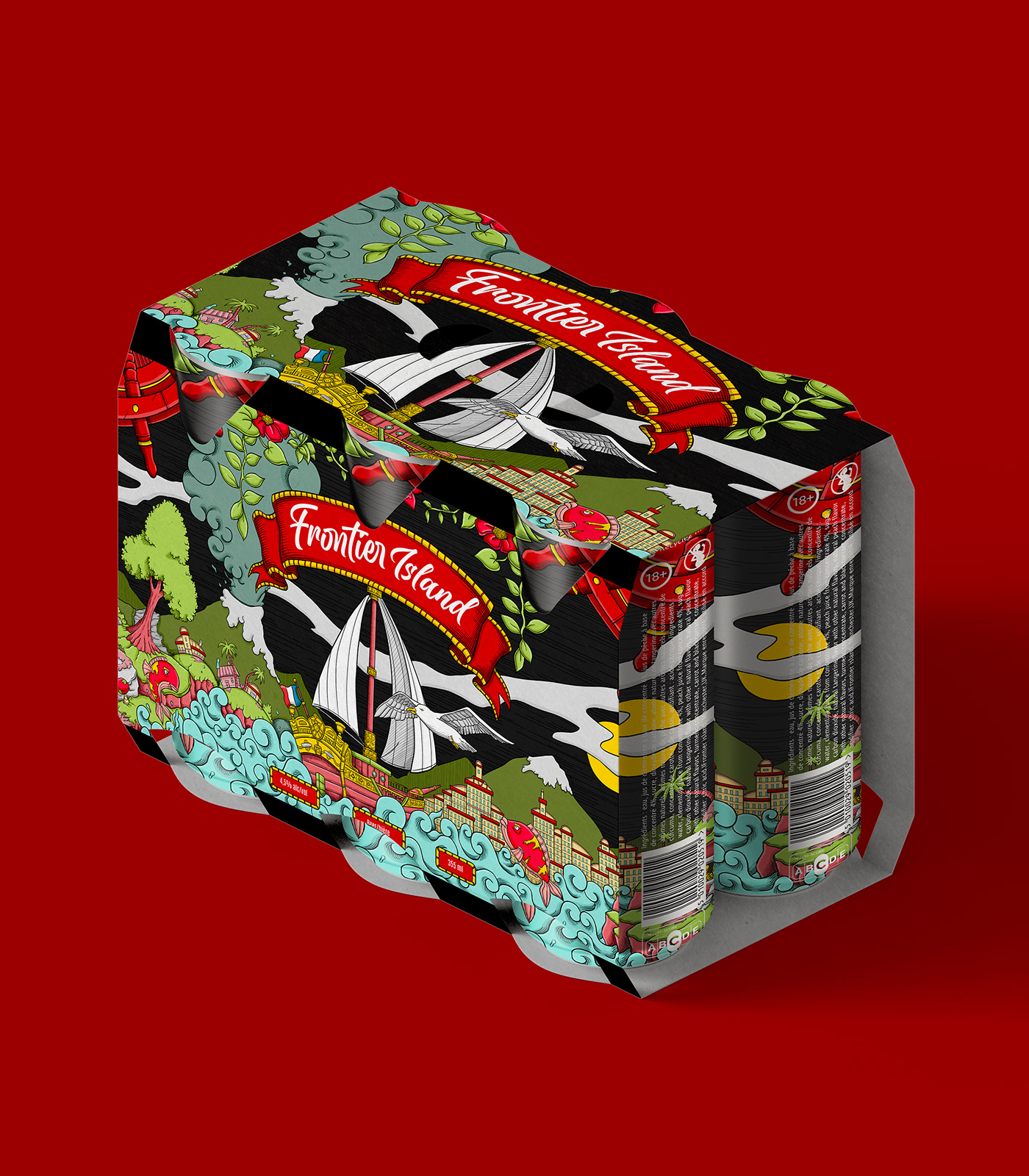
Frontier Island - Prade Studio
Before designing the illustration, I decided to bring the Frontier Island logo to life,
adopting a calligraphic style to give it a touch of old-world authenticity.
Next, I set about creating a distinctive label for the beer brand. I chose a much more graphic approach,
using a bold, restrained color palette to make the brand stand out in a striking way.
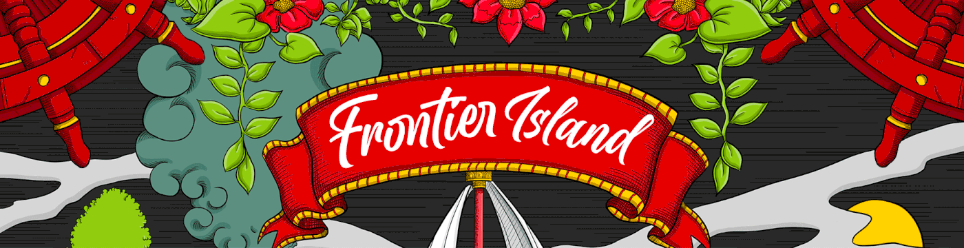
In the composition, I drew inspiration from the maritime world, fusing elements of French culture,
such as a boat, with Japanese influences for the graphic style and wave motifs.
This fusion creates a unique illustration that fully reflects Frontier Island's identity and vision.

Play with the swipe ⬇
SKETCHING PROCESS

COLOR PROCESS
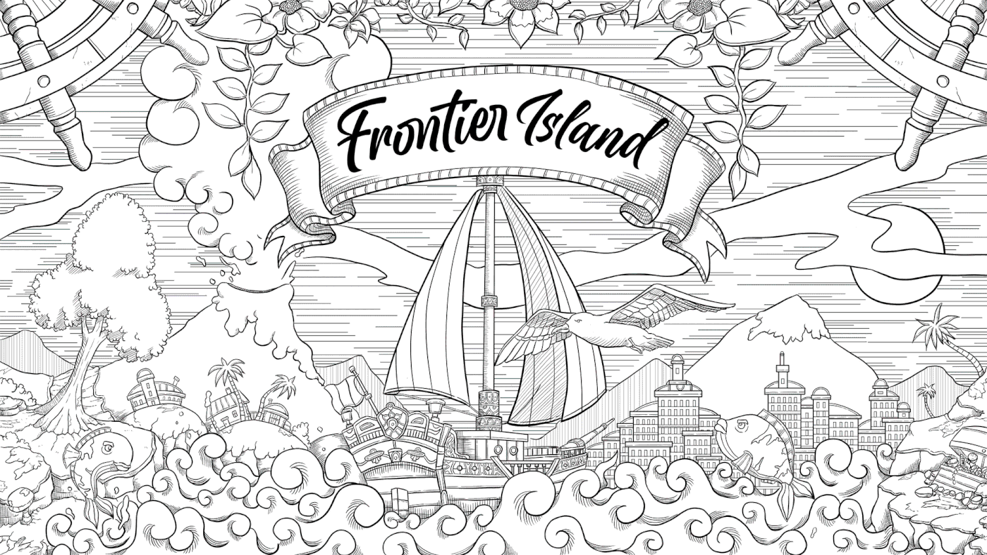


DETAILS


website

poster