

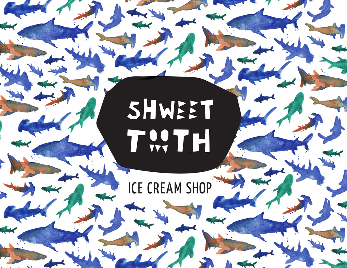
Inspired by ocean life, candy kitsch, and vintage surf boards, the fictional Shweet Tooth Ice Cream brand presents an identity that is bold, sweet, and tongue-in-cheek.
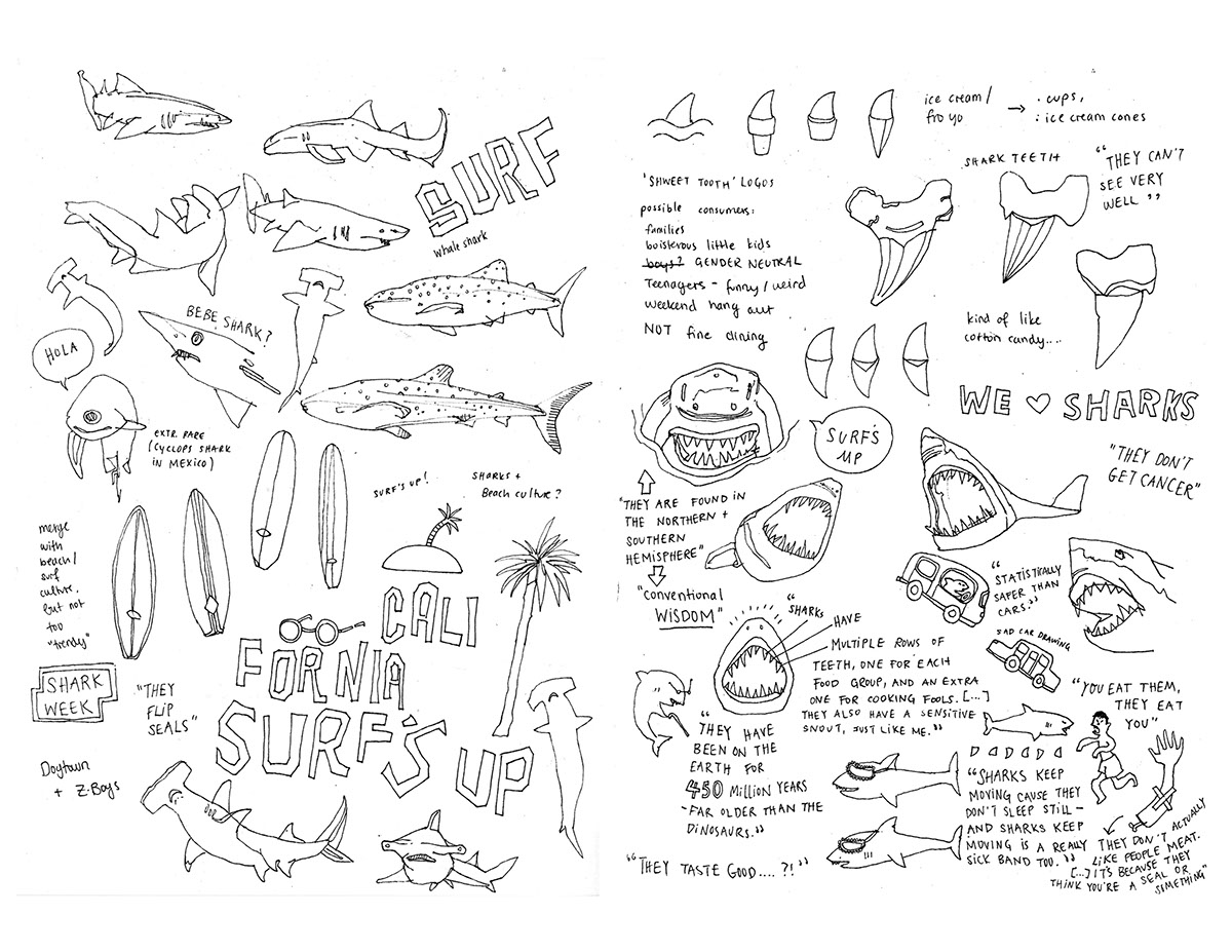
Prelimnary stage
In these original sketches, I explored different shapes inspired by the sea & surf.
I used different media for different effects – pen & ink, cut paper, water color.
I used different media for different effects – pen & ink, cut paper, water color.


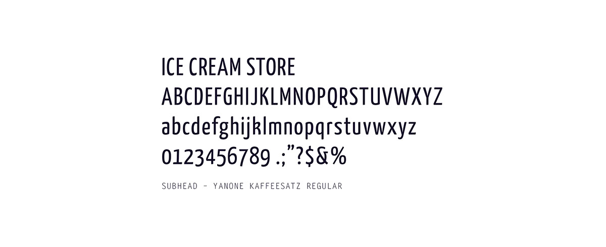
Identity
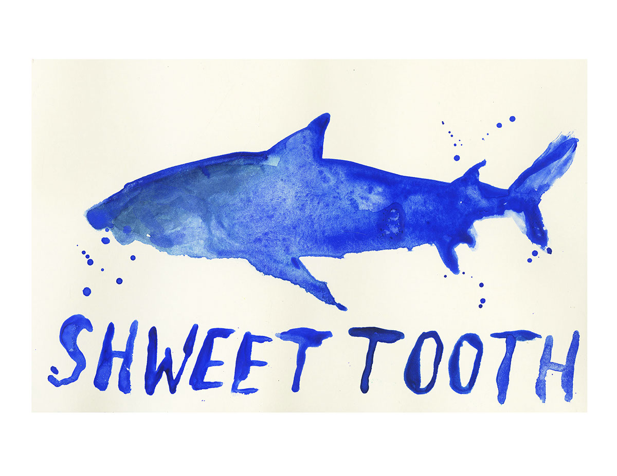
The cut paper shapes became the main inspiration for the logo.
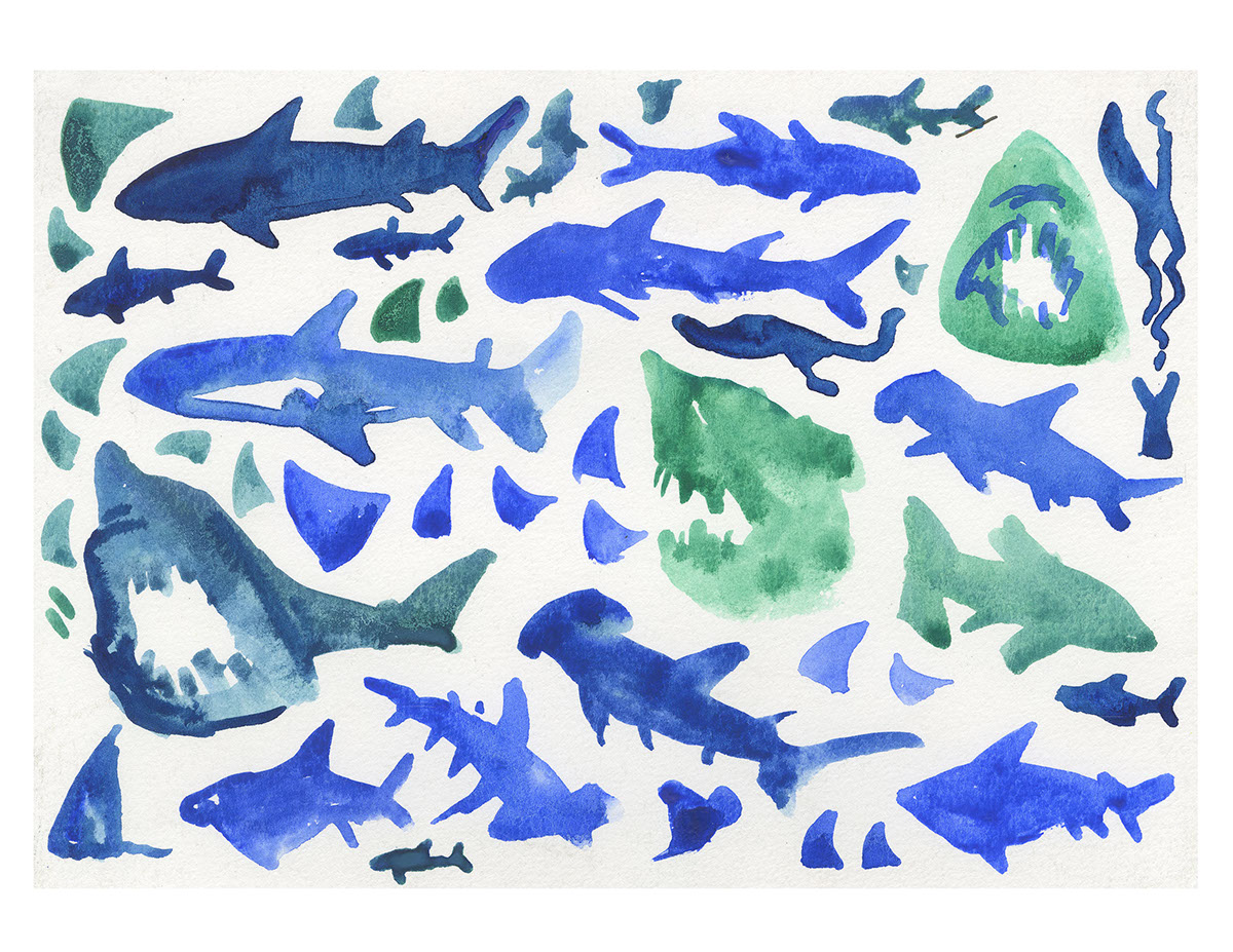
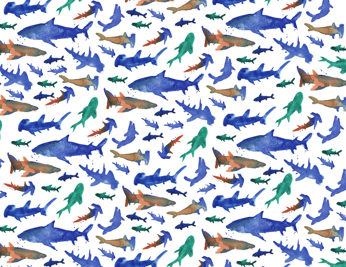
Parts of the water color sketches were reorganized into three different repeat patterns.
Parts of the water color sketches were reorganized into three different repeat patterns.
Logo development stage

Final solution

Color studies – the palette was extracted from select hues of the prelimary water color sketches.

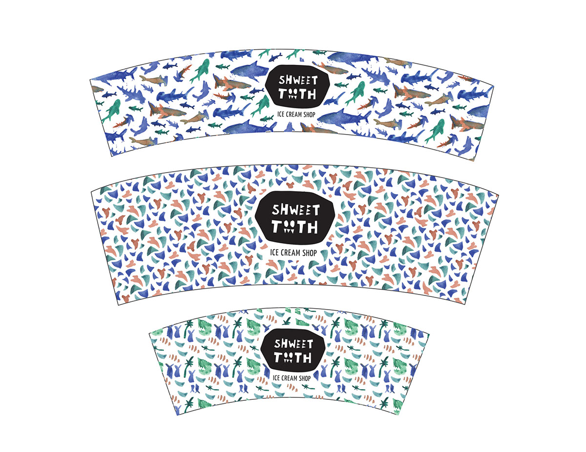
Water color repeat patterns – building the back-bone of the brand.


Branding
In this part of the process, I explored with varying the scale of the water color graphics.


Narrative Literature (Menu)


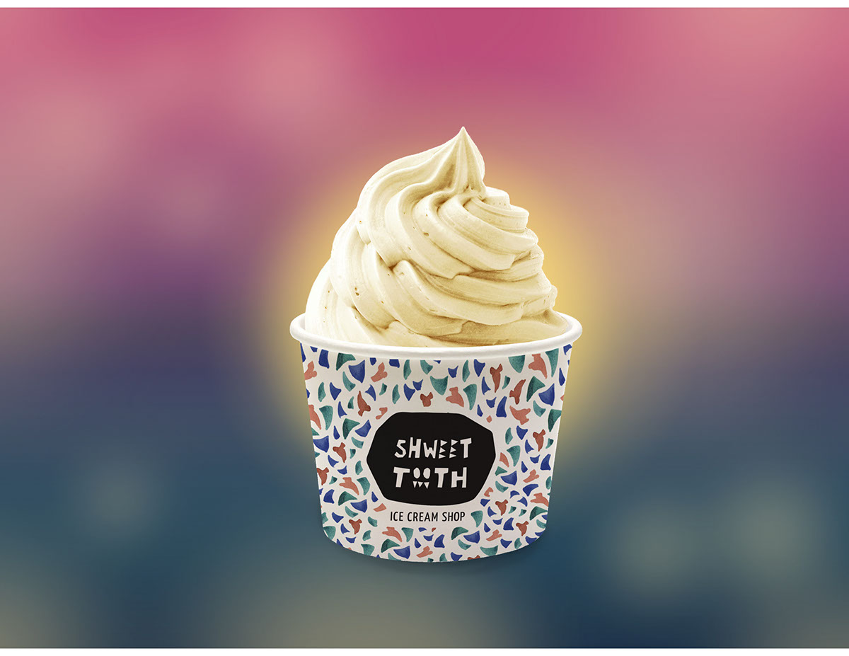
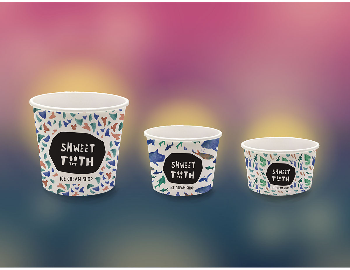
Packaging (Ice cream cups)
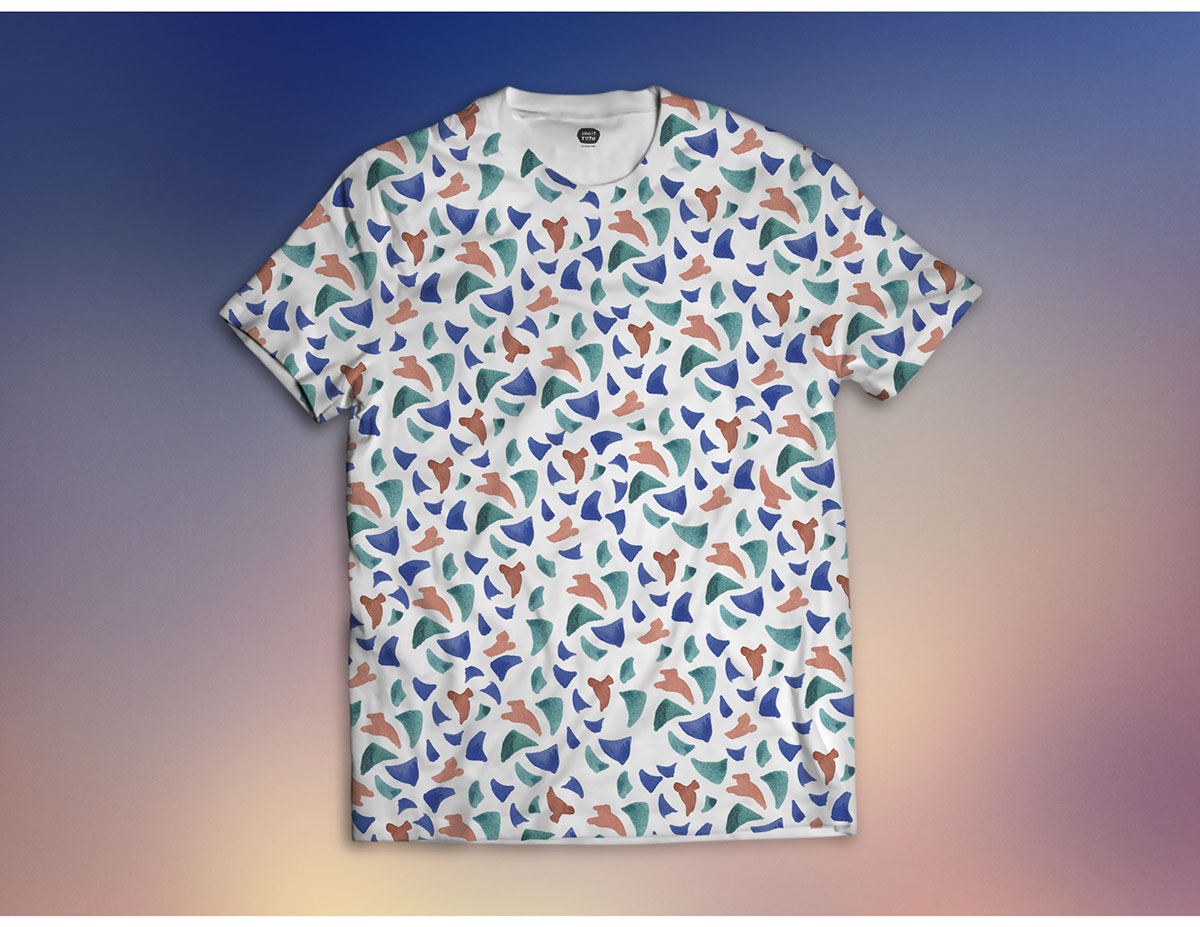
Apparel


Extras
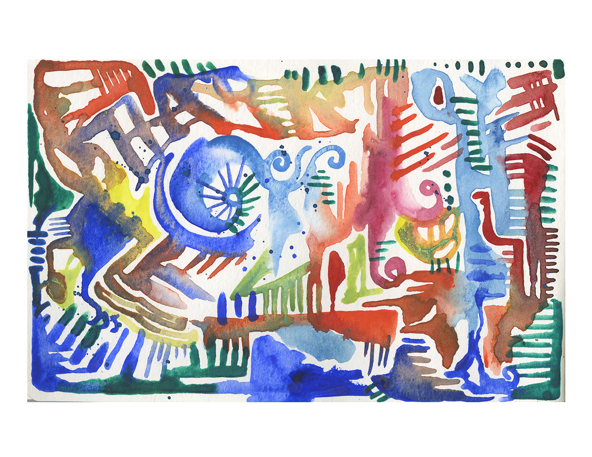
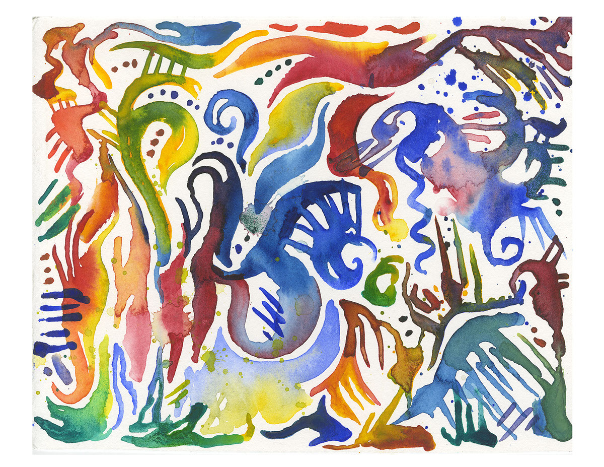
This project presented a really great opportunity for me to explore, play, and simply have fun. Below are some quick paintings I did in which I attempted to capture the mood of the brand and its concept.
This project presented a really great opportunity for me to explore, play, and simply have fun. Below are some quick paintings I did in which I attempted to capture the mood of the brand and its concept.

All images © Kat J. Weiss 2015. Do not reproduce without
the expressed written consent of Kat J. Weiss.
the expressed written consent of Kat J. Weiss.


