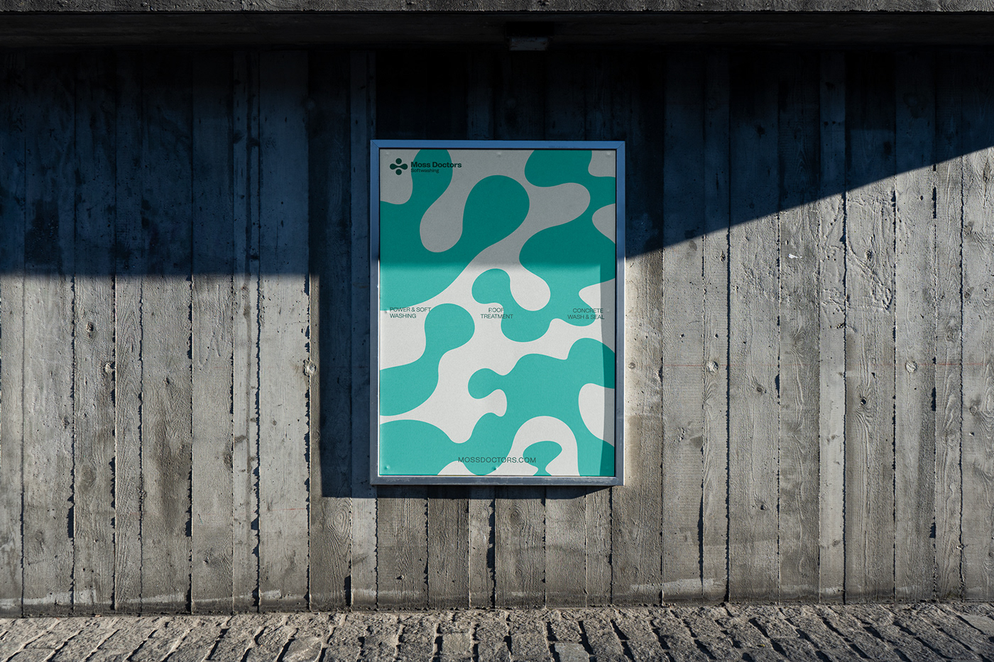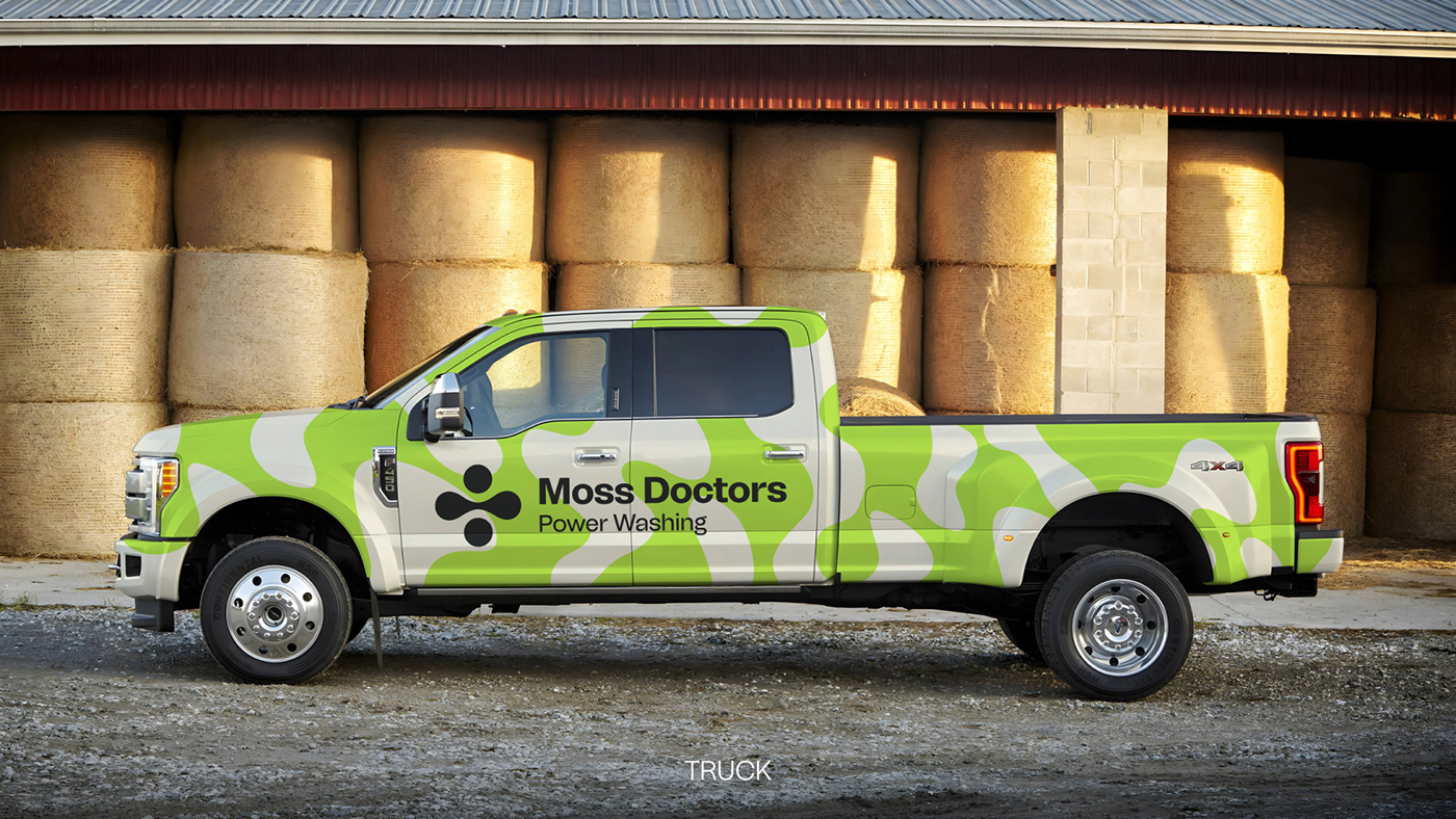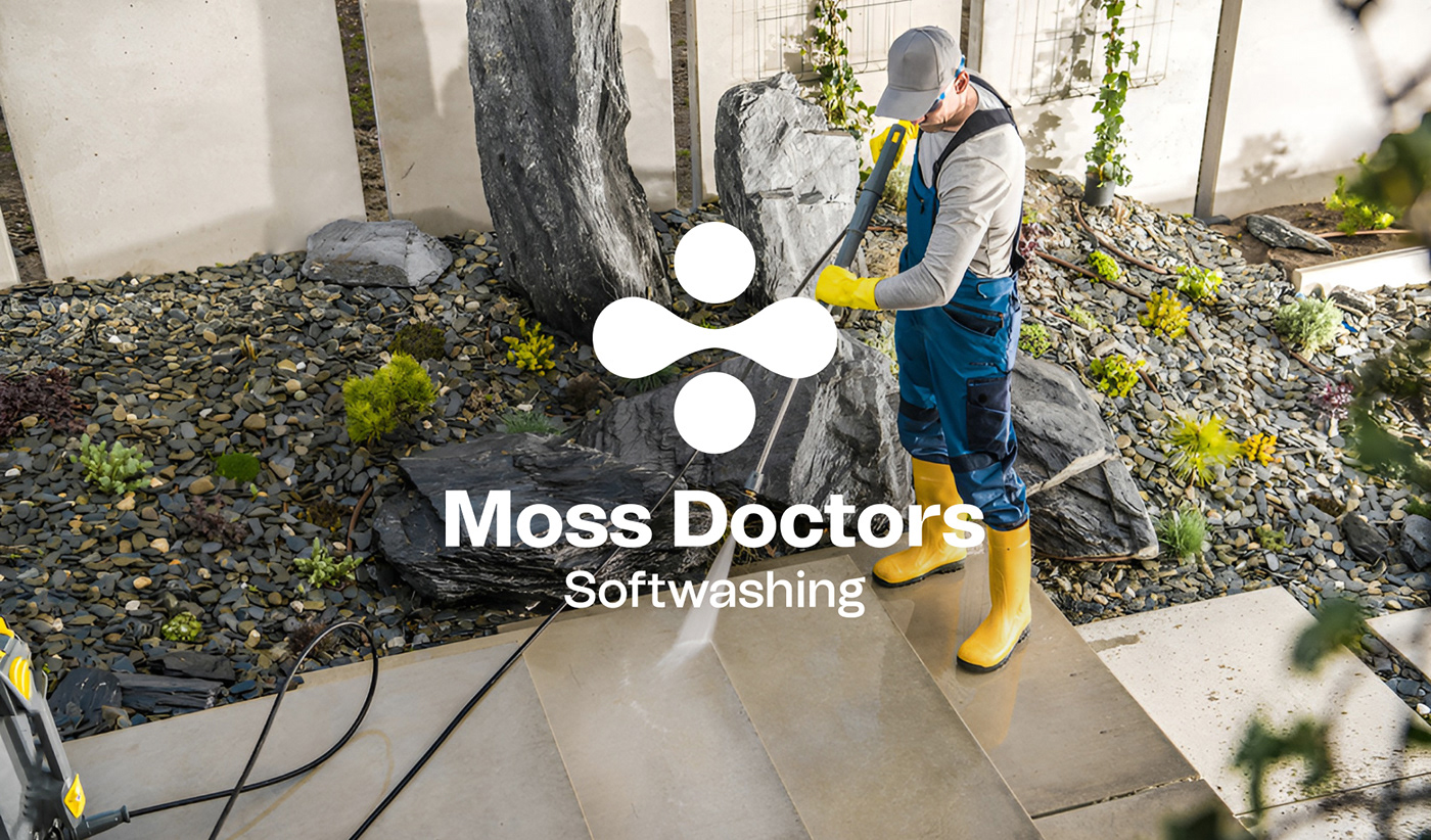
Moss Doctors
Graphic identity for Moss Doctors, an USA power washing company. The brand identity is inspired by the natural elements that surrounds the product. On one side the moss, which in nature traces wave-shaped or ball-shaped forms. And, In the other side the water, used to clean this moss, which is represented by the shape of a drop. Also, we wanted to reflect the “doctor” part
of the name with the "+" symbol, that allowed us to create an icon
that is abstract, but, at the same time, is full
of meaning.