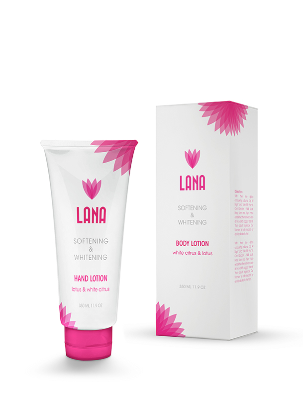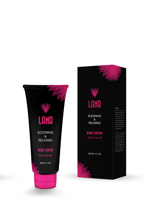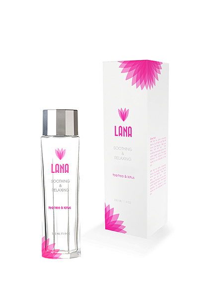
This is a re-branding project for Lana, an international manufacturer and distributor of beauty, and personal care products sold through representatives in Vietnam and Asean. With the combination of the ultimate high technology science and the essential of natural herb, fruit, and flower, Lana has created a full range of cosmetics that would offer an attentive care to your skin, hair and body. Lana’s wide ranges of product appear in the market with so many different identity marks that sometimes confuse the consumers.
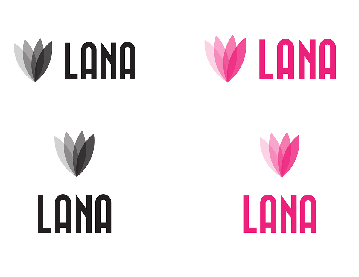
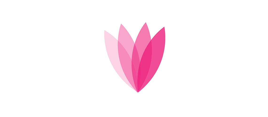
The goal of the project is to create a unified identity for all products of Lana. The new identity is inspired from the mulan flower with soft organic flower petal shape. The transparencies indicate the blooming state of the flower. The san serif type expresses the contemporary aspect; still support the organic shape of the symbol.
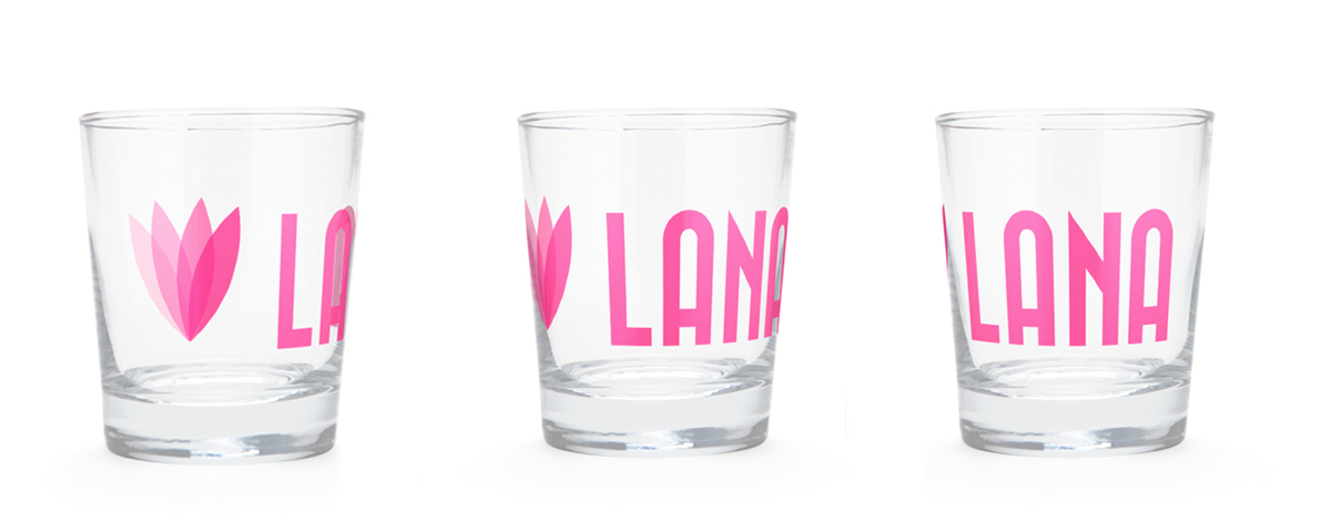
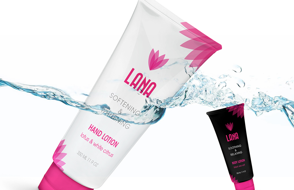
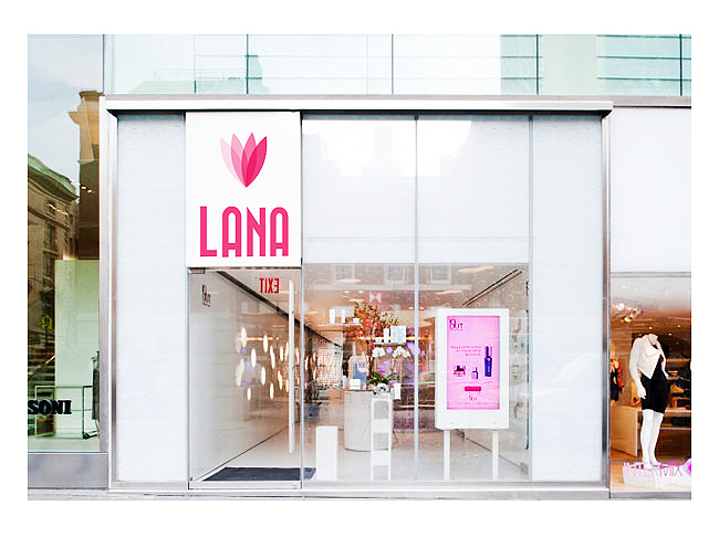
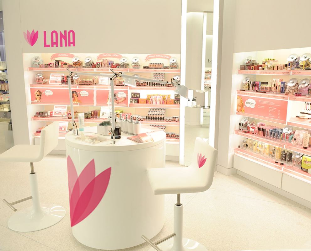
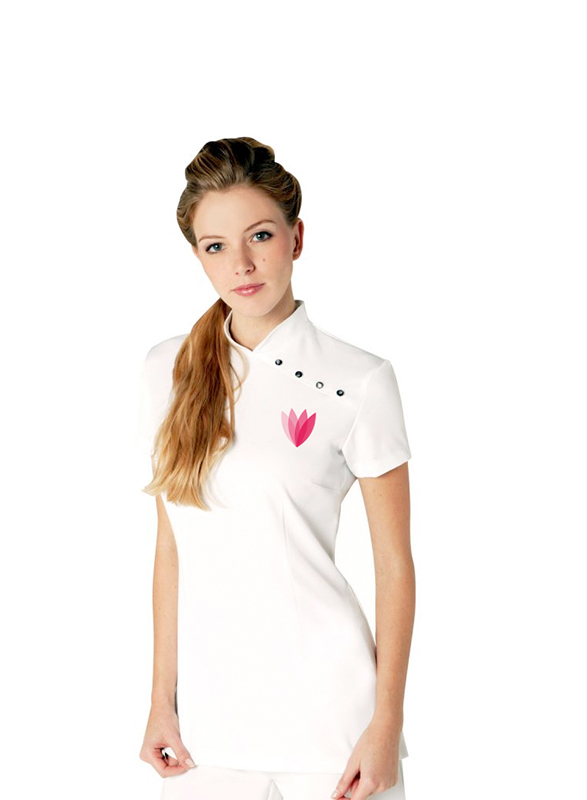
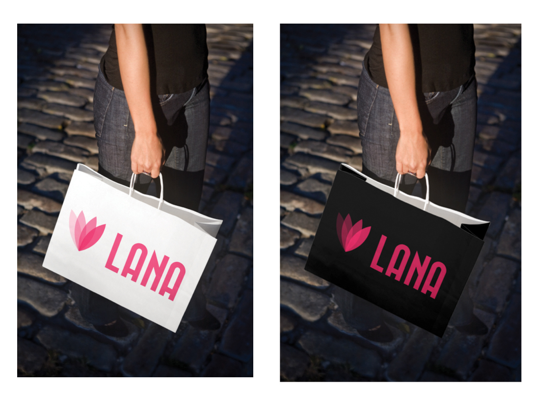
Lana’s new identity are applied on the system of products and store exterior and interior of the brand; as well promotional items such as employee's uniform, shopping bag, furniture, and etc.
Lana’s new identity are applied on the system of products and store exterior and interior of the brand; as well promotional items such as employee's uniform, shopping bag, furniture, and etc.