Stride Corporation
About the project
[EN]
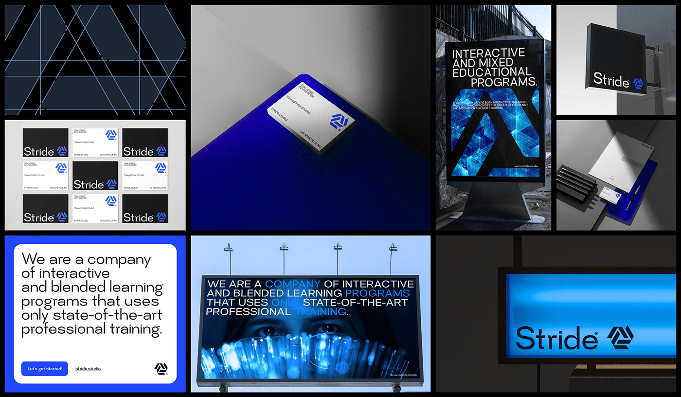
I was approached by an educational IT company with a request to develop their corporate identity and website. I designed the logo in the form
I was approached by an educational IT company with a request to develop their corporate identity and website. I designed the logo in the form
of a lens, since their online school is constantly in touch with its students and communicates via video link. I chose a color and font specifically
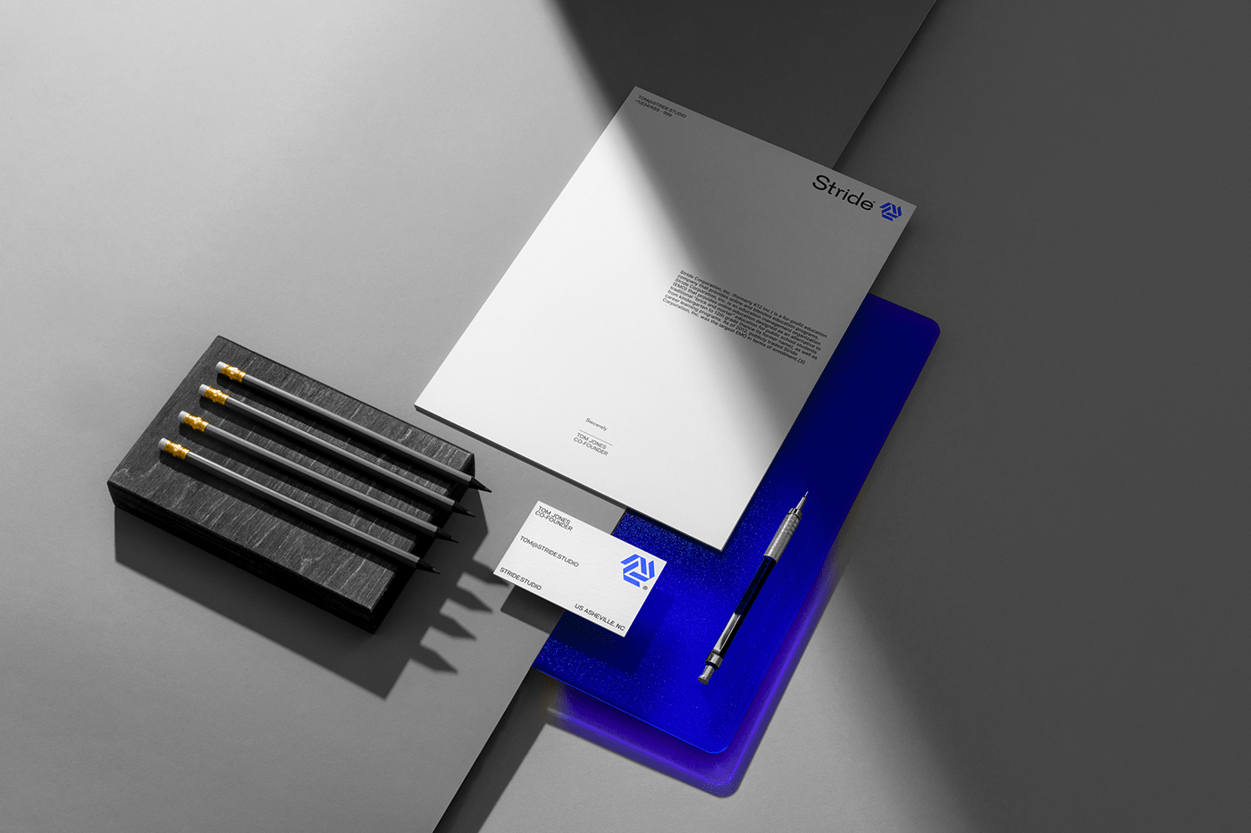
for the IT style. They teach a variety of information technology. I showed three different logo colors, and through the layouts I presented banners, business cards, envelopes and letterheads, which completes the whole composition. The color choice was deliberate and had to reflect the cutting-edge solutions that IT style offers. The font is modern and professional and gives the right feel to the overall brand design. Layouts were used to see how the logo would look on different materials and give a full sense of the brand design. The results were stunning, and the client was very happy
with the end result.
The next step was to create marketing materials to accompany the brand design. We designed a set of flyers, brochures, and banners with the logo and branding in mind. The colors were chosen to reflect the overall personality, and the messaging was incredibly effective. The client was thrilled
with the results, and our team was proud to have created such a stunning and professional brand design.