


L. H. Personal Branding - Recognition and variety through flexible design language.
Visually representing yourself as a brand is a challenging task that requires a lot of sensitivity. The personal branding for a young entrepreneur with the initials L and H, who creates connections between people, must precisely convey this feeling of connectedness in order to establish itself on the market.
The Moby Digg design team developed a visual language and differentiated three brand themes characterizing the young entrepreneur and his work. Various shapes and animations in different color spectrums were experimented with until the client was able to visually recognize himself.


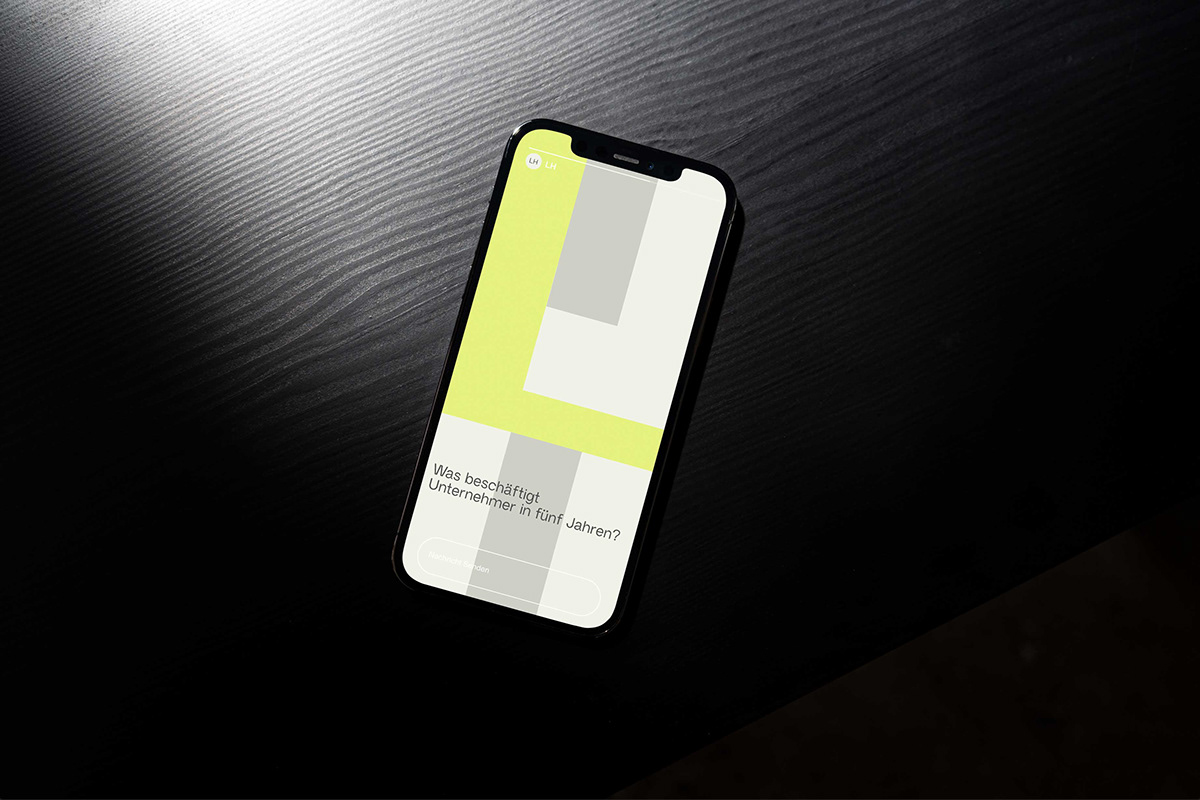
The personal branding is based on a design grid with fifteen units – consisting of three columns and five rows. The three columns symbolize the three developed brand themes, while the five rows are based on the number of letters in the first name. A friendly green tone and warm gray nuances fill the grid, so that the initials L and H are always recognizable. Both the letter combination and the grid allow for creative layout possibilities.
Colors and shapes as well as the choice of text and image appear youthful and modern, yet timeless. The many variation possibilities are illustrated with the help of animations. This creates a pool of different visualizations that can be used in a versatile way. This provides a pool of various visualization options that can be used flexibly. The animations add recognition and variety to the client’s social media presence.


