Be ready to change.
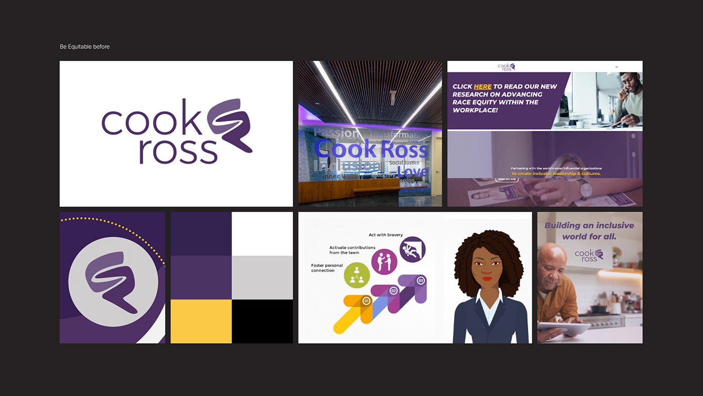
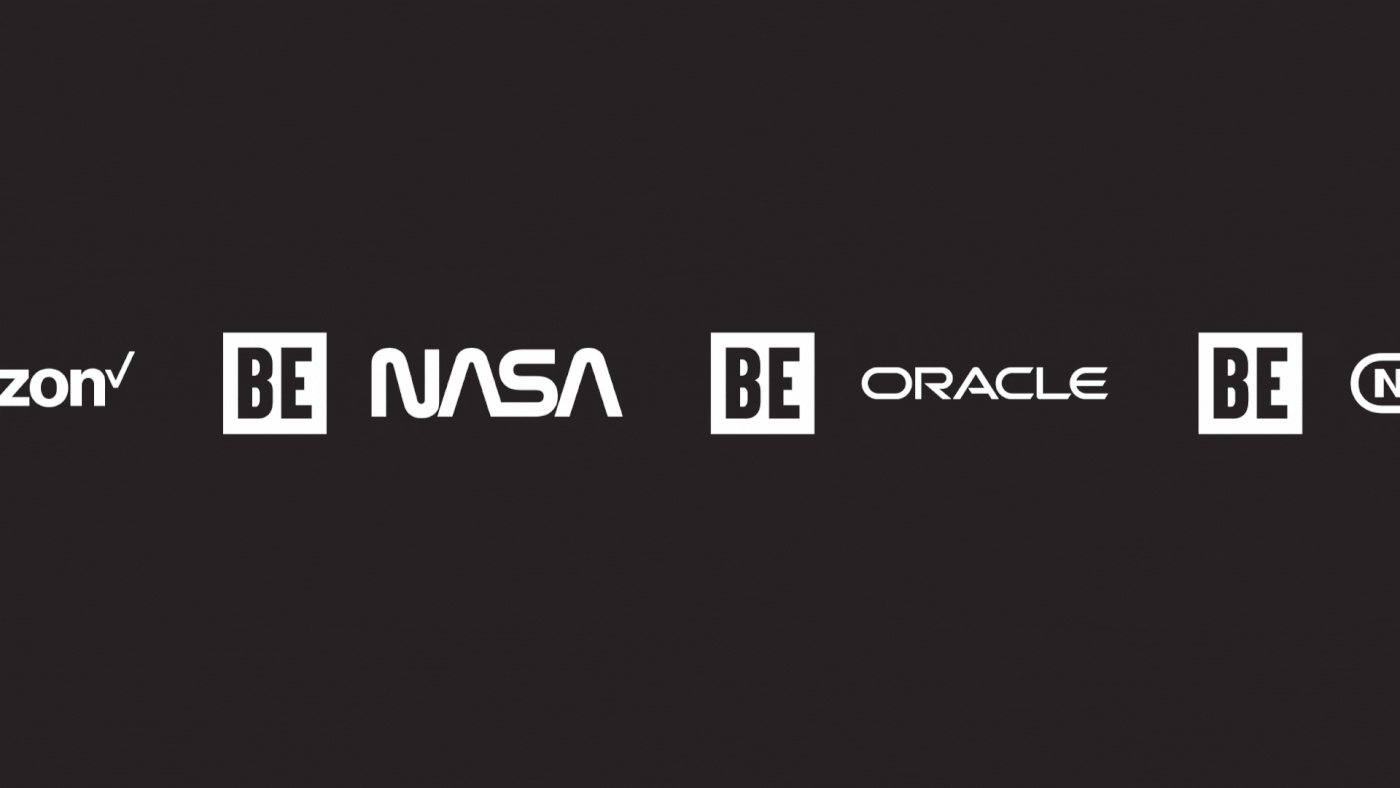
Be Equitable (formerly, ‘Cook Ross’) is on a mission to build a more inclusive, diverse, equitable and accessible world – starting with the workplace. Offering consulting, strategy and training services to clients like NASA, Nintendo, Oracle and Verizon, Be Equitable has helped businesses to realise the power of difference and cultivate workplaces where everyone can be. Over the past thirty years, they’ve developed a reputation as leaders in unconscious bias training; a program developed by their founders and favoured by clients across the country.
But by 2021, it was clear they could be doing more.
In the US and throughout the world, the rise of the Black Lives Matter movement sparked conversations about equity. In this new political climate, businesses made public commitments to reassess their practices and restructure their organisations, while ESG standards were updated to include racial equity frameworks. The appetite for change was high. But if businesses were going to make meaningful progress, a one-off training session wouldn’t be enough. They’d need a long-term, strategic partner experienced at driving systemic transformations. Be Equitable was committed to taking on this role.
Guiding this new approach was Michael Leslie Amilcar – an Afro-Latina and Be Equitable’s new owner/CEO. Having been with the company for many years, Michael knew what would be required to build on Be Equitable’s history and redefine its future. To make this happen, she reached out to For The People to help evolve the business from a company named after two, white practitioners and known for unconscious bias training, to one that celebrated a truly diverse and passionate collective of individuals, dedicated to doing the work.
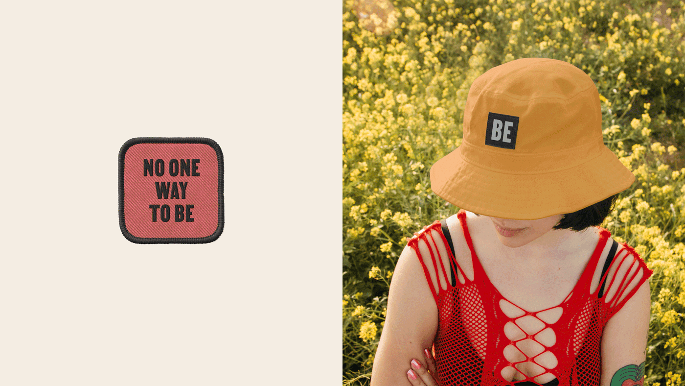
With a new leader, a new mission and a new name, we set out on a collaborative journey to help Be Equitable become the leader the world needed them to be.

Finding meaning in the messy process of change.
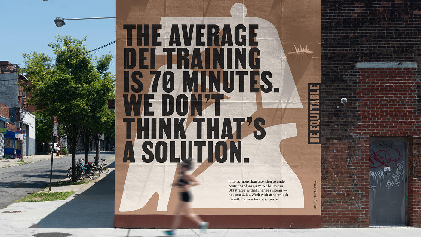
After a particularly challenging few years, businesses were reaching out to organisations like Be Equitable in the hopes of finding a quick fix for inclusion, diversity, equity, and accessibility (IDEA). But complex problems don’t have simple answers. From institutionalised racism to invisible privileges – the issues Be Equitable hoped to address require difficult, ongoing work.
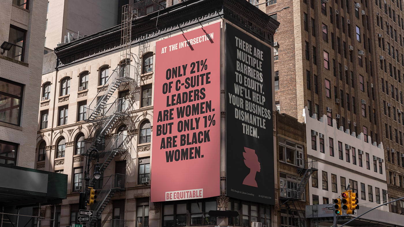
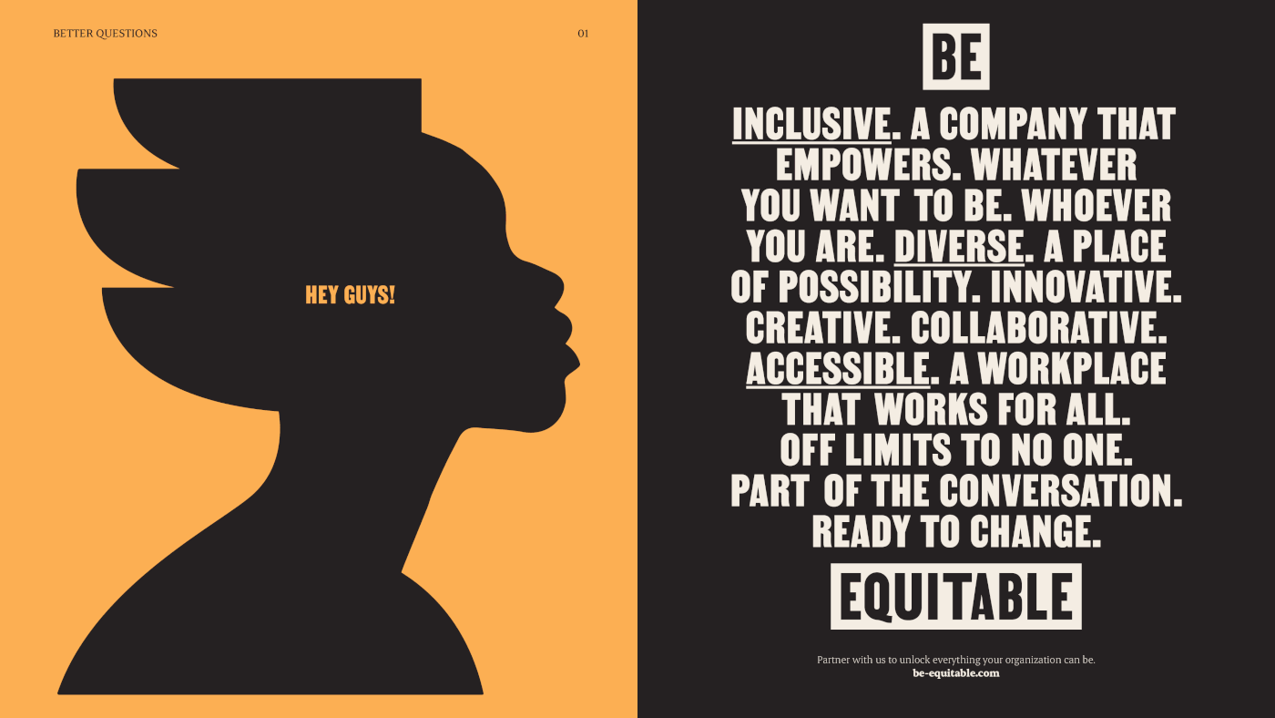
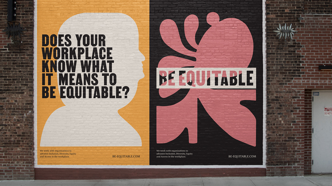
But amongst the feel-good phrases and staged imagery, the complex, uncomfortable and messy process of systemic organisational change was not honestly reflected in the category. Appealing to businesses with promises of ease wouldn’t get Be Equitable where they wanted to be. Instead, they needed to motivate others to set out on that difficult journey, by proving that it was more meaningful and more impactful than a quick fix could ever be. For that to happen, we needed to show that inclusion, diversity, equity and access aren’t problems waiting to be solved. They’re opportunities waiting to be unlocked – a chance for individuals to reach their full potential, whether in the workplace or out in the world.


An identity shaped by adversity, built on optimism.
This attitude to the work was already well-established at Be Equitable. Over the course of the project, we witnessed the way their team responded to mass-shootings, hate crimes, and the violation of reproductive rights. Instead of being overwhelmed by these events, Be Equitable remained a proactive force, thoughtfully navigating through each new challenge. Their approach was inspirational and uplifting, but it wasn’t being reflected in the way they represented themselves. Instead of relying on toxic positivity and promising quick fixes, we needed to capture the spirit of Be Equitable and express it to the world.
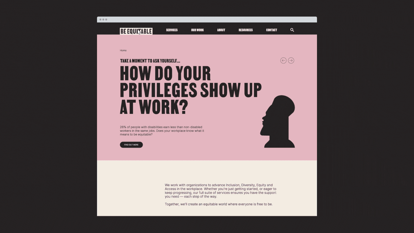
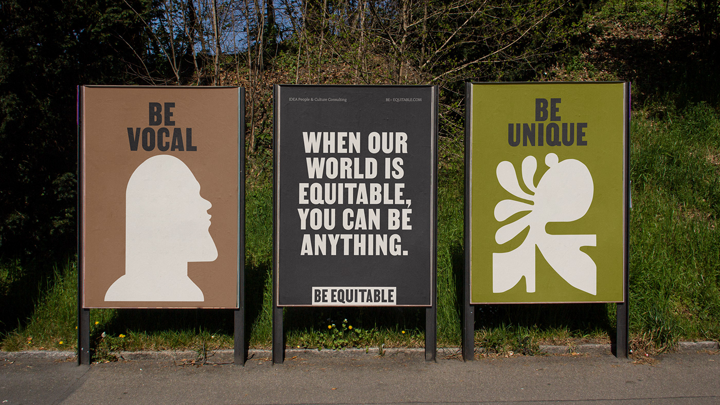
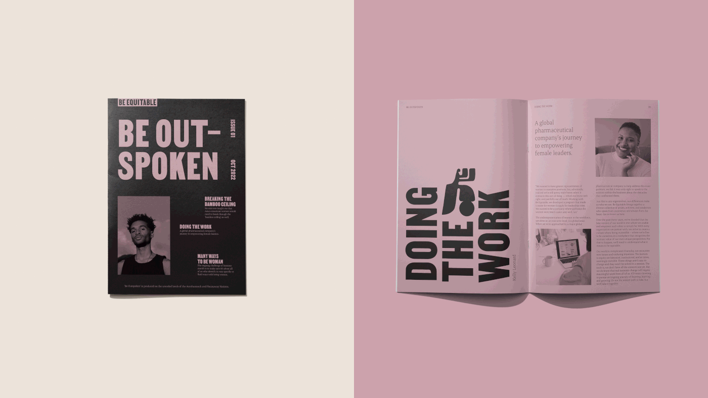
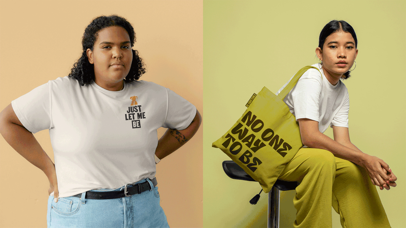
We initially drew upon the history of activism, taking cues from protest posters and grassroots publications. Whilst these styles matched Be Equitable’s outspoken and courageous attitude, they didn’t reflect the compassion and warmth that made working with them so special. To find the right balance, we couldn’t just take inspiration from what came before. We needed to instil a sense of optimism for what could be. Using an earthy, organic colour palette and a bright, candid approach to photography, the design system evolves from its historical roots to create something that’s challenging, yet inviting.
But the new identity doesn’t just inspire others to do the work. It begins the work itself. Working closely with the team at Be Equitable, we made sure IDEA was integrated into every element of the brand – from the history behind the typeface, to the talent represented in imagery. Together, these elements shape an image of an equitable future and reignite our belief that creating it is possible.
“It almost feels ancestral. It has this feeling that there is history to what I’m looking at…You’ve tapped into something for a brand that a lot of people don’t dig deep enough for.” – Brandon Brown. Be Equitable, creative collaborator.
Authentic diversity, illustrated.
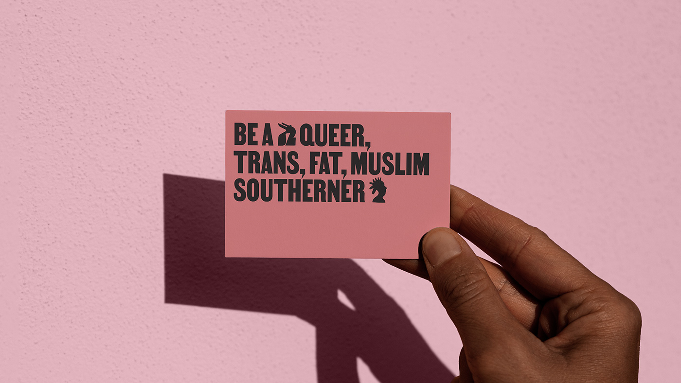
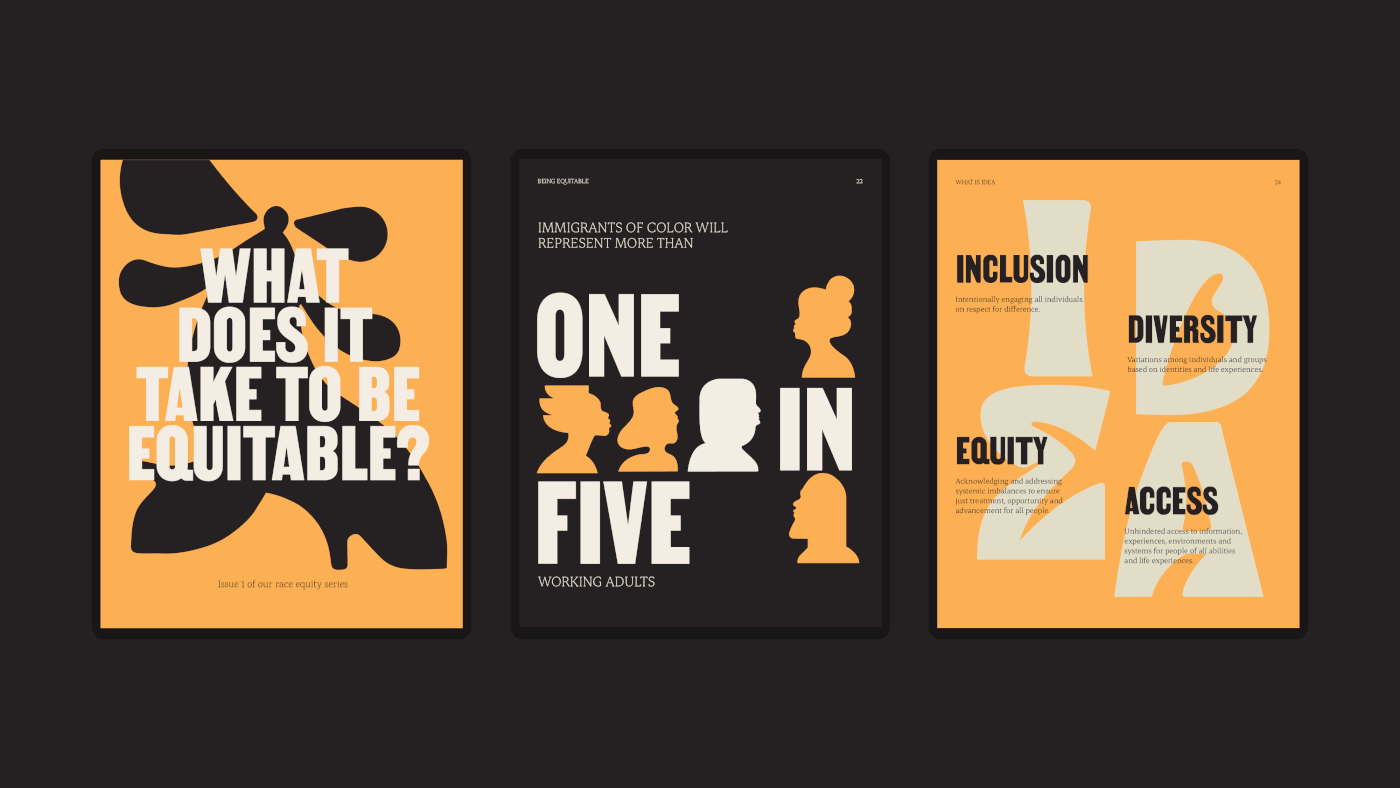
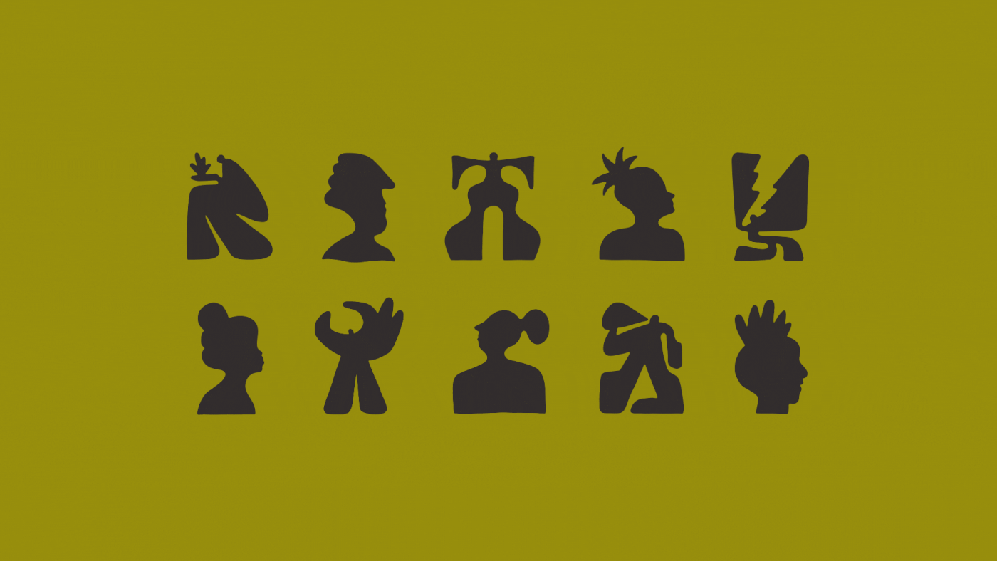
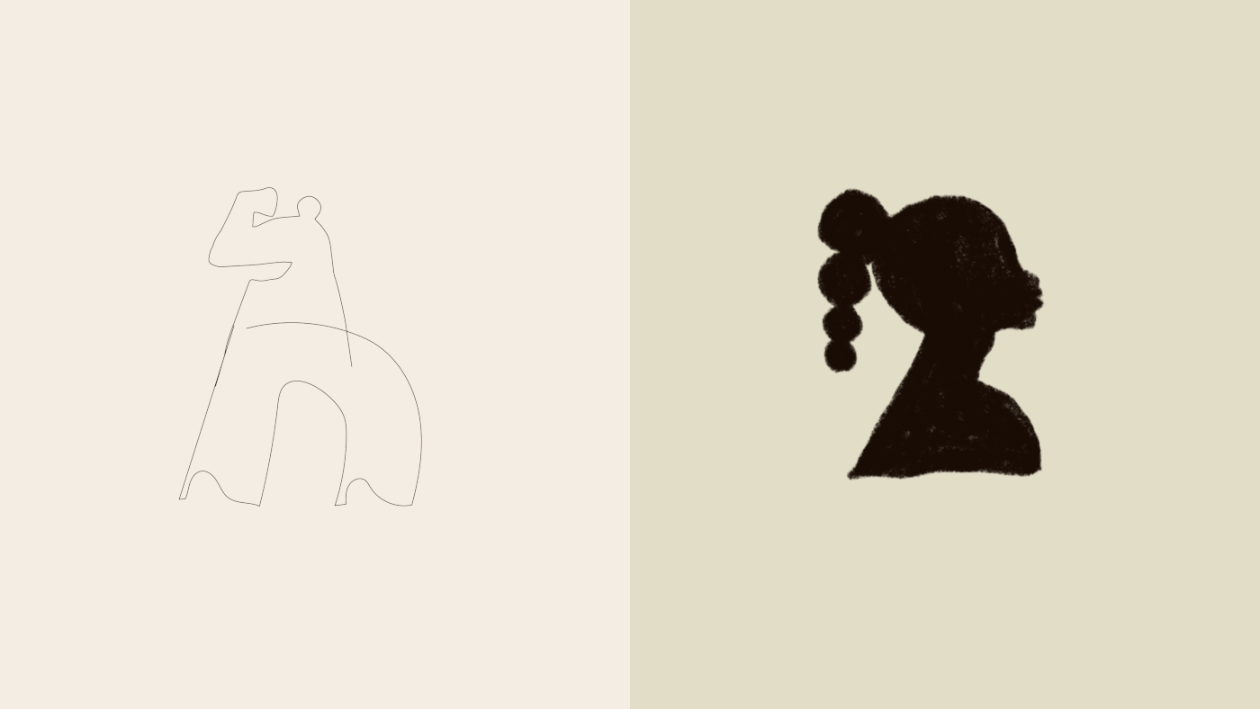
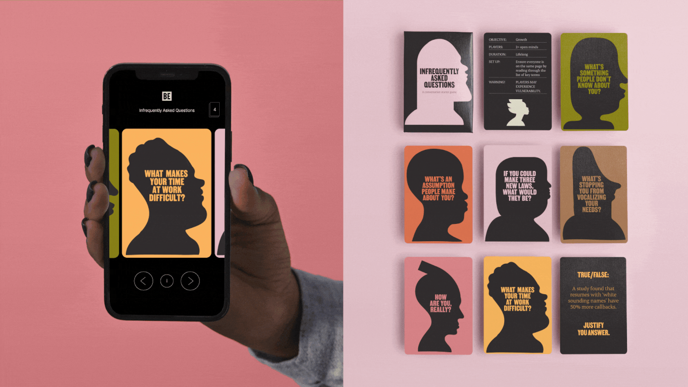
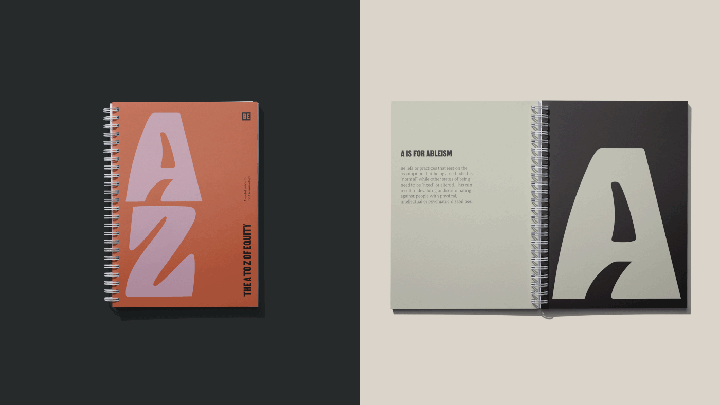
Representations of diversity largely rely on abstract metaphors, narrow definitions, or iron out our idiosyncrasies by focusing on what makes us ‘the same.’ Attempting to create something that’s inclusive of everyone, can often end up including no-one. For an organisation as diverse as Be Equitable, we needed to create illustrations that celebrate our unique differences, while still being representative of a wide range of people.
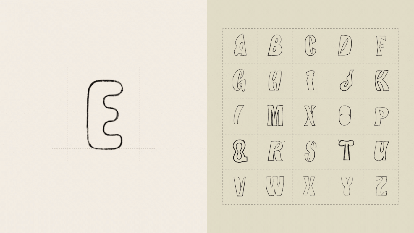
The best way to find a new approach is to seek out new perspectives – which is why we collaborated with New York based artist, Edward Ubiera, to develop Be Equitable’s custom illustrations. Instead of relying on literal representations, these imaginative and intentionally imperfect forms are a glimpse into a possible future – an equitable world where difference is the norm and individuals are free to be.
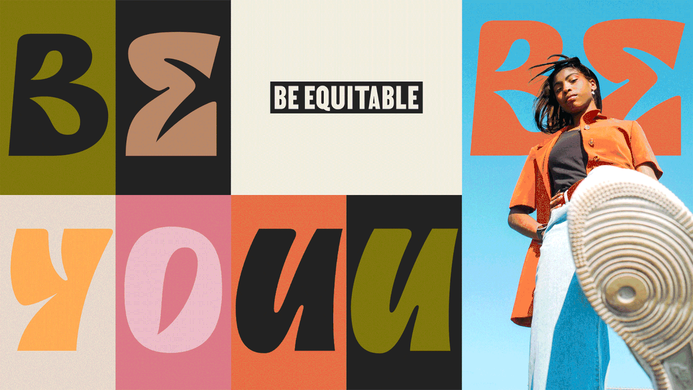
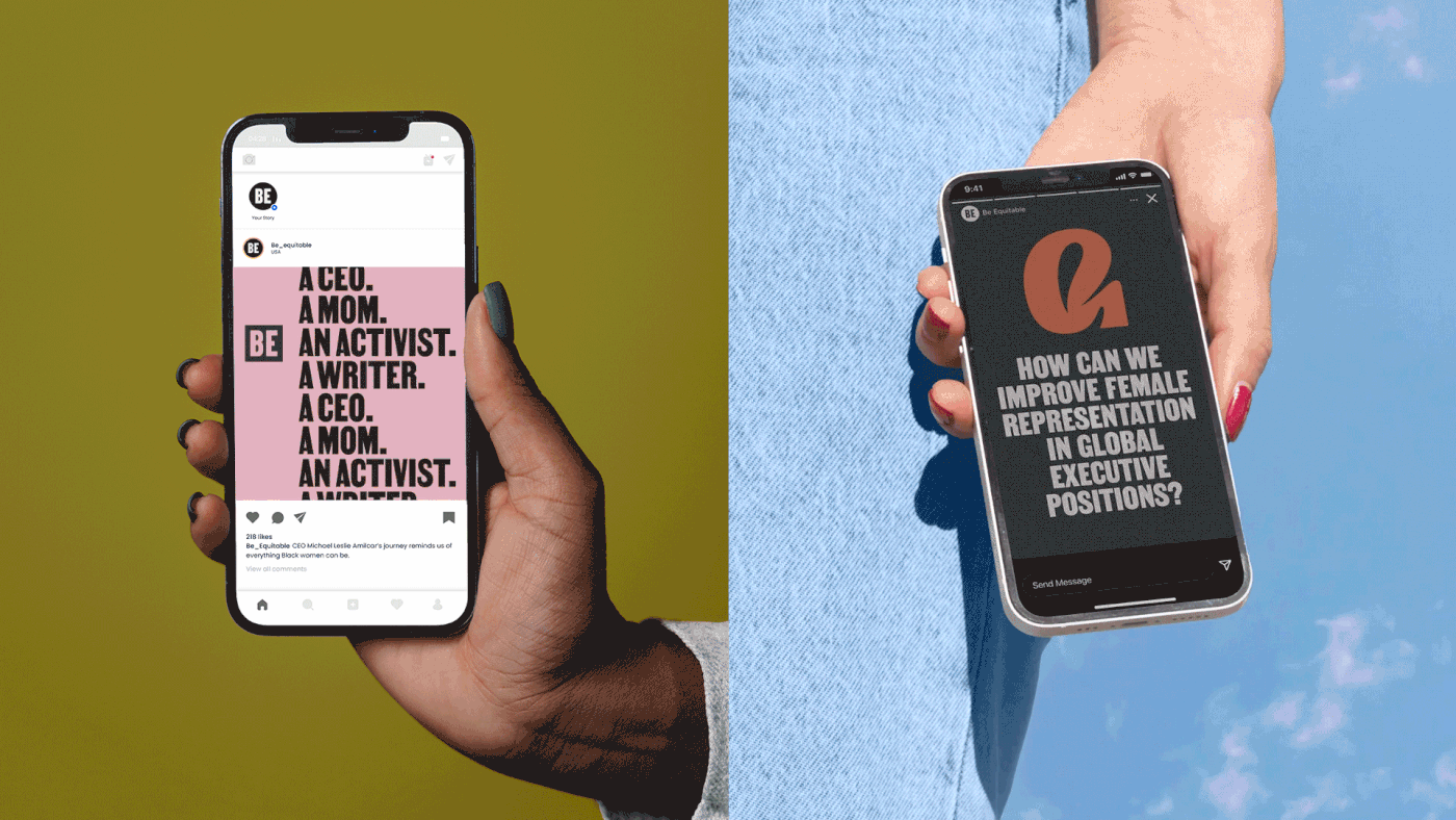
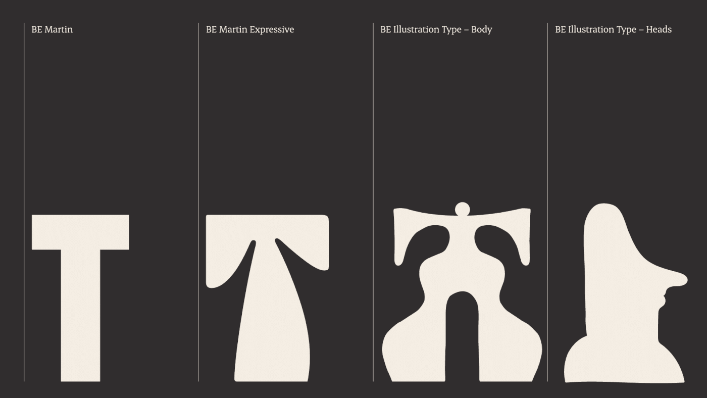
We embedded these illustrations into a type format to make it easy for anyone at Be Equitable to use. By combining the alphabetic elements with the symbolic ones, we created a pictorial style of writing – with a slight nod to ancestral scripts. Bringing phonograms and ideograms together, Be Equitable is able to write figuratively, symbolically and phonetically all at once.
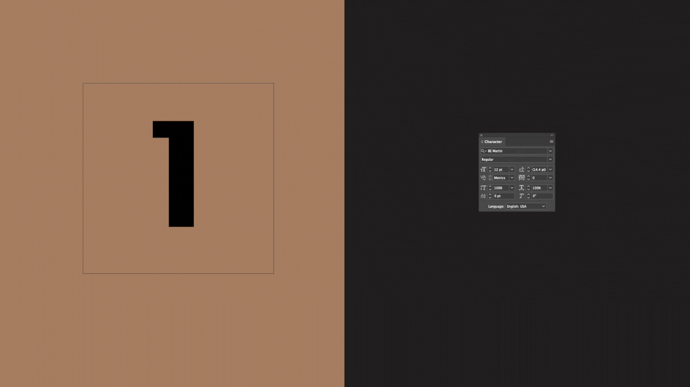

Be Martin: a typeface inspired by history, advocating for the future.
“Be Martin” is part of a larger story. Designed by Washington-based typographer, Tré Seals, the expressive typeface is a variation on “Martin” – also developed by Tré and influenced by a history of non-violent protesting. The original Martin is inspired by the ‘I AM A MAN’ posters carried during the Memphis Sanitation Strikes of 1968 and is named after Martin Luther King, who was assassinated the night after delivering a speech in support of the cause. Interchanging Martin with its expressive variation allows Be Equitable to communicate impactful messages, in an optimistic and uplifting way.
We continued this approach when developing other key elements of the branding, ensuring we celebrated the skills and perspectives of a diverse group of creatives. For example, support typefaces “Erode” and “Pretendard” were sourced from typographers based in India and South Korea. Both fonts prioritise legibility and are suitable for multilingual typography, ensuring the words of Be Equitable can be read by all.

The power of difficult conversations.
The sensitivity and complexity of the issues discussed by Be Equitable were often accompanied by fears of saying the wrong thing, fears of being too political, or fears of being not political enough. This created an inconsistent voice and at times, resulted in their worst fear – saying nothing at all.
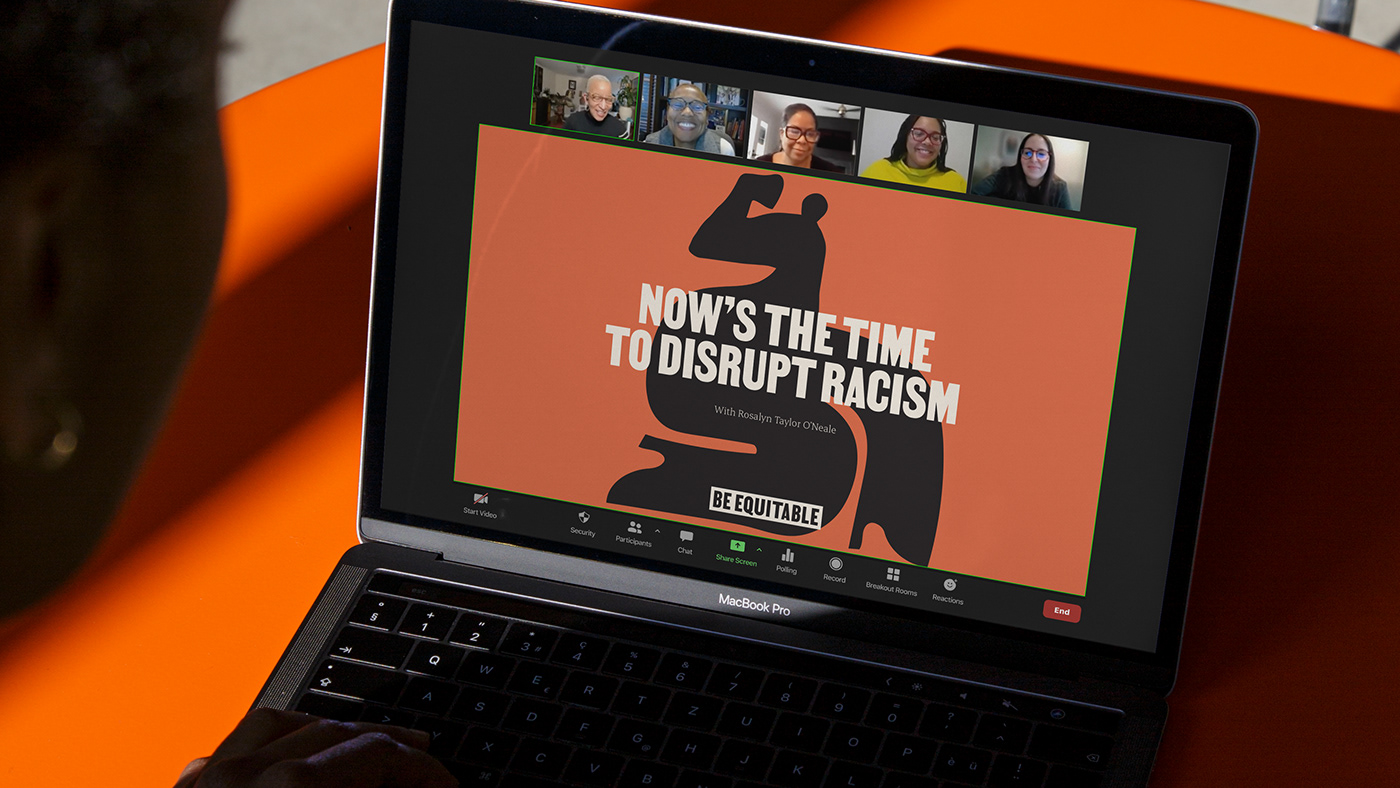
To lead the world into a more diverse and inclusive future, Be Equitable couldn’t shy away from the conversation. They had to start it. To help them find their voice, we needed to answer a question many of us still struggle with: how do we engage in a productive conversation about equity? For Be Equitable, this meant speaking directly about the issues, educating with empathy, leading with optimism and strategically amplifying the voices of others. In a complex and fast-changing world, it was important for Be Equitable to respond quickly, but thoughtfully, to current issues and events. To help them navigate these moments, we created a guide to speaking up in troubling times and held bi-weekly coaching sessions to ensure they could confidently use their voice to lead the conversation.
This process reminded us of our responsibility as storytellers and required us to pay careful attention to the nuances of our language. This wasn’t just about being ‘politically correct.’ It was about being aware of how our language choices can reinforce norms, uphold beliefs, or exclude others from the conversation entirely. In an environment of openness and vulnerability, we worked closely with Be Equitable to learn from our mistakes and ensure our stories were always a force for good.
A brand built by many.
The IDEA space is incredibly complex and we realised early on just how much we still had to learn — as individuals and as an agency. By working with Be Equitable, we reconsidered terms we had used unconsciously, discovered tools to mitigate bias, and recognised how far our industry still has to go to include creatives from diverse backgrounds. Through this process, we were reminded of the most important lesson of them all: the value of vulnerability.
Recognising the limits of our understanding, we relied on the input, knowledge and empathy of the entire team at Be Equitable. Listening to their expertise and lived experiences was an essential and ongoing part of the process. But with their business based in the US, we needed to work across oceans, across time-zones, and across cultures to develop the new branding together. Through early morning Zoom meetings and weekly workshops, we found ways of working that brought the best of both teams together.
It’s why we made sure Be Equitable’s new branding upholds this approach and supports collaboration with diverse communities. By working with creatives from across the world, the new identity is a step towards inclusivity in itself – a culmination of different skills, experiences and ideas brought together to create a brand built by many. Of course, this is only the beginning of the journey. But with branding that captures their enthusiasm and encourages them to continue doing the work, Be Equitable is ready to lead the world into a more inclusive, diverse, equitable and accessible future.

Executive Creative Director: Jo Roca
Creative Director: Alexis Waller
Designers: Atsaya Gabiryalpillai, Georgia Urie, Emma Turney, Cassie Ciccarelli
Head of Strategy: Damian Borchok
Senior Strategists: Matt Pearce, Claudia Henderson
Head of Storytelling: Mat Groom
Storyteller: Arielle Bodenstein
Account Directors: Mabel Tu, Sonia Uznadze
Illustration: Edward Ubiera
BE Martin Typeface: Tré Seals
Other contributors:
BE Martin, Expressive Typeface – Tré Seals, Dash O’Brien-Georgeson
BE Illustration type conversion – Joseph Dennis
BE Martin Typeface: Tré Seals
Other contributors:
BE Martin, Expressive Typeface – Tré Seals, Dash O’Brien-Georgeson
BE Illustration type conversion – Joseph Dennis


