
While a deliverable was indeed created, I view this project as a study of ux/ui and process. The name "SipSavvy" is a clever play-on words. Savvy is both short for "Savannah" and a way of telling the user that the app knows a lot about coffee.

This was the first time I started putting my thoughts down on paper. As seen on the right side of the page, I originally wanted a “check in” service, all button navigation, a real time map and live twitter feeds. This not only proved out of reach, but wasn’t lending itself to the best design solutions.

This was after awhile of sketching and thinking. The aesthetics started taking shaped here and I realized I needed to simplify a few things.

This was the first model that I actually tested on an Ipad. It was overly ambitious. I realized at this point that the use of full button navigation not only took a lot away from the dps toolkit, but it was difficult (if impossible) to make work 100% correctly. The use of multi-state within multi-state proved ineffective.
It involved a main index of button links (above) that navigate to each individual page. From there, each page (right) has a slideshow at the top, info of the shop underneath, a live twitter feed and a video of the architectural space.
It involved a main index of button links (above) that navigate to each individual page. From there, each page (right) has a slideshow at the top, info of the shop underneath, a live twitter feed and a video of the architectural space.
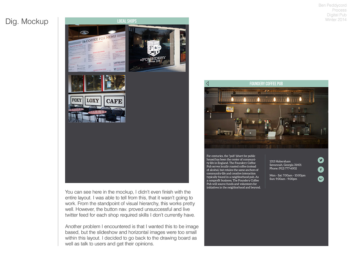
You can see here in the mockup, I didn’t even finish with the entire layout. I was able to tell from this, that it wasn’t going to work. From the standpoint of visual hierarchy, this works pretty well. However, the button nav. proved unsuccessful and live twitter feed for each shop required skills I don’t currently have.
Another problem I encountered is that I wanted this to be image based, but the slideshow and horizontal images were too small within this layout. I decided to go back to the drawing board as well as talk to users and get their opinions.
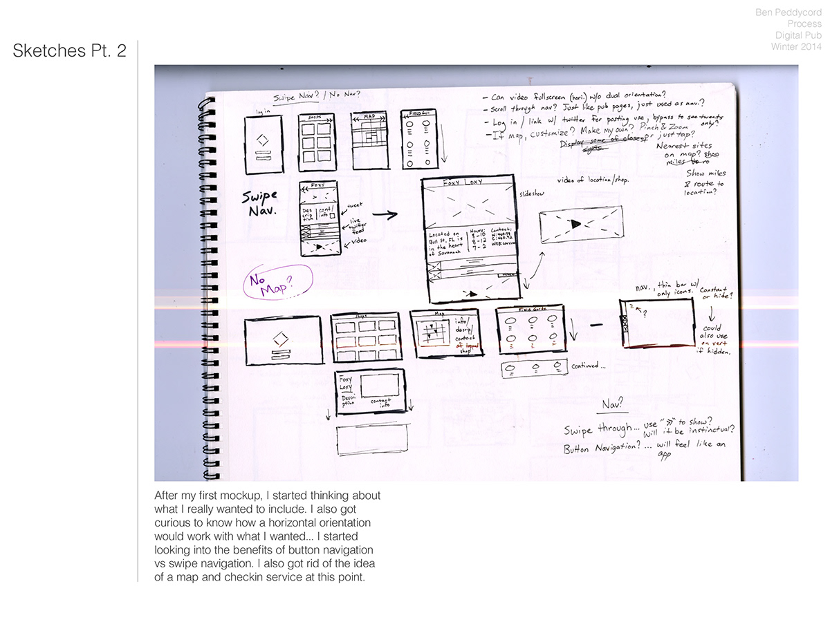
After my first mockup, I started thinking about what I really wanted to include. I also got curious to know how a horizontal orientation would work with what I wanted... I started looking into the benefits of button navigation vs swipe navigation. I also got rid of the idea of a map and checkin service at this point.

I decided to talk to people and observe how they liked to use Ipad. 4/5 people that I talked to and observed prefered to use the Ipad horizontally. I also got feedback that they felt the images were too small when Vertical nav was the standard. I decided to flip the orientation to horizontal and put more focus on the images.

These were the final sketches I came up with. I decided to go with a full horizontal orientation. Instead of using a master index page with links to every other article, I decided to embrace the swipe navigation due to the nature of dps. To put more emphasis on the images (user feedback) I ended up making each shop its own article. Within each article was a single page (swipe down) that contained the video link, and info for each shop.

Here are the wire frames for the first horizontal orientation, with the new photo based nav that I did. This was much closer to what the app needed to be, both in terms of usability and design flow. The main problem I had with this was heirarchy of information. In order to display images in the slideshow without cropping them to a size similar to the size they were when vertical, I had no room to put information or video controls. I needed to solve the problem of image size being too small, and having the right amount of room for type and icons.

This is the first page of the final app, a set of instructions to let the user know how to control it.
"Swipe left and right to travel to the next article or return to a previous one"
"If a particular shop catches your interest, swipe up from the bottom to view more info."
"Swipe down at any point on your journey to access the coffee "field guide."

This is what each page looks like. A simple full screen slide show. This solves the user problem of wanting to see rich imagery displayed at a larger size.

Swipe up from the bottom to reveal a little tab with info on the shop, a link to social media and a tap video. This solved the problem of having too much space for the information available.
Also notice this is the same page as above, but a different image (automatic slideshow)
Also notice this is the same page as above, but a different image (automatic slideshow)

The final page of each app. What the user sees when he/she swiped down. Most people don't know the difference between certain coffee drinks. This chart both actively educates the user, and provides him/her with a bit more confidence when ordering.

