While contemplating the sound and context of my letterform, I began to research languages and pronunciations different from what I was familiar with. I stepped away from romance languages and delved into research on Germanic languages. I came across Icelandic, and found quite a few intriguing differences from the english alphabet. “Z” does not exist in Icelandic and they have two letters english does not have. I found the different pronunciations
of “Y” and “J” the most interesting. “Y” is pronounced like “I” and when “J” is followed by a vowel it makes a “Y” sound. This is where I found an opportunity for a series of new letterforms.
of “Y” and “J” the most interesting. “Y” is pronounced like “I” and when “J” is followed by a vowel it makes a “Y” sound. This is where I found an opportunity for a series of new letterforms.
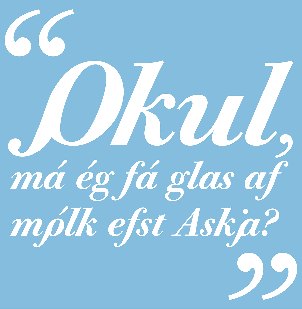
I wished to create a series of ligatures for “J-vowel” pairings. I see these new ligatures as a completely practical amendment to the Icelandic alphabet. It is not the first time the Icelandic alphabet has gone under revision in recent years, the last being in 1973.
I plan to integrate this idea into any typface I design in the years to come.
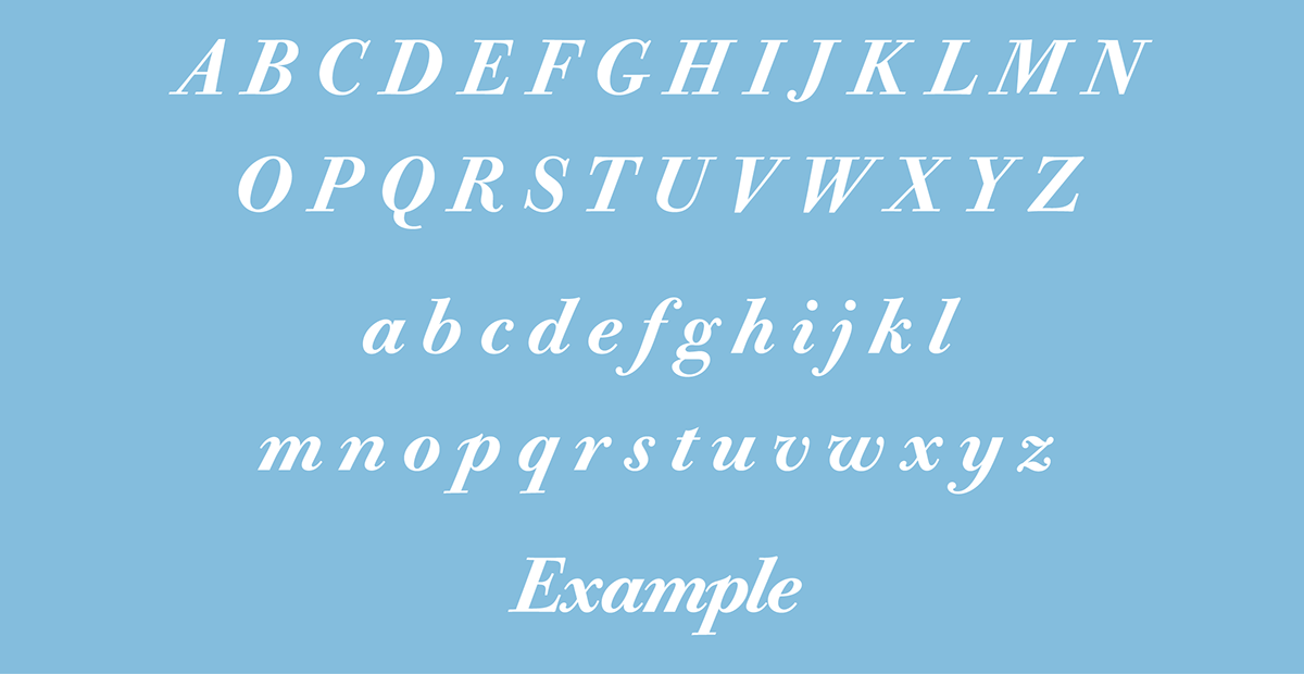
The font I used is Bodoni Old Face Medium Italic. For the series to be complete, both majuscule and minuscule versions of each ligature were required. Some of the letters lent themselves to each other more readily than others. Uppercase “JA” and lowercase “ji” were particularly challenging. In order to retain unity throughout the alphabet with the addition of these new forms, I ensured the original heights and depths of the letters. “JA” utilizes the tail of J, and the stem and cross bar of A. I appropriated the unique finial-esque stroke of the lowercase “p” to inform the transitional strokes from J to A. The angle of the A stem was kept intact. The two tittles and overall similarity between “j” and “i” were problematic. The spacing of the tittles was derived from the diaeresis available in Bodoni. The size was retained from the tittles. The placement of the tittles was shifted to align with the original tittle of the “j”. The transitional stroke was inspired by the shoulder of a lowercase “n”. By drawing upon strokes from other letters within the font I was able to retain the integrity of the typeface as a whole.