BEN'S BEST
Restaurant / Bar in Miami | Logo & Visual Identity
[ project year: 2021 ]
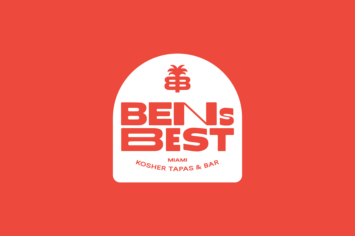
Latin American and Caribbean dishes with Miami style and Kosher friendly. It’s a new, unexpected way for a Kosher restaurant. The purpose of the restaurant and bar is to serve a menu which usually is not typical for Kosher. The Visual style is bold and uses both tropical and Jewish graphic elements. Colors are bright red, in contrast with a clean white. The symbol on the logo is a palm with letters BB for Ben's Best. A palm is one of the most common symbols of Miami and so is for Ben's Best. A simple pattern of triangles is used to form a circular shape like a solar symbol. The shape of the Tablet of Stone is used as a subtle connection to the Jewish culture. The little roughness of the logotype makes the place to look more informal and friendly, and gives it a retro touch. The contrast between the letters makes it more dynamic, playful and contemporary. The overall concept and the tone of communication are based on the humour and contrasting ideas.