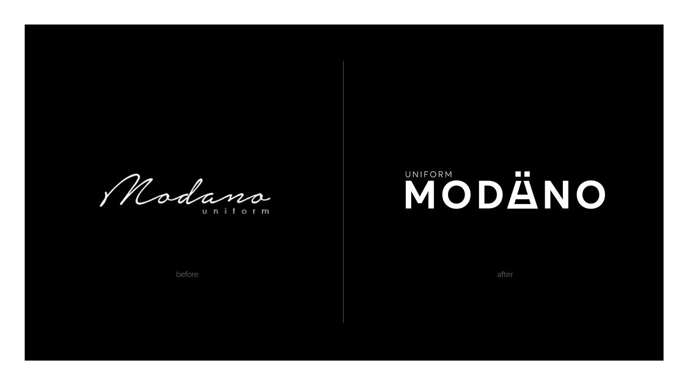
Rebranding of aprons and uniforms manufacturer. The task was to develop a new identity, which should be more brutal and at the same time minimalistic.
As a result, the logo has become more unique and memorable. It became better readable, while becoming cleaner, and an additional element in the form of an umlaut added a Scandinavian style.
The main element of the style was a stylized apron inscribed in the letter A.