Health service. Primary healthcare branding

In 2021, we were approached by the client, ANСO National Priorities, with the task of creating a comfortable environment for employees, patients and visitors of primary health care organizations, to form their positive image. Primary care includes adult and children's polyclinics, women's clinics, ambulance and emergency care, and feldsher-midwife stations. The main task of the brand was to become unifying for departments across Russia, to create a general human-centered system that would be recognisable to visitors.
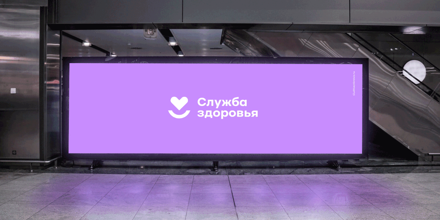
We had to develop a simple brand name that anyone could understand, but at the same time that name had to convey brand expertise and inspire trust and safety. Thus, we came up with the name "Health service" - friendly, neutral, non-intimidating and could be easily combined with many different department names.
A recognisable sign was developed in the conceptual phase. It’s about supporting your health, conveying friendliness in the smile and human-centredness in the heart. The naming and the sign fit together perfectly ideologically and logically. At the same time, we understand that the logo is the main point of contact for the brand, and will be placed both in large regional centres as well as in scarsely populated remote locations.
For certain services, such as the ambulance and children's polyclinics, additional signs were created, continuing the basic idea of the logo, but different in terms of graphics.


A special typeface was developed for the logo, which could be used in different forms: digitally and in print, as well as in volume.

The corporate font is simple and straightforward, easy to understand for any target group. The colour palette consists of a basic bright blue with a slight purple undertone to convey the brand's digital nature, combined with a confident black and neutral white. The complementary palettes for the adult and children's divisions differ in shades. There is also a separate colour scheme for illustrations and graphics.

Additional graphics have been developed for the brand – icons, patterns, illustrations that help to better reveal the brand and are used in different communications.


The illustrations bring the communications to life perfectly, making them understandable to people of all ages and groups.

The communications are about maintaining a healthy lifestyle, longevity and disease prevention. Vivid graphics make the story more lively and human-centred.


Separately, minimalistic and stylish merchandise has been developed for people to wear with pleasure.


The uniforms of the employees and the design of the vehicles are not reserved and understated, but friendly, bright and expressive.


All the constants of the new brand are included in a voluminous, clear guide that covers the needs and questions of managers and unit designers from major centres and small towns.

Project team
Ilya Lazuchenkov, CEO
Varvara Kanevskaya, Account director
Alyona Bystrova, Producer
Katya Palshina, Head of Strategy
Alyona Bystrova, Producer
Katya Palshina, Head of Strategy
Olga Barkova, Senior Strategist
Olga Kuznetsova, Strategist
Olga Kuznetsova, Strategist
Oleg Ahn, Content Producer
Egor Myznik, Head of Design
Maria Pechkurenko, Art director
Egor Myznik, Head of Design
Maria Pechkurenko, Art director
Irina Purtova, Art director
Andrey Zhaglin, Art director
Evgeniya Khludentsova, Designer
Anna Volkova, Designer
Typeface designer
ANCO National Priorities team
Ministry of Health of the Russian Federation
Anna Volkova, Designer
Typeface designer
ANCO National Priorities team
Ministry of Health of the Russian Federation


