
Building a brand for a new, even more nutritious rice
Our design team at IDEO partnered with the founder of RightRice to create a launch-ready brand—including positioning, values, personality, visual identity, packaging, website and more—designed for consumers’ needs.

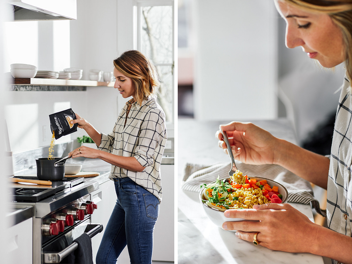
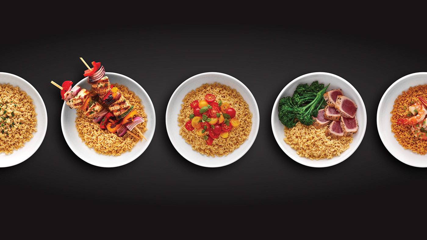
The new, shelf-stable grain is made from a blend of lentils, chickpeas, peas, plus rice, making it easier to pack in more plant-based nutrition without compromising on flavor.

RightRice is available in five of the most popular rice flavors from ingredients you can read. The visual identity makes it easy for consumers to navigate toward their preferred flavor.

The dominant black package and its stark simplicity was designed to break the norms of the rice aisle. The black brings a premium, culinary edge while the cut out window provides transparency to the product, and acts as both a smile and a bowl full of rice.
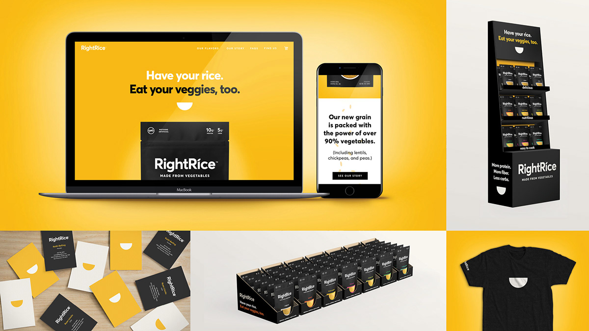
In addition to the visual identity, the team designed RightRice’s go-to-market website and initial launch materials.
Enjoy!
