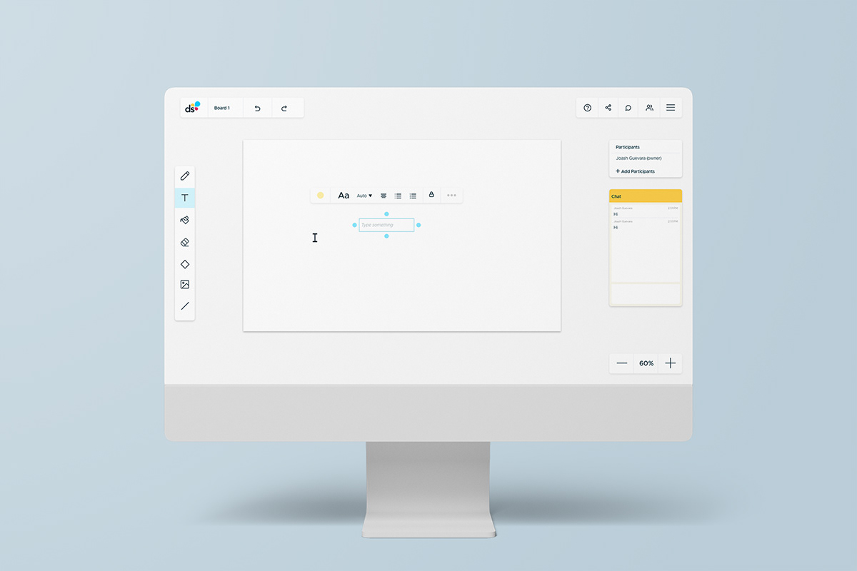
Complete redesign (UX/UI + Branding) for an online whiteboard.
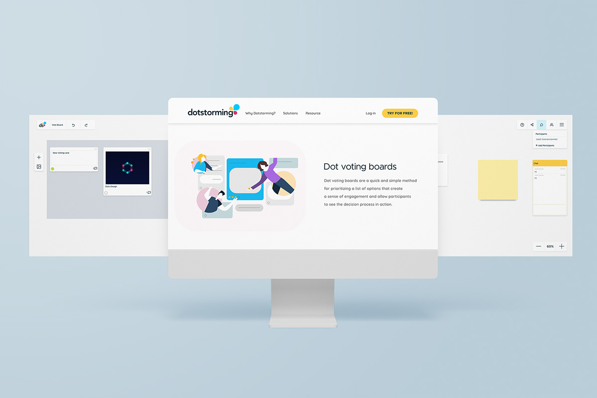
I was asked to update the design of an online whiteboard. The task which initially started as just a face lift turned in to a full UX/UI + Branding project after I conducted an audit of the site and presenting my findings.
Research
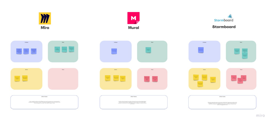
I began by doing a competitor analysis to see how the current online whiteboard landscape was like. I looked at all their key features, branding, the ease of the UX and the feel of the UI. I also conducted a few interviews and surveys with some target users that included students, teachers and creative professionals. This gave me insight on their needs and how they interacted with online whiteboards.

Information Architecture
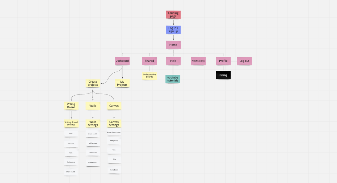
I did an audit on the old website and put it up against the criteria from the competitor analysis and looked at ways I could improve the site. One of the main points I found was that their UX was lacking in clarity despite the site being quite wordy. Users often got lost or confused when trying to find certain functions, tools, or boards. To help improve this I took all the key features and categories and performed a card sort.

From the results of the test I created a new hierarchy for the website as well as sorted out the tools needed for each type of board.
Wireframes

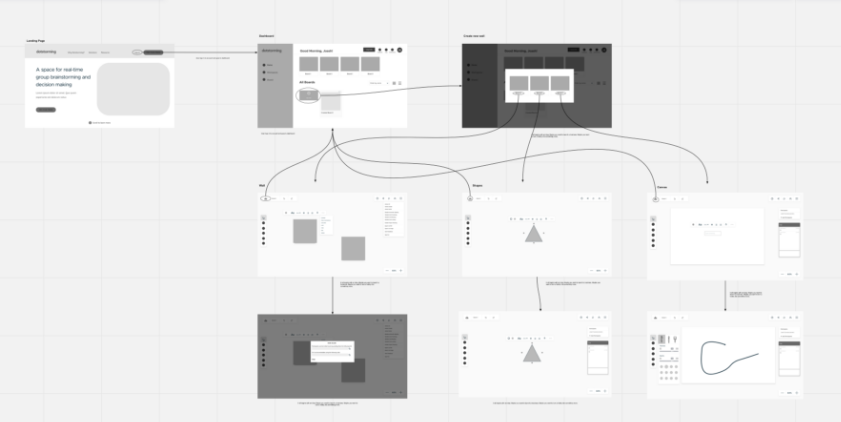
Wireframes were created based on the research. The walls and tools layout were also redesigned and updated to reflect what was missing in the previous site.
Before


This was the previous branding and site UI.
Rebranding
From the beginning I knew that there was a need to refresh the branding of the site as it felt uninviting and technical, especially for the target audience they were trying to reach. This was further confirmed by the competitor analysis as well as a few interviews and questionnaires with their target audience. I chose to go with more playful color palette to make the brand more inviting and modern while still making sure it felt professional.



Landing Page
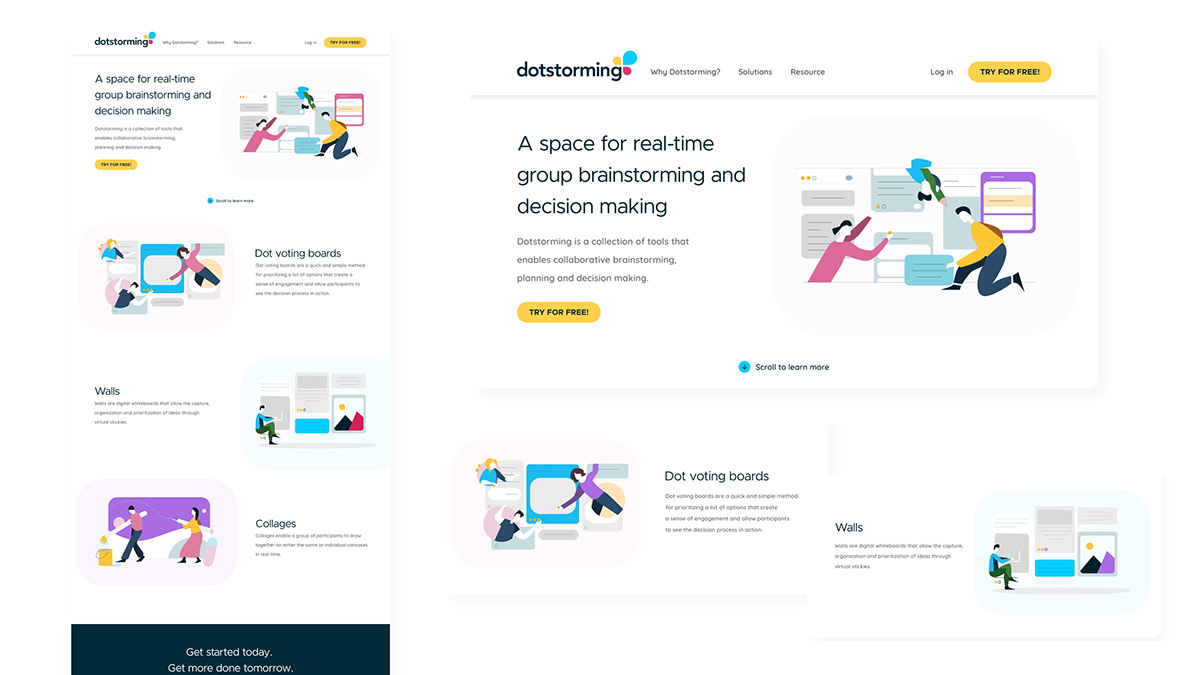
I updated the landing page to highlight key features to so that new visitors can get a quick overview of what the site is about.

Dashboard
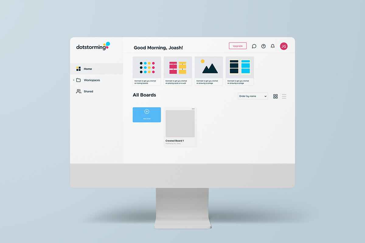
I created a dashboard layout that housed all the key navigation points.
- Users are easily able to jump into their boards
- Create new boards from scratch or use templates
- View shared or collaborative boards
- Access their profile and billing
Walls, Voting board, Collage
Based on the research gathered from interviewing users and the target audience, I added more tools to certain boards and rearranged their hierarchy based on the most used tool for that board. I redesign the layout of the canvas space so that all the essential information is easily accessible and also improved the icons so that their functions are better understood at a glance.
