
The Typography Explorer's Guide (Guia do Explorador Tipográfico) is a digital publication developed as the final project paper in Graphic Design at UFSM, under the supervision of Volnei Matté. It was the result of an applied, quantitative, qualitative, and exploratory research of design as reading's motivator and facilitator through motivational aspects and typography. This publication is aimed at children above 8 years old, already acquainted with reading, and its purpose is to expand the knowledge about typography, allowing a greater understanding of design as a broad field. Although the target audience is children, the publication can also be used by anyone interested in typography.

The typeface Abril Fatface, designed by Veronika Burian and José Scaglione, was chosen to be used on headers and subheaders. Its contemporary design, curves, and high contrast, give a strong personality to the page. The research previously made with children also helped on the choice of Abril Fatface: 90% of the children liked serif fonts, defining them as more "fun and childlike", which suggests that these typefaces have a positive influence on the motivation to start reading.
The typeface Open Sans, designed by Steve Matteson, was also chosen based on the research made with children: every interviewed children considered sans serif fonts "normal fonts", once they are used to read them regularly. Open Sans' open forms and neutral design allows it to be used in long texts, which is why it was selected for use on paragraphs and captions inside the digital publication.

The publication was divided in six chapters. The first one is about typographic concepts, where the user will get familiar with the typographic terms and basic concepts such as serifs, weight, styles, etc.


Summary. Each animal was designed to look like the typeface they represent.


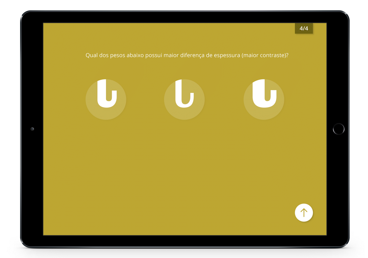
The next five chapters have information on five different typefaces and its particular characteristics. Using tools such as the X-ray Glasses and Binoculars, the user can get to know their personality and closer details. Each chapter is divided in four parts: the first one presents an introduction about the typeface and compares it with an animal. On the second part, the user enters the X-ray glasses and gets the comparison between the typefaces and the animals anatomies. On the third part, the user activates the binoculars, where he can see the details closer. In this section, the user can also get access to the "Advanced explorer" content, which presents a more complex information about the details seen before. Finally, on the last part, the user answers a question about the content presented along the chapter.


As the user ends their journey, they receive a badge of "Certified explorer".

