


Building one house for a whole village
As most businesses do, SJB started small – with the surnames of founders Alan Synman, Charles Justin and Michael Bialek giving the fledgling architecture practice its name. But in the almost five decades since then, the practice had expanded more than they could’ve initially imagined.
Now, the business is split over two main offices – Sydney and Melbourne. Their offering has broadened – encompassing architecture, interior design, planning and urban design. And their team has grown both much more numerous, and much diverse. But that diversity wasn’t being properly represented by the brand, which receded as the team struggled to decide how (if at all) to collectively portray their multitudes.
The SJB story is one of constant evolution. From the three directors and one employee in 1976, to a multi- studio collective working all over Australia with over 200 staff. To reflect this new reality, the new brand needed to demonstrate their multi-layered diversity and perspective as one confident and united front.
Both monolithic and modular
One of the primary challenges to reckon with when beginning the project was the many different teams within the business, many of which operated in totally different markets. Were many small brands required to represent this all? Ultimately, it was decided that a single, monolithic brand would best represent the all-for-one, one-for-all nature of the SJB collective – but it would need to have the flexibility to represent all that SJB had to offer.
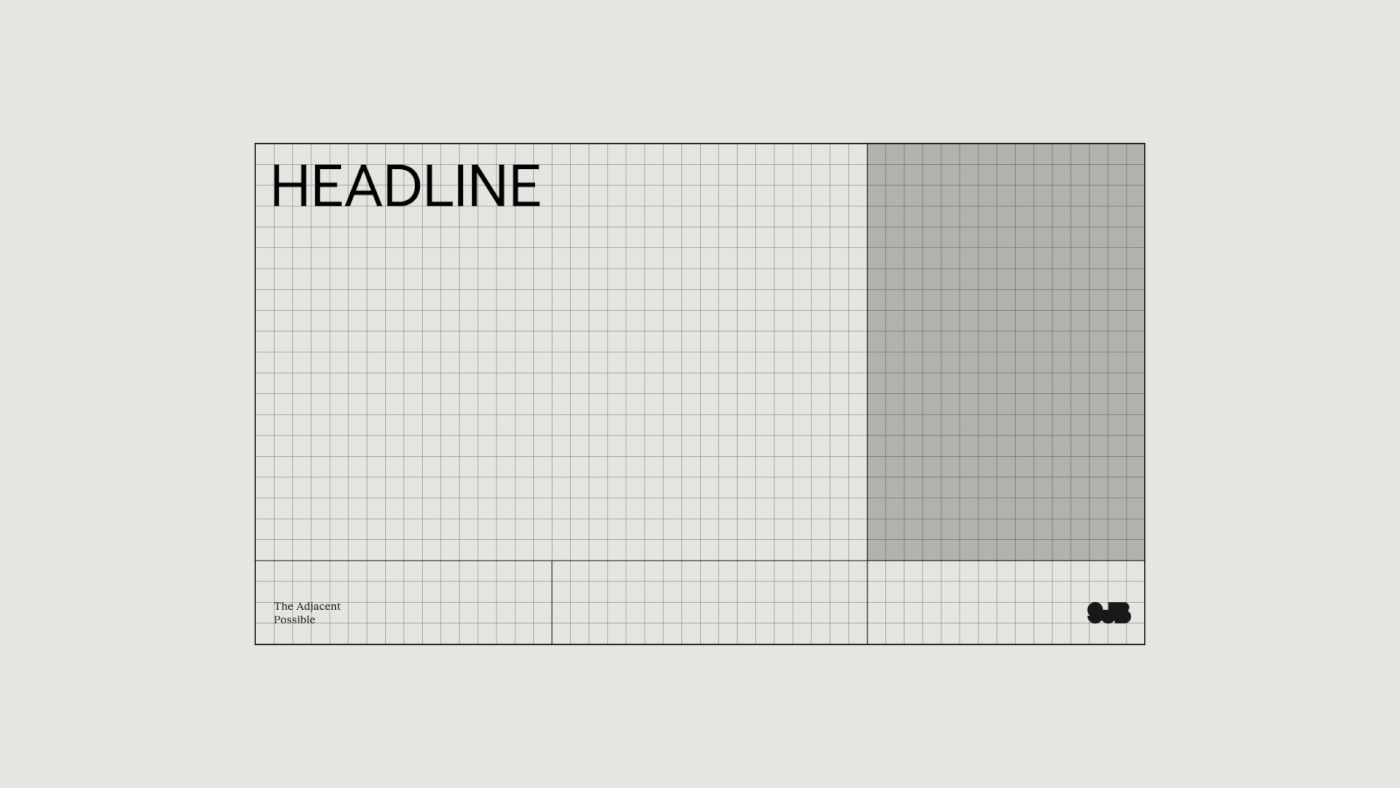
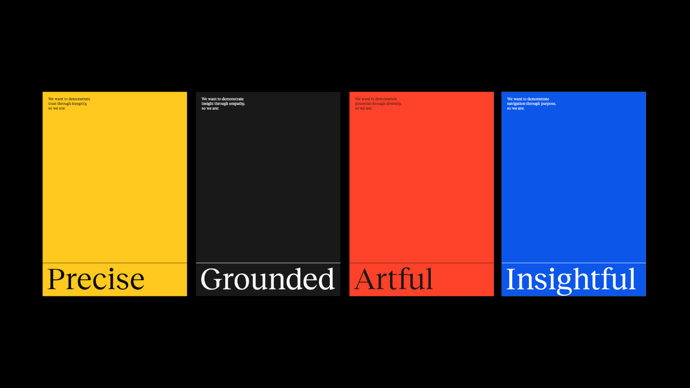
The key to this was creating space for what makes SJB distinct: ‘the adjacent possible’ – that unexpected, powerful potential that can only be discovered when a group of people from diverse backgrounds, with diverse experiences and specialties, come together without ego or concern over hierarchy.
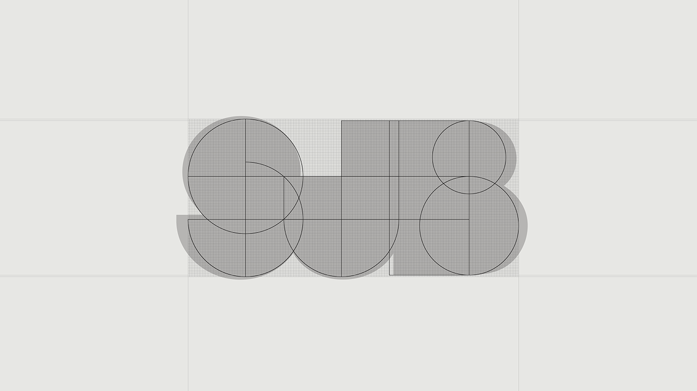
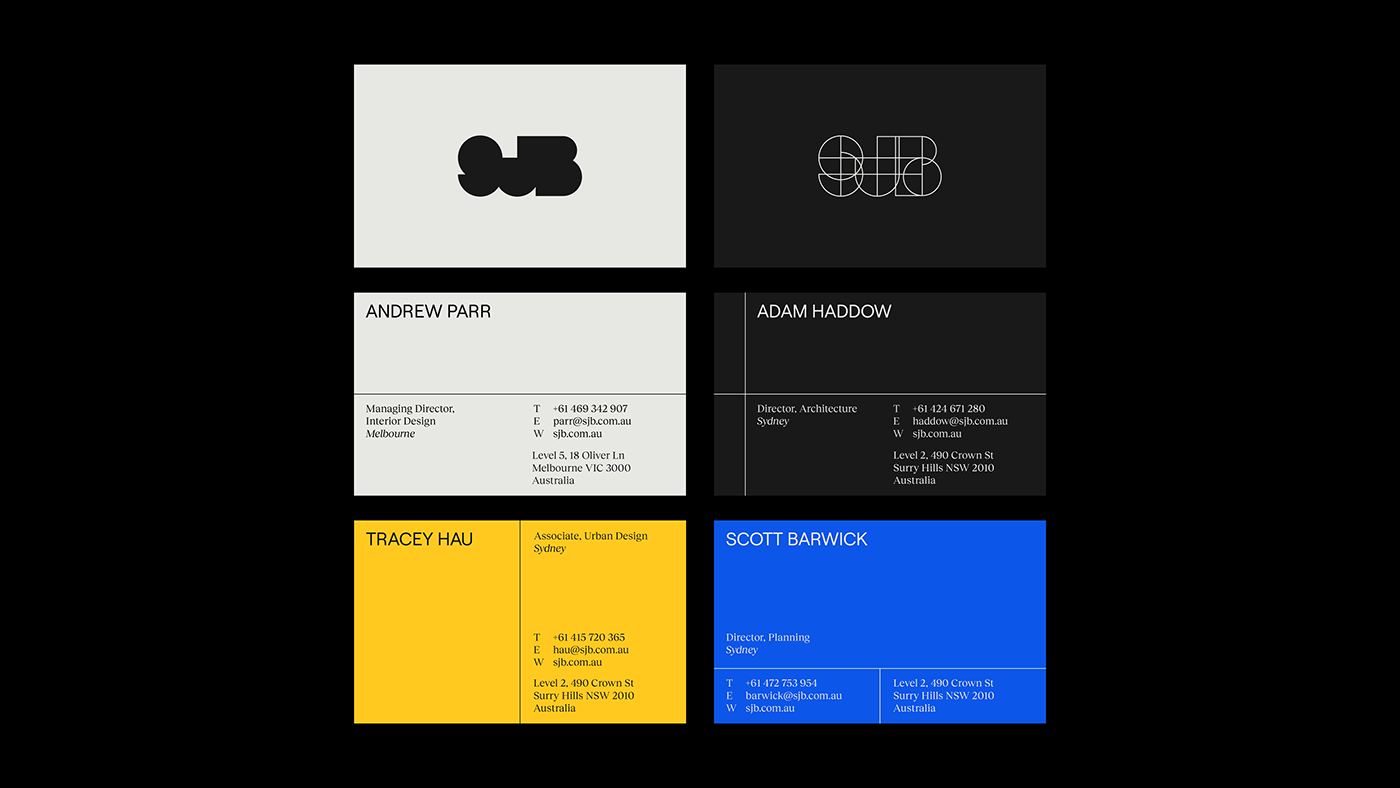
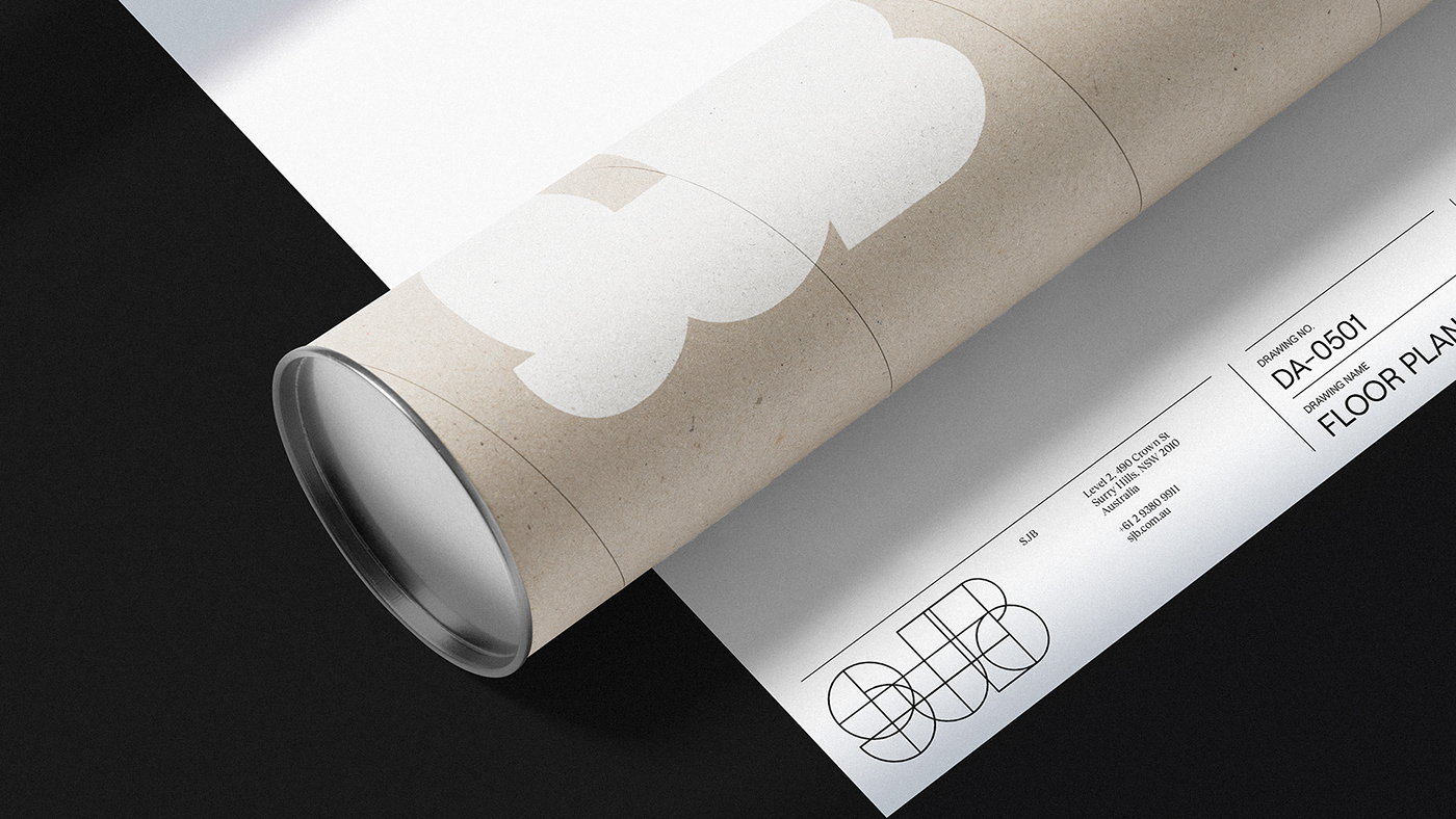
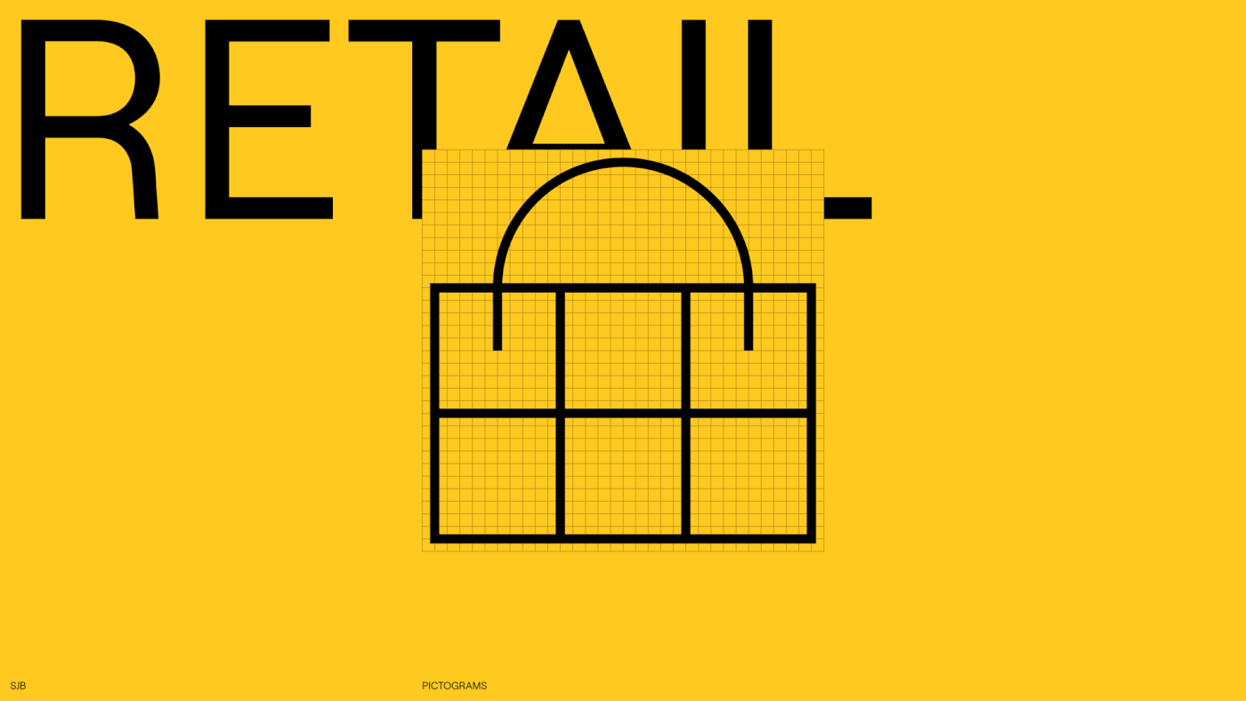
But making that space required a flexible brand foundation, built on a keyline grid system – one that was recognisable and reliable, but could shift and adapt to the great many contexts SJB operates in. This system evokes the modernist and minimalist architectural cues.
The key to this was creating space for what makes SJB distinct: ‘the adjacent possible’ – that unexpected, powerful potential that can only be discovered when a group of people from diverse backgrounds, with diverse experiences and specialties, come together without ego or concern over hierarchy.
But making that space required a flexible brand foundation, built on a keyline grid system – one that was recognisable and reliable, but could shift and adapt to the great many contexts SJB operates in. This system evokes the modernist and minimalist architectural cues.


A Collective SHIFT
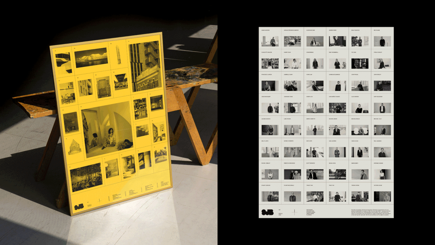
SJB now recognises a different model in that it is effectively a collective of experts working collaboratively and separately as a multi-disciplinary practice that embraces architecture, interior design, town planning and urban design. “SJB is an industry leader, from built form outcomes to our inclusive and progressive studio culture. Our updated brand is a celebration of who we are and reflects our shared values,” says Andrew Parr, Director, Interiors, SJB.
In keeping with this philosophy, the new SJB brand is far more human-centric, and is demonstrated in application such as the website. Notable shifts are seen in SJB acknowledging and celebrating authorship of work by its leaders, collaborators and clients, along with the inclusion of new perspectives, essays and thought pieces by industry experts.
“SJB is an industry leader, from built form outcomes to our inclusive and progressive studio culture. Our updated brand is a celebration of who we are and reflects our shared values,” says Andrew Parr, Director, Interiors, SJB.
Getting under the hood
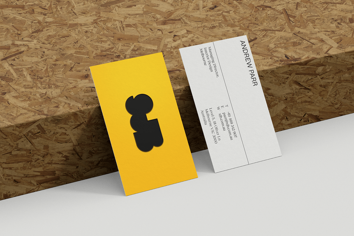
The SJB logo, or the blob, as it’ was affectionately referred to, was very recognisable and it would been a great shame to see it go. But, a a few tweaks here and there would help to bring it more in line with the heavily gridded design system. Through this redrawing, came the added benefit of allowing for new variations for special situations that elaborated on the modular system. Even the relatively simple structured logo could demonstrate new possibilities.


Bringing texture to structure
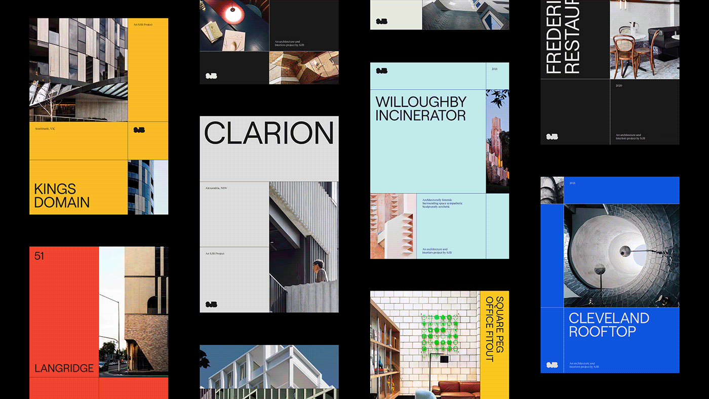
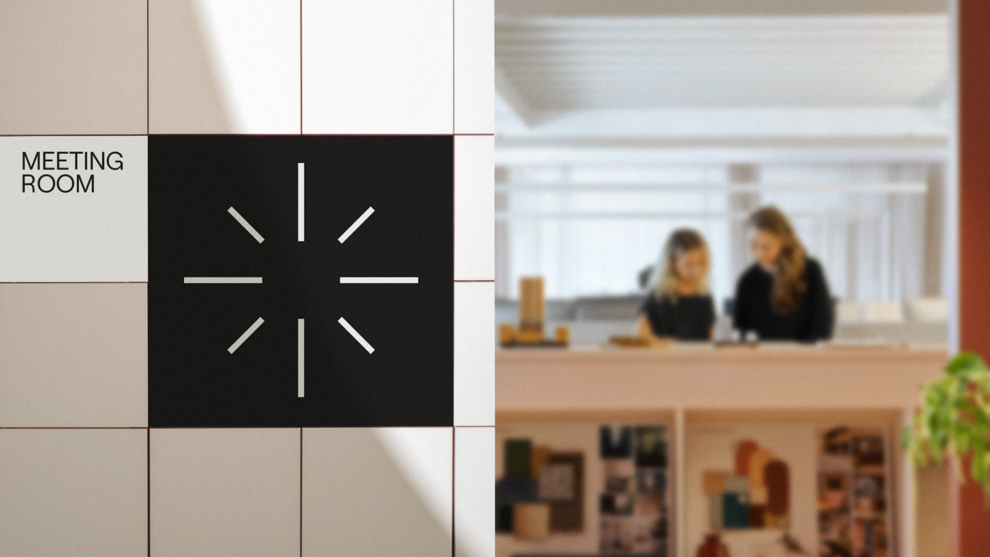
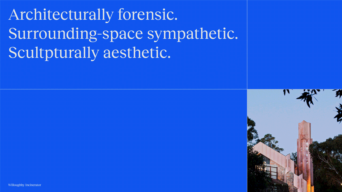
When building out the system, a new approach to photography was developed, showing how to find the humanity in created spaces – whether it’s by literally showing how people engage with spaces in an authentic way, or by shooting from a human perspective, to show the human consequences of design and planning choices.
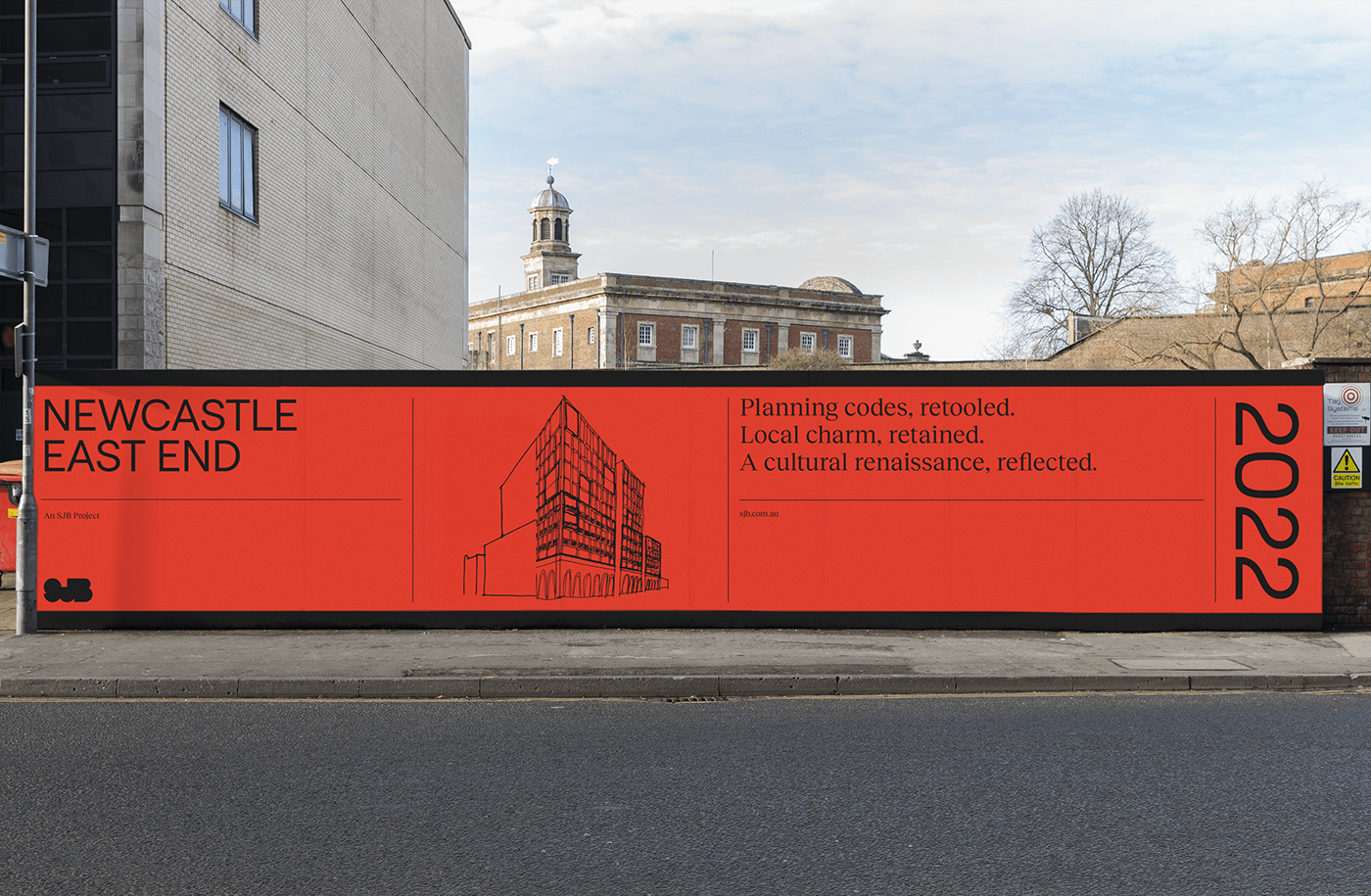
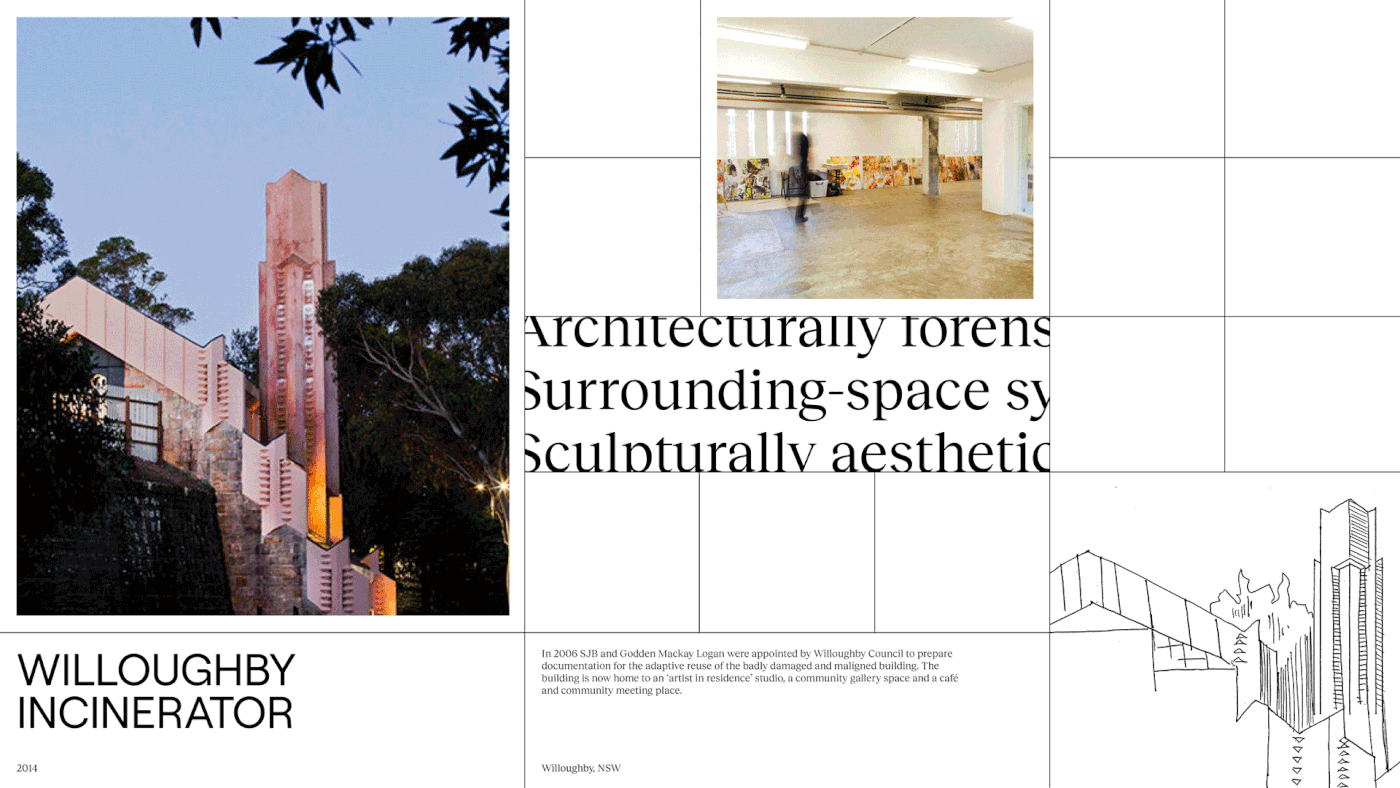
But part of showing the power of ‘adjacent possibilities’ requires showing the path not taken – so threading architectural sketches, material examinations and other process documentation through the identity given an insight into how different phases are navigated.
But part of showing the power of ‘adjacent possibilities’ requires showing the path not taken – so threading architectural sketches, material examinations and other process documentation through the identity given an insight into how different phases are navigated.

Open homes, open hearts
Writing in the category is often detached, clinical and vague – after all, it’s easy to avoid criticism if you’re loose with the details. But knowing that SJB’s work could more than hold-up to close scrutiny, we encouraged them to invite readers into the details – creating a vulnerable brand voice system with traits that guides writers to get specific about details, speak with empathy, reach for human insights and embrace artful expression.
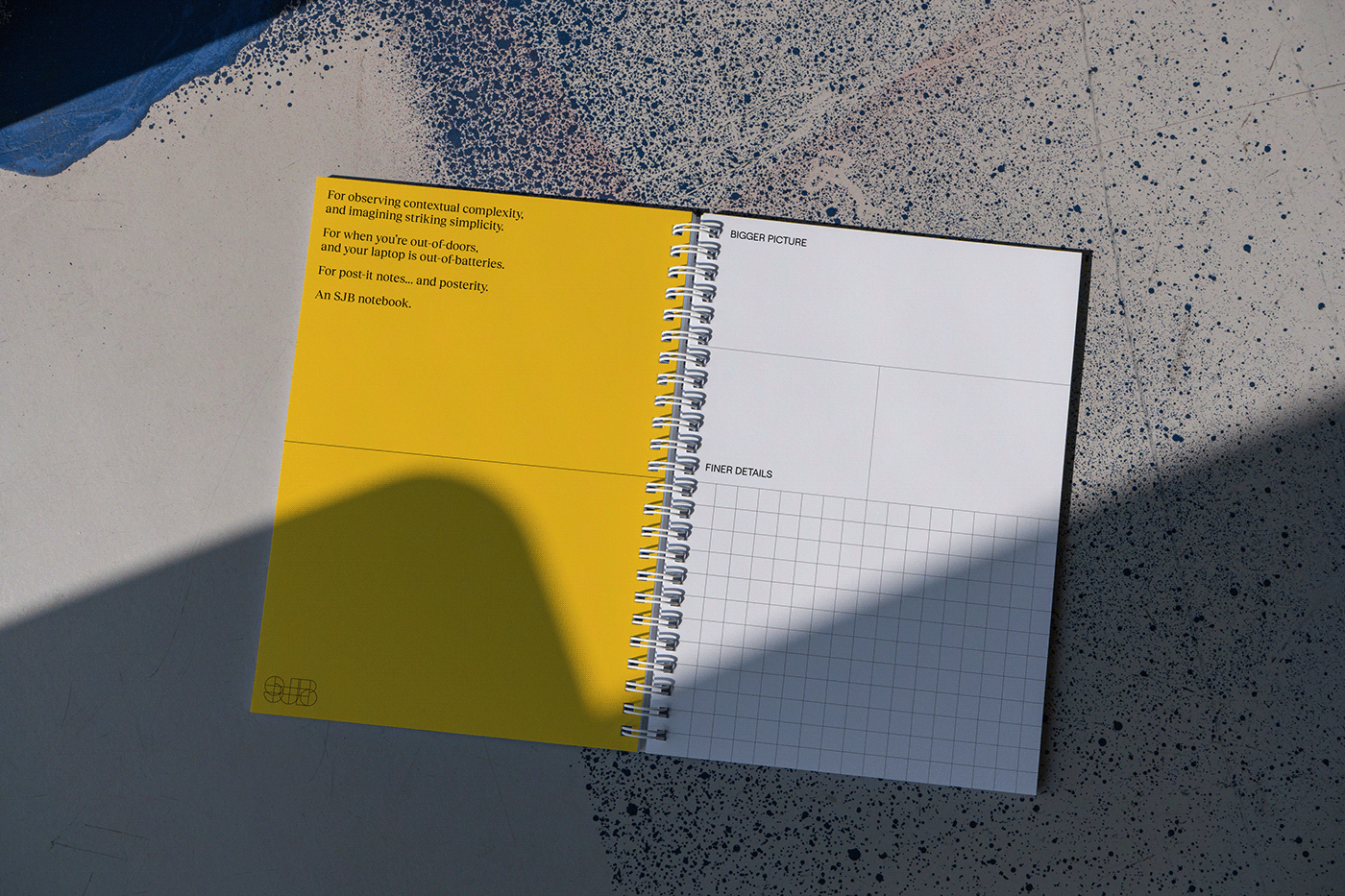
To support this, we created a multi-levelled narrative structure that provides guidance on how these elements can work together – whether its for a striking architectural design case study, a breakdown of a complex-but-important planning achievement, or a charming company notebook.
To support this, we created a multi-levelled narrative structure that provides guidance on how these elements can work together – whether its for a striking architectural design case study, a breakdown of a complex-but-important planning achievement, or a charming company notebook.

Letting the light in
All of these elements of the brand work together to tell a subtle-but-nuanced story – about how the specific, tangible benefits of genuine diversity can be shown, and how the fundamentally human arts of design and planning can be expressed in a fundamentally human way.
“The brand identity is deftly straightforward. Drawing on our many previous reinventions, there are modernist ideals, minimalism and simplicity that counter moments of warmth and craft all the while playing the supporting role to our published work,” says James Kennedy, Communications Manager, SJB.
“The brand identity is deftly straightforward. Drawing on our many previous reinventions, there are modernist ideals, minimalism and simplicity that counter moments of warmth and craft all the while playing the supporting role to our published work,” says James Kennedy, Communications Manager, SJB.

Credits
Creative Directors - Jo Roca
Executive Creative Director - Jason Little
Design Director - Olivia King, Nicola Ferry
Copywriters - Mat Groom, Daniel St. Vincent
Designers - Dash O'Brien-Georgeson, Mac Archibald
Motion Design - Mac Archibald, Dash O'Brien-Georgeson
Strategists - Damian Borchok, Malcolm Miller, Sammy Page
Developers - ED.


