COLORS Magazine
Being the "magazine about the rest of the world", COLORS depicted explicit content and image juxtapositions that were shocking to the world at the time it first began publishing its first few editions in the 90s. To completely rebrand, re-structure and reorganize its image to what is current and relevant, I decided to go with a more toned down and lighter COLORS magazine edition that more people would enjoy.
Being the "magazine about the rest of the world", COLORS depicted explicit content and image juxtapositions that were shocking to the world at the time it first began publishing its first few editions in the 90s. To completely rebrand, re-structure and reorganize its image to what is current and relevant, I decided to go with a more toned down and lighter COLORS magazine edition that more people would enjoy.
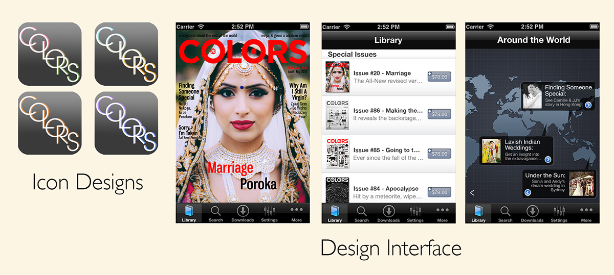
Problem: Reposition a brand with a new user-interface by improving magazines and making them look digital. Factors include the app's icon design, the look and feel of the UI and a promotional video for the launch of the new app.
Solution: The taglin became the inspiration and fundament of the story behind the promo video. The notion that the app can let you see another dimension of customs and traditions that could be celebrated in one part of the world and looked down upon on the other. It's seeing the different perspectives in different parts of the world
With this magazine app, it allows the readers to relate more and see things in a new light compared to just a regular hardcopy magazine. One can watch videos and see other external links and relatable content, jump to and fro, back and forth, that can allow the user to get a fuller and broader global experience of the things they are reading about.
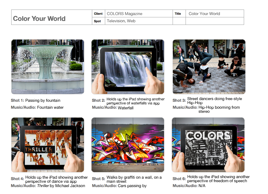
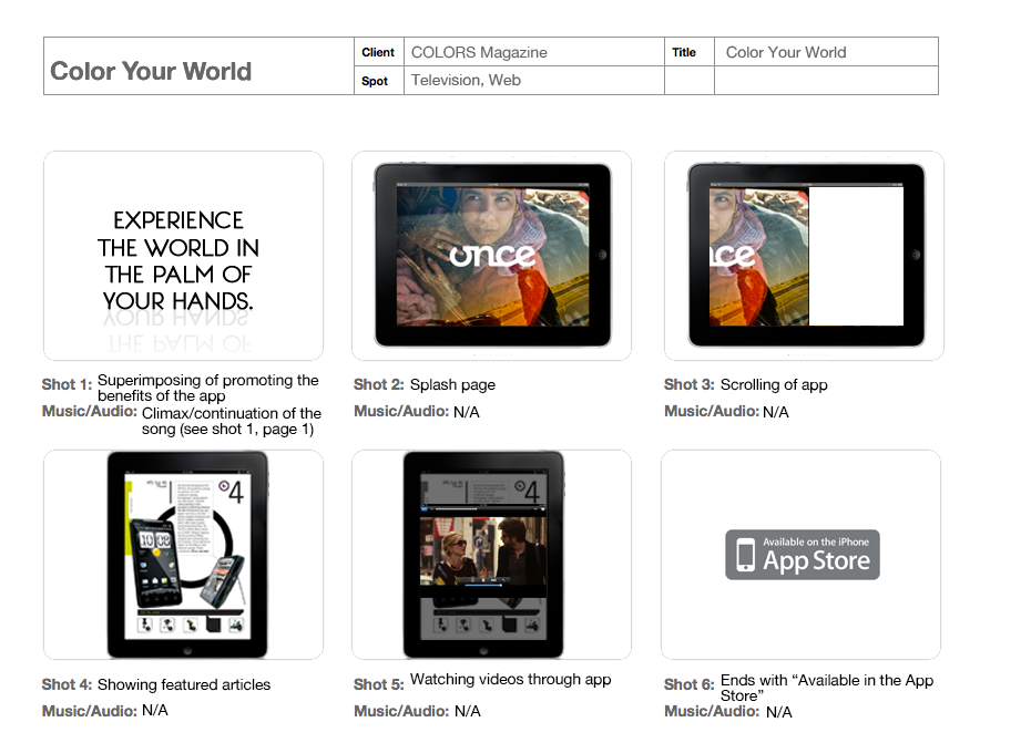
Promotional Video
Storyboard

Moodboard

Cover Re-design


User-Interface Development