FR
.
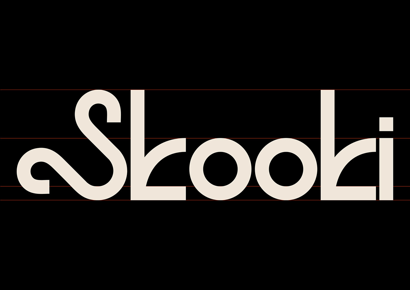
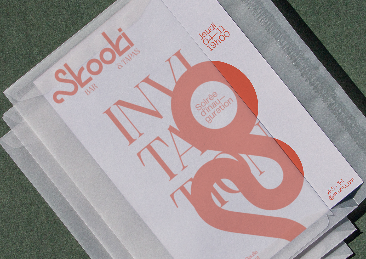
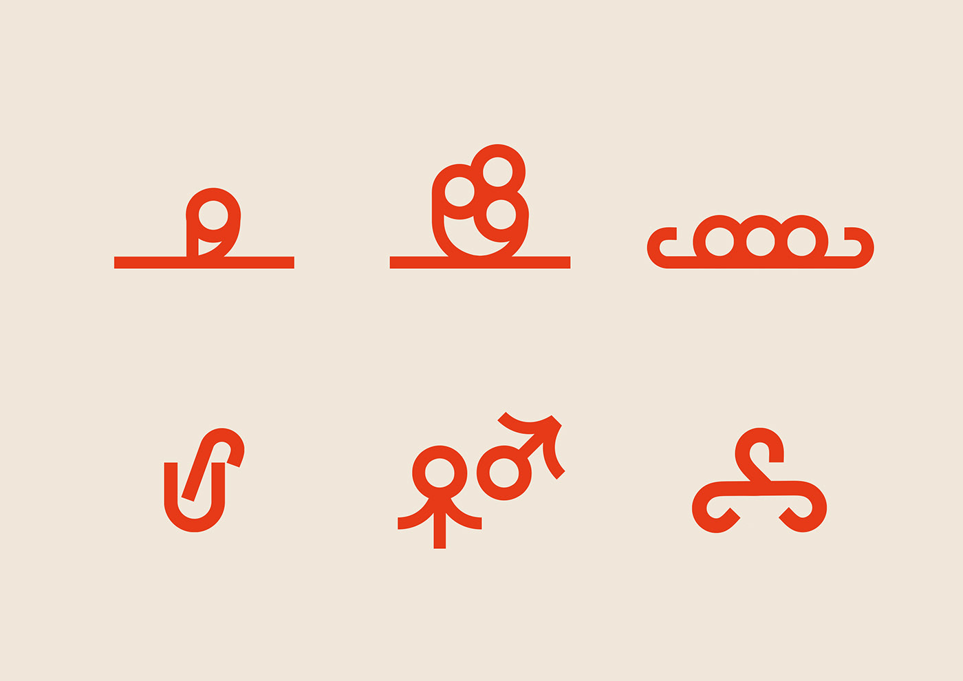
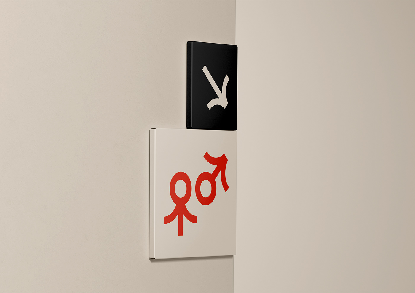
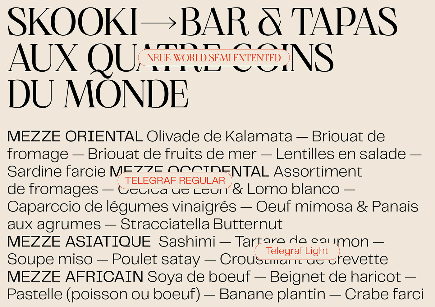
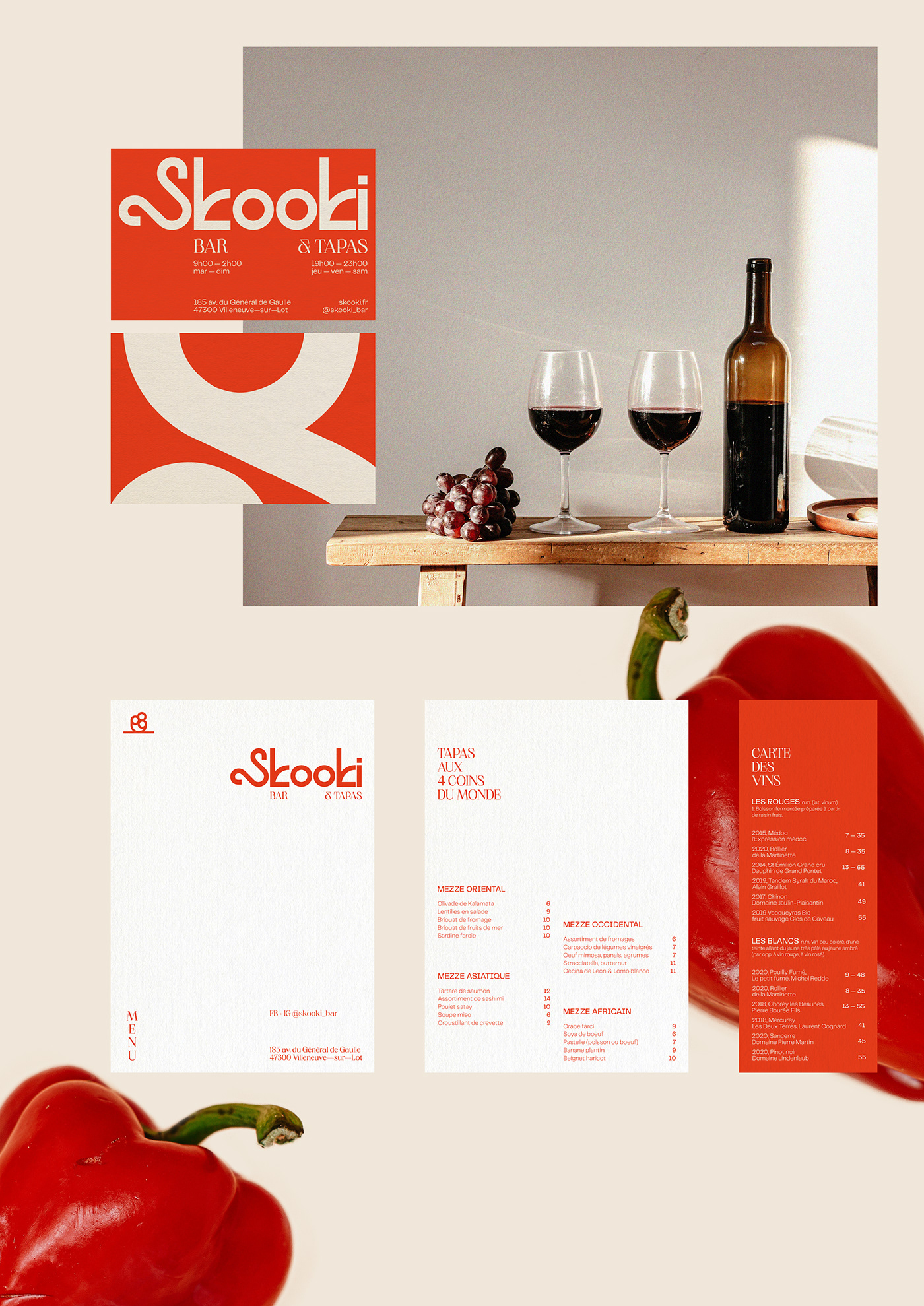
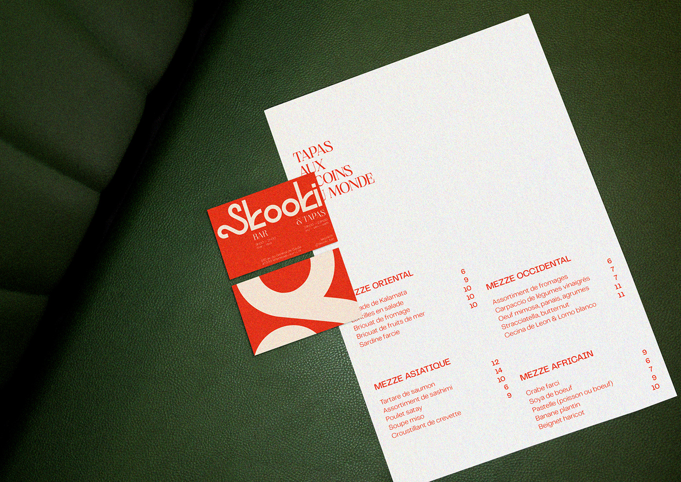
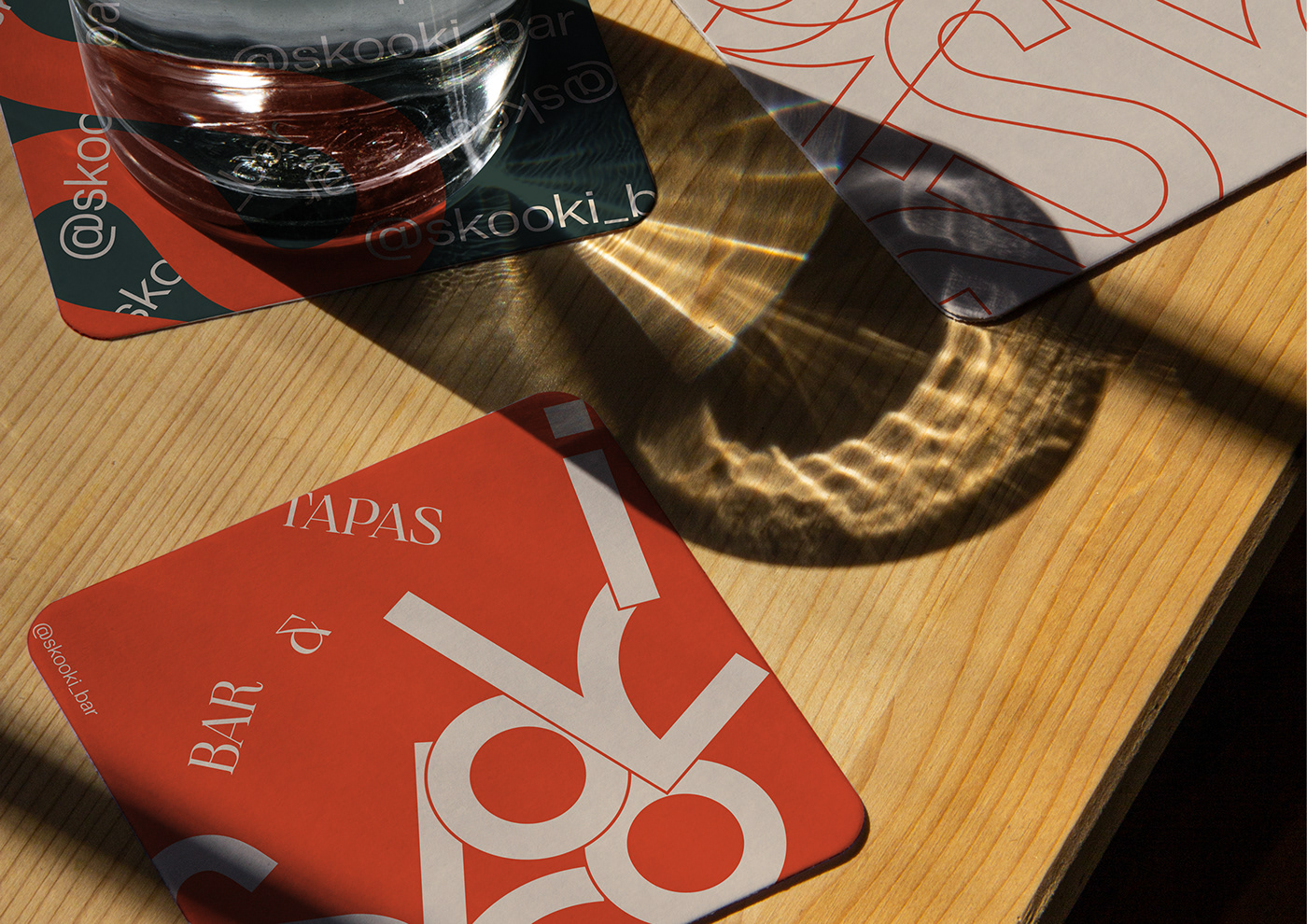
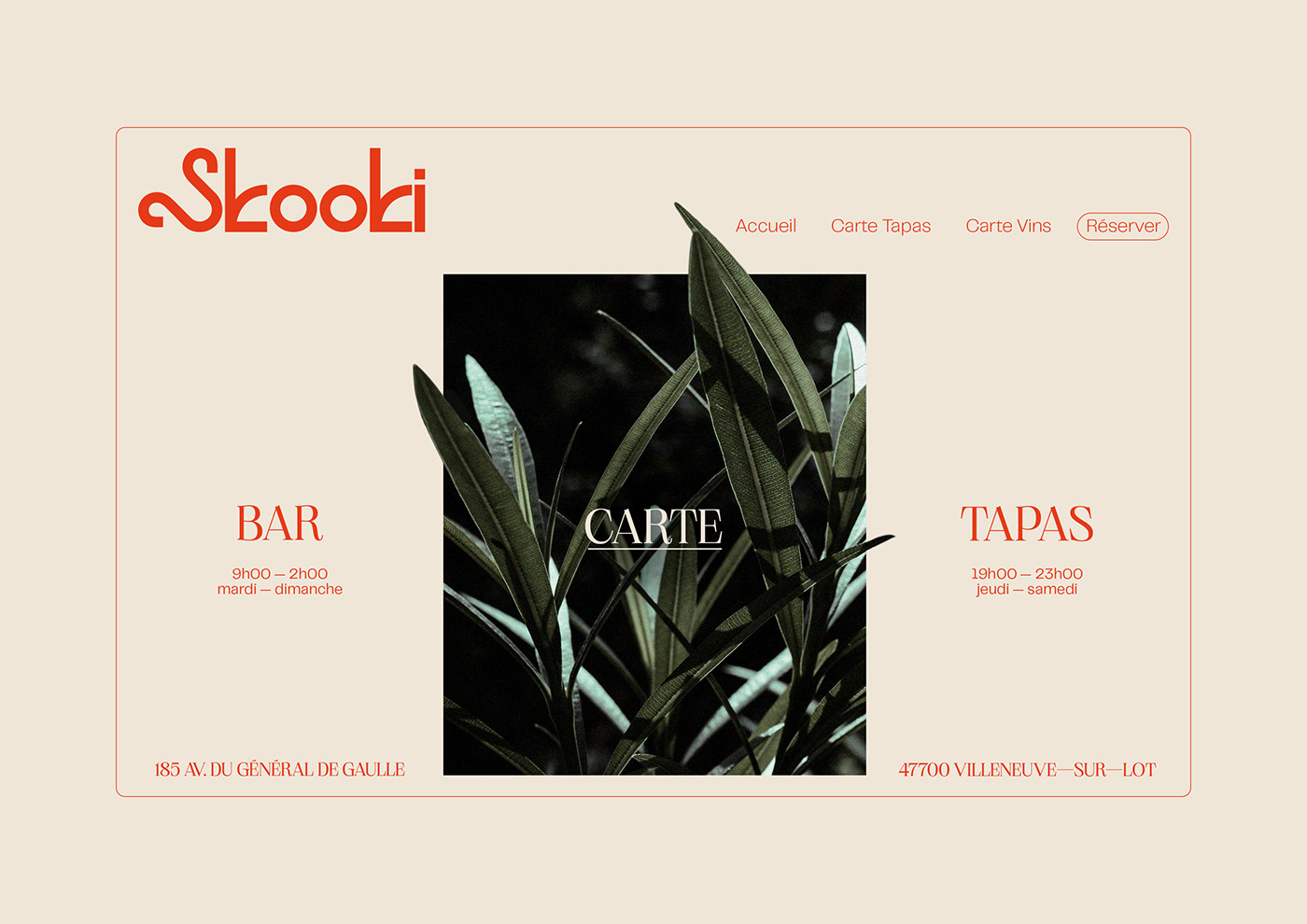
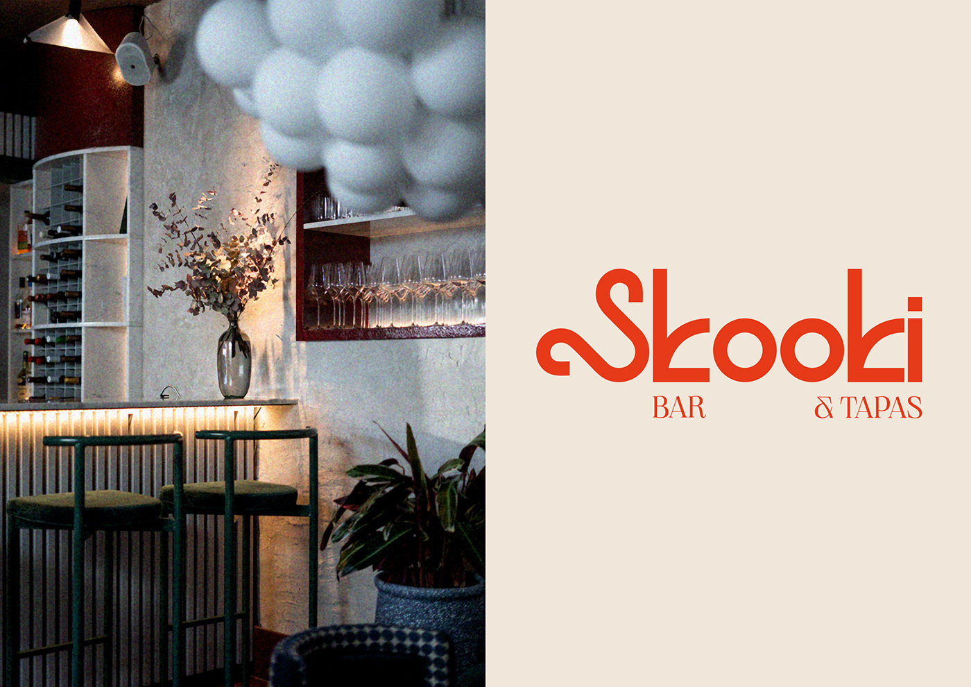
Skooki est un bar dans le sud de la France et propose une carte de tapas hybride teintée d'influences à la fois orientales et occidentales. Pour cette identité visuelle, nous nous sommes particulièrement intéressés à la culture berbère et son alphabet Tifinagh puis nous l'avons réinterprété avec un dessin typographique dépourvu d'ornementations. Le jeu de symétrie et de désordre est au cœur du système graphique imaginé pour l'occasion. La lettre S est à la fois l'ossature du logo et le point de départ d'un itinéraire infini à la découverte des milles et unes saveurs aux 4 coins du monde : l'Asie, l'Afrique, et l'Occident.
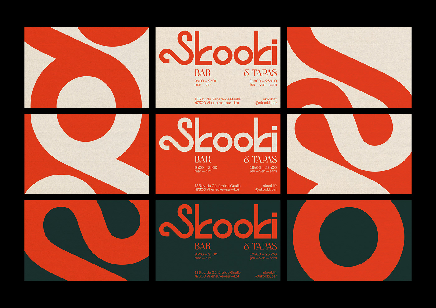
La palette chromatique quant à elle est composée de 3 couleurs centrales pour symboliser la nature humaine, la terre nourricière et l'éveil à la vie; en d'autres termes, Skooki a pour vocation d'accueillir ses clients dans la gaieté et la simplicité, comme à la maison.
ENG
.
Skooki is a bar in the south of France and offers a hybrid tapas menu tinged with both Oriental and Occidental influences. For this visual identity, we were particularly interested in the Berber culture and its Tifinagh alphabet and then we reinterpreted it with a typographic design devoid of ornamentation. The interaction of symmetry and disorder is at the heart of the graphic system imagined for the project. The letter S is both the backbone of the logo and the starting point of an infinite itinerary to discover the thousand and one flavors in the 4 corners of the world: Asia, Africa, and the West.
The chromatic palette is composed of 3 central colors to symbolize human nature, the nourishing earth and the awakening to life; in other words, Skooki's vocation is to welcome its customers in a cheerful and simple way, as at home.