MAISON25
In the center of St. Petersburg, at 25 Galernaya Street, there is a multifunctional space called MAISON25. It is a gallery with regular re-expositions, a place for private lectures and consultations on contemporary art, and also a venue for art shows, events, and closed events.
In French, maison means 'living house'. MAISON25 occupies the first floor of a house located in the historical part of the city. The road in front of the building has preserved masonry.
The special location and the semantic content of the space dictated the initial prerequisites for the creation of a brand identity — the visual component of the brand.

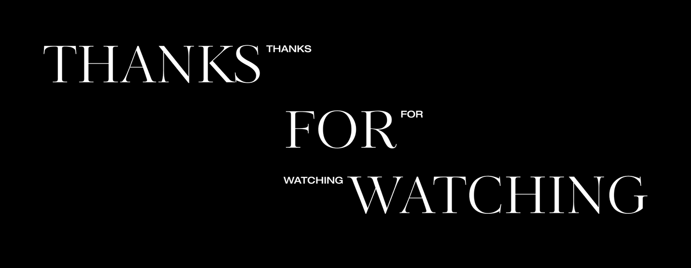
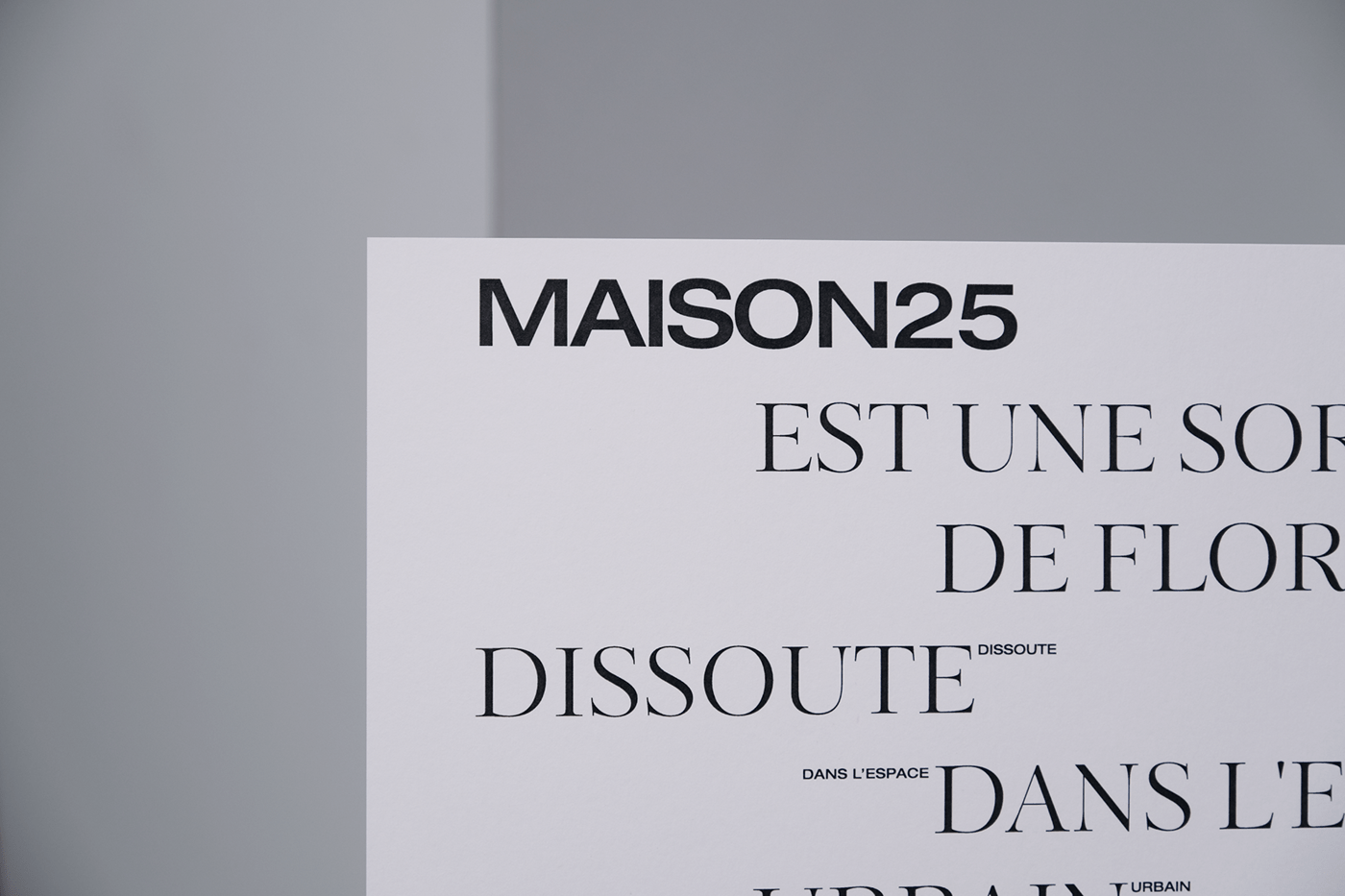
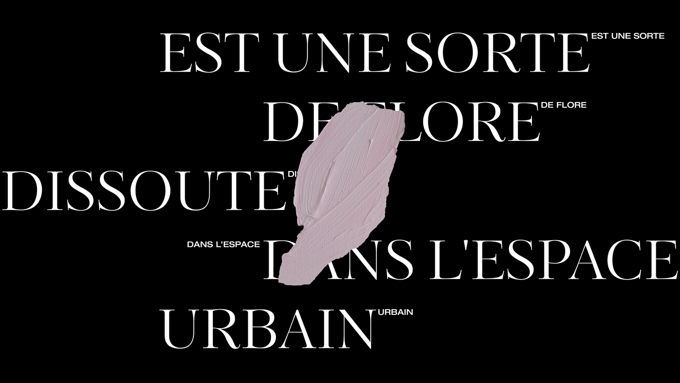
Font
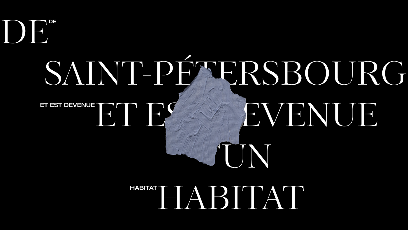
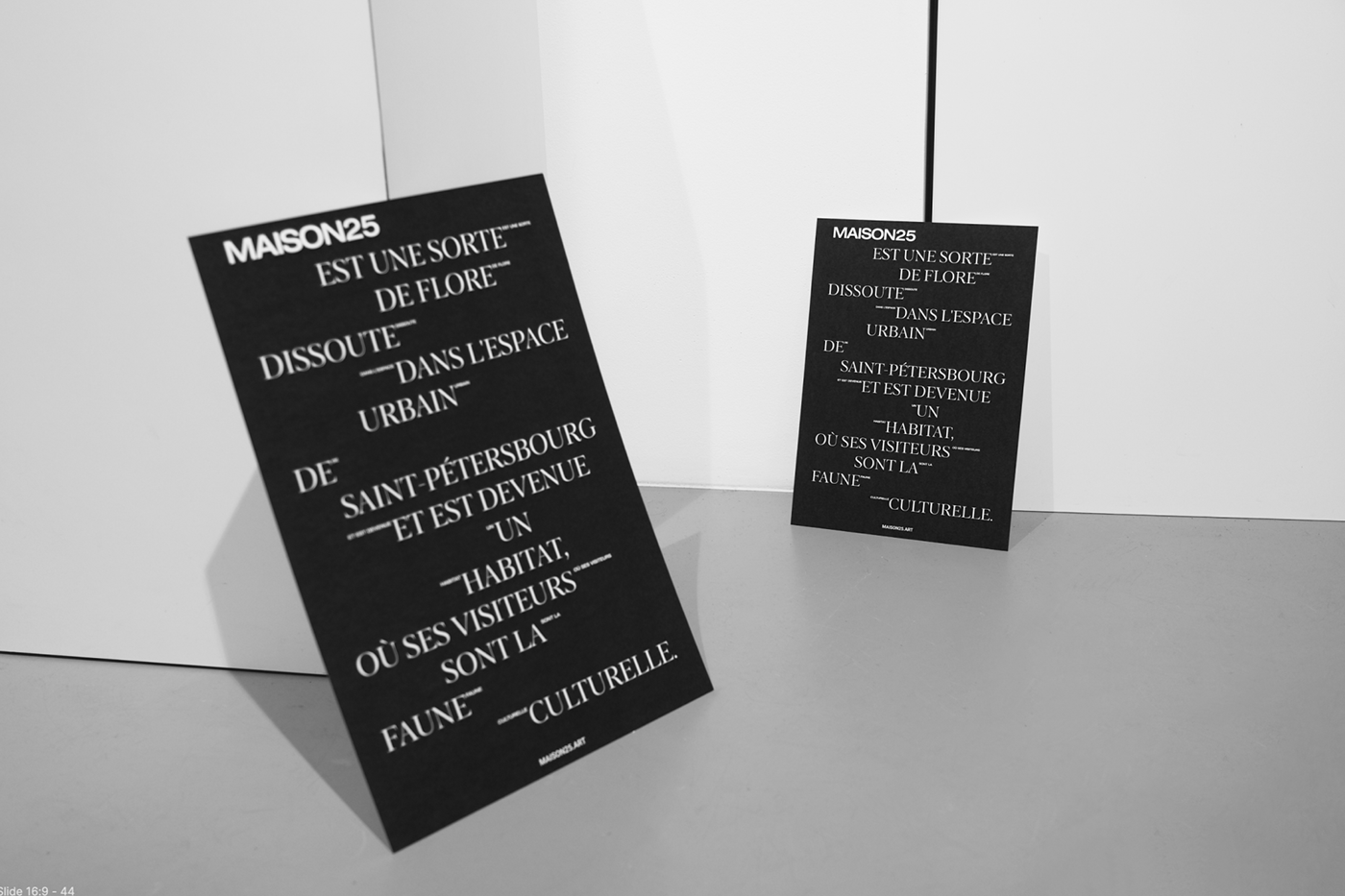
The interrelation of modern art and traditionalism in history, culture, heritage is traced through the combination of the font pair we chose for the identity of MAISON25.
The positions of traditionalism are reflected by Antiqua, the first font to appear in print. The concept of modern art is embodied by the Grotesque. HELIOT EMIL, Jil Sander, Balenciaga and other brands precisely use the grotesque fonts.


Colors
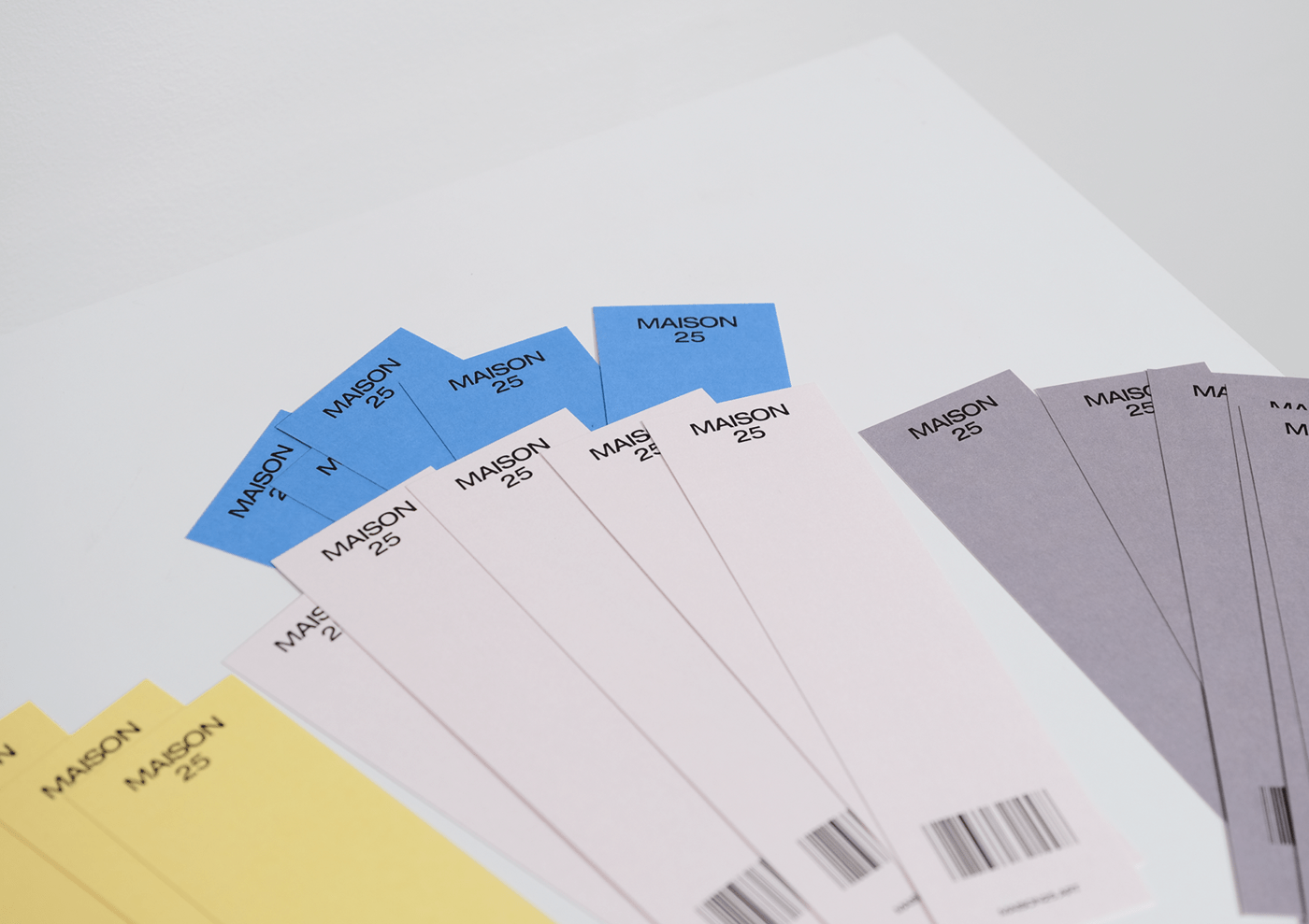
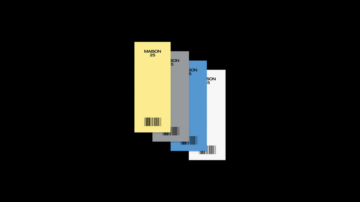
The choice of colors for the Maison25 identity was inspired by the shades of 2021 according to Pantone Institute - gray and yellow.
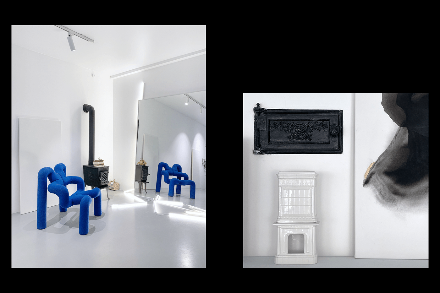
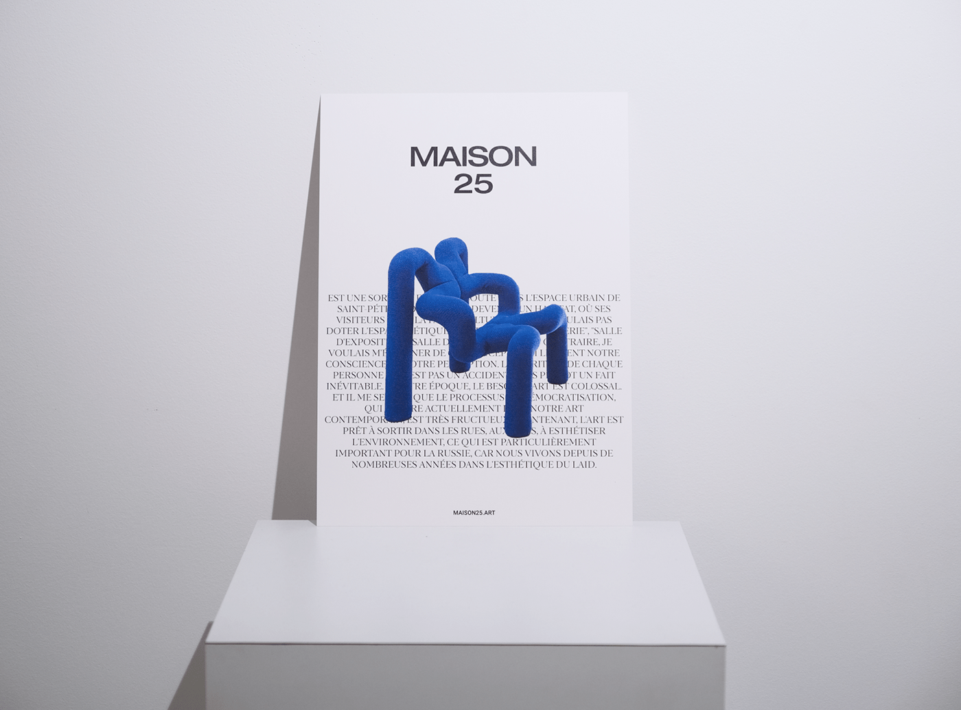
Blue was an additional color accent. The fact is that the space features a 1970s art piece from Norway. It is an ultramarine chair with an irregular shape. Its author is considered one of the first postmodernists in Norway. The chair has become perhaps the most recognizable object in Maison25.
The choice of colors for the Maison25 identity was inspired by the shades of 2021 according to Pantone Institute - gray and yellow.
Blue was an additional color accent. The fact is that the space features a 1970s art piece from Norway. It is an ultramarine chair with an irregular shape. Its author is considered one of the first postmodernists in Norway. The chair has become perhaps the most recognizable object in Maison25.


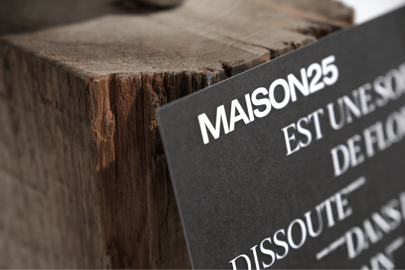
Details
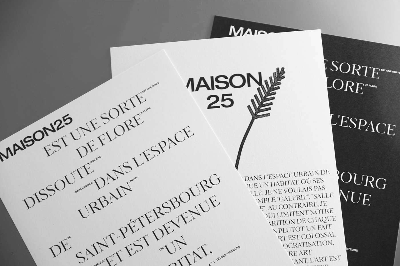
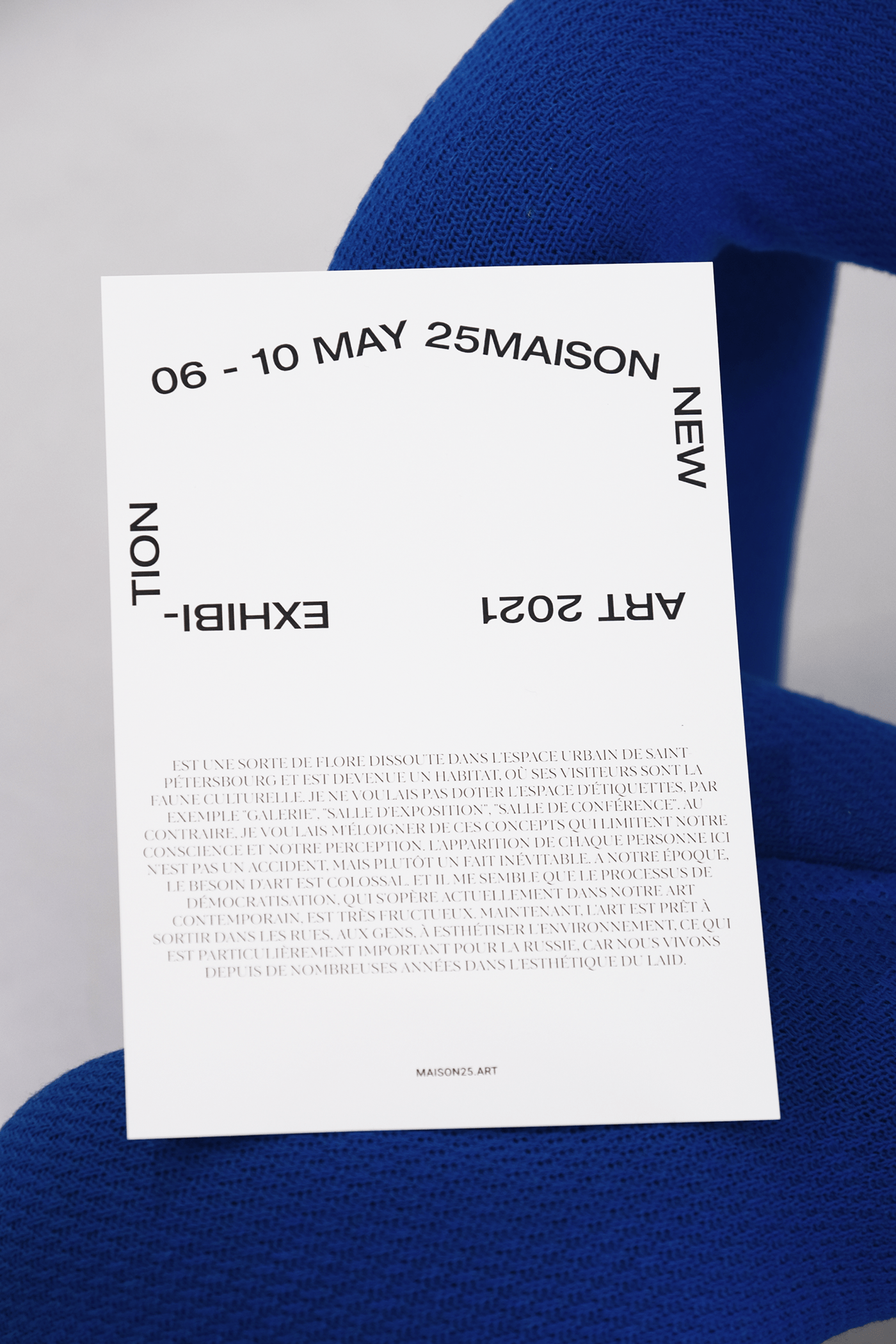
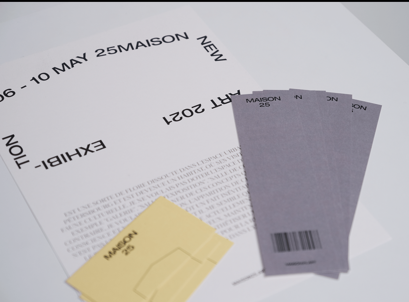
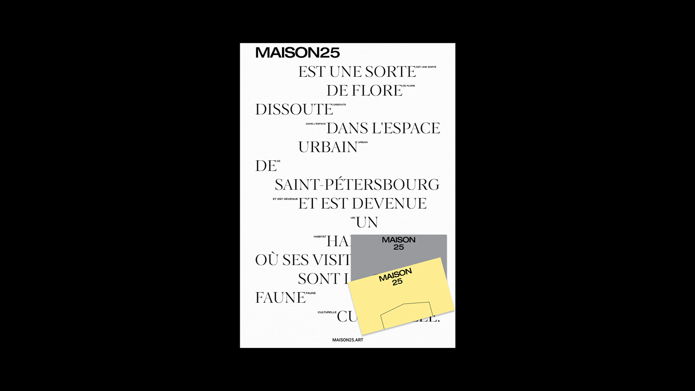
We reflected the connection to the concept of the apartment building through the image of the plaque, typical of France. There, a rectangle with a semicircle above it is fastened onto buildings in order to indicate the names of the streets and house numbers. We adapted the format of the sign to the objectives of the space and made it the main indicator of the design.
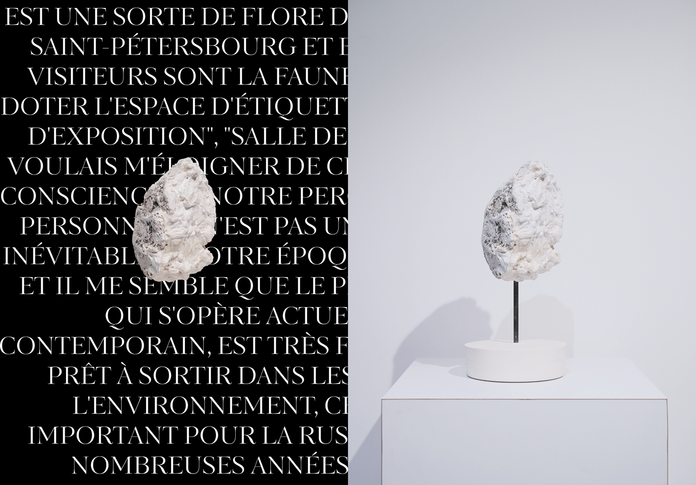
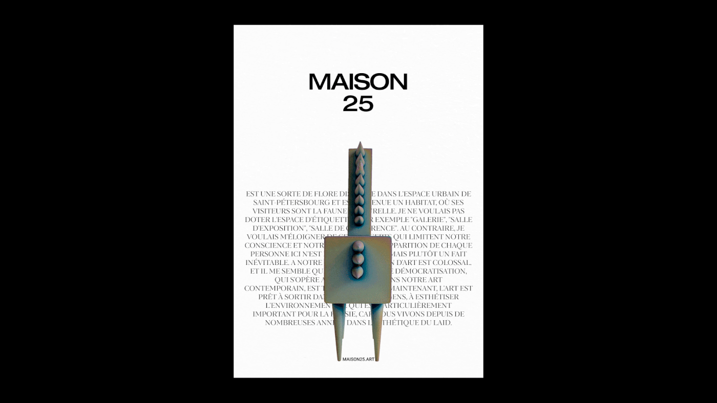
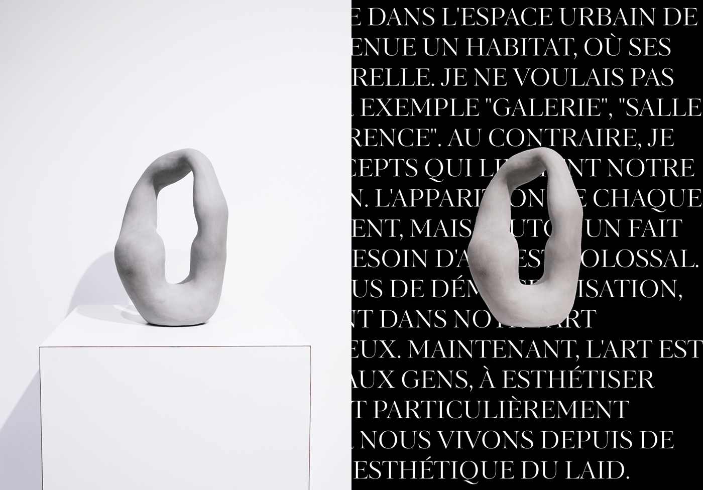
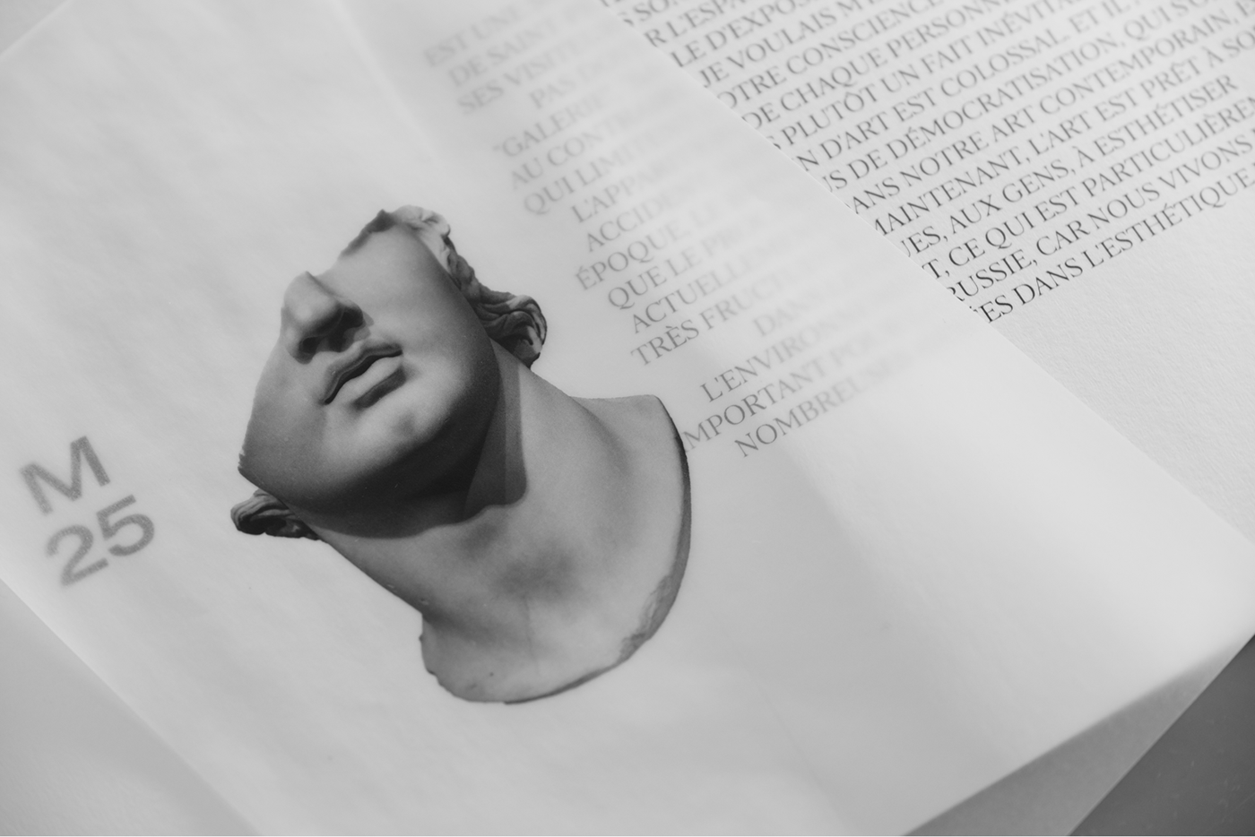
The identity includes labels for art objects and brochures with descriptions of art objects. The covers of the brochures are made of matt translucent paper. Onto them, we suggested placing a conventional image of the artwork. This is followed by sheets with a description of the object and a story about Maison25. Everything looks aesthetically appealing and pleasant for tactile interaction, completing thus the beauty of the space and emphasizing the uniqueness of the project for St. Petersburg.
We reflected the connection to the concept of the apartment building through the image of the plaque, typical of France. There, a rectangle with a semicircle above it is fastened onto buildings in order to indicate the names of the streets and house numbers. We adapted the format of the sign to the objectives of the space and made it the main indicator of the design.
The identity includes labels for art objects and brochures with descriptions of art objects. The covers of the brochures are made of matt translucent paper. Onto them, we suggested placing a conventional image of the artwork. This is followed by sheets with a description of the object and a story about Maison25. Everything looks aesthetically appealing and pleasant for tactile interaction, completing thus the beauty of the space and emphasizing the uniqueness of the project for St. Petersburg.
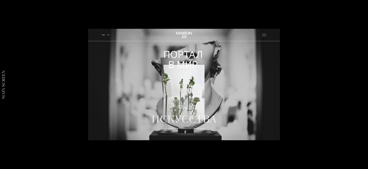
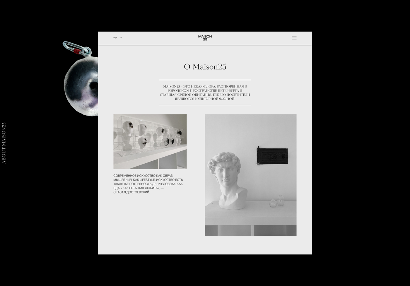
Website
Website is built on the same principles that we used in the identity: large typography using two fonts, simple grid, emphasis on art objects.


designer - Rust Balyaev
creative director - Vladimir Nikandrov