Teastan
THE CHALLANGE
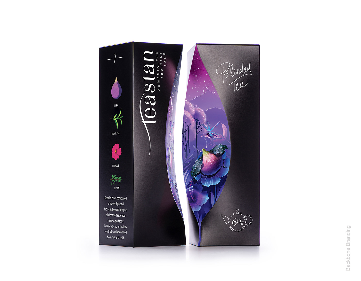
The challenge in creating this packaging design was visually expressing the associations and feelings, aromatic notes, and effect the tea passes while drinking it.
THE SOLUTION
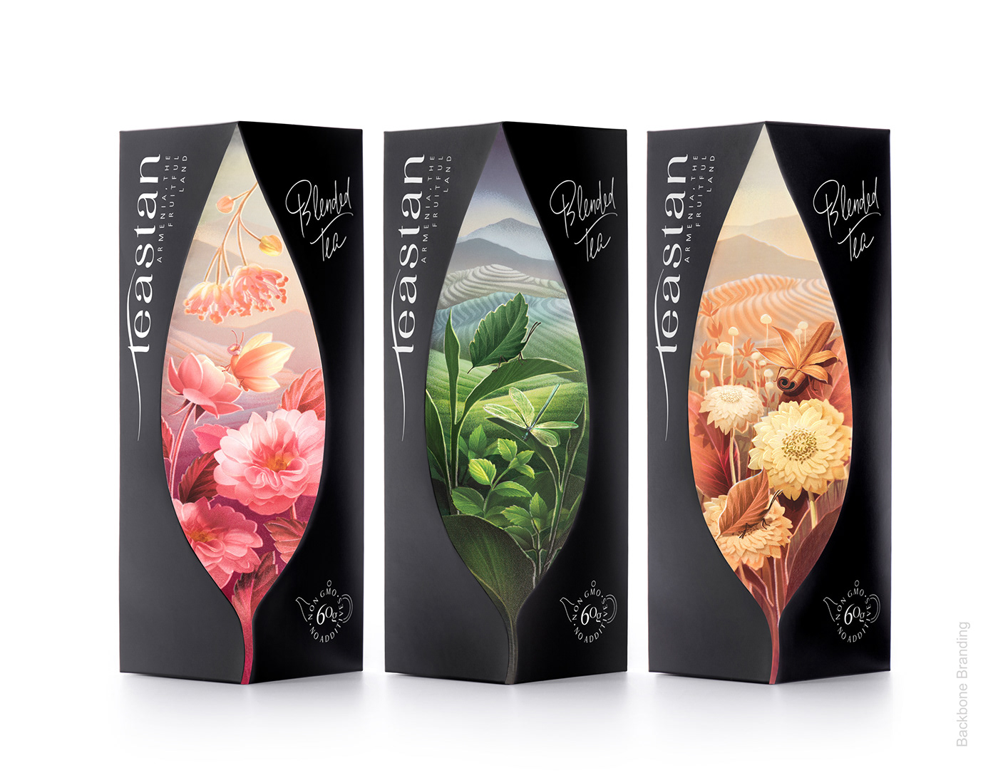
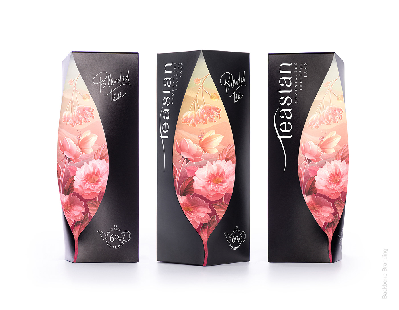
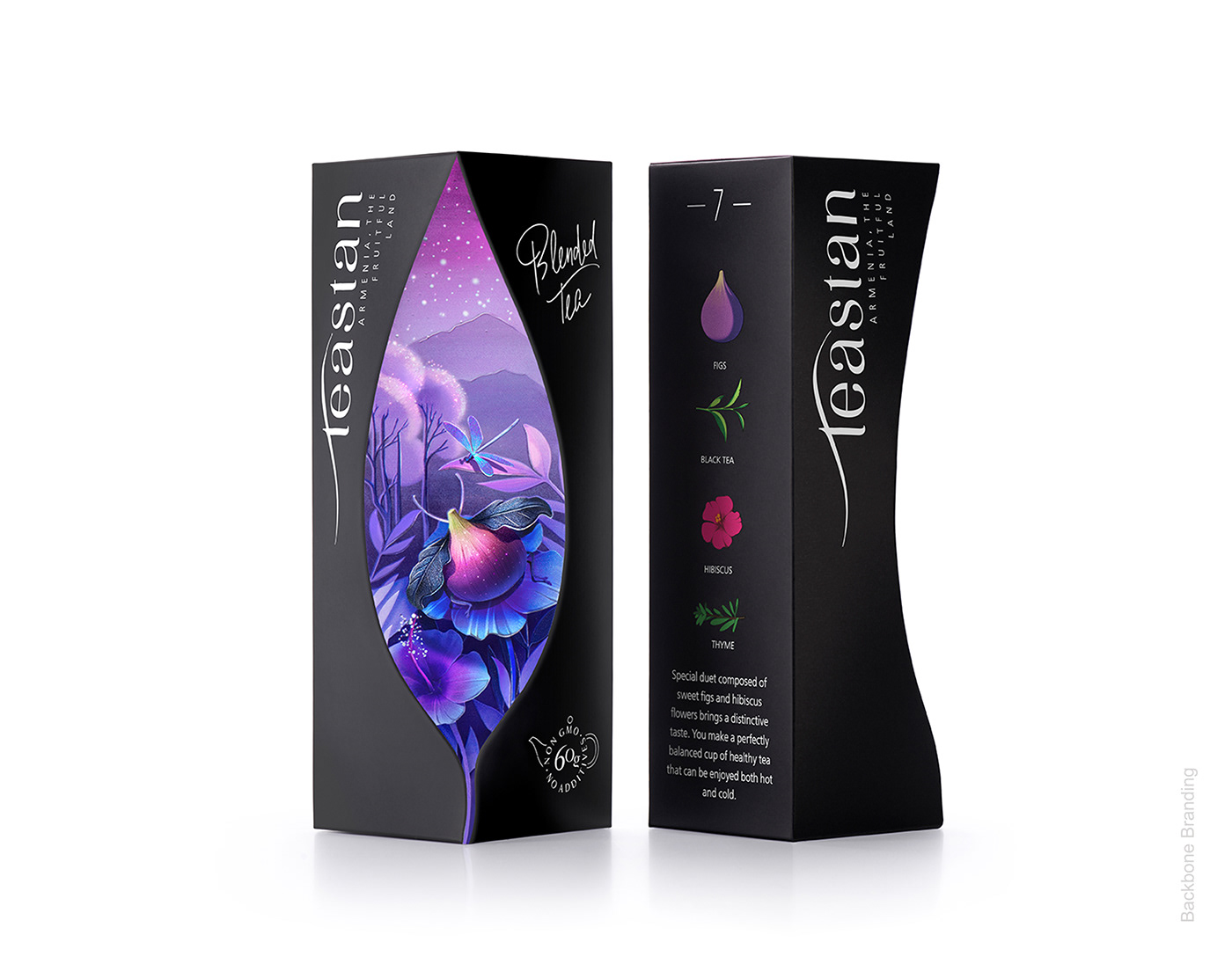
Our packaging dieline is an imitation of a cut from the box with a tea leaf, as if with a bare hand. It shapes a window that lets us penetrate to the world of tea leaves, illustrated as a magical world of insects and plants and leaves that grow next to each other in wild nature, devouring the sun and fresh air of the beautiful mountains, where they rise.
There are mainly two different types of tea – with refreshing and soothing effects. We have exemplified energizing teas on white packaging with a symbol of Sun– a source of energy, and relaxing teas in black packaging with a symbol of Moon.
So you can get the feeling that the tea gives not solely by the color of the package and symbols, but also by the mood that it passes.
Teastan opens up the world to the fascinating nature of Armenia while enjoying the delicious teas․
Credits:
Brand Strategist: Lusie Grigoryan
Creative Director & Structure Designer: Stepan Azaryan
Illustrator: Mariam Stepanyan
Photos by: Backbone Branding & Suren Manvelyan