PROJECT BRIEF:
Time: 3 weeks | Work Force: 4 Designer Team
Role: Team Leader, Research, Visual Design, Service Design, UX & Interaction Design
Role: Team Leader, Research, Visual Design, Service Design, UX & Interaction Design
DESIGN GOAL:
• Design, build, and test a comprehensive online ordering experience for the Savannah Food Co-op across the browser, tablet, and smartphone.
• Our team was tasked with focusing on the views and needs of current, past, and non co-op members in order to redesign an online ordering platform that could work for all user groups.
CURRENT WEBSITE:
The following screenshots depict the current website design and it's online ordering platform.

Post log-in home page

List of producers who provide products to the co-op
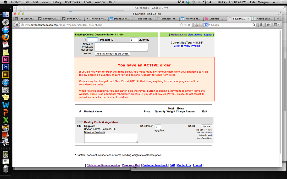
Checkout product page
• Conduct observations and interviews with current or past co-op members to discover the pain points and opportunities.
• Discover the perception of the co-op from non-members.
• Affinitize user data into an infographic map.
• Develop a primary and secondary persona based on our research.
SITES OF ENGAGEMENT:
Secondary Sites: Foxy Loxy (Local coffee shop), Savannah Farmer's Market (weekly market)
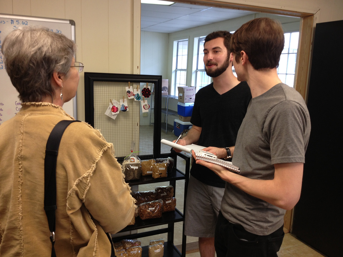
Informal interviews with users of the Savannah Food Co-op
USER GROUP PRESENTATION:
The following presentation documents the data and insights gathered from the sites of engagement.
*The customer journey maps shown in the presentation are labled with Red and Green events. Red standing for pain points and Green representing pleasure points.
USER GROUP SUMMARY:
From our research and observations we found that most users had similar problems with the Savannah Food Co-op's current online ordering service. The main issue was general navigation. The current site is unorganized and bland.
• Many users requested some way of saving previous purchases or an order history feature. They require a streamlined way to find what they want within the site and order it with ease. The service offers a very large variety of products represented in a confusing manner, which causes the site to become very overwhelming for most users.
• Generally, the idea of buying local fresh produce seemed attractive to many non-users, but they haven't been introduced to the Savannah Food Co-op's service.
SYNTHESIZING USER DATA:
Based on the user analysis research, our team was equiped with the insights needed to focus on transforming the Co-op's website and ordering process. We began by grouping the Co-op's different offerings with the services provided by each producer. This allowed us to better streamline the
Co-op's inventory and general naviagation.

In order to work through the large amount of data we built low-fidelty page layouts that served as the base for our wireframes and infromation navigation.
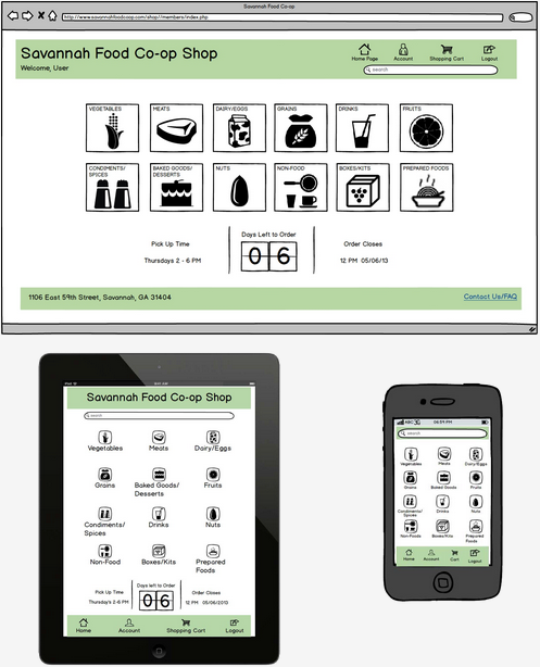
HOME PAGE
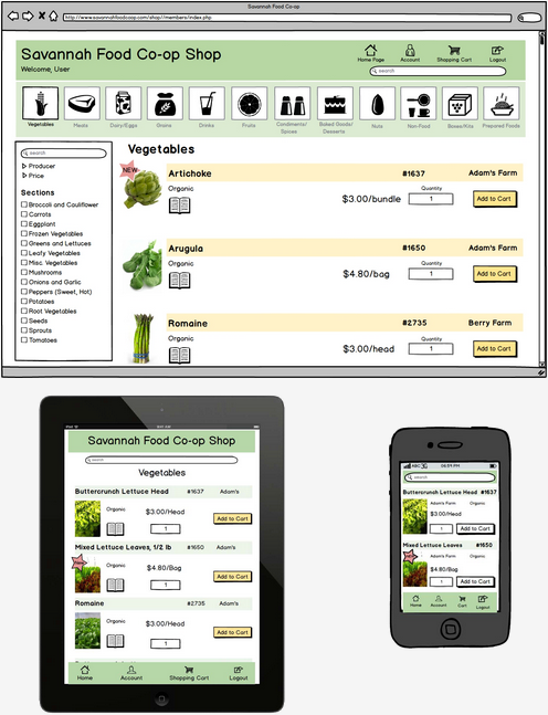
PRODUCT LISTING
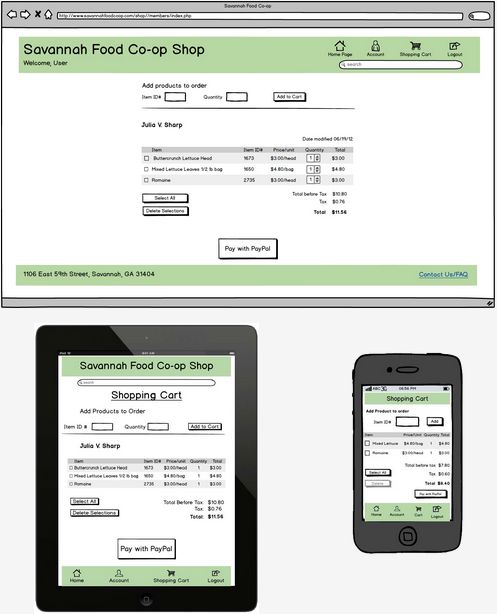
CART
TESTING & RESULTS:
In order to validate our layout, we took it to the people that might actually be using it. After initially testing on two peer groups we made sure to test on multiple demographics, in various locations. We spoke to 3 different SCAD students and had each of them test all three platforms. Based on these results we then moved on to test the design on four other people at Foxy Loxy (coffee shop), and eight more at the Sentient Bean (coffee shop), totaling fifteen user tests across all device platforms.

Testing the Balsalmiq mock-ups on our fellow SCAD peers

Testing the wireframes on members of the Savannah community while using Camtasia (screen and web cam capturing software) to record usage data.
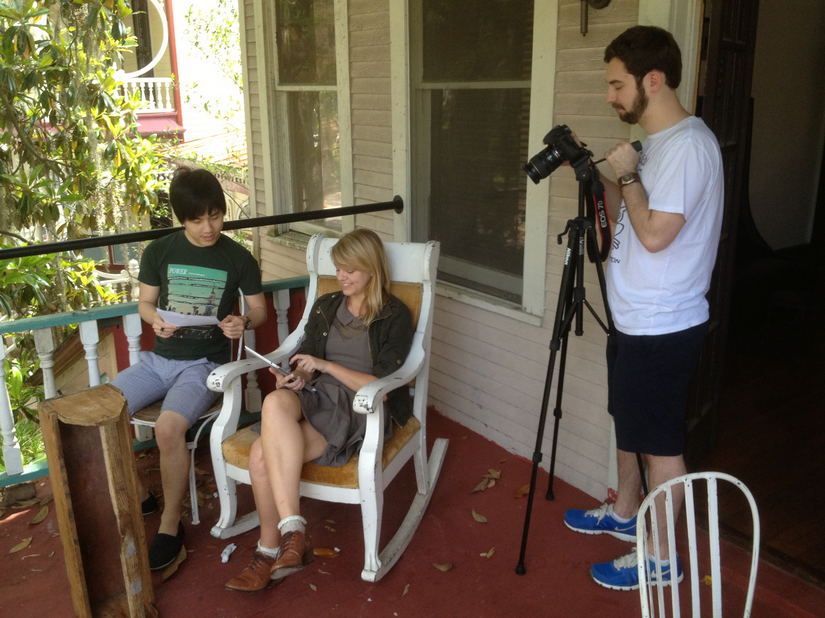
Video recording the testing of the mobile platforms on members of the Savannah community.
User testing helped us to eliminate unnecessary steps in our web layout. We got rid of a filtering step as well as repetitive elements, such as the "delete selection" option in the cart page. We were able to make corrections to icons that users deemed to be confusing which helped to strengthen and guide our visual design.
The following video recaps our teams findings and how that related to testing and the final design.
VISUAL DESIGN:
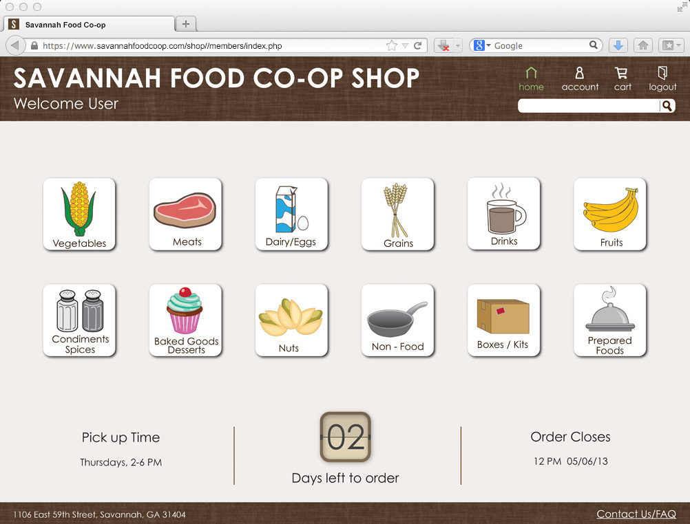
Home page for ordering food online. The page features icons to denote the different search categories as well as a main navigation bar. The page also informs the user of the days left to place an order.

The main search page after selecting vegetables. Narrow the search by using the check-boxes on the left-side of the window. Search preferences are listed by vegetable type, producer, and price.

Once an item has been added to the cart a notification appears to denote the added item.
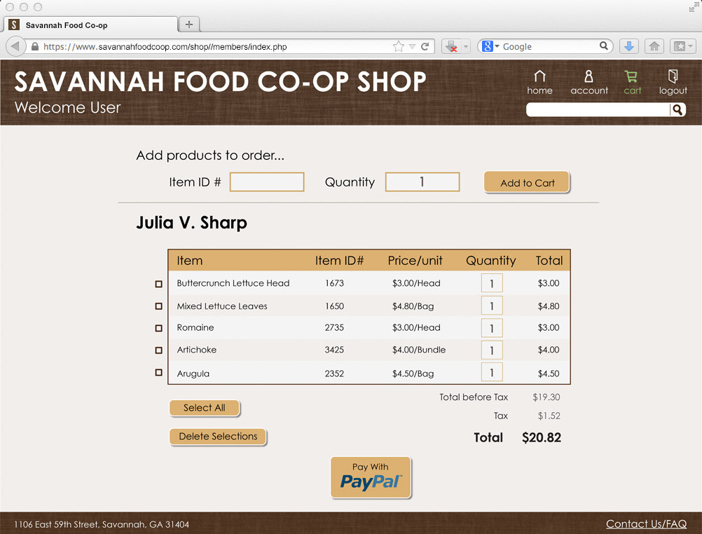
Cart Page: Items can be confirmed for purchase or deleted from the billing invoice. Users are given the option to put in item ID #'s in order to quickly add items to the cart prior to checkout.

The account page shows users personal information as well as past order history

The FAQ page as well as a streamlined email contact feature.

TABLET APPLICATION WINDOWS
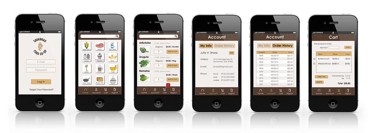
MOBILE PHONE APPLICATION WINDOWS

Detail view of the mobile application, featuring the homepage window.
FINAL THOUGHTS:
Ultimately our team successfully captured a simplistic and desirable visual design and responsive web design that adapted easily to the different needs of multiple device platforms. We found that many users were pleased with the usability of the service we designed and had minimal negative feedback. Our testing process was genuinely extensive and well planned out, capturing the basics as well as small details of each device's application.
*Special thanks to our professor Michael Felix and the Savannah Food Co-op for all of their help and assistance in this collaboration.


